How to Build a Basic Custom Button Component in React TypeScript
Time to read: 6 minutes
March 04, 2021
Written by
Reviewed by

Learning how to code, especially with React, a JavaScript UI library, can be unnecessarily difficult. However, if you enjoy interactive web pages, then you might be able to view learning React as a fun way to design your own interactive site.
With React, you can create elements quickly by writing the guidelines for one customizable component and reusing it throughout the project, only altering some of its details. This is also a great exercise for understanding why you should follow best programming practices to write code in an organized and efficient way.
In this article, you'll be exploring how to write a custom button component for a basic TypeScript React project. You will be able to reuse the button throughout the site and practice reusing components efficiently.
Tutorial Requirements
- Node version 14.16.0 or above at the time that this article is written.
- npm, yarn, or another package manager.
- Some prior knowledge in JavaScript and TypeScript, or a willingness to learn.
Start a React app
In React, there are a few different ways to start an application. For the sake of simplicity, use the create-react-app utility to create a project structure that you can build on.
On your command line, run the following lines to create the project folders and change into the my-first-typescript-app directory.
Type the following commands in your terminal to install TypeScript and related dependencies:
Notice that there are already some folders and files created in the directory created for your convenience. Open the src folder and navigate to App.tsx where you will see some boilerplate code for the React webpage. Replace the contents of the file with the following code:
Save your file and enter the command npm start in your terminal to start the server on localhost:3000/.
You'll see that the only thing on your localhost:3000 page is the header. Feel free to kill the server so that you can focus on the code, otherwise leave the terminal open and running to see the changes as you go.
Define the properties for a custom component in React
As mentioned above, React uses components and props to make the code cleaner. Remember that the goal is to simplify the components as much as possible so that you can reuse them throughout the project.
Let's think about the functionality and appearance of the most basic button on any website. A button can have different appearances and come in all shapes and sizes. However one thing remains consistent - all buttons are intended to be clicked on.
Here's an example of a basic button you want to display:
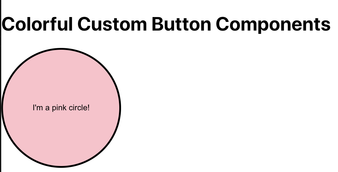
Examine the appearance of the button so that we can break down the values required to write out the details of the CustomButtonComponent component. When writing any component in React, you will need to define the Props at the top. Keep in mind that props - which stands for properties - are similar to function arguments because they are used to pass data into a component.
Each button in your React app will consist of the same properties as elaborated below:
border: Optional CSS attribute to change the border style of each button.children: Optional property to allow developers to include another ReactNode or text on top of the button.color: The color of the button.height: The custom height of the image file.onClick: An event handler that can define the result of a button when clicked.radius: Optional CSS attribute to change the radius of each button.width: The custom width of the image file.
In order to use these props and render the input passed in, we will have to write a Button object that takes in placeholders of the properties defined above. Then, the Button object will be exported so that it can be called multiple times throughout the React project.
Write a component in React
Now that you have an idea of the props required for the button component, create a new folder within the src folder named components. Make one new file named CustomButtonComponent.tsx.
Copy and paste the following code into CustomButtonComponent.tsx:
As you can see, the properties that were discussed in the previous section are shown in interface Props. Each property has a defined type that can be passed in. Most of the properties take a string input because they require specific units for the CSS - such as a % or px value - whereas, the onClick event handler doesn't need any more information.
The children property is interesting because it is handled automatically by React and does not need to be explicitly passed when defining a component. The property can either take in an entirely new node if you were to define any more React nodes in the future. Otherwise, you can pass in text which will show up on top of the button, as we will be doing for the sake of simplicity in this article.
Use the component in your React project
It's time to test out your code.
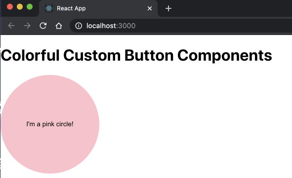
Update the App.tsx file in the src folder with the following code to create a round, pink button on your React page:
Save the project files.
You're ready to see your custom components in action! If you aren't running npm start from earlier, go ahead and type that into your terminal. Otherwise, refresh the page to see the pink button you just added.
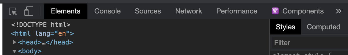
Inspect the element of the page and select the Console tab at the top. A great visual way to test if your button works properly when clicked is to have the Console tab opened on the side to show the message once the button is clicked.
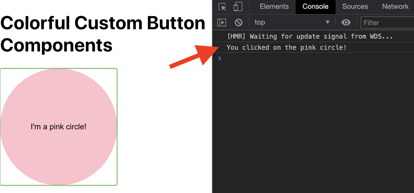
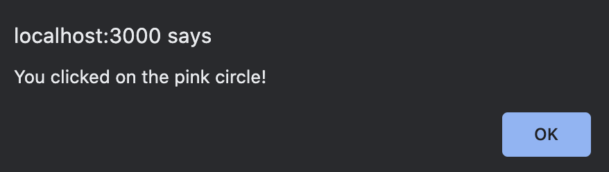
Alternatively, you could replace console.log() with an alert() call instead.
You can expand the project by giving new instructions to the onClick event handler. Perhaps you can redirect the user to a new page or be creative and turn this into a React art project where more colorful shapes are added and represent a music note.
I channeled my inner artist to throw in a bunch of buttons of different shapes. Hopefully this can inspire you to use code to make art as well!
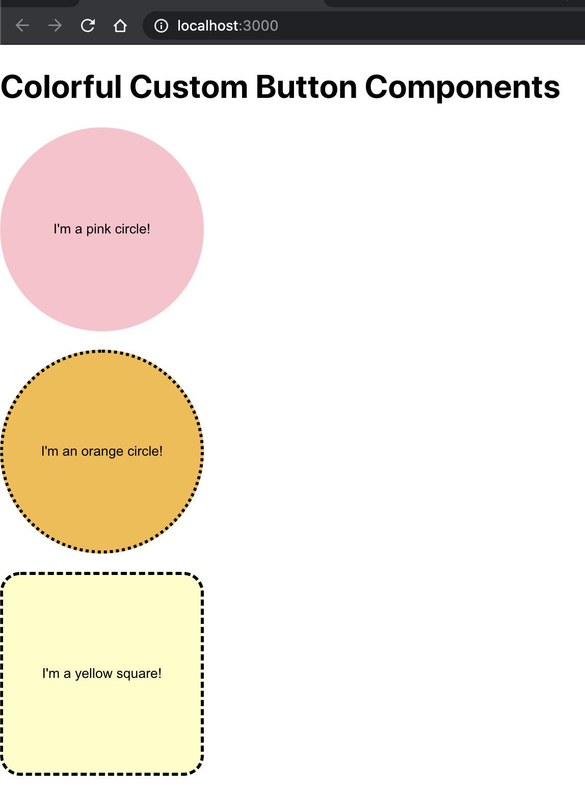
Here's the code for the screenshot above if you want to use my example to build off of:
OPTIONAL: Install a developer tool to experiment with the CSS in the React project
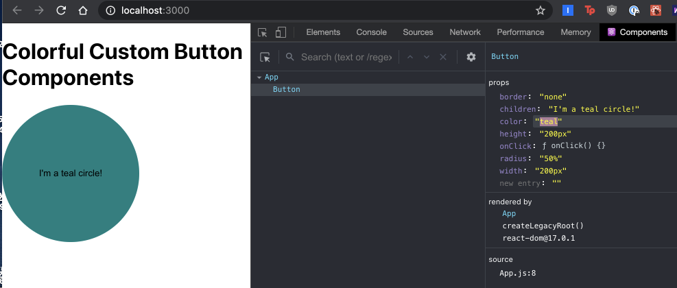
If you plan on developing with React more, another cool extension that you might consider installing is React Developer Tools. This is a chrome extension that conveniently shows you the breakdown of the React components that are rendered on the page.
You'll see the Components tab in the Internet inspection browser after installing the extension:
Click on Components to see the components used in App.tsx. If you add more buttons, you can see each and every button component repeatedly called throughout the page.
You can even use this extension to change the values of the props and see them change immediately. This is a great way to experiment with the CSS quickly before changing the code in your project. Just select the button and write in a different value for the props on the right hand side.
Here's an example of me changing the values of the color and children props directly on the webpage so that I can see how a teal circle is displayed on screen:
Go ahead and play around with the values and explore more properties you can add to your custom button component!
What's next for custom button components in TypeScript React projects
Congratulations! You are now one step closer to writing clean, efficient, and beautiful reusable code for your project. React might have a huge learning curve but investing time into learning how to write your own custom components and wrappers can save you so much time in the long run.
By using React's tools – and connecting with its massive open source community – you will be able to scale up the application that shows user entries in no time. Want a quick challenge? Add a background image to the Button component so that users can click on pictures instead of shapes.
Check out these articles to learn how to build more with React and Typescript:
- Build React projects with a background in Python, Flask, HTML, and CSS
- Learn how to move your project to TypeScript at your own pace
- Learn how to use wrappers in TypeScript React projects
Reach out to me over email to show me how your first TypeScript React projects are going!
Diane Phan is a Developer Network editor on the Developer Voices team. She loves to help programmers tackle difficult challenges that might prevent them from bringing their projects to life. She can be reached at dphan [at] twilio.com or LinkedIn.

Related Resources
Twilio Docs
From APIs to SDKs to sample apps
API reference documentation, SDKs, helper libraries, quickstarts, and tutorials for your language and platform.
Resource Center
The latest ebooks, industry reports, and webinars
Learn from customer engagement experts to improve your own communication.
Ahoy
Twilio's developer community hub
Best practices, code samples, and inspiration to build communications and digital engagement experiences.