20 email newsletter examples that don't suck in 2026
Time to read:
November 25, 2025
Written by
Reviewed by
20 email newsletter examples that don't suck in 2026
Sending an email newsletter every third Tuesday because "that's what we've always done" is a fast track to unsubscribes.
Newsletters work when they give people something worth reading, not when you're scrambling to fill space just to hit your cadence. The problem is, too many marketers treat newsletters like a box to check instead of a worthwhile conversation with their audience.
Fortunately, plenty of brands are doing newsletters right. They're creating content people want to open, read, and engage with.
We've rounded up 20 of the best email newsletter examples to show you what's possible when you prioritize value over consistency for consistency's sake.
What is an email newsletter?
An email newsletter is a regularly distributed digital publication sent via email to a list of subscribers. Businesses use this medium to share information, updates, news, promotions, and valuable content with their audience.
Newsletters can be a great excuse to communicate with your subscribers regularly. Without a newsletter, it feels like you're always having to kickstart a conversation to get a touchpoint—and that's not a great way to build a lasting relationship.
There's no one-size-fits-all email marketing newsletter. Some businesses use text-only updates, while others focus heavily on visuals. It can be as simple or as complex as you like.
We're not here to tell you how to do your email newsletter—we just want to provide you with a few best practices and some of the best email newsletter examples to inspire your own.
Elements of an effective email newsletter
Before you scroll through the examples below, let’s go over the most important elements that encourage recipients to open and read your newsletter. These include:
- Engaging subject lines
- Well-designed email newsletter templates
- Focused, relevant topics
- Skimmable copy with engaging content
- Strong calls to action (CTAs)
Want to learn more about what makes a top-notch newsletter? Read our 22 newsletter tips.
Best email newsletter examples
Check out these email newsletter examples and consider how you can incorporate your favorite elements into your newsletter.
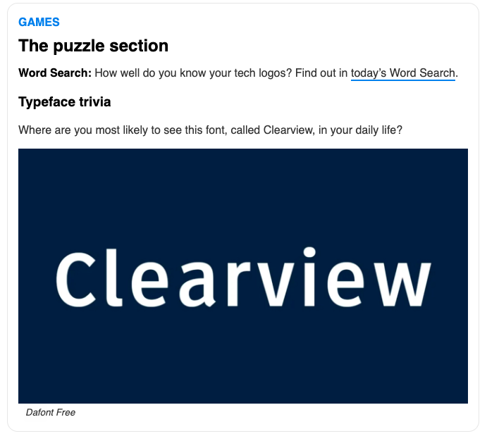
1. Morning Brew
Business news can be dense and dry, making some people want to tear their hair out. But Morning Brew changes the game, transforming the subject into an enjoyable and entertaining read. Quippy headings and simple charts make the news fun to consume. Plus, the conversational tone, with the strategic use of bullet points and bolded text, allows readers to digest the content easily.
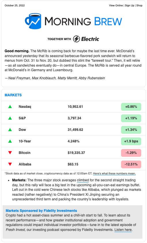
Morning Brew also uses interactive elements, like daily puzzles and weekly quizzes that check how much knowledge readers retained, to keep them engaged to the very end.
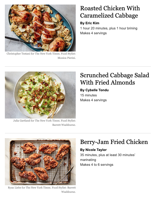
2. New York Times Cooking
The daily newsletter from New York Times Cooking provides recipes for home cooks written in a casual, first-person voice. While the blog-style text is longer than many newsletters, the content is informative and entertaining for those who want to spend a little more time reading about the recipes.
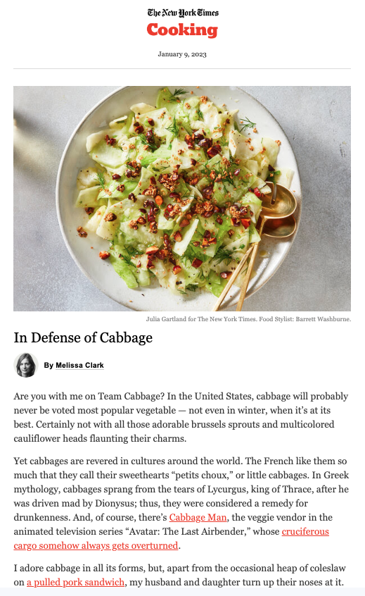
And those who don’t want to read can scroll straight to the recipes at the bottom, which come with mouth-watering images encouraging the reader to click.
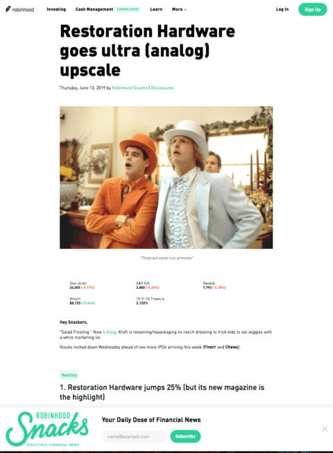
3. Robinhood Snacks
You might not associate investing and finances with comedy and wit, but Robinhood Snacks manages to pull off this combination. It delivers weekly financial trends in a digestible format with a comedic tone that keeps readers engaged. This newsletter also does a good job of keeping Robinhood top of mind without pushing its services too hard.
4. Accept Cookies
We often talk about visuals as one of the most important elements of a newsletter, but there are some exceptions to this rule. A great example is Accept Cookies, a newsletter by musician and podcaster Hrishikesh Hirway that shares “small delights” like media recommendations, snack suggestions, and occasional plugs for personal projects.
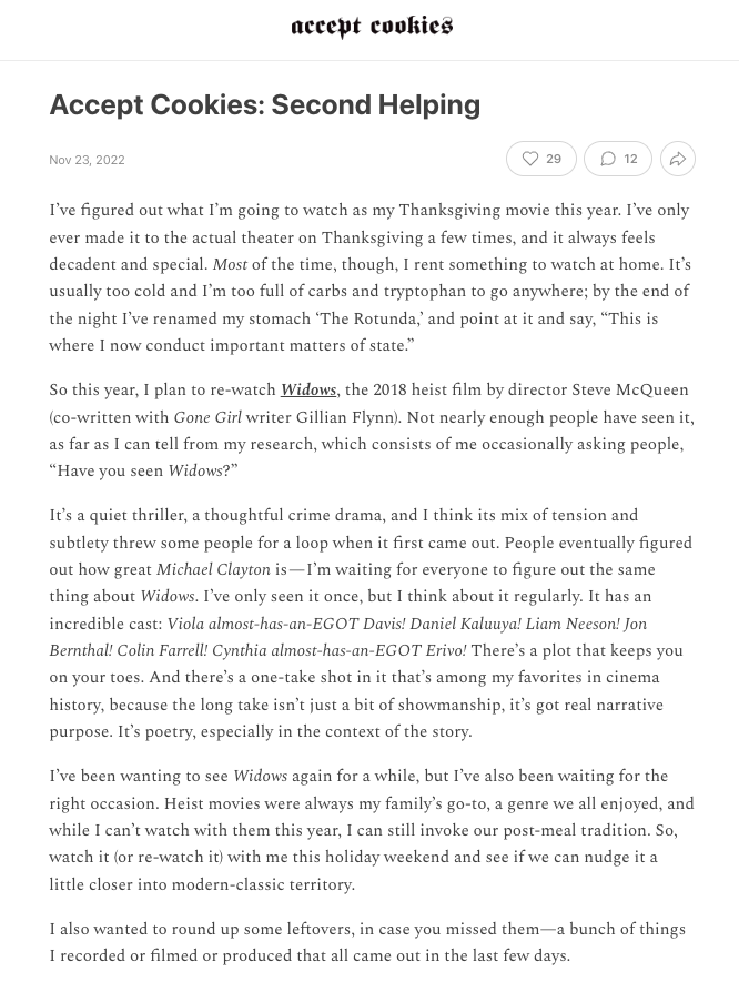
The newsletter is text heavy, typically punctuated with a video or image at the end. But Hirway tailors the content toward the audience, largely made up of fans who enjoy storytelling and want to set aside time to read about a great film they should watch or an international snack they might never have heard of otherwise.
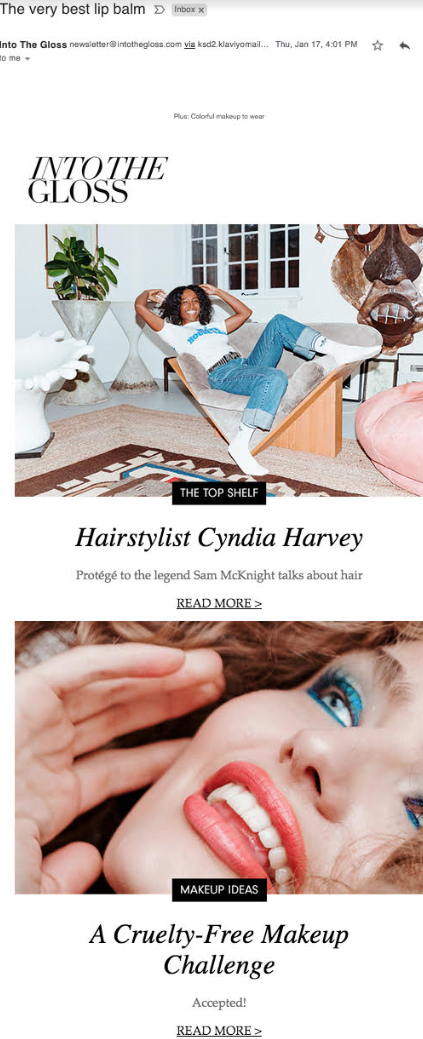
5. Into the Gloss
Beauty brand Glossier produces this newsletter on all things beauty, health, and wellness, but it’s hardly a promotional campaign for its products. Into the Gloss is editorial and provides educational content, including tips, techniques, beauty myth-busters, and interviews. Plus, aesthetically, the design is eye-catching with bold images and a minimalist, scrollable layout.
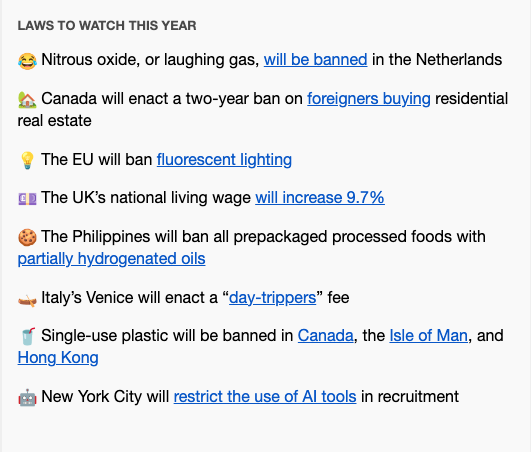
6. Quartz Daily Brief
A daily roundup, Quartz Daily Brief features economic news from around the world. It makes clever use of charts, emojis, and short bullet points to give readers an overview of interesting stories in an easy-to-read format.
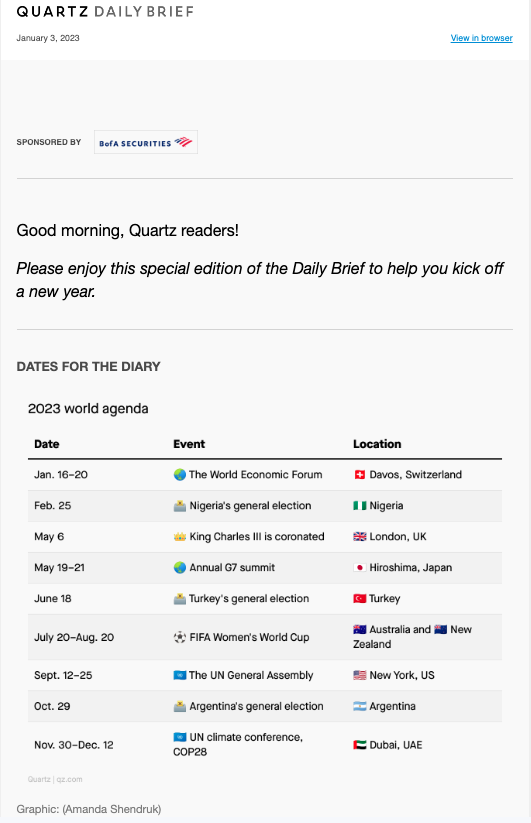
Readers can enjoy the short tidbits and move on or click on the CTAs for a deeper dive into each topic. Either way, the reader comes away feeling informed, even if they only spent a few minutes reading the newsletter.
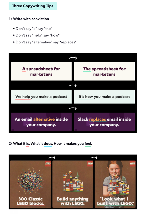
7. Harry's Newsletter
An inspiration for many marketers, Harry's Newsletter from Marketing Examples has a loyal fan base. The newsletter includes an estimated reading time, usually around 2 minutes, so recipients know it'll just take them a few minutes to potentially learn something new.
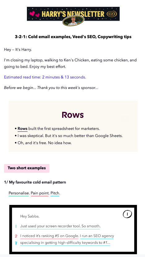
Each newsletter includes examples of good (or sometimes not-so-good) marketing campaigns, copywriting tips, and a favorite tweet, all laid out in a scrollable format. Plus, the copy is short and to the point, letting the visual examples do the talking.
8. Girls’ Night In
A weekly newsletter dedicated to all things cozy and comforting, Girls’ Night In curates book and podcast recommendations, interesting articles, and short interviews. It also reinforces the downtime theme with a soothing color palette and a laid-back tone, inviting readers to slow down and peruse the content at their leisure.
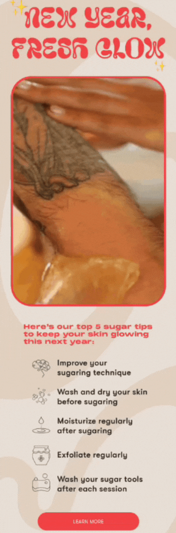
9. Sugardoh
With a strong visual identity, Sugardoh's newsletter strikes a great balance between promoting its products and giving readers useful information. The groovy header font and engaging GIFs also reinforce the Sugardoh brand identity, and the content appears in short bullet points with icons that make it easy to skim.
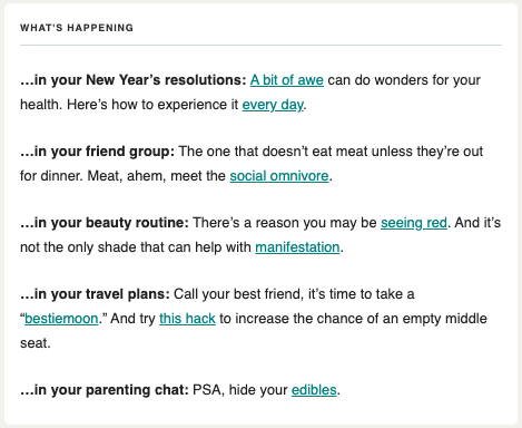
10. theSkimm
Using abbreviations, pop-culture references, and a cheeky tone to make it easily digestible, theSkimm compiles the major global and national news of the day into short summaries. This newsletter provides readers with relevant information that’s also fun to read.
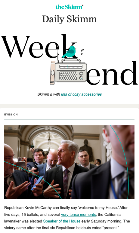
As you can see, theSkimm uses a mix of longer blurbs for major stories and shorter bullet points with links to interesting articles for readers to choose what they want to read.
11. The Margins
A workplace newsletter by Grammarly Business, The Margins has a cohesive visual identity that carries through the entire newsletter, from the header to the thumbnail images for each story.
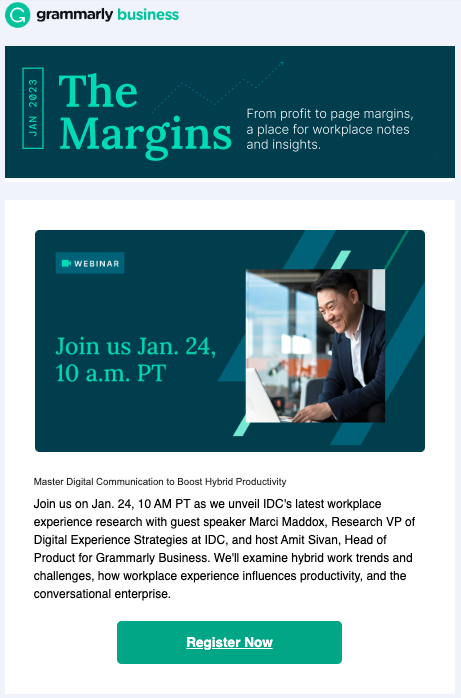
The content is a mix of promotion for Grammarly’s products and relevant information like industry reports. And it’s all tied together with identifiable brand colors and a clear CTA hierarchy that drives clicks to the primary CTA.
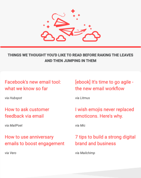
12. Really Good Emails
With its vast library of brand emails, it's no surprise that Really Good Emails sends an engaging newsletter with a strong brand identity and interesting email marketing content. Really Good Emails keeps the color palette simple, using only the brand's signature red and off-white hues.
The content is a mix of articles by Really Good Emails and email marketing resources from around the web. The tone is conversational and witty, appealing to the audience of copywriters, designers, and other marketing professionals.
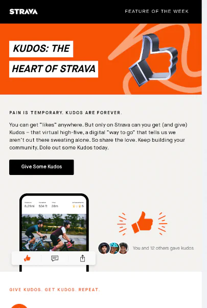
13. Strava
Strava's email newsletter always features, well, one of their new features. There's a lot going on under the hood of Strava, and most users don't know all the incredible things they can do on the platform. Every week, Strava sends a friendly reminder (along with other information) to keep athletes inspired and trying new things.
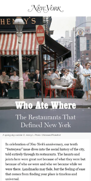
14. New York
Clean, simple, and classy—that's New York's email newsletter for you. They use great photography and storytelling to capture a narrative in an email, and that's more than some brands can do in an entire magazine spread.
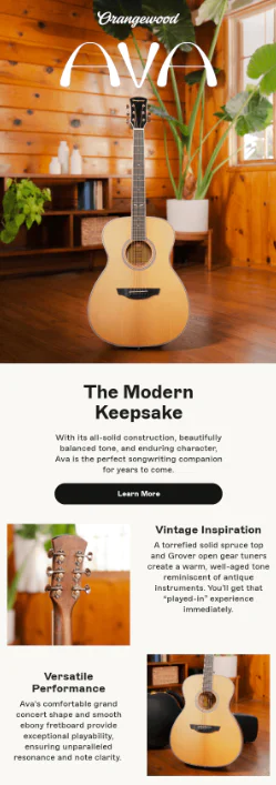
15. Orangewood Guitars
Orangewood guitars features one of their beautiful guitars in each of their newsletters. They make them pretty—really pretty. It's a fairly simple email newsletter example, though. A few images, some good headers, and then some text. Sometimes, that's all you need to pull off a great email campaign.
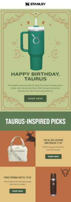
16. Stanley
Product newsletters need to be fun and visually appealing to keep the audience's attention—Stanley does both well. It makes its big ol' bottle the highlight of the email newsletter, while also tying in other somewhat related products.
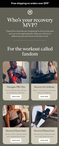
17. Therabody
Therabody makes its newsletter more engaging by creating a two-way conversation rather than just talking at its subscribers. It also balances showing off its products with great visuals, well-written supporting text, and bold, contrasting CTA buttons.
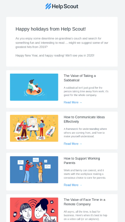
18. Help Scout
Help Scout's email newsletter does a great job at keeping it simple and focusing on the value—no clutter here. It starts with a clean and quick introduction before listing off its best articles of last year.
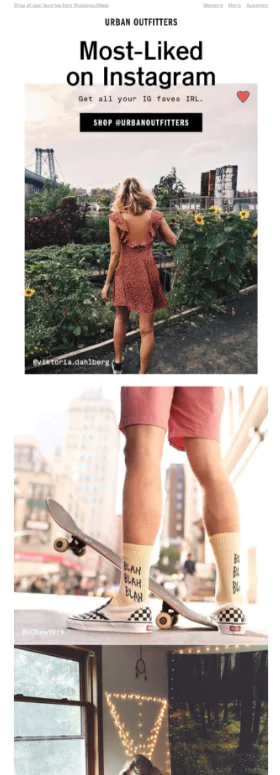
19. Urban Outfitters
Let your followers do the talking—that's what Urban Outfitters did with this email newsletter. It's a certain form of user-generated content by highlighting the content they liked on another channel. It's also a great way to repurpose content. Same images, multiple channels, double wins.
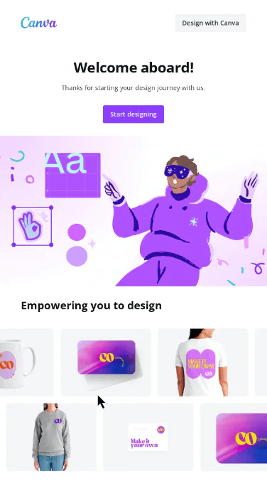
20. Canva
Canva's email newsletter example is so...Canva. It's incredibly on brand and shows users what they can jump into the platform to build—everything from t-shirt designs to business cards and mugs.
Send engaging newsletters with Twilio SendGrid
As you create or revamp your newsletter, you can find some inspiration in the common themes that unite all these examples:
- Valuable and relevant information presented in digestible formats
- Tailored content and tone for the audience’s specific interests
- Simple layouts with a balance of images and text
Ready to start sending? Sign up for free today.
Frequently asked questions
Q. What makes a good email newsletter?
A good newsletter gives people something they can't easily find elsewhere, whether that's curated content, insider knowledge, or just a unique perspective. It should be easy to skim, visually clean, and consistently valuable enough that people look forward to it.
Q. How often should I send a newsletter?
As often as you have something worth saying. Weekly works for news-driven content. Monthly makes sense for deeper dives or curated recommendations. The worst thing you can do is send on a rigid schedule just because, even when you've got nothing interesting to share.
Q. Do newsletters need to be heavily designed?
Not necessarily. Accept Cookies proves that text-heavy newsletters work if the content is strong enough. But most newsletters benefit from some visual structure (headers, images, bullet points) to make them easier to scan.
Q. Should my newsletter promote my products?
It can, but that shouldn't be the whole point. The best newsletters balance promotion with genuinely useful content. Into the Gloss promotes Glossier, but most of the newsletter is educational beauty content. That's the sweet spot.
Q. How long should a newsletter be?
Long enough to deliver value, short enough to respect people's time. Harry's Newsletter clocks in around 2 minutes. New York Times Cooking goes longer because their audience wants the detail. Know your audience and what they're looking for.
Related Resources
Twilio Docs
From APIs to SDKs to sample apps
API reference documentation, SDKs, helper libraries, quickstarts, and tutorials for your language and platform.
Resource Center
The latest ebooks, industry reports, and webinars
Learn from customer engagement experts to improve your own communication.
Ahoy
Twilio's developer community hub
Best practices, code samples, and inspiration to build communications and digital engagement experiences.