Flex UI 2.x.x updates that can affect your customizations
This page describes Flex UI updates that you should be aware of when migrating to Flex UI 2.x.x. Review this information to determine if you need to make updates to your customizations to be compatible with Flex UI 2.x.x.
For more information about the entire migration process, see Migrate from Flex UI 1.x.x to 2.x.x.
We have introduced a Degraded mode for Flex UI - now Flex UI will initialize with limited capabilities, even if some of the components like SDKs (TaskRouter, Conversations, Voice, or Sync) are down. In case of disruptions to Twilio's services, Flex users can still log in to Flex and perform certain tasks related to operational services. For example, in the case of Twilio Voice experiencing an incident, your agent will still be able to handle messaging tasks.
Users will see a notification informing them of a possible disruption in the normal work of Flex UI and they will be able to download a thorough report with error details and logs.
For more on error handling and reporting, check out our Troubleshooting the Flex UI guide.
Currently, the Flex UI uses the Programmable Chat SDK to handle messaging channels. In 2.x.x, the Flex UI uses the Conversations SDK to replicate this functionality.
To ease migration of plugins from Flex UI 1.x.x to 2.x.x, we want to create a virtual bridge to also export Chat SDK-compatible constructs. Therefore, you can still use your Chat-based customizations with fewer changes. This bridge logic will render a warning highlighting that the accessed methods and properties are actually deprecated.
Here are the properties and methods that have been changed or removed.
Chat Client
| Type | Chat Client | Conversation Client |
|---|---|---|
| property | channels | conversations |
| method | createChannel | createConversation |
| method | getChannelBySid | getConversationBySid |
| method | getChannelByUniqueName | getConversationByUniqueName |
| method | getSubscribedChannels | getSubscribedConversations |
| method | getUserDescriptor | // pass user instead |
| method | getLocalChannels | // get subscribed channels |
| event | channelAdded | conversationAdded |
| event | channelInvited | conversationInvited |
| event | channelJoined | conversationJoined |
| event | channelLeft | conversationLeft |
| event | channelRemoved | conversationRemoved |
| event | channelUpdated | conversationUpdated |
| event | memberJoined | participantJoined |
| event | memberLeft | participantLeft |
| event | memberUpdated | participantUpdated |
Channel vs Conversations
| type | Channel | Conversation | Notes |
|---|---|---|---|
| property | isPrivate | Returns true | |
| property | lastConsumedMessageIndex | lastReadMessageIndex | |
| property | type | Returns a string 'private' | |
| property | advanceLastConsumedMessageIndex | advanceLastReadMessageIndex | |
| property | members | participants | Not exposed |
| method | getMemberByIdentity | getParticipantByIdentity | |
| method | getMemberBySid | getParticipantBySid | |
| method | getMembers | getParticipants | |
| method | getMembersCount | getParticipantsCount | |
| method | getUnconsumedMessagesCount | getUnreadMessagesCount | |
| method | removeMember | removeParticipant | |
| method | setAllMessagesConsumed | setAllMessagesRead | |
| method | setNoMessagesConsumed | setAllMessagesUnread | |
| method | updateLastConsumedMessageIndex | updateLastReadMessageIndex |
ChannelDescriptor
No parallel in the Conversations SDK, we fall back to Conversation.
UserDescriptor
No parallel in the Conversations SDK, we fall back to User.
Chat User vs Conversation User
| type | Chat User | Conversation User |
|---|---|---|
| property | online | isOnline |
| property | notifiable | isNotifiable |
Chat Message vs Conversation Message
| type | Message | Message | Notes |
|---|---|---|---|
| property | channel | conversation | |
| property | memberSid | participantSid |
Chat Member vs Conversation Participant
| type | Member | Participant | Note |
|---|---|---|---|
| property | channel | conversation | |
| property | lastConsumedMessageIndex | lastReadMessageIndex | |
| property | lastConsumptionTimestamp | lastReadTimestamp | |
| method | getUserDescriptor | Use getUser | |
| event argument | updateReason 'lastConsumedMessageIndex' | updatedReason 'lastReadMessageIndex' | |
| event argument | updateReason 'lastConsumptionTimestamp' | updatedReason 'lastReadTimestamp' |
Chat SDK methods and concepts dropped in the Conversations SDK
- There's no concept of a public channel. All the conversations are private.
- Descriptors have been removed. They used to be a "snapshot" of the described entity. This is replaceable by returning the actual entity and unsubscribing from its changes.
- There is no invite method anymore on conversations. We fall back to the add method as their functionalities are very similar.
Deprecated reducers
- channels
- channelInput
Deprecated props
- channel
- channelSid
- isMemberOfChannel
- member
- autoInitChannel
- activeChatChannel
- chatChannel (on taskContext)
Deprecated Helpers
- ChatChannelHelper - replaced by ConversationHelper
Deprecated methods
- TaskHelper.getTaskChannelSid
Deprecated notifications ID
- ChatOrchestrationAddToConversationFailed
- ChatOrchestrationDeactivateConversationFailed
- ChatOrchestrationLeaveConversationFailed
The Flex UI 1.x.x uses the twilio-client SDK for voice communications. In 2.x.x, it uses the twilio-voice SDK for this functionality since the twilio-client is now deprecated. Functionality and usage of the new Voice SDK remains largely the same with a few exceptions:
- The events
Connect,Disconnect, andCancelwhich used to apply to the Device instance now applies to the Call instance instead. - The Device
readyevent has been replaced with aregisteredevent. Likewise foronlinewhich is nowunregistered. - The structure of the Device state has changed to:
1namespace Device {2isBusy: boolean;3enum State {4Unregistered = 'unregistered';5Registering = 'registering';6Registered = 'registered';7Destroyed = 'destroyed';8}9}
To detect a running call within the Flex UI 2.x.x, you can listen for an incoming Voice event through the Flex Manager. For detecting a call using UI actions, see "Common use cases and examples" on Use UI Actions.
1const manager = Flex.Manager.getInstance();2manager.voiceClient.on('incoming', onVoiceClientConnectListener);34// Listener function5function onVoiceClientConnectListener (){6console.log("Call detected");7// Do something8}
Refer to the Twilio.Device and Twilio.Call pages for more details on the Device and Call objects of the Twilio Voice JavaScript SDK.
In Flex UI 1.x.x, your code may have listened to Flex access token updates in the following way:
manager.store.getState().flex.session.loginHandler.on('tokenUpdated', (token) => {});
With Flex 2.x.x, loginHandler no longer supports this functionality. You can instead use the native Flex 'tokenUpdated' Event to achieve the same behavior:
1import { Manager } from "@twilio/flex-ui";2const manager = Manager.getInstance();3manager.events.addListener("tokenUpdated", (tokenPayload) => {});
We have added new Flex actions wrapping TaskRouter:
1import { Actions } from "@twilio/flex-ui";23// Set worker attributes4Actions.invokeAction("SetWorkerAttributes", { attributes: {}, mergeExisting: true });56// Update worker token7Actions.invokeAction("UpdateWorkerToken", { token: "newToken" });89// Update task attributes10Actions.invokeAction("SetTaskAttributes", { sid: "WRxxxxx", attributes: {}, mergeExisting: true });1112// Issue a Call to a Worker13Actions.invokeAction("IssueCallToWorker", { callerId: "callerId", twiMLUrl: "twiMLUrl", options: {} });1415// Dequeue the Reservation to the Worker.16// This will perform telephony to dequeue a Task that was enqueued using the Enqueue TwiML verb.17// A contact_uri must exist in the Worker's attributes for this call to go through.18Actions.invokeAction("DequeueTask", { options: {} })1920// Redirect the active Call tied to this Reservation21Actions.invokeAction("RedirectCallTask", { callSid: "callSid", twiMLUrl: "twiMLUrl", options: {} });2223// Update the Worker's leg in the Conference associated to this Reservation24Actions.invokeAction("UpdateWorkerParticipant", { options: {} });2526// Update the Customer leg in the Conference associated to this Task27Actions.invokeAction("UpdateCustomerParticipant", { options: {} });
and introduced new Flex Events wrapping TaskRouter events:
1import { Manager } from "@twilio/flex-ui";2const manager = Manager.getInstance();34// Emitted when a worker receives a new task5manager.events.addListener("taskReceived", (task: ITask) => {});67// Emitted when the worker's activity changes8manager.events.addListener("workerActivityUpdated", (activity: Activity, allActivities: Map<string, Activity>) => {});910// Emitted when the worker's attributes changes11manager.events.addListener("workerAttributesUpdated", (newAttributes: Record<string, any>) => {});1213// Emitted when the worker's task status gets updated14manager.events.addListener("taskUpdated", (task:ITask) => {});1516// Emitted when the worker's task gets set to 'accepted'17manager.events.addListener("taskAccepted", (task:ITask) => {});1819// Emitted when the worker's task gets set to 'canceled'20manager.events.addListener("taskCanceled", (task:ITask) => {});2122// Emitted when the worker's task gets set to 'completed'23manager.events.addListener("taskCompleted", (task:ITask) => {});2425// Emitted when the worker's task gets set to 'rejected'26manager.events.addListener("taskRejected", (task:ITask) => {});2728// Emitted when the worker's task gets set to 'rescinded'29manager.events.addListener("taskRescinded", (task:ITask) => {});3031// Emitted when the worker's task gets set to 'timeout'32manager.events.addListener("taskTimeout", (task:ITask) => {});3334// Emitted when the worker's task gets set to 'wrapup'35manager.events.addListener("taskWrapup", (task:ITask) => {});
Now you can use exclusively Flex UI Actions Framework when working with TaskRouter SDK, without needing to access its methods directly.
Visit our Flex UI API docs for more details on Actions and Events.
Flex UI 2.x.x uses a new theming structure that more closely maps to the Twilio Paste design system. This new structure is based on the concept of design tokens, a set of variables that you can modify. This structure promotes consistency, customization, and web accessibility.
config.colorTheme is deprecated. Components which receive the theme as props have the following changes:
-
props.theme.calculated is deprecated.
- Use props.theme.isLight instead of props.theme.calculated.lightTheme
- Use props.theme.tokens.textColors.colorText instead of props.theme.calculated.textColor.
-
props.theme.colors is deprecated.
-
props.theme.tokens is introduced:
1interface Tokens {2backgroundColors: BackgroundColors;3textColors: TextColors;4borderColors: BorderColors;5borderWidths: typeof BorderWidth;6radii: typeof BorderRadius;7fontSizes: typeof FontSize;8fontWeights: typeof FontWeight;9lineHeights: typeof LineHeight;10sizings: typeof Sizing;11spacings: typeof Spacing;1213}
To override theme styles in Flex UI 2.x.x, see Override Flex UI 2.x.x themes, branding, and styling.
Flex UI 2.x.x deprecates all predefined themes like DarkTheme, MediumTheme, BlueDarkTheme, BlueMediumTheme. It will now have 2 modes of Flex: Light and Dark.
1const deprecatedTokens = [2"errorColor",3"errorGlow",4"buttonHoverColor",5"tabSelectedColor",6"connectingColor",7"disconnectedColor",8"notificationBackgroundColorInformation",9"notificationBackgroundColorSuccess",10"notificationBackgroundColorWarning",11"notificationBackgroundColorError",12"notificationIconColorError",13"notificationIconColorWarning",14"userAvailableColor",15"userUnavailableColor",16"defaultButtonColor",17"lightTextColor",18"darkTextColor",19"disabledColor",20"focusColor",21"focusGlow",22"holdColor",23"declineColor",24"acceptColor",25"declineTextColor",26"acceptTextColor",27"completeTaskColor",28"flexBlueColor",29"agentBusyColor"30];
1const deprecatedChannelColors = [2"inactive",3"call",4"video",5"chat",6"sms",7"facebook",8"line",9"whatsapp",10"custom"11];
In Flex UI 2.x.x, we've introduced Flex.setProviders() to let you load providers once at the root level and set the context correctly. Developers won't have to worry about wrapping again, as the context will be set correctly. For usage examples, see:
When using Material UI for styling, it is important to wrap our plugins with a StylesProvider with a classNameGenerator that sets a productionPrefix and a seed so styles classes don't clash between plugins and Flex. The below example shows how to use a custom provider for styling Material UI components:
1import { StylesProvider, createGenerateClassName } from '@material-ui/core/styles';23Flex.setProviders({4CustomProvider: (RootComponent) => (props) => {5return (6<StylesProvider generateClassName={createGenerateClassName({7productionPrefix: 'pluginXYZ',8seed: 'pluginXYZ',9})}>10<RootComponent {...props} />11</StylesProvider>12);13}14});15
If you would like to gradually migrate from Material UI to Twilio Paste, you may use both in a single plugin by setting both a CustomProvider and a PasteThemeProvider:
1import { StylesProvider, createGenerateClassName } from '@material-ui/core/styles';2import { CustomizationProvider } from "@twilio-paste/core/customization";34Flex.setProviders({5CustomProvider: (RootComponent) => (props) => {6return (7<StylesProvider generateClassName={createGenerateClassName({8productionPrefix: 'pluginXYZ',9seed: 'pluginXYZ',10})}>11<RootComponent {...props} />12</StylesProvider>13);14},15PasteThemeProvider: CustomizationProvider16});17
Info
This change is implemented in version alpha.15 and is turned off for accounts signed up for Flex UI 2.x.x Private Beta prior to this version being released as it is a breaking change in the component API. Please reach out to your technical account manager to have the new messaging UI enabled.
Moving to Flex Conversations with Flex 2.x.x has enabled us to provide an even more customizable Messaging UI, and this comes with a few of changes which you may need to adjust to.
The new default input component in the messaging canvas is the dynamic component MessageInputV2 . This includes the text area component and a new dynamic component, MessageInputActions , and is structured like so:
1<MessageInputV2>2<MessageInputArea key="textarea"/>3<MessageInputActions key="actions"/>4</MessageInputV2>
MessageInputActions contains the message send button and the file attachment button (if file attachment is enabled).
You can use custom actions for this component via the add, replace, and remove methods.
MessageInputV2 has two new default props: hideSendButton and rows. These control the rendering of the send button and row height of the text area respectively. You can use hideSendButton together with returnKeySendsMessage to enable sending message on Enter.
The SendMessage action is now capable of sending file attachments and text in the same message. Files can be passed to the SendMessage action on the attachedFiles field of its Action payload.The SendMedia action is deprecated but is still available.
Learn more about new components in the Flex UI API docs.
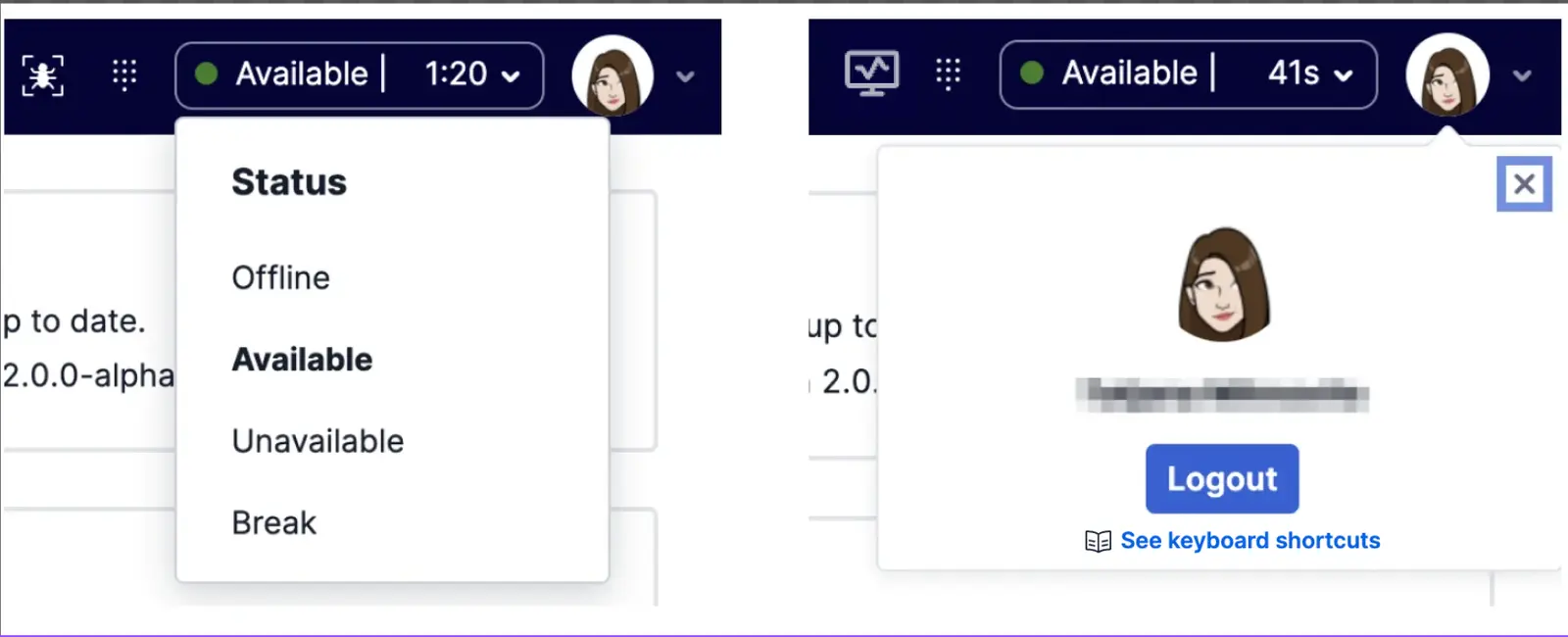
The user-controls child component in Flex UI 1.x.x has been split out into two new child components for the MainHeader in Flex UI 2.x.x:
activityshows and allows the user status to be changed.user-controlsshows the currently logged in user and allows the user to logout.
Warning
This is a potential breaking change if you have customized UserCard and its child components using CSS.
As part of the upgrades to our core APIs, Flex UI 2.x.x includes the Redux Toolkit and some new APIs for managing your internal state. These tools provide some guardrails for your state management, helping you set up boilerplate code with better defaults.
We recommend using single Redux store, either let Flex UI create its own store or pass a custom store using Manager.create() API
A wrapper around Redux's useSelector method. It exposes the same API but adds some Flex validations to ensure Flex's internal state is usable. This selector is specific for working with Flex state itself. Outside of accessing Flex state, we recommend using the default useSelector.
1const MyComponent = (props) => {2const viewState = useFlexSelector(state => state.view);3return (4{viewState.isSideNavOpen &&5<div>My Custom Code</div>6}7)8}
The selector takes the current view state for the custom component. The selector guarantees that the state being selected is safe to read and can be used in the application without side effects. This couldn't be guaranteed with useSelector.
A wrapper around Redux's useDispatch method. It prevents dispatches from causing side effects to Flex's state, ensuring your changes work as expected. Use this hook for interacting with Flex's state. You can use the native useDispatch method outside of Flex's state.
1const MyComponent = (props) => {2const viewState = useFlexSelector(state => state.view);3const dispatch = useFlexDispatch();4return (5{viewState.isSideNavOpen &&6<button onClick={() => dispatch({type: 'close_side_bar'})}>My Custom Code</button>7}8)9}
The Flex UI 2.x.x no longer uses the MessageInput.defaultProps.useSeparateInputStore flag and its behavior has been deprecated. All Flex UI development must now be done with a separate Store. You can remove the flag without any repercussions.
You need to update your AppConfig structure to utilize the new config structure's names and capabilities.
| Flex 1.x.x | Flex 2.x.x | Changes |
|---|---|---|
| Notifications.browser | Notifications.enabled | renamed |
| warmTransfers | - | removed |
| colorTheme | theme | Updated (more info) |
DownloadMedia action no longer requires "message" as a part of the payload. Instead, a new property "media" of type "Media" from @twilio/conversations is required.
These actions were renamed to follow the action naming convention:
| Flex UI 1.0 | Flex UI 2.x.x |
|---|---|
InsightsPlayer:play | InsightsPlayerPlay |
InsightsPlayer:show | InsightsPlayerShow |
InsightsPlayer:hide | InsightsPlayerHide |
InsightsPlayer:initialized | InsightsPlayerInitialized |
HistoricalReporting:view | HistoricalReportingView |
- Removed
FilterData(shouldn't be needed) andTeamFiltersPanelProps(useTeamFiltersPanelChildrenPropsinstead) interfaces fromFlex.Supervisor. - Removed
filtersprops from the Component properties for TeamsView. UseTeamsView.defaultProps.filtersto apply a filter. - Removed
uniqueNamefromTaskCanvasTabsChildrenProps. - Removed the deprecated
WorkerProfile.defaultProps.detailsprop. UseWorkerProfile.Contentto add additional details to the worker profile panel. - Legacy filtering in TeamsView was removed. Filters from
WorkersDataTable.defaultProps.filterswill still be added to the new filter panel, but the support for filter factories was dropped. WorkersDataTable.defaultProps.initialCompareFunctionwas removed. Support for sorting was added to the workers table and you can now usesortWorkers,sortCalls, andsortTasksonWorkersDataTable.defaultPropsto specify the compare functions used by the workers, calls and tasks columns. For initial sorting, we've introduced a new prop,defaultSortColumn, to the WorkersDataTable where it would take the key as the value. Please refer to WorkersDataTable of the Flex UI API Reference for key details.WorkersDataTable.defaultProps.tablePlaceholderwas removed. The message displayed when the table is empty can be modified with theTeamsViewResultsSummaryNoWorkersDisplayedTitleandTeamsViewResultsSummaryNoWorkersDisplayedtemplates.- Cleaned up the
WorkersDataTableChildrenProps. Onlyworkers,selectedTask,selectedWorker, andmonitoredTaskSidare now available. - WorkersDataTable no longer forces updates every second. This could be considered breaking for customers who added columns, which contain some timers (eg. task age) and which will no longer tick every second.
We have also cleaned up our api and renamed or remove objects and interfaces. Most of the changes should not have any impact on plugins.
UserControlsImplPropshas been removed. Refer toUserControlsChildrenPropsinsteadcall.oldHoldremoved from TaskContext andstate.phone.connection.onHoldremoved from state. UseTaskHelper.isCallOnHold(task)to get the status of the call.DeprecatedLoginViewcomponent removedDeprecatedRuntimeLoginViewcomponent removedstate.flex.phone.connectionsproperty removed. Refer tostate.flex.phone.connectioninstead.- Event
selectedViewChangednow only receives one argument (newViewName) and it's not triggered on view resize anymore. To listen to view resize events, please subscribe to theviewResizedevent. ActionsImplobject has been removed. Please refer toActionsinstead.registerGlobalStyleshas been removed. Please refer toregisterStylesinstead- AudioManager's
ErrorCodehas been renamed toAudioErrorCode Actions.emithas been removed - useActions.invokeActionsinstead.Actions.removeAllListenershas been removed - please useActions.removeListenerand provide the specific listeners you want to remove.- Removed export of
Flex.ErrorManager. This functionality has been replaced withFlex.Monitor.sendDebuggerEvent - Removed
selectionStart/selectionEndfromMessageState,MessageInputArea,MessageInput,ConversationState - Removed show and hide methods from the
ModalPopupWithEntryControl - Changed
hiddenQueueFiltertoqueueFilterwhich takes a predicate function. See "Add a Worker Directory Tabs Queue Filter" on Work with Components and Props for usage details
ChatModuleChatStateCallbackchatReducerregisterGlobalStylesStateMachineCbStateMachineinitWithStringsVersion (not VERSION)Initialize (from flex-core)DeepPartialNotificationManagerwithDefaultPropsUpdateAggregatedDataTileArrayInterpolationFunctionInterpolationInterpolationStyledOptionsThemedCreateStyledCreateStyledOtherComponentCreateStyledStatelessComponentStyledComponentStyledComponentMethodsStyledOtherComponentStyledStatelessComponent,getBackgroundWithHoverCSSThemeSupportUtilsCountryManagerAnimationsSVGContainerPropsFrameConstantsStyledUlCSSProps
TaskInfoPanelinner html styles tweaked to accommodate new designTaskInfoPanelContentstring inner html updatedTaskCanvasTabsresets to default task when switching between tabs- Flag
file-attachments-in-chatis deprecated - Customizing the TaskListItem color directly is no longer possible. Please refer to
addwrapper()in Work with Components and Props for customizing the component