Voice Insights Trust & Engagement Insights
Learn about Trust & Engagement Insights, a dashboard that monitors call deliverability, answer rates, and the ROI of Trust Products. This tool provides actionable data to predict when customers will answer and helps you mitigate risks like number blocking or account suspension.
You can use this guide to send voice notifications, build outbound contact centers, use a sales dialer, and create call tracking.
See Related reference documentation to learn more about the API calls used in this guide.
Legal notice
Not a HIPAA Eligible Service
Voice Insights Trust & Engagement Insights is not a HIPAA Eligible Service and should not be used in workflows that are subject to HIPAA.
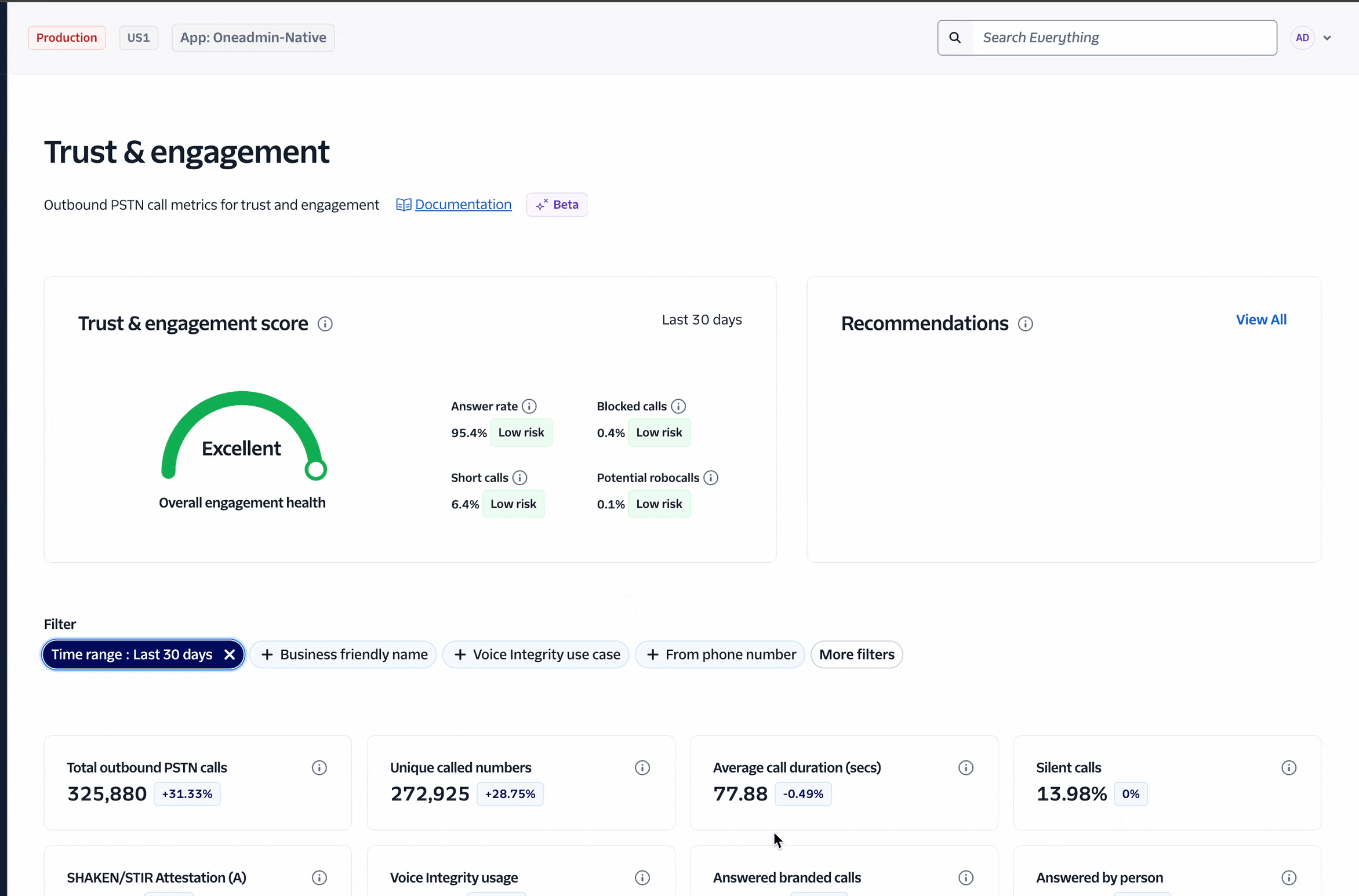
Trust & Engagement Insights helps you monitor and improve the trust, compliance, and performance factors that determine whether outbound calls are delivered and answered. By analyzing calling patterns and customer behaviors, the dashboard surfaces the metrics that influence reach and pickup, predicts when each customer is most likely to answer, and evaluates the return on investment (ROI) of Trust Products such as branded calling. Centralized visibility reduces the risk of number blocks, account suspensions, lost revenue, and inefficient dialing by explaining what is trending in the wrong direction and prescribing mitigation steps. With these actionable insights, teams can prioritize dials, reduce wasted attempts, protect operations, and systematically raise answer rates while investing where it delivers value.
To access Trust & Engagement Insights in Twilio Console, go to Monitor > Insights > Voice > Trust & engagement.
- Know your trust and compliance standing: Continuously monitor trust posture at the account and subaccount levels to avoid suspensions, revenue loss, and operational outages.
- Diagnose degrading trust metrics: Identify which behaviors are driving low trust, create a mitigation plan, and correct issues before downstream carriers or analytics penalize your traffic.
- Predict answer likelihood: Improve operational efficiency by calling at the times customers are most likely to pick up, reducing wasted attempts and agent idle time. Surface patterns that can help flag potential Telephone Consumer Protection Act (TCPA) issues earlier.
- Prove ROI of branded calling: Quantify how branded experiences impact answer and engagement rates so budget decisions rely on measurable outcomes.
- Isolate and fix blocked numbers: Find phone numbers or subaccounts that are being blocked by carriers, quarantine low-trust assets, and remediate through voice integrity controls and branded calling.
The following section describes the Trust and Engagement Insights dashboard in detail.
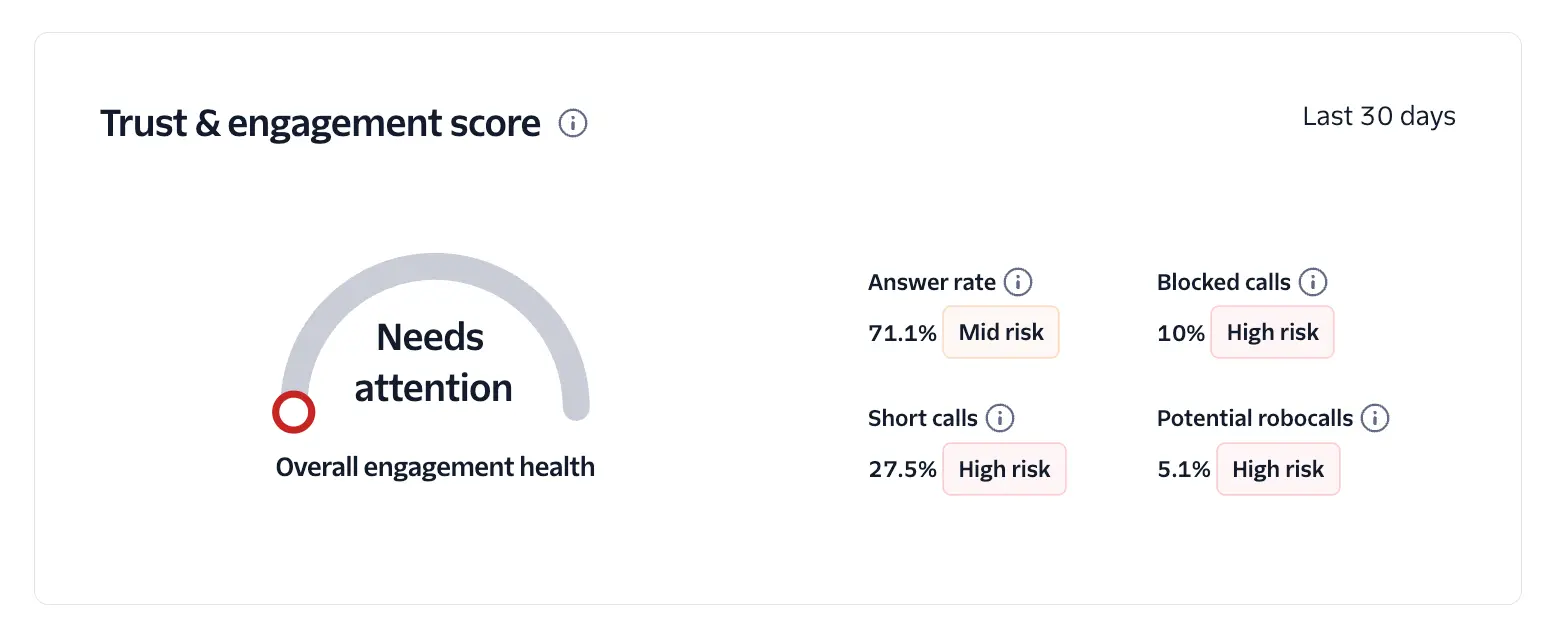
Trust and Engagement scores are calculated by combining four underlying parameter scores, each of which contributes to the overall result.
| Parameter | Description |
|---|---|
| ASR | Call answer rate. This is the percentage of calls that are answered by a person or voicemail. A value of 70% or higher is considered a good score. |
| Short calls | Percentage of answered calls that last fewer than 10 seconds. |
| Blocked calls | Percentage of calls blocked by downstream carriers. Currently tracked only in the USA for AT&T, T-Mobile, and Verizon. |
| Potential Robocalls | Percentage of calls dialled to unallocated/invalid numbers. This metric is highly correlated with robocalls. |
The following table shows parameter thresholds:
| Parameter | High risk | Medium risk | Low risk |
|---|---|---|---|
| ASR | < 40% | >=40% AND <=75% | > 75% |
| Short calls | > 15% | >= 7% AND <=15% | < 7% |
| Blocked calls | > 5% | >= 3% AND <= 5% | < 3% |
| Potential robocalls | > 1% | >=0.5% AND <=1% | < 0.5% |
The overall score is evaluated as follows:
- Excellent: All parameters are in the low-risk range.
- Needs attention: One or more parameters are in the high-risk range.

The Recommendations section outlines mitigation actions you can take to improve your overall score.
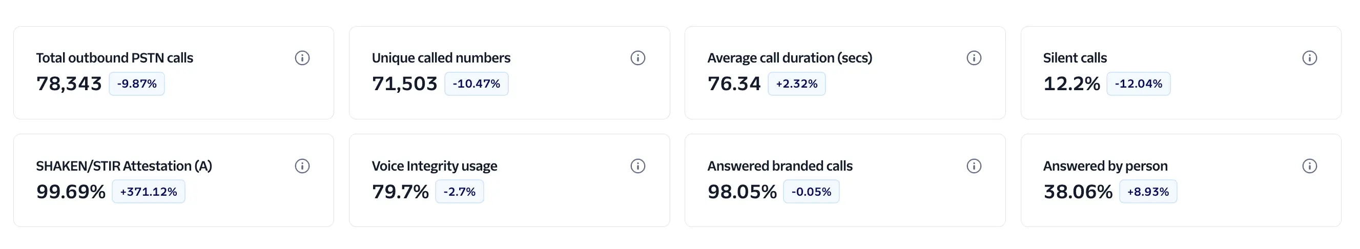
- Total outbound PSTN calls: These are the total outbound calls to PSTN destinations over the time period defined in the time filter selector.
- Unique calls numbers: Unique phone numbers dialed.
- Average call duration: Average duration of answered calls (measured from the moment the call is picked up).
- Silent calls: Indicates the percentage of calls with at least one silent leg, which may indicate low engagement or unwanted calls.
- ST/SH A: Percentage of outbound calls which had a ST/SH attestation-A.
- Voice Integrity usage: Percentage of outbound calls with Voice Integrity enabled.
- Answered branded calls: Percentage of branded calls answered. These include both calls answered by the person or voicemail. Note: To get precise details consider enabling answering machine detection.
- Answered by person: Percentage of calls answered by a person. Requires the enablement of Answering Machine Detection
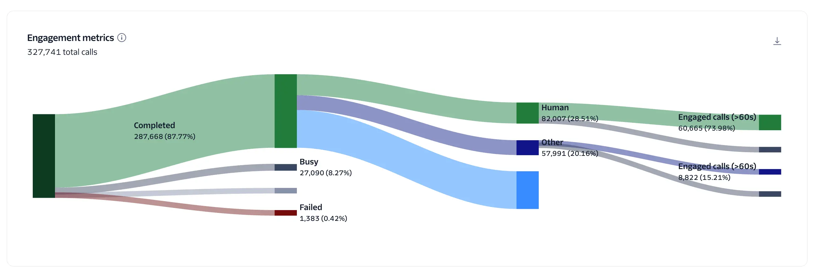
Visualize the end-to-end path of outbound calls and quantify where engagement is gained or lost. Use the diagram to diagnose delivery and answer issues and to measure the impact of branded calling and voice integrity on human pickup and conversation quality.
- The left-most node (Total calls) flows into initial call outcomes: Completed, Busy, No Answer, Cancelled and Failed.
- Completed calls then split into answered categories:
- Green: Answered calls (entry point to the "engagement" path).
- Blue: Voicemail (calls answered by a machine/voicemail).
- Purple/Other: Calls for which AMD wasn't enabled or a determination couldn't be made.
- Answered calls are further segmented by duration:
- Short duration: under 10 seconds (typically screened or hang-ups).
- Engaged calls: over 60 seconds (indicative of a meaningful conversation).
- The green path—from Completed → Answered → Human → Engaged calls (
>60s)—represents the ideal engagement flow and is the best proxy for ROI.
Hover over any band or node to see the absolute count and its percentage at that step. Filters above the chart (for example: date range, use_case, destination country, branded campaign etc) dynamically update the Sankey. Counts and percentages are recalculated based on the active filter set.
All percentages are relative to the immediately previous node, not to the total calls. Example: Human answered % = Human answered calls ÷ Total answered calls. If 28.5% is shown, it means that 28.5% of answered calls were answered by a person. This relative framing is intentional; it allows you to assess funnel efficiency at each stage and make accurate comparisons when filters are applied.
- Increase human pickup: Branded calling and voice integrity typically raise the share of human answers relative to voicemail/other.
- Improve engagement quality: Drive more Human → Engaged (
>60s) outcomes; long-duration human calls are a strong proxy for successful outreach and ROI. - Reduce potential spam calls: High Short (
<10s) rates can indicate poor timing, low trust, or potential robocalls; use this view to target mitigation.
- "Short calls" is defined as calls under 10 seconds; "Engaged calls" as calls over 60 seconds.
- Human answered long-duration calls are the clearest indicator of customer engagement.
- Use this Sankey alongside trust metrics to pinpoint whether low trust, carrier treatment, or call strategy is limiting performance.
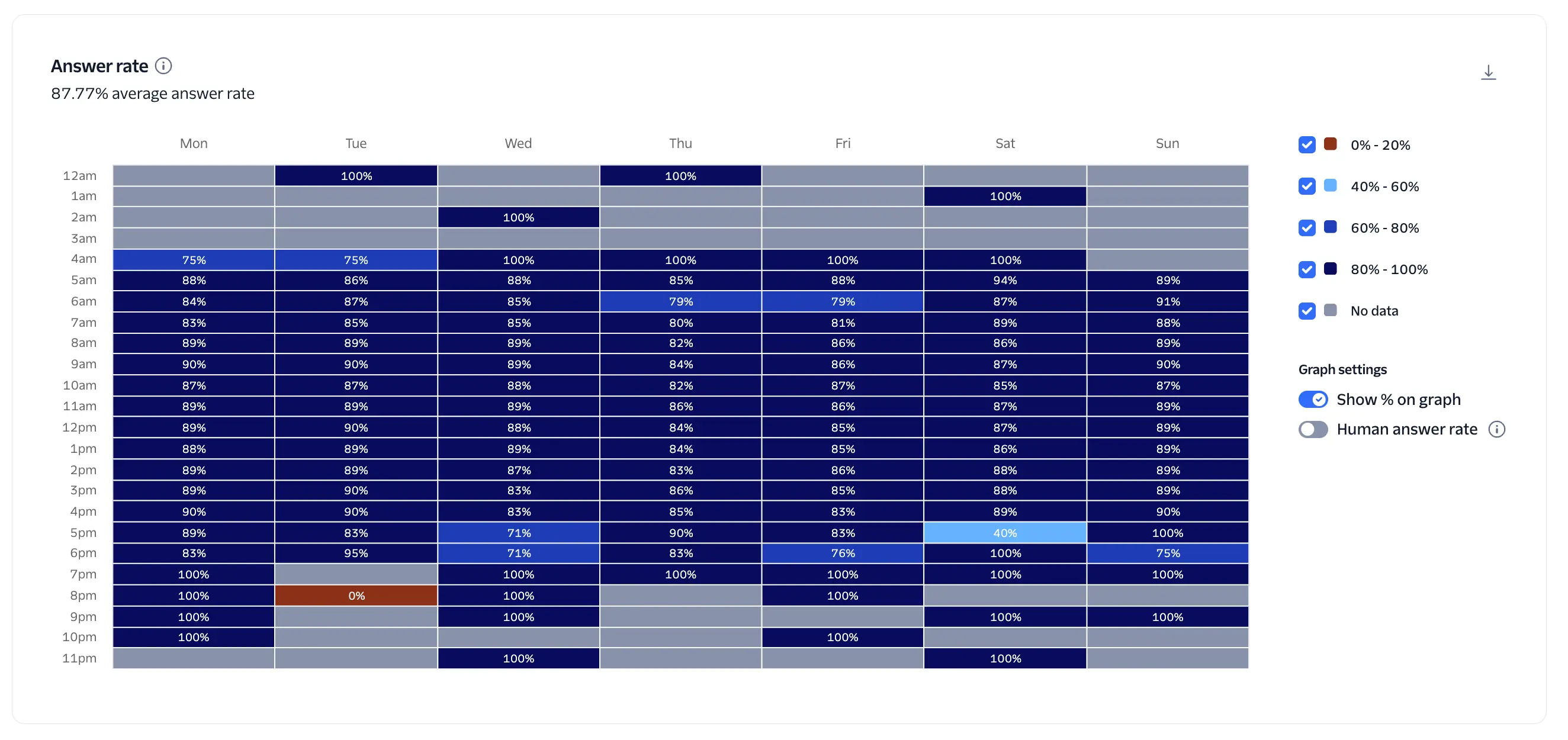
The Answer rate heatmap shows when customers are most likely to pick up, by hour of day (rows) and day of week (columns). Each cell displays the answer rate for calls placed during that hour and day. Color intensity represents performance bands (for example, red/orange = low answer rate, dark blue = high answer rate; gray = no data). This view is designed to help you schedule outbound campaigns for maximum reach and engagement.
- Answer rate per cell = answered calls during that hour/day ÷ total calls attempted in the same hour/day.
- When Human answer rate is enabled, the calculation becomes human-answered calls ÷ total calls, using only calls classified as human answers.
- Percentages shown in the cells are relative to that hour/day only and are grouped into the legend's ranges.
-
Times on the graph are mapped to the local browser time zone so teams see performance in their local context.
- Note: If your operations span multiple time zones, interpret the results as local-time performance. A custom time zone selector is planned for a future release. Around daylight saving transitions, one hour may be repeated or skipped depending on your locale.
- Hover: Displays a tooltip with the exact answered count and total calls for the selected cell.
- Show percentage toggle: Overlays the percentage value on each cell for quick scanning.
- Human answer rate toggle: Switches the metric to human-only answers across the entire heatmap. This requires Answering Machine Detection (AMD) to be enabled in your account.
- Filters: Narrow the view by use case, business profile, Voice Integrity, or Branded Calling bundles to isolate performance for specific campaigns, number pools, or trust products. All cells update to reflect the active filters.
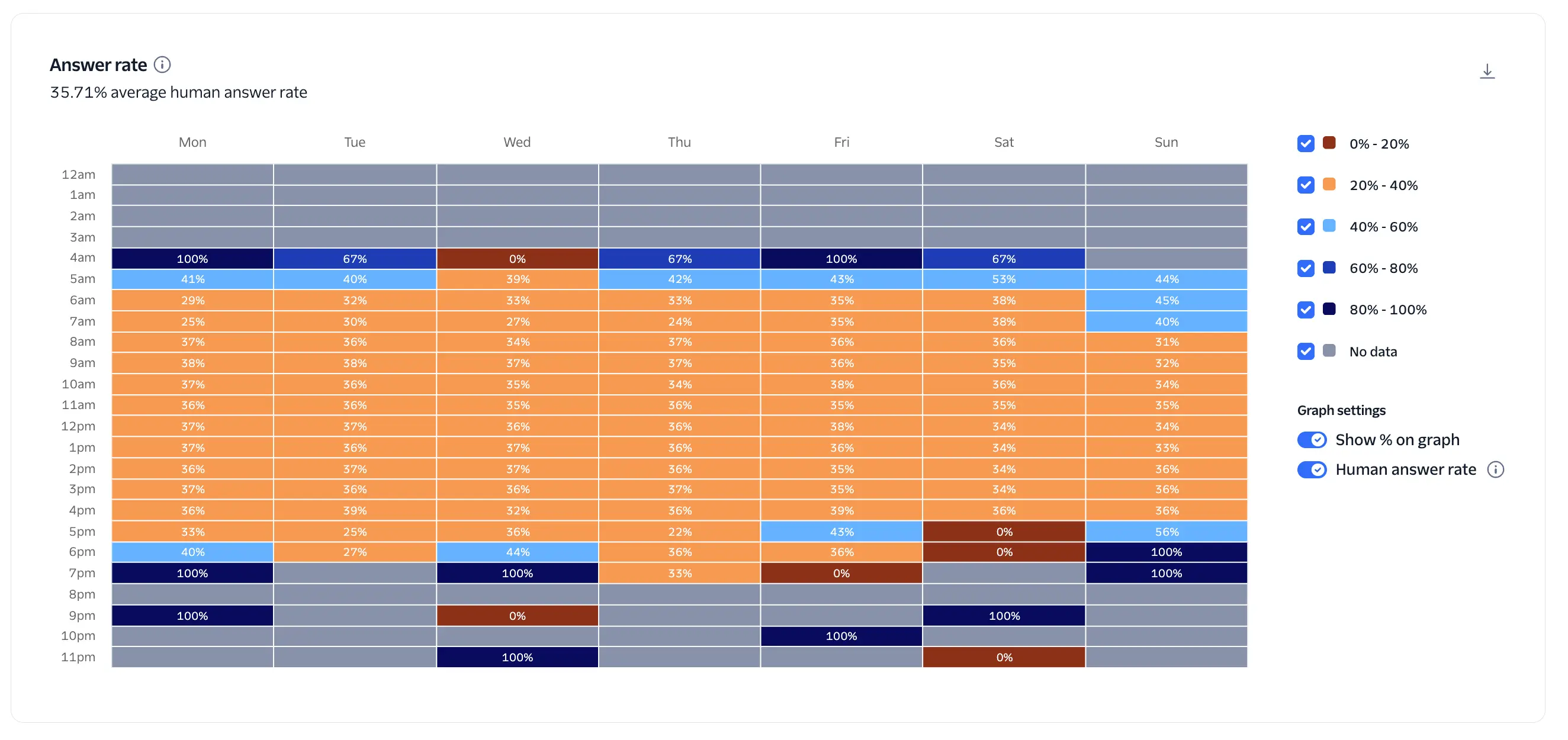
- Optimize calling windows: Identify high-performing hours/days to schedule campaigns when customers are most likely to pick up. Avoid consistently low-performing windows or test alternative strategies there.
- Prioritize human engagement: The Human answer rate is a stronger proxy for ROI than overall answer rate because it reflects actual conversations versus machine answers.
- Diagnose strategy and trust impacts: Compare answer patterns across filtered segments (for example, branded vs. non-branded, with vs. without Voice Integrity) to quantify which tactics lift human pickup and engagement.
- Safeguard compliance: Use the hourly view to avoid calling at odd hours that could frustrate recipients. Pair this with your internal policies to help reduce the risk of contacting consumers during times that may conflict with TCPA guidelines.
- Short, medium, and long call duration analysis is available in the engagement funnel; use both views together to understand not just when calls are answered, but whether those answers turn into meaningful conversations.
- Gray cells indicate no calls were placed during that time bucket.
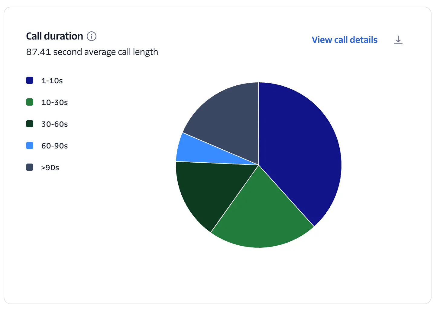
Distribution of answered calls by talk-time bucket. Each slice represents the share of answered calls whose duration falls in that range. The chart header also displays the overall average call length for the filtered dataset.
- 1–10 seconds
- 10–30 seconds
- 30–60 seconds
- 60–90 seconds
- 90 seconds All buckets are mutually exclusive and together account for 100% of answered calls.
- Hover over a slice to see the exact count and percentage of answered calls in that bucket.
- Select View call details to drill down to the underlying calls for that segment.
- Filters applied elsewhere on the page (for example, use case, business profile, Voice Integrity, Branded Calling bundles, date range, account/subaccount) update the pie and the average duration.
- 1–10s ("short calls") typically indicate screened calls, quick hang-ups, or calls that ended at voicemail; sustained high share in this bucket suggests low trust, poor timing, list quality issues, or misaligned caller intent.
- 60s+ buckets are a better indicator of meaningful conversations and downstream ROI. Aim to increase the combined share of 60–90s and >90s.
- Compare distributions across filters (for example, branded vs. non-branded, with vs. without Voice Integrity) to quantify which tactics lift conversation length.
If short-call share is high, test branded calling, explore Voice Integrity, refine number pools, adjust calling windows (see the Heatmap), and improve lead targeting and agent scripts. Track improvements over time; a shift from sub-30s into 60s+ should correlate with higher conversion and revenue metrics.
- The pie includes answered calls only; unanswered, busy, and failed attempts are excluded.
- Small sample sizes can produce volatile percentages—use filters and date ranges that ensure sufficient call volume.
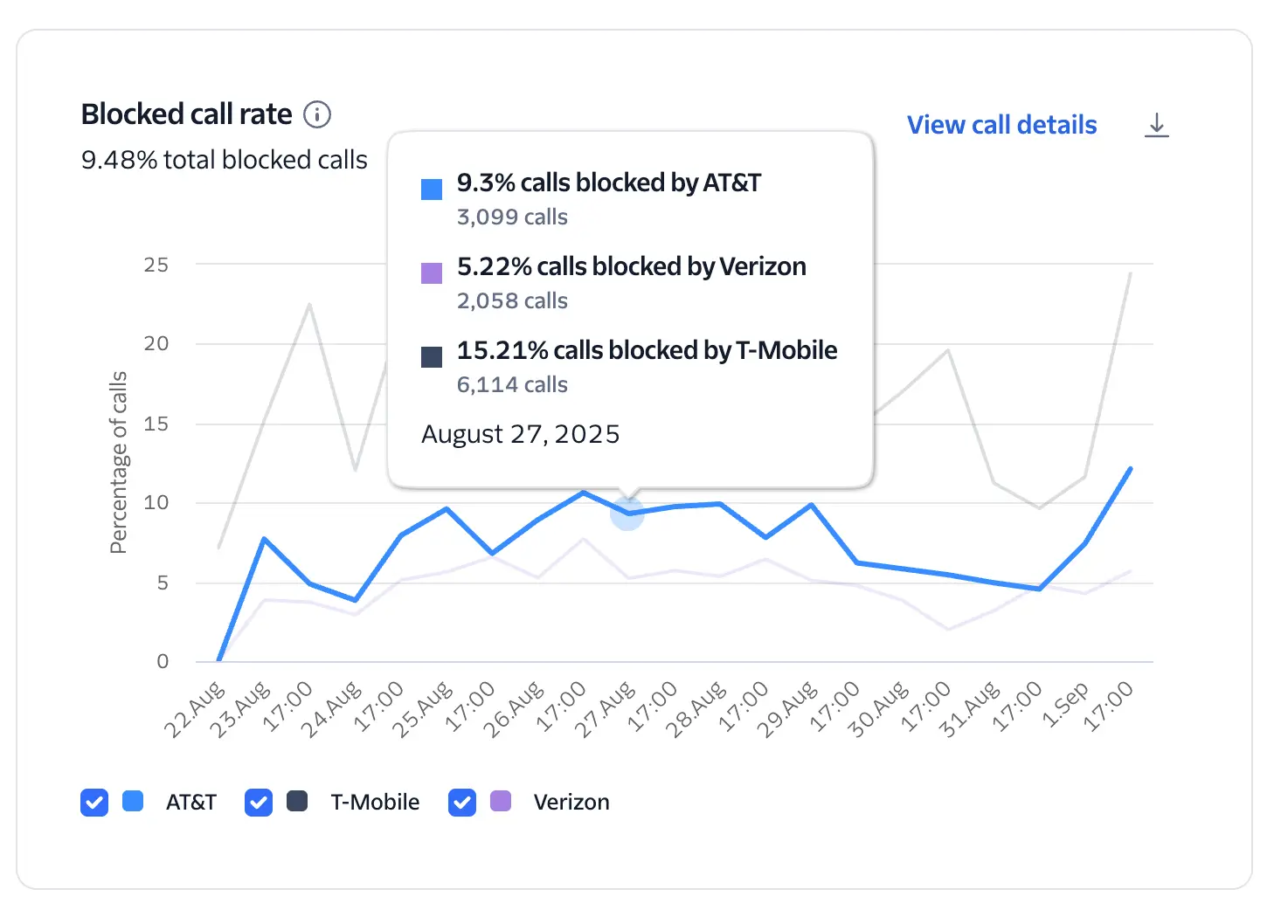
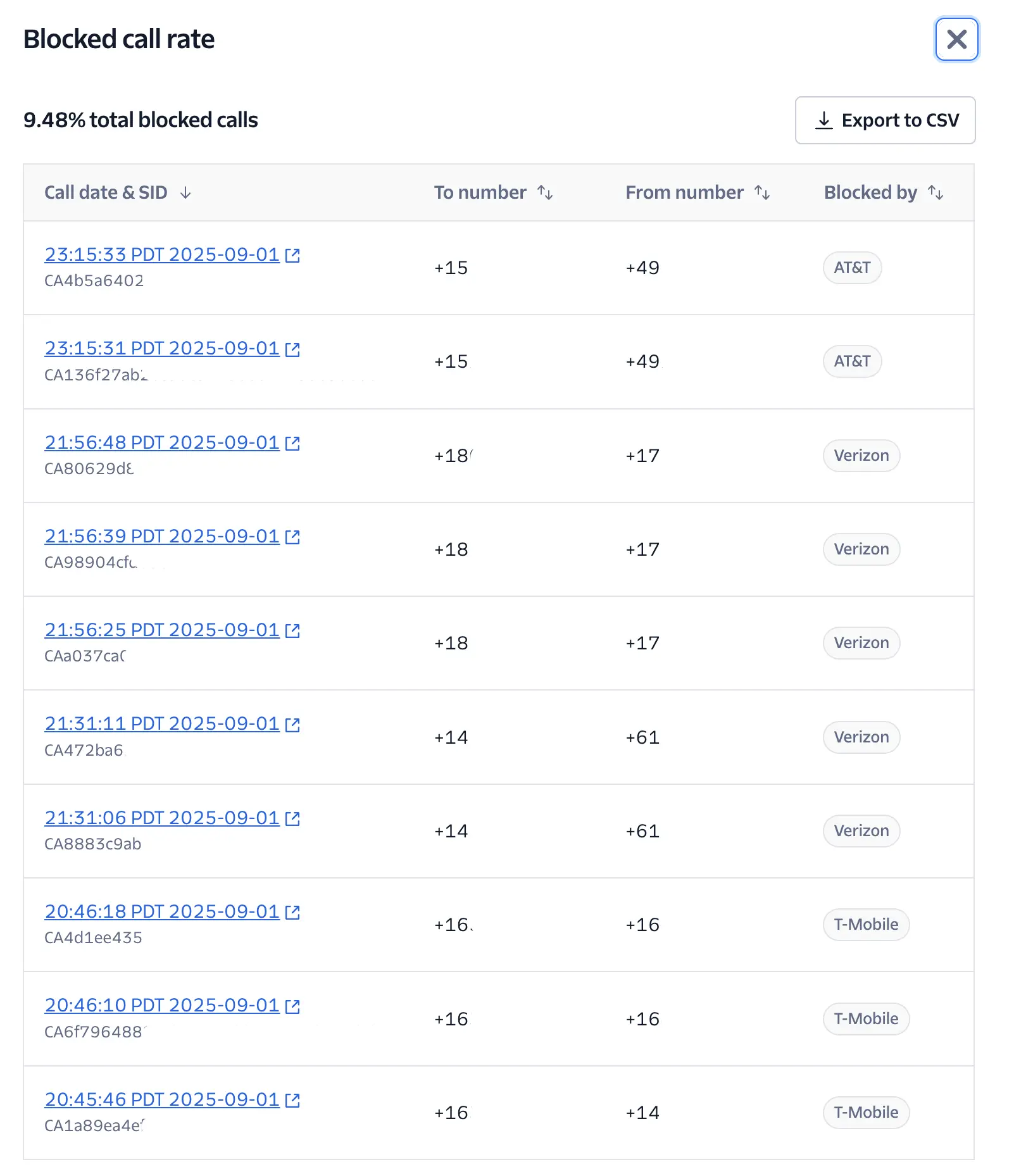
Time-series view of the percentage of outbound calls that were blocked by downstream carriers. Each line represents a carrier (AT&T, T‑Mobile, Verizon), and the header displays the overall blocked-call rate for the selected period.
- Currently available only for calls to US phone numbers.
- Supported carriers: AT&T, Verizon, and T‑Mobile.
- "Blocked" indicates the call was prevented from reaching the destination by the carrier; these attempts never reach the end user and directly translate to lost revenue and degraded customer experience.
- Blocked call rate (per carrier or overall) = blocked calls ÷ total call attempts to US destinations during the time bucket.
- The chart aggregates by the page's selected time granularity and applies any active filters (date range, account/subaccount, campaign, number pool, use case, trust products, etc.).
- Hover on any point to see per‑carrier percentages and absolute counts for that timestamp.
- Use the legend to toggle carriers on/off to compare trends.
- Select View call details to see the exact phone numbers being blocked, with timestamps and carrier.
- Use the download icon to export the data.
- Monitor closely: Rising or sustained blocked rates indicate trust and compliance issues that suppress answer rates and revenue.
- High risk threshold: A blocked call rate over 5% is considered high risk and will impact the overall Trust and Engagement score. Consider isolating the impacted numbers immediately.
- Compare carriers: Spikes on a single carrier often point to number‑level or campaign‑level reputation problems; broad spikes across all carriers suggest calling behavior or policy issues.
- Correlate with other widgets: Cross‑check answer rate and duration views to see how blocking impacts engagement.
- Identify and quarantine numbers with high block activity using View call details.
- Remediate affected numbers via Voice Integrity (for example, re-registration/verification, number replacement/rotation, reputation rewarming).
- Reduce risky calling behaviors: limit redial frequency, avoid rapid short calls, maintain opt‑in, honor DNC policies, and align call times with the Heatmap.
- Consider branded calling to improve caller trust and reduce analytics-driven blocking.
- Establish alert thresholds internally (for example, investigate if any carrier exceeds your acceptable blocked rate for N consecutive intervals).
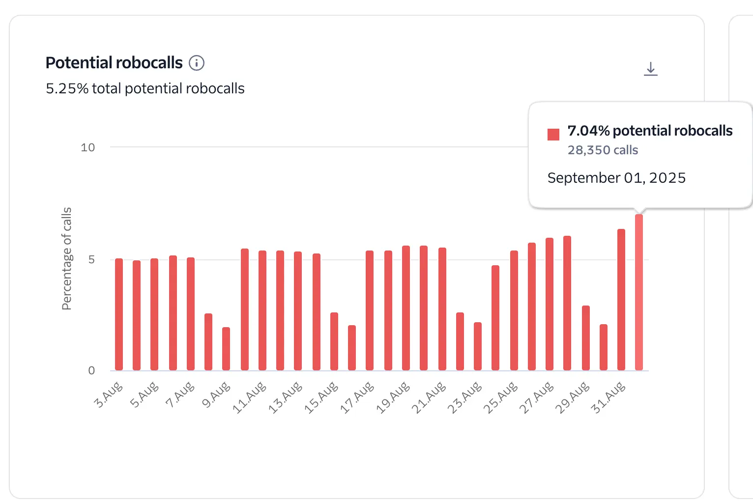
A time‑series view of dialing to unallocated or invalid numbers, expressed as a percentage of total call attempts for each time bucket. The header displays the overall potential-robocall rate for the selected period.
- Calls that terminate with SIP 404 (Not Found) are counted as dials to unallocated or invalid numbers. This pattern is a strong indicator of robocall‑like behavior and is highly correlated with number reputation degradation and downstream carrier scrutiny.
- Metric formula: Potential robocalls % = SIP 404 calls ÷ total call attempts in the bucket.
Traffic with a potential-robocall rate of 0.5 percent or higher is considered high‑risk behavior. Sustained levels at or above this threshold can quickly damage a phone number's reputation, reduce answer rates, and increase the likelihood of carrier blocking or analytics labeling.
- Hover over any bar or point to see the exact percentage and call counts for that date or time.
- The chart respects all page filters (date range, account or subaccount, campaign, use case, number pool, and trust products), so you can isolate problematic segments.
- Monitor daily: Spikes indicate list hygiene problems, malformed numbers, or dialer configuration issues (for example, sequential or random number patterns).
- Correlate with trust and blocking: Rising potential-robocall rates often precede increases in blocked calls and drops in human answer rate.
- Set internal alerts: Investigate immediately when the metric crosses 0.5% for any segment or persists for multiple intervals.
- Clean lists: Validate numbers before dialing (formatting, country or area code, ported/LRN checks), and remove unallocated or invalid entries.
- Tighten dialer rules: Prevent sequential dialing, throttle redials, and block patterns that can resemble war‑dialing.
- Quarantine affected caller IDs: If specific numbers are over‑represented in SIP 404 attempts.
- Strengthen consent and data sourcing: Use verified opt‑in sources and perform frequent list refreshes to avoid stale or mistyped numbers.
- "Potential robocalls" is a risk signal, not a definitive legal classification of robocalling. It highlights behavior patterns that resemble robocall traffic and harm reputation.
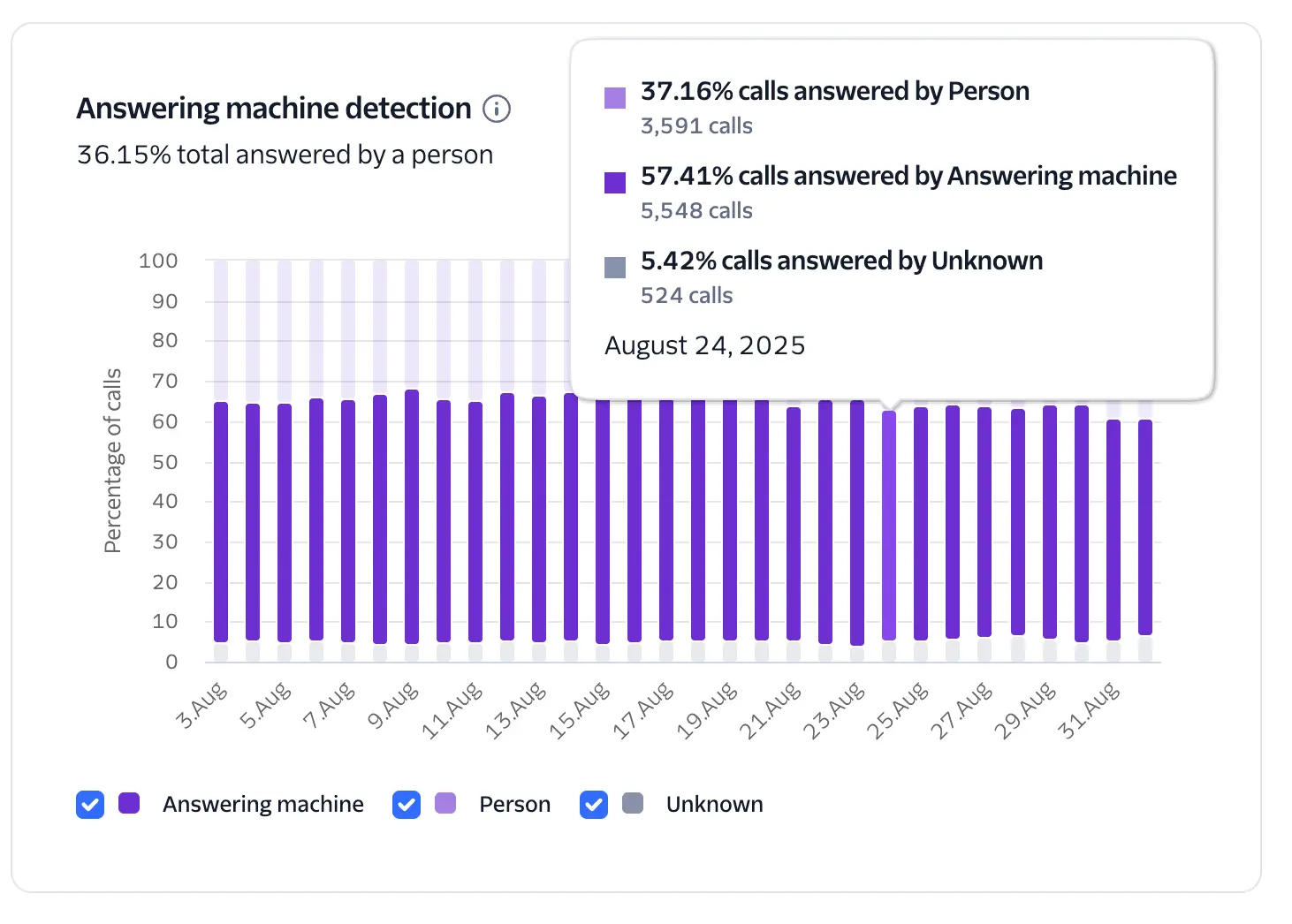
A time-series breakdown of AMD outcomes for answered calls. Bars are segmented into Person, Answering machine (voicemail), and Unknown. The header summarizes the overall human-answer rate for the selected period.
Visible only when Twilio Answering Machine Detection (AMD) is enabled on your calls. See Twilio AMD docs for setup details and supported parameters.
- Higher Person share indicates more real conversations and typically correlates with better ROI.
- Elevated Answering machine share suggests poor timing, low trust, or list quality issues; compare with the Heatmap and Engagement Sankey to adjust calling windows and evaluate branded calling or Voice Integrity.
- Unknown above a small baseline can indicate very short calls, early hang-ups, or configuration issues; review dialer behavior and call flow (for example, greeting length, AMD settings).
- If you use AMD's configurable options, choose detection settings that balance speed and accuracy for your use case; more aggressive detection may reduce delay but increase Unknown or misclassification.
- Pair this chart with Human answer rate views and Call Duration distribution to verify that increases in Person also produce more engaged, 60s+ conversations.
- Investigate spikes by drilling into call details and segmenting by campaign or number pool.
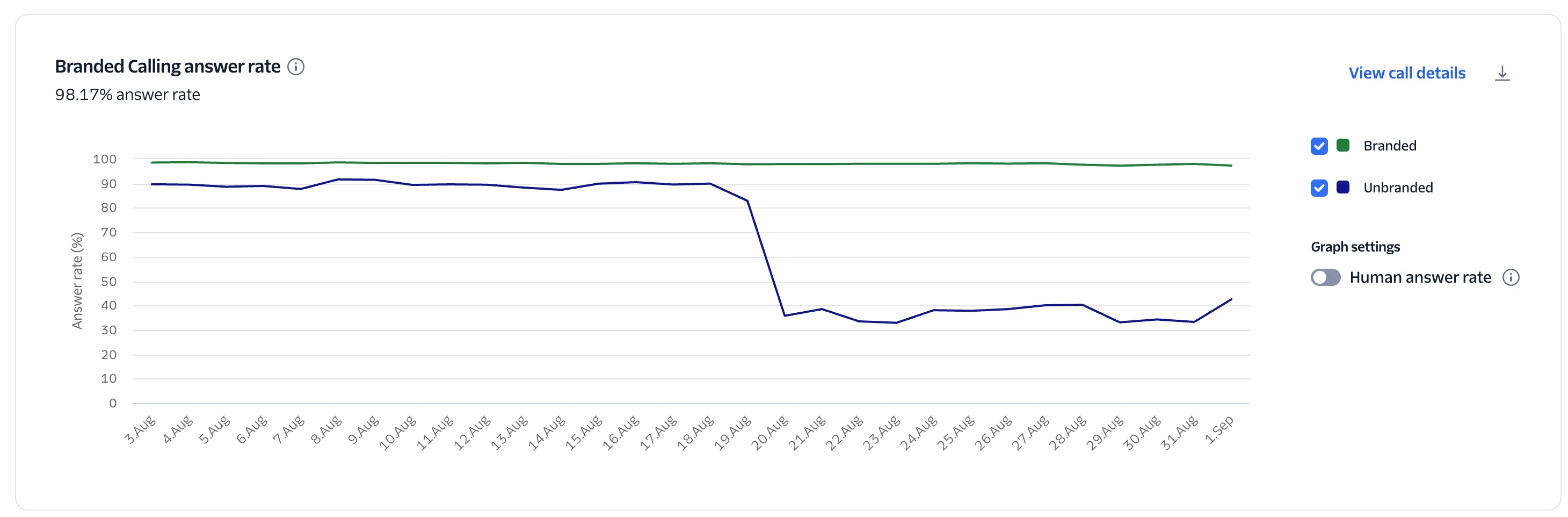
A time‑series comparison of answer rates for Branded vs Unbranded calls. Branded includes both in‑band and out‑of‑band branding. The header displays the current answer rate for the selected period.
- The chart is populated only when Branded Calling is enabled on your account.
- For the Human answer rate view, Twilio Answering Machine Detection (AMD) must be enabled. Without AMD, "answered" includes voicemail/machine pickups.
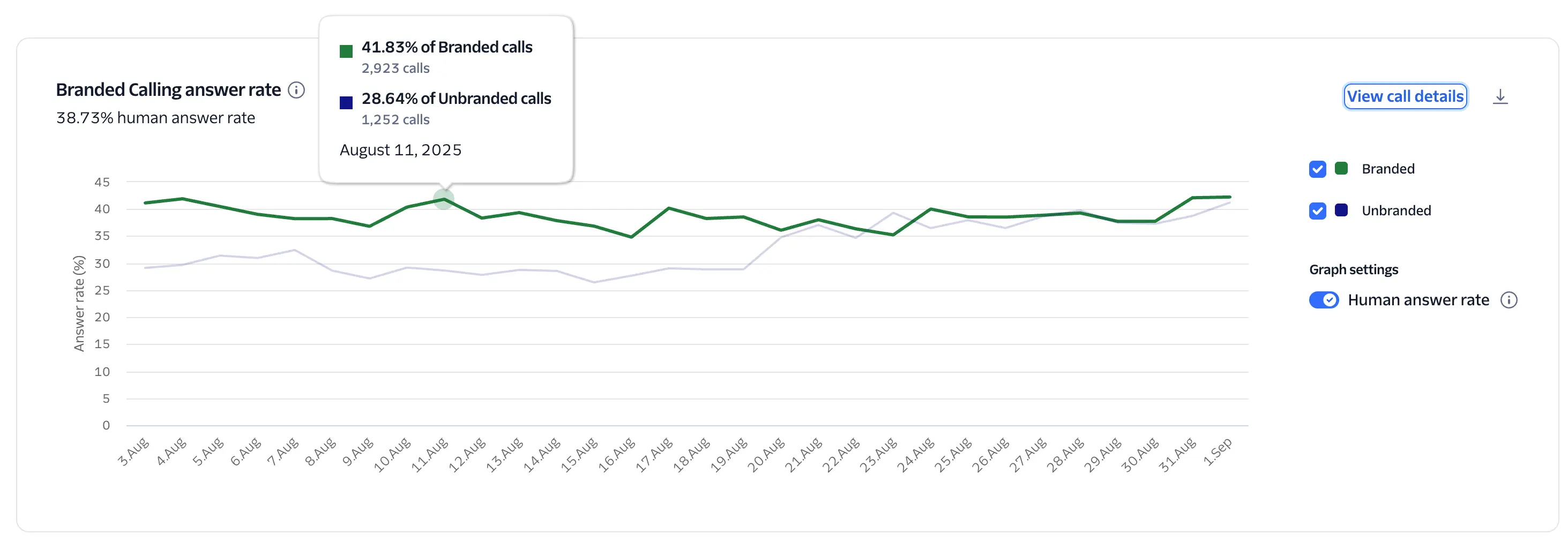
- Real‑time A/B testing: Run comparable traffic simultaneously through branded and unbranded routes, then compare the two lines. Use the Human answer rate toggle (with AMD enabled) to measure true lift in conversations rather than machine answers.
- Interpreting lift: Track relative uplift = (Branded − Unbranded) ÷ Unbranded. Positive, sustained lift indicates branding is improving reach and trust.
- Segment analysis: Apply filters (for example, use case, campaign, number pool) to identify where branding delivers the most impact, and allocate budgets accordingly.
- Correlate outcomes: Pair this with the Engagement Sankey and Call-Duration charts to confirm that higher human-answer rates are also associated with more conversations lasting over 60 seconds.
- Make sure you have an adequate sample size, and run tests over comparable days and times to avoid bias from time-of-day effects.
- When the Human-answer-rate toggle is off, voicemail counts as "answered"; rely on the Human-answer-rate view for ROI decisions.
- If branding lift is small or negative, review Caller ID reputation (Voice Integrity), call timing (Heatmap), and list quality before concluding.
This guide covers a feature that can support the following use cases:
You can use the feature in this guide to get insights whenever you send voice notifications using your app. For example, you can programmatically call customers to notify them of important updates, such as emergency weather closings, and learn how many calls connect successfully.
To learn more advanced features that you can use with voice notifications, see Voice notifications.
You can use the feature in this guide to get insights for your programmatic outbound call center that dials customers for telemarketing.
To learn more advanced features that you can use with outbound call centers, see Voice outbound contact center.
You can use the feature in this guide to track call connection rates and audio quality for your sales team's outbound dialing activities.
To learn more advanced features that you can use with sales dialers, see Voice sales dialer.
You can use the feature in this guide to analyze the performance and metadata of calls routed for marketing attribution.
To learn more advanced features that you can use with call tracking, see Voice call tracking.
Explore the following guides to build on what you've learned in this guide:
- Make outbound phone calls with Twilio Programmable Voice: Start placing calls programmatically using the REST API.
- Record phone calls: Capture call audio for storage or transcription.
- Respond to incoming phone calls: Learn how to handle inbound calls using TwiML.