Flex Webchat release notes
This page provides release notes for Flex Webchat. For details about setting up and using Webchat, see our Webchat 3.x.x documentation.
To find other release information, go to these pages:
- If you're looking for information about Flex UI, see the Flex UI release notes.
- For historical release notes for earlier Webchat versions, see the archived Webchat release notes.
release date April 9, 2026
- Added support for styling customizations. You can now adjust the appearance of Webchat components to match your organization's style guide.
release date April 2, 2025
- Updated Twilio Paste to version 21.0.0.
- Security-related updates.
announced March 20, 2025
We're excited to announce that Flex Webchat 3.x.x is now generally available (GA).
For information about updating from Webchat 2.x, see our Webchat migration guide.
release date March 10, 2025
- Updated to provide enhanced security.
- Fixed an error that occurred when using Webchat with the Google Dialogflow CX native integration in Flex for virtual agents. Previously, when the webchat reloaded or refreshed in a conversation that included a Dialogflow participant, the chat would freeze and the following error appeared in the Console log: "Error: Getting User is not supported for this Participant type: dialogflowcx."
- Corrected an issue that caused unsent attachments from a previous chat to unexpectedly appear in a new chat. For customer-initiated chats, if a customer attached a file but left the chat before sending it, the attachment reappeared if the customer started a new chat.
release date December 9, 2024
- Webchat 3.1.0 supports pre-engagement form configuration and context. These features enable you to gather additional information to help with routing decisions and provide agents with details that can make their interactions more efficient and effective.
- Customers can now leave the chat by closing the chat window. Previously, only an agent could end the chat. Note: If you're updating from Webchat 3.0.x and have implemented custom functionality to allow customers to end the chat, you must ensure that any conflicts with this new feature are resolved before you update to this version. For more information, see Set up and use Webchat 3.x.x.
- In Flex UI 2.10.0 and later, you can enable an option to show a message to agents to let them know when the customer has left the chat. This setting is turned off by default. To use it, turn on the new Show message when customer leaves webchat feature on the Flex Feature Settings page.
release date December 12, 2023
To get started with Webchat 3.0, see the Webchat 3.0 overview. This release is in Public Beta.
Webchat 3.0 works with Flex UI version 2.0.x and later.
This release includes breaking changes from Webchat 2.0. If you want to upgrade from Webchat 2.0, you must migrate to the new version.
- Webchat 3.0 is now deployed to your website using a deployment key, which shields your account information.
- When a new chat begins, Webchat captures a fingerprint of the user's browser and device, then validates that fingerprint with every new message to prevent spoofing.
- Webchat 3.0 is built on Flex Conversations, rather than legacy messaging.
release date May 28, 2024
- Webchat now uses the Open Sans font hosted on Twilio's CDN instead of the file hosted on Google's CDN.
release date September 15, 2023
- Fixed support for .me links in markdown in CDN version
release date September 15, 2023
- Fixed support for .me links in markdown in NPM version
release date June 15, 2021
- Upgraded Handlebars version to 4.7.7
release date May 11, 2021
- A fix to allow markdown links to be rendered correctly even if there is a space between the link text and the URL it's linking to
release date FEB 26, 2021
- Characters being dropped intermittently when typing in the input field
release date FEB 24, 2021
- Added .app domain to the allow list
- Fixed the issue with WebChat not loading in mobile Safari
- Fixed the markdown code element overflow bug
release date JAN 13, 2021
- [axios] To version 0.21.1
release date DEC 9, 2020
- Markdown feature improvements including support for new elements (headings, ordered lists, code snippets, block quotes) and several bugfixes. Note, implementation now relies more on semantic HTML, so if you have styled generic html elements, keep an eye on how they look in chat.
Info
New versions of dependencies can contain changes in internal APIs that we do not document in release notes. If you're using any undocumented apis of upgraded dependencies, please review your code and update your customizations as needed. Any changes in undocumented api's are not considered breaking changes, however, if you are using them, this might break your customizations.
Example: This version of chat-sdk contains changes in internal API. To access channel attributes, channel.attributes is supported as per https://media.twiliocdn.com/sdk/js/chat/releases/3.4.0/docs/Channel.html and not channel.state.attributes.
release date OCT 27, 2020
- Upgraded lodash transient dependency in CDN bundle to remove a security vulnerability
- Fixed a bug with drag and drop into chat input field
- [handlebars] upgraded to version 4.7.6
release date SEP 16, 2020
- You can now set character limit of a message programmatically. Default limit is 32768 characters
MessagingCanvas.defaultProps.charLimit = 1000
- Size of CDN bundle has been reduced from 550kb to 390kb
- Domain links with parameters, not separated by a slash, are now recognized as links. For instance:
http://flex.twilio.com?test=true.
release date SEP 01, 2020
Info
Web Chat UI API Reference for this version of Web Chat UI is available here
- Chat link parser now recognize domain and parameters not separated by a slash. For instance:
http://flex.twilio.com?test=true.
release date JUN 23, 2020
- Image and file sharing for Web Chat channel in Pilot - Agents and Customers can now share images, documents and other files during a chat conversation. You can learn more about Chat attachments here.
- A new Boolean property in the MainContainer component called showNotificationBar which by default is
true. It's used to render the notification bar below the main header. You can find out more about the Notifications Framework here
- CSS font style fix for title child (key=text) in
MessageCanvasTray
release date APR 27, 2020
- [handlebars] to version 4.7.3
Warning
Handlebars Dependency Upgrade: Handlebars provides templating for the strings exposed by Flex UI and Flex WebChat UI. In this release we are upgrading Handlebars to 4.7.3 to fix critical security vulnerabilities exposed in previous versions of Handlebars. This may be a breaking change if you use certain undocumented Handlebars features. You can find more information about this change atthe following link.
- We restructured our internal dependencies and stopped using a bundled dependency for our internal libraries. Developers can now manage their project dependencies using yarn.
- Improved chat message input rendering performance by debouncing store update on keypress.
- Fixed illegal unquoted character error when submitting WebChat messages via Enter button.
release date MAR 04, 2020
- Highlight URLs in chat messages only if they are not part of another string
release date JAN 16, 2020
- Issue with WebChat messages being marked as read
- Attempt to create a manager instance using incompatible redux store will now throw an error instead of string
MainContainermax-height set to80vhto make webchat accessible from smaller screens.
release date OCT 30, 2019
- Numbered List support for Markdown has been temporarily suspended due to some side effects found with the implementation. All other markdown options are still available as part of the released feature. Find out more about Markdown support here
release date OCT 07, 2019
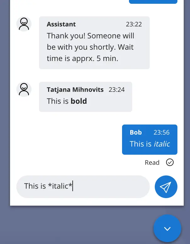
Markdown
- WebChat now has basic markdown support. A user can use Flex standard markdown syntax when typing a WebChat message and it will be displayed to agent and WebChat user as formatted text
- Messages with markdown syntax can also be sent with Programmable Chat REST API into the chat channel using the same Flex markdown syntax and they will displayed for Flex and WebChat users as formatted text.
- Flex user must be using Flex UI V1.4.0 or later
- Flex standard markdown syntax:
| Options | Syntax |
|---|---|
| Bold | **Bold** |
| Italic | *Italic* |
| Strikethrough | ~Strikethrough~ |
| Bullet list | * List * List * List |
| Numbered list | 1. One 2. Two 3. Three |
- The Message Input component's useLocalState flag is obsolete
- Typing indicator in chat canvas now shows count of people typing if that number is above 1.
release date AUG 29, 2019
DynamicFormemail validation now correctly supports 2-chars domains, subdomains.
release date AUG 12, 2019
- Bundled code now transpiles to IE11-compatible version. If you're integrating Flex NPM package into your application, you also have to include polyfills for required features at the top of your application's entry point. For instance, in case of
create-react-app:
1import "react-app-polyfill/ie11";2import "react-app-polyfill/stable";
release date JUL 17, 2019
- twilio-chat from version 3.0.2 to version 3.2.3
- @material-ui/core from version 1.3.1 to version 3.9.3
-
Aria props properties to the following components to support accessibility:
-
MessageInput:
sendButtonAriaProps• AriaProps • Send button aria props ({ ariaLabel: "Send Message" }by default).textAreaAriaProps• AriaProps • Text area aria props ({ ariaLabel: "Enter your message here to get help" }by default)
-
MessageList:
listContainerAriaProps• AriaProps • List container aria props ({ ariaLive: AriaLive.Off }by default).
-
EntryPoint:
collapsedIconAriaProps• AriaProps • Collapsed icon aria props ({ariaLabel: "Click here to open Web Chat and get help."}by default).openedIconAriaProps• AriaProps • Opened icon aria props ({ariaLabel: "Hide Chat"}by default).
-
Example on how to set aria attributes:
1FlexWebChat.MessageInput.defaultProps.sendButtonAriaProps = {2ariaLabel: "Send Message",3ariaLive: FlexWebChat.AriaLive.Polite,4};56FlexWebChat.MessageInput.defaultProps.textAreaAriaProps = {7ariaLabel: "Enter your message here to get help",8ariaLive: FlexWebChat.AriaLive.Assertive,9};
- Chat "Send message" button can now be themed with
theme.Chat.MessageInput.Button.
Example on how to change the icon for a text:
1appConfig = {2<...>3Chat: {4MessageInput: {5Button: {6borderRadius: "5px",7width: "100px",8fontSize: "18px",9svg: {10display: "none"11},12":after": {13content: '"Send Button text"'14}15}16}17},18<...>
- General Flex UI styles (like headers, paragraphs or links) are now applied only to HTML elements that have a class starting with Twilio or their direct descendants without any class
- CSS reset is no longer applied automatically.
- EntryPoint.tagline can now be set also via config's ComponentProps.
- Polyfills for IE11 support. Now WebChat is added to the page from CDN, it will work in IE11 with some minor style issues.
- Email validation in the pre-engagement form now allows numbers in the email.
- Unused
AppState.tryGetmethod
@twilio/flex-webchat-ui@2.0.0
release date APR 1, 2019
Warning
Info
This WebChat version works with any Flex UI version starting from version 1.0.0
- We have added a character limit of 32kB to
MessagingCanvas.Users will see a character limit notification and message submit will be disabled if the limit is reached. TheSendMessageaction will validate the character limit and fail the action if the limit is reached. Requiredvalidation in the pre-engagement form was fixed. Users will not be able to submit the form if all required fields are not filled.- We have fixed several issues causing chat messages to be sent or rendered twice.
- Breaking change: Set
predefinedMessagedefaultProp toMessagingto display and customize a predefined initial message to the user. It is set to be displayed by default, but can be customized or turned off completely. Read more about how predefined message is used in Installing and using Flex WebChat - Added
sdkOptions.chatkey to configuration object that can be used to pass options to chat SDK during initialization. - Breaking change: New function
Twilio.FlexWebChat.renderWebChatadded to initialize and render WebChat automatically. To create and render WebChat automatically (without configuring anything). Read more about ways to initializing and configure WebChat in Installing and using Flex WebChat. - We have added an
emailtype field to the pre-engagement form. Data entered in that filed by the user will need to pass email validation to be submitted.
-
Breaking change: Global
Twilio.Flexrenamed toTwilio.FlexWebChat. -
Breaking change:
Twilio.FlexWebChat.createWebChatnow only creates an instance of WebChat, but does not render it automatically. UseTwilio.FlexWebChat.renderWebChatto render automatically (instead ofcreateWebChat). Read more about ways to initializing and configure WebChat in Installing and using Flex WebChat. -
Breaking change: We have removed
configure()method from returnedTwilio.Flex.createWebChatobject. Usemanager.configurationmember to set the configuration. -
Breaking change: We have removed a default pre-engagement form from the out-of-the-box WebChat experience. Now
startEngagementOnInitby default istrue, and the defaultpreEngagementConfigis removed. Read about how to add a pre-engagement form in Pre-engagement and context -
Breaking change: We have changed the following component props of the
EntryPointcomponent:hideTaglineWhenExpanded- choose whether to hide thetaglinewhen chat box is expanded.iconClosed- name of the icon to be shown when chat box is closed.iconExpanded- name of the icon to be shown when chat box is expanded.tagline- tagline content.
-
We have also removed the following EntryPoint props in favor
EntryPoint.Containerdefined in the colorTheme object:entryPointStyleentryPointBorderStyleentryPointClassNamewidgetClassNameentryPointSizeentryPointLocationbottomrightbackgroundcolor
-
Breaking change: Added footer text as an attribute to pre-engagement config. Now use
preEngagementConfig.footerLabelto set it. To style pre-engagement form footer text, usePreEngagementCanvas.Footerin colorTheme object. -
logLevelby default is set toerror. -
Breaking change: Chat's
MessageInputnow useslocalStateby default. This will allow the developer to store the message input value in the component state instead of the Redux state.MessageInput.defaultProps.useLocalStateshould be set tofalseif there's the intention of changing the input value using theSetInputTextaction. -
Group engagement stage constants in an Enum
EngagementStage -
Breaking change:
setEngagementStage()method has been removed from returnedTwilio.Flex.createWebChatobject. Engagement stage is determined by configuration and chat state. -
We have removed the following unused config options:
Config.canvasBottompropConfig.postEngagementConfigpropConfig.timeoutEngagementConfigpropSessionState.sessionDatapropSessionState.waitingTimeoutSecondspropSessionState.preEngagementReadyprop- Engagement stages
- Session Actions