Archive: Flex UI release notes for past releases
Use this page to find historical information about older Flex UI releases. For up-to-date information on the latest Flex UI version, see Flex UI 2.x.x. release notes.
@twilio/flex-ui@1.34.6
release date January 18, 2024
- Fixed a bug that caused chat messages to incorrectly interpret two underscores as markdown formatting even when markdown formatting is not enabled. For example, the chat message, "My email address is order_support_troubleshooting@owlshoes.com" would incorrectly appear as "My email address is order_support_troubleshooting@owlshoes.com."
- Fixed a bug that made it harder to click the Flex UI navigation menu icon when a red notification dot appears on the icon.
- Fixed a potential login issue for customers who are using a specific authentication flow and running Flex within an iframe (for example, the Flex Salesforce integration). This issue was related to Google's rollout of restrictions on third-party cookies, which was announced in December 2023 and began in January 2024.
- Fixed a rare performance issue for specific customers who are using a feature enabled by our support team.
@twilio/flex-ui@1.34.5
release date November 1, 2023
- Updated the Voice SDK to version 1.15.1. Voice SDK 1.15.1 fixes a Chrome issue where audio is choppy when another application is also using the audio devices.
@twilio/flex-ui@1.34.4
release date September 27, 2023
- Added support for Google Chrome's experimental Storage Partitioning feature. Previously, enabling this feature prevented users from logging in to Flex using SSO, particularly in environments using Flex inside of an iframe.
@twilio/flex-ui@1.34.3
release date August 21, 2023
- Fixed an issue with SDK auto-reconnect if initialization fails
- Fixed an issue where the Status Report could be opened while disabled from a notification
- Fixed an issue with the 'Clear Issues' button on Status Reports disappearing in dark mode.
- Fixed a broken hyperlink to Twilio marketplace in Chat Info.
- Fixed an issue where hyperlinks for '.me' URLs were not enabled in Webchat.
@twilio/flex-ui@1.34.2
release date July 14, 2023
- Increased timeout interval for certain SDKs to address initialization issues
@twilio/flex-ui@1.34.1
release date June 28, 2023
- Fixed logging issues in Flex Configuration API enabling custom settings.
- Fixed initialization issues using timeout for dependencies.
@twilio/flex-ui@1.34.0
release date Apr 20, 2023
- Changes introduced in UI 1.33 for 'Sync removal from critical path of outbound, transfer and conference state' have been reverted and behavior present in UI 1.32 is restored. For more info on the Sync removal changes, refer to the section 'Changes to Sync usage in Flex UI' in the Flex UI release notes.
- Added support for multiple country codes for the Dominican Republic in the Flex dialpad
- Fixed issue around incorrect notification for missing recording when authenticated recording is enabled.
- Fixed issue around userLoggedIn Flex event not getting triggered
- Fixed issue around SideLink added by a plugin not getting displayed correctly
- Fixed issue around Unhold not working correctly when agents transfer call to themselves via a queue.
- Fixed issue around external participant name disappearing when call is put on hold for external warm transfers.
@twilio/flex-ui@1.33.3
release date Feb 21, 2023
- Fixed issue around increased plugin load time
- Addressed issue with Teams page not displaying the list of workers correctly when the hidden filter property is configured for filtering agents
- We have had reports of intermittent issues with call hold state, where the actual hold state and UI hold state are inconsistent. This is being actively investigated. Please see Changes to Sync usage in Flex UI for more details.
@twilio/flex-ui@1.31.3
release date Dec 15, 2022
- Fixed issue with token refreshment behavior
@twilio/flex-ui@1.33.2
release date Dec 14, 2022
- Fixed issue with token refreshment behavior
- We have had reports of intermittent issues with call hold state, where the actual hold state and UI hold state are inconsistent. This is being actively investigated. Please see Changes to Sync usage in Flex UI for more details.
@twilio/flex-ui@1.32.3
release date Dec 14, 2022
- Fixed issue with token refreshment behavior
@twilio/flex-ui@1.33.1
release date Dec 9, 2022
- Updated messages in Status report and Degraded mode notifications
- We have had reports of intermittent issues with call hold state, where the actual hold state and UI hold state are inconsistent. This is being actively investigated. Please see Changes to Sync usage in Flex UI for more details.
@twilio/flex-ui@1.32.2
release date Dec 8, 2022
- Updated messages in Status report and Degraded mode notifications
@twilio/flex-ui@1.33.0
release date Nov 21, 2022
- Removed Sync backend from critical path of outbound, transfer and conference state.
- Worker and Queue lists now fetch all available items and are no longer restricted to items with updates in the last 30 days.
- Minor text updates to Status Report
- Correct Insights dashboards are now shown based on permissions
- Fixed an issue preventing audio constraints from being applied to the device audio
- Disabled Degraded notification when user token has expired
- We have had reports of intermittent issues with call hold state, where the actual hold state and UI hold state are inconsistent. This is being actively investigated. Please see Changes to Sync usage in Flex UI for more details.
@twilio/flex-ui@1.32.1
release date Nov 10, 2022
- Fixed an issue with type definitions that prevented some customers from creating new plugins.
@twilio/flex-ui@1.32.0
release date Sep 29, 2022
- Consume flex-sdk 0.13.0.
- Fetch all queue stats data before updating store on initialization to improve performance.
- Moved Debugger UI to Status Report and released to GA.
- Resolved an issue where Hosted Flex users were not automatically logged in to Flex UI after providing their Twilio account details.
- Users can no longer interact with Status report (formerly Debugger UI) when the token has expired.
- Fixed a bug in Historical Reporting where segment links were not clickable in created KPI dashboards.
- Fixed an issue where remote config loglevel was not being applied correctly to SDK logs.
- Restore loginHandler functionality inside Flex store.
- Add critical error parsing to provideLoginInfo.
- The downloadable report provided by Status report now includes a summary of the user's degraded mode state and information about Twilio service status.
- Flex UI will now wait for plugins to complete initialization after login before moving on.
@twilio/flex-ui@1.31.2
release date Jun 28, 2022
- Fixed an issue with loginHandler session not being supported in the previous version.
@twilio/flex-ui@1.31.1
release date Jun 6, 2022
- During login, after redirection from SSO provider, Flex will no longer ask to re-enter runtime domain for the second time.
@twilio/flex-ui@1.31.0
release date May 18, 2022
Degraded mode - now Flex UI will initialize with limited capabilities, even if some of the components like SDK's (TaskRouter, Conversations, Voice or Sync) are down. This allows users to login to Flex even during a partial disruption of services and use the unaffected functionality. Learn more about degraded mode in our docs.
- Expired tasks will no longer be kept in redux store on worker init
- MessageBubble will now be able to handle null message body
- Markdown links without protocol prefix will no longer be interpreted as internal links
@twilio/flex-ui@1.28.2
release date Feb 07, 2022
- Overlay Player support for new address format of drill down links in Flex Insights Historical Reporting.
@twilio/flex-ui@1.29.3
release date Feb 07, 2022
- Overlay Player support for new address format of drill down links in Flex Insights Historical Reporting.
@twilio/flex-ui@1.30.2
release date Feb 03, 2022
- Overlay Player support for new address format of drill down links in Flex Insights Historical Reporting.
@twilio/flex-ui@1.30.1
release date Jan 17, 2022
- A fix to avoid using useState in chat channel reducer which caused Chat messages to fail to load in some instances
@twilio/flex-ui.1.30.0
- Real Time Queue Monitoring with SLA GA. See Twilio Changelog for more details.
- The logLevel setting in the Flex Configuration object now also applies to the underlying Flex SDKs
- Fixed session issues related to Flex Insights Analytics Portal
- Fixed an issue with deactivating chat channels which are created during plugin initialization
@twilio/flex-ui@1.29.2
release date Jan 19, 2022
This release contains fixes to our pilot or private beta features.
@twilio/flex-ui@1.29.1
release date Dec 01, 2021
- Fixed bug with
isCallTaskhandlebar helper function
@twilio/flex-ui@1.29.0
release date Nov 10, 2021
- Improvements to Flex Dialpad:
- Zero key can now be long pressed to enter a +
- Backspace now deletes last entered digit
- Custom audio from AudioPlayerManager no longer plays unintentionally during outbound calls
- Fixed an issue with audio not being played when Flex tab is not active or when the browser is minimized. Issue was introduced due to changes in Chrome Autoplay policy.
- Fixed issue with valid runtime domains not being accepted
- Fixed text alignment issue on empty task canvas on small screens
- Fixed issue with search in Flex UI API reference
- Fixed issue with DataTable not updating outside of viewport
- When switching from compact overlay Player to Conversation Screen, the call that user started listening to will continue playing without interruption
@twilio/flex-ui@1.28.1
release date Oct 19, 2021
- Fixed an issue where plugins were not loading correctly for customers who were hosting their own flex-ui library
@twilio/flex-ui@1.28.0
release date Sep 30, 2021
- Flex Dialpad is now GA! This release brings improvements in quality and reliability and solves several known limitations. For more information, refer to the Flex Dialpad documentation
- An audio device will now be checked readiness before placing the call and handle errors related to audio device errors when placing outbound calls
- To avoid several clashing concurrent calls, placing outbound calls when having another call ongoing will now be disabled.
- Fixed an issue where an unsupported file could be pasted to the chat
- Fixed an issue where chat date separator was positioned incorrectly
@twilio/flex-ui@1.27.0
release date Jun 21, 2021
- Real Time Queue Monitoring with SLA Public Beta. To try the Queue Monitoring, visit Flex settings to enable it for your account. See Twilio Changelog for more details.
- Advanced Filtering in Teams View enabled by default.
- Updated navigation in Flex Insights dashboards with programmability improvements. The new navigation is optional and can be enabled in Flex settings. If you run self-hosted Flex make sure you request our support to enable access to Flex Insights for your domain.
- Programmable access to workspace-level queue statistics has changed since the release of Real Time Queue Monitoring with SLA Private Beta. Please review the latest programmability documentation.
- For workers without activity changes in the last 30 days Teams View no longer shows NaN as the activity duration
@twilio/flex-ui@1.26.3
release date June 7, 2021
- Upgraded Handlebars version to 4.7.7
@twilio/flex-ui@1.26.2
release date June 3, 2021
- Notification for unexpected token expiry. If the user's access token is removed from local storage for whatever reason, they receive a notification to refresh the page in order to refresh their token.
- More verbose logging around SSO login functionality for debugging purpose
@twilio/flex-ui@1.26.1
release date May 13, 2021
- Transfer directory hidden filters - Now you can programmatically pre filter the list of agents or queues in the transfer directory.
WorkerDirectoryTabsaccepts 2 new default propshiddenWorkerFilterandhiddenQueryFilterwhich are filters that are applied to the list together with the filter applied due to user typing in the search string. For example, you can choose to display and search only agents with available status. To learn more about Transfer directory hidden filters, go to Flex docs. ApplyListFiltersandResetListFiltersactions are now emitted when the apply or reset button is clicked in TeamsView filters. To learn more about Actions Framework go to our Flex UI Programmability docs.
- Browser Notifications and Markdown for Web Chat are now Generally Available and can be turned on in Flex settings
- Error reporting - Flex UI will now be reporting on errors that end-users experience. This will help us continuously improve the quality of the application and get more insights into issues that need troubleshooting. To read more about ways to troubleshoot Flex UI, including how you can opt out of error reporting, go to Flex docs
- Deprecated unintentionally exported private interfaces
Flex.ErrorManager.processErrorandFlex.ErrorManager.createAndProcessError
- Fixed an issue where agent changing activity to the same one resulted in an error
WorkerDirectoryTabscan now be accessed directly and not just throughWorkerDirectory.Tabs- Star rating in Conversation screen now renders correctly
- Negative time values in Conversation Screen comment tooltip are now correctly formatted
- Added error notification when copy to clipboard fails because Flex is embedded in iframe without copying to clipboard disabled (
allow="clipboard-write") - Initiating outbound calling will now be disabled, while another outbound call is being attempted
- Transfer directory will now be closed automatically, if the call is disconnection
- Fixed Player waveform render issues on displays with higher pixel ratio
- Fixed an issue where fast switching between tasks in Teams View caused uncaught exception
- Initiate transfer button in Call Canvas now has a tooltip
@twilio/flex-ui@1.26.0
release date May 11, 2021
- Transfer directory hidden filters - Now you can programmatically pre filter the list of agents or queues in the transfer directory.
WorkerDirectoryTabsaccepts 2 new default propshiddenWorkerFilterandhiddenQueryFilterwhich are filters that are applied to the list together with the filter applied due to user typing in the search string. For example, you can choose to display and search only agents with available status. To learn more about Transfer directory hidden filters, go to Flex docs. ApplyListFiltersandResetListFiltersactions are now emitted when the apply or reset button is clicked in TeamsView filters. To learn more about Actions Framework go to our Flex UI Programmability docs.
- Browser Notifications and Markdown for Web Chat are now Generally Available and can be turned on in Flex settings
- Error reporting - Flex UI will now be reporting on errors that end-users experience. This will help us continuously improve the quality of the application and get more insights into issues that need troubleshooting. To read more about ways to troubleshoot Flex UI, including how you can opt out of error reporting, go to Flex docs
- Deprecated unintentionally exported private interfaces
Flex.ErrorManager.processErrorandFlex.ErrorManager.createAndProcessError
- Fixed an issue where agent changing activity to the same one resulted in an error
WorkerDirectoryTabscan now be accessed directly and not just throughWorkerDirectory.Tabs- Star rating in Conversation screen now renders correctly
- Negative time values in Conversation Screen comment tooltip are now correctly formatted
- Added error notification when copy to clipboard fails because Flex is embedded in iframe without copying to clipboard disabled (
allow="clipboard-write") - Initiating outbound calling will now be disabled, while another outbound call is being attempted
- Transfer directory will now be closed automatically, if the call is disconnection
- Fixed Player waveform render issues on displays with higher pixel ratio
- Fixed an issue where fast switching between tasks in Teams View caused uncaught exception
- Initiate transfer button in Call Canvas now has a tooltip
@twilio/flex-ui@1.25.4
release date APR 19, 2021
- Fixed the issue in Player that prevented from playing recordings provided via custom media links in case the recordings were different for different segments within a single conversation
@twilio/flex-ui@1.25.3
release date MAR 31, 2021
- Fixed the issue in Player causing Flex UI to crash when custom media links are provided with invalid or missing start time
@twilio/flex-ui@1.25.2
release date MAR 16, 2021
- Increased max number of event listeners for the events of Notifications Framework that resulted in
MaxListenersExceededWarningin console - Fixed voice client connection initiation when agent is using a sip endpoint
@twilio/flex-ui@1.25.1
release date FEB 26, 2021
- Characters being dropped intermittently when typing in the input field of Messaging Canvas
@twilio/flex-ui@1.25.0
release date FEB 24, 2021
- Improvements to Flex UI troubleshooting experience with release of:
-
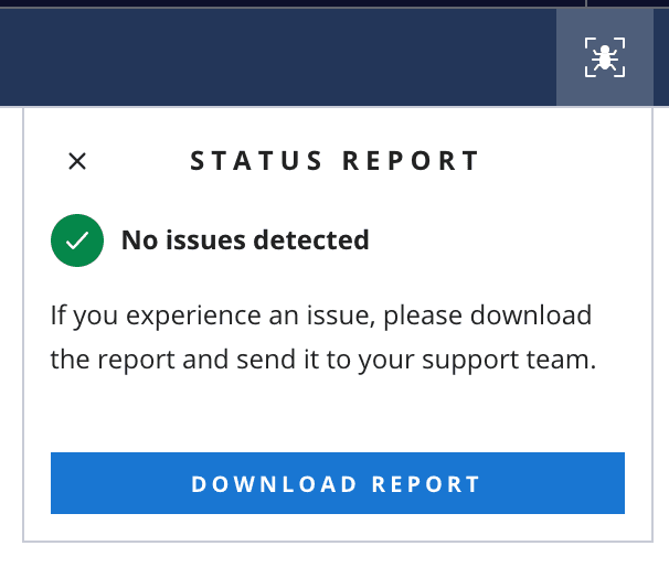
Debugger UI allowing users of Flex UI to get error notifications and download report with full error descriptions and logs. Debugger UI can be enabled for your account via a Pre-release Feature Flag
-
Flex UI programmable interfaces that provide ability to retrieve errors and logs programmatically and implement customized error monitoring and reporting
1import { Monitor } from "@twilio/flex-ui";23Monitor.getErrors(); // returns { errors: [Monitor.FlexErrorJSON] }4Monitor.getLogs(); // returns { logs: 'string' }5
-
To learn more about Flex UI troubleshooting, Debugger UI and programmatic access to errors and logs, visit our Flex docs and Flex UI API Reference.
- Teams View advanced filters now show legacy custom filters as an additional filtering option in the side bar. You can now use Advanced Filters without losing access to filters you have defined programmatically via the
WorkersDataTable.defaultProps.filtersAPI. Learn more about advanced filters in Flex documentation and programmability guide. We encourage you to migrate to the advanced filters that provide greater flexibility for the end users. - Flex Insights overlay player now enables to switch between Segments of a single Conversation without need to go to Conversation Screen. So if a call was transferred you can listen to all parts of the call without leaving Flex Insights dashboards.
- Initial audio device check (previously in Pilot release) is now in GA and will be enabled by default for all accounts
- Transfers:
- It will no longer be possible to transfer to the agent that is unavailable
- Transfer Directory will now close automatically when switching between tasks
- Native Dialpad:
- Default Task Queue will now always visible in Native Dialpad Queue dropdown
- Fixed copy for the error notifications that worker receives while attempting to make an outbound call to the disabled country
- Fixed the markdown code element overflow bug
- Fixed token refresh issue - invalidated sessions will no longer update the access token
- Worker has no longer access to the incoming task content after refreshing the page
@twilio/flex-ui@1.24.3
release date FEB 15, 2021
- More improvements to token refresh issues - invalidated sessions will no longer update the access token
- Fixed a dependency versions conflict (
react-selectandemotion) where importing flex-ui in Jest unit tests could sometimes break
@twilio/flex-ui@1.24.2
release date JAN 25, 2021
- An issue with refreshing of the token
@twilio/flex-ui@1.23.4
release date JAN 25, 2021
- An issue with refreshing of the token
@twilio/flex-ui@1.24.1
release date JAN 14, 2021
- A bug where playback speed of a recording in Conversation Player would reset after secure recording URL expiry and refresh.
- A bug where playahead no longer briefly jumped to zero, when secure recording URL is refreshed
- [axios] to version 0.21.1.
- [twilio-client] to version 1.13.1.
@twilio/flex-ui@1.24.0
release date DEC 9, 2020
- Markdown feature improvements including support for new elements (headings, ordered lists, code snippets, block quotes) and several bugfixes. Note, implementation now relies more on semantic HTML, so if you have styled generic html elements, keep an eye on how they look in chat.
- In Outbound dialpad, in case of the default queue not being available in the queue selector, we will now leave selection empty and disable outbound call button
- ToggleSidebar action called twice when sidebar is already collapsed
- Improvements and fixes in Flex Insights Conversation Screen and Player
- [twilio-taskrouter] to version 0.5.2
- Updated @gooddata/gooddata-js to version 13.2.0
@twilio/flex-ui@1.23.3
release date DEC 2 2020
- Fixed regression in Flex Insights that prevented users from playing some recordings stored outside of Twilio
@twilio/flex-ui@1.23.2
release date NOV 23 2020
- Minor internal bugfixes
@twilio/flex-ui@1.23.1
release date NOV 16 2020
- Real-time Queue Stats Public Beta can now show more than 50 queues
- N/A answers are supported for questions with 5 star rating when assessing a conversation in Flex Insights
- Improvements and fixes in Flex Insights Conversation Screen and Player
@twilio/flex-ui@1.23.0
release date NOV 09 2020
- Usability improvements for Conversation Screen - now when users drill down to individual conversations they stay in the Flex UI. Former Conversation Screen is still available but will be deprecated.
- New
enableReduxLoggingflag in AppConfig that will help developers to fine-tune their preferred logging level of redux action
- Fixed race condition which can cause concurrent outbound calls
- Fixed inaccuracies in displaying timestamp of messaging task predefined message
Info
New versions of dependencies can contain changes in internal APIs that we do not document in release notes. If you're using any undocumented apis of upgraded dependencies, please review your code and update your customizations as needed. Any changes in undocumented api's are not considered breaking changes, however, if you are using them, this might break your customizations.
Example: This version of chat-sdk contains changes in internal API. To access channel attributes, channel.attributes is supported as per https://media.twiliocdn.com/sdk/js/chat/releases/3.4.0/docs/Channel.html and not channel.state.attributes.
@twilio/flex-ui@1.22.2
release date OCT 27 2020
- [handlebars] upgraded to version 4.7.6
- [twilio-chat] reverted to 3.2.4 (update to version 3.4.0 will be done in 1.23.0 release)
@twilio/flex-ui@1.22.1
release date OCT 21 2020
- Dragging & dropping text into chat text input
- Updated lodash transient dependency in CDN bundle to remove a security vulnerability
- [twilio-chat] upgraded to 3.4.0
- [twilio-sync] upgraded to 0.12.3
@twilio/flex-ui@1.22.0
release date SEP 16, 2020
- Chat attachments are now in Public beta with new capabilities, like drag-n-drop and copy/paste, ability to send text and attachment together, read-only mode and more. Check out list of capabilities and developer guides in Chat attachment docs.
- Retired feature flag for Real-time Queues View. Real-time Queues View is now always enabled for all accounts.
- Vertical
TaskCanvasminimum size reduced to allow splitter interaction on small screens. Now, if window height is less than 600px, there will be 20% of space left forTaskList
- Domain links with parameters, not separated by a slash, are now recognized as links. For instance:
http://flex.twilio.com?test=true.
- Removed the legacy Real-Time Queues View implementation.
@twilio/flex-ui@1.21.1
release date SEP 15 2020
- Fixed an issue with Teams View advanced filters. When using custom programmable filtering for agents the custom filtering was not applied after agents changed their state which led to showing agents that did not match the filtering criteria.
@twilio/flex-ui@1.21.0
release date AUG 10, 2020
- [twilio-taskrouter] to version 0.5.2
- Hidden Filters in the Teams View restrict which users an agent is able to view and manage. Unlike normal filters, these cannot be overridden from the UI.
- Support 'Login with Twilio', enabling admin users and developers to access Flex without SSO for self-hosted applications
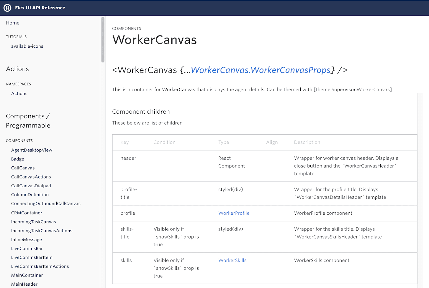
- Flex UI API Reference now includes the list of component children for dynamic components (with information such as key, condition, type, alignment and description).
- Removed references to
getState()from within Redux reducer methods to support custom Redux stores. - An incoming task notification will now be shown for unregistered task channels.

- Search, UI filters, and Hidden Filters in Teams view now work in conjunction. Teams View only displays agents that match all search and filtering criteria.
@twilio/flex-ui@1.20.1
release date JUL 1, 2020
- Fixed "calling errorPage of undefined" error by making
errorPagecontext-independent
@twilio/flex-ui@1.20.0
release date JUN 23, 2020
Info
This version Flex UI API Reference is available here
- [twilio-client] to version 1.11.0.
Image and file sharing for Web Chat channel in Pilot
- Agents and Customers can now share images, documents and other files during a chat conversation. You can learn more about Chat attachments here.
Hold music
- Support for new payload properties
holdMusicUrlandholdMusicMethodfor HoldCall/HoldParticipant actions to configure a custom hold music
HoldCall/UnholdCall actions will now getparticipantCallSidproperty in their payload, which indicates the voice connection sid in the conference for the participant. Flex does not take that payload into account, but customers overriding these actions can use that property to filter out custom participants. For more details on specific actions, go to Flex UI API reference
Error handling improvement
- New
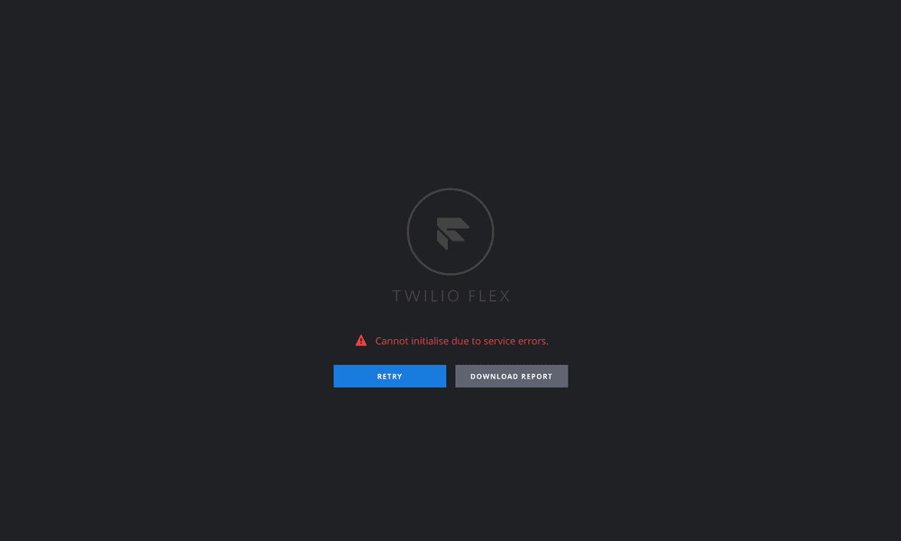
Flex.errorPageAPI to render a user-friendly error message screen for errors during Flex initialization. Users will now see details of the error and they can download a report which will provide technical details for troubleshooting.
- Introduce
FlexError- a universal error class that provides unified API to work with Flex exceptions. For more details on FlexError class, go to Flex UI API reference
Notification for signal connectivity issues
- Users will now be notified if Flex UI has lost network connectivity and is trying to reconnect. UI will show a notification when any of the SDKs detect that there is an issue with network connection. UI will also emit
FlexEvent.connectionStateChangedevent for both disconnect and reconnect.
- Call canvas dialpad display issue in small screens sizes
@twilio/flex-ui@1.19.0
release date APR 27, 2020
- [twilio-taskrouter] to version 0.5.1
- [handlebars] to version 4.7.3
Warning
Handlebars Dependency Upgrade: Handlebars provides templating for the strings exposed by Flex UI and Flex WebChat UI. In this release we are upgrading Handlebars to 4.7.3 to fix critical security vulnerabilities exposed in previous versions of Handlebars. This may be a breaking change if you use certain undocumented Handlebars features. You can find more information about this change atthe following link.
- Add
defaultSortColumnprop toDataTableto allow for initial sorting of the table. - Add
sortDirectionprop toDataTable.ColumnDefinitionto specify how the data should be sorted first. The value is either "asc" or "desc". - Add
theme.DataTable.Headerto customizeDataTableheaders. You can specify therootandclickableproperties.
For more information on programmable sorting in Queue Stats View visit Queues View programmability guide
- Fixed a state issue when starting monitoring a call.
insightsClientcan no longer be broken by incorrectsdkOptions.insightsconfiguration.- Improved chat message input rendering performance by debouncing store update on keypress.
- We restructured our internal dependencies and stopped using a bundled dependency for our internal libraries. Developers can now manage their project dependencies using yarn.
- Minor design updates to Queues Stats view.
- Deprecated the
QueuesStats.QueuesDataTable.sortableproperty. The table can be sorted by any of the default columns. Find out more about Queue Stats View customizations here. - Deprecated
TeamsView.defaultProps.filtersEnabledwas removed. Custom code still attempting to use it will not work. To toggle Advance Team View Filters on/off, please use the pilot flag on the feature page https://flex.twilio.com/admin/features. For more info on Advanced Team View Filters, go here.
@twilio/flex-ui@1.18.1
release date APR 16, 2020
- Fixed a state issue when starting call monitoring
@twilio/flex-ui@1.17.3
release date APR 14, 2020
- Fixed a state issue when starting call monitoring
@twilio/flex-ui@1.18.0
release date MAR 24, 2020
Info
Release notes updated on April 16th. Added mention of Outbound Dialing and Native Dialpad Public Beta release and Browser notifications bugfix
@twilio/flex-ui@1.18.0
release date MAR 24, 2020
- [twilio-taskrouter] updated to version 0.4.5
- Advanced Team View filters to allow supervisor to search or filter your agents by name or activity or add your custom filter criteria like teams or skills
- Updated: Outbound Dialing and Native Dialpad to allow Agents to place outbound calls and Developers to build Click to dial capabilities. For more details, visit our Dialpad documentation
- Fixed an issue with fetching and updating workers during call monitoring
- TeamsView filters now correctly applies default filter
- Updated: Browser notifications now get triggered whenever the browser is not in focus
@twilio/flex-ui@1.17.2
release date MAR 23, 2020
- Fixed an issue with fetching and updating workers during call monitoring
- TeamsView filters now correctly apply default filter
@twilio/flex-ui@1.17.1
release date FEB 24, 2020
- Fixed a race condition in receiving
initialDeviceCheckfrom feature flag config.initialDeviceCheckin Flex UI will respect the feature flag value.
@twilio/flex-ui@1.17.0
release date FEB 20, 2020
- Added new
viewResizedevent. This event gets triggered once the window resizes, debounced by 100ms. This will replaceselectedViewChangedfor resize events in the next major release. If you rely onselectedViewChangedfor detecting resize events, consider adoptingviewResized. - Flex tries to detect a default microphone and test that it works when the application is launched or when any device changes. In some headsets this check can be heard as a glitch so
initialDeviceCheckcan be set tofalseto prevent this issue.
selectedViewChangedevent now gets correctly triggered only once when view changes- Insights Overlay Player now respects a selected theme
- Application now redirects correctly after logging in when developing on HTTPS and port 443
- Application now doesn't crash when a new Agent activity is created while on Queue Stats screen
- Insights Overlay Player now displays an error notification when it fails to fetch a conversation
- After long inactivity, the Insights Overlay Player no longer loses its session token
- Fixed hyperlink color in darker message bubbles
- Improvements to chat performance when typing
- Email domains in MessageBubbles are no longer converted to links
- Triggering a deleted notification will no longer result in an exception
- Filter on Teams View page now preserves its state when navigating away
- Supervisor view now shows call's hold state in task card
selectedViewChangedevent now receives a second argument:isSameViewResized. This Boolean describes whether the view has actually changed or the same view has been resized.isSameViewResizedwill be always set tofalseonceselectedViewChangedis deprecated for resize events.
@twilio/flex-ui@1.16.2
release date JAN 27, 2020
- For browsers without Notification capabilities Flex logs a warning and disables browser notifications.
- Highlight URLs in chat messages only if they are not part of another string
- Fix Handlebars 4.7.0+ errors
- Notify user about a new chat message only if user is a participant of that chat and not supervisor monitoring the chat
@twilio/flex-ui@1.16.1
release date JAN 14, 2020
- Issue with WebChat messages being marked as read
- Minor UI bugs with pilot dialpad feature
- Removed unwanted CSS parse errors when running unit tests
@twilio/flex-ui@1.15.3
release date JAN 14, 2020
- Minor UI bugs with pilot dialpad feature
@twilio/flex-ui@1.16.0
release date DEC 17, 2019
- [twilio-client] to version 1.9.7
Actions Framework
- SendDTMFDigits action to send DTMF tones to a call of a call task. Previously, UI sent those digits directly when you used the DTMF Dialpad component. Now it goes through the action and if you make a custom component that needs to dial DTMF tones, a developer can use this action. Go to Actions Framework docs for more info on Flex UI Actions
1Actions.invokeAction("SendDTMFDigits", {23sid: "WRXXXXXXXXXXXXXXXXX",45digits: "567"67});
- HistoricalReporting:view Flex Insights action to respond to dashboard drill-downs of conversations that have media link of type Raw. The action is fired any time you drill down to a conversation or a segment. By replacing the action you can now handle drill-downs however you want - for example, if you want to display a content from a 3rd-party system. See Flex Insights documentation for custom media attached to conversations.
1Actions.replaceAction("HistoricalReporting:view", async (url, original) => {23// implement your own handling of URL or call original(url) to use the original handler45})
- ReloadWindow (Insights) action to force page reload from the server, bypassing the browser HTTP cache to have a unified way to recover from unexpected states that might require full refresh.
Actions.invokeAction("ReloadWindow")
Flex Insights
- Player usability improvements - You can now listen to calls and view chats within a dashboard without opening the call in a new browser tab. Quickly skim through many calls within Flex without going back and forth. You can still open the call in a separate tab to comment on and assess it. Go to Player docs for more info
- Chat transcripts - You can now drill down to chat transcripts from Flex Insights. You can understand the underlying conversations behind your chat-related KPIs. Your supervisors can comment on and assess chat conversations to gather feedback on the quality of agent conversations with your customers. Go to Flex Insights Conversation Screen docs for more info
- Custom media attachments - You can view custom media attached to conversations. You can use TaskRouter attributes to reference web pages (for example internal CRM records, tickets, etc.) that you can view on drill down directly in Flex Insights. This can add more context to every conversation. Go to Flex Insights docs for more info
- Dashboards, Analyze, and Questionnaire editor are now integrated into Flex navigation and are directly accessible from the left navigation bar. This makes Flex Insights a first-class citizen and consistent with the rest of Flex.
- Flex Insights now displays more detailed status if it is not available or there is another issue. This will enable easier troubleshooting.
- Fixed a bug in Flex Insights when SSO isn't enabled.
- Fixed a bug where sometimes a permanent sidebar would be added.
- DTMF Dialpad component will now call
SendDTMFDigits`` actioninstead of calling Voice SDK directly. QueuesDataTableheaders are now localizable with:QueuesStatsHeaderQueueName, QueuesStatsHeaderActiveTasks, QueuesStatsHeaderWaitingTasks, QueuesStatsHeaderLongestWait, QueuesStatsHeaderAgentsActivity.
@twilio/flex-ui@1.15.2
release date DEC 05, 2019
- Fixed a bug with stuck scrollbar
- Fix a bug with incorrect number of typing members in the chat typing indicator
@twilio/flex-ui@1.15.1
release date DEC 01, 2019
- Authentication issues to WFO (Flex Insights) for customers on https://flex.twilio.com without SSO setup
@twilio/flex-ui@1.15.0
release date NOV 22, 2019
- [twilio-taskrouter] to version 0.4.1
- [twilio-client] to version 1.9.5
- New Action Framework action:
SetWorkerActivity, which is invoked when supervisors update a worker's status. Read more about actions here.
Actions.invokeAction("SetWorkerActivity", { workerSid: "WKXXXXXXXXXXXXXXXXX", activitySid: "WAXXXXXXXXXXXXXXXXX" })
- New variable to Task Channel Definitions API
channel.templates.TaskCanvasTabs.contentTabHeaderfor channel specific labels inTaskCanvasTabs. Now labels ofTaskCanvasTabscan be changed like any other labels. Note, thatTaskTabAgentCallLabelandTaskTabAgentChatLabelstrings are no longer used. Find out more about Task Channel Definition API here and strings templating here.
- TeamsView correctly renders even if TaskRouter skills array is not defined.
- Text in chat input box can be now correctly selected
@twilio/flex-ui@1.13.2
release date OCT 31, 2019
- Minor bugfixes and internal refactoring
@twilio/flex-ui@1.14.1
release date OCT 30, 2019
- Numbered List support for Markdown has been temporarily suspended due to some side effects found with the implementation. All other markdown options are still available as part of the released feature. Find out more about Markdown support here
- Teams View crashed if TaskRouter skills array was not defined properly. Now an error will be logged and Teams View will still be rendered.
@twilio/flex-ui@1.13.1
release date OCT 08, 2019
- Using SFDC Identity provider, login flow was stuck at the redirect to pop-up dialog
@twilio/flex-ui@1.14.0
release date OCT 07, 2019
- [twilio-client] to version ~1.9
Notifications
-
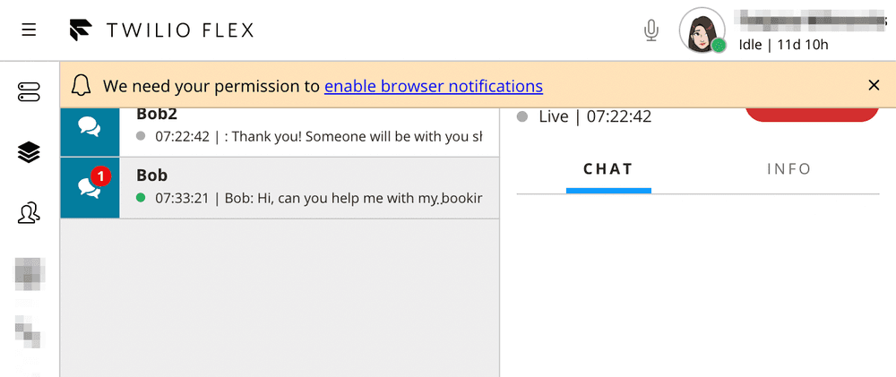
We introduced browser notification capabilities:
- Agent will be notified about new task or new message in an active messaging task with a browser notifications if Flex is not in focus

-
- Agent will be requested for browser notification permissions on each login or page refresh if they have not yet made a choice whether to allow or block browser notifications.
-
- Developer will be able to register custom browser notifications for Flex
-
Improvements to Notifications Framework:
- NotificationBar can now be given clickable actions
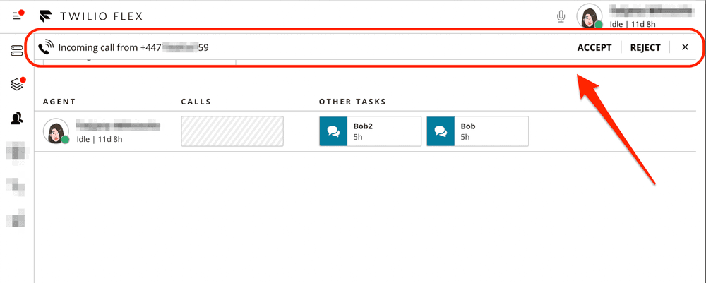
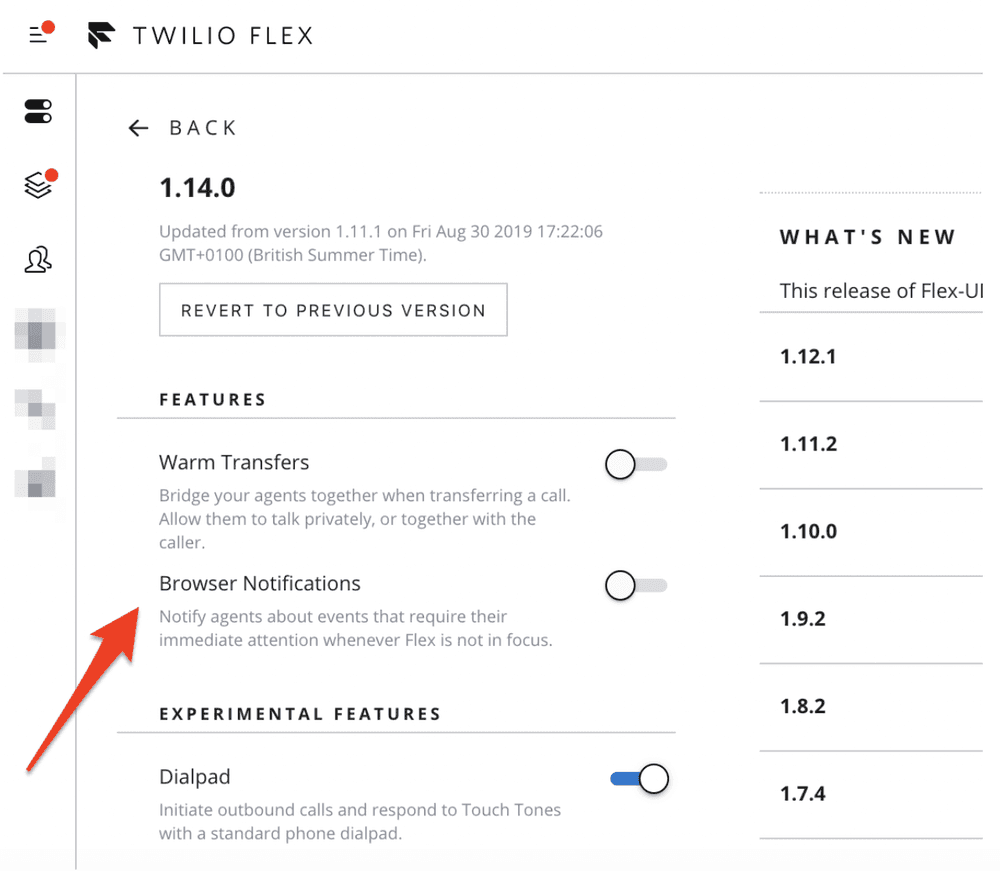
Browser notifications can be enabled via a feature flag. Go toFlex UI versions page in Twilio Console to turn browser notifications on or off.
Find out more about these and other capabilities of Flex Notifications Framework here
Customer presence
- Agent and supervisor will now be able to see an indicator of a WebChat customer reachability. It will show a green icon in the task canvas header and the task list item if the customer is online, and a grey one if offline.
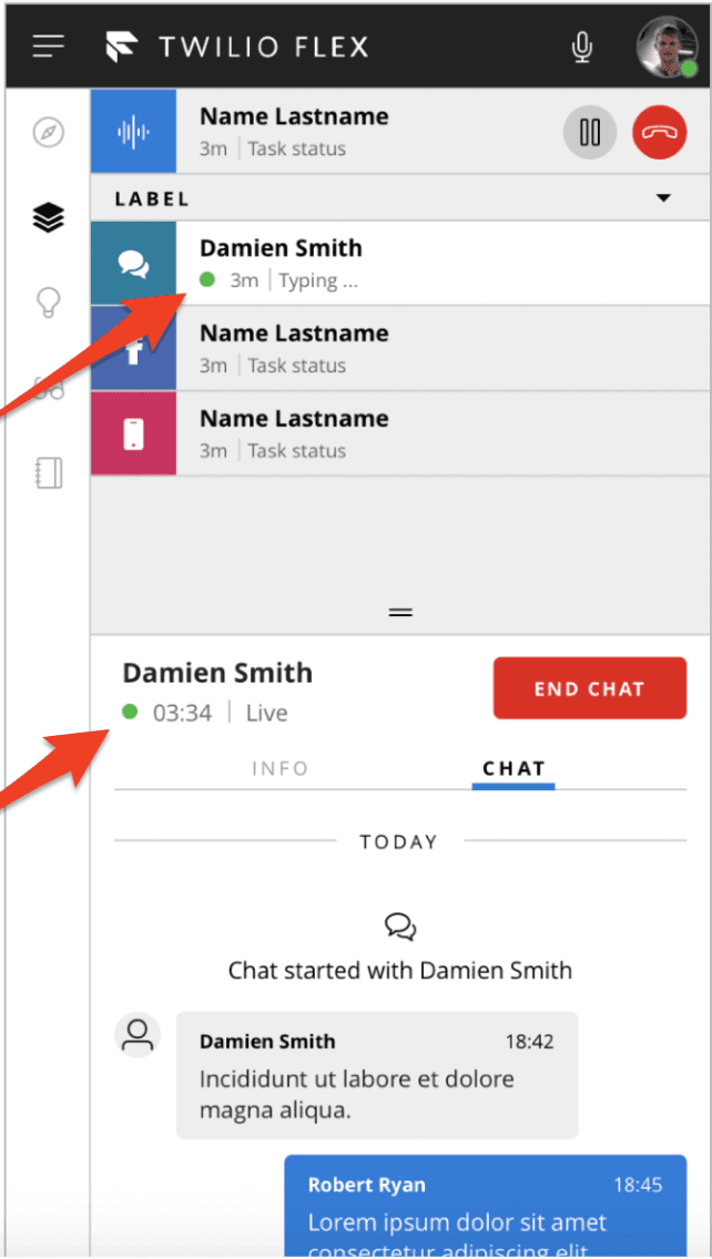
- You can customize the templates
TaskHeaderWebChatStatusAcceptedand/orTaskLineWebChatAssigned. For these templates, you can access the reachability status viahelper.chat.isCustomerOnline.
Typing indicator improvements
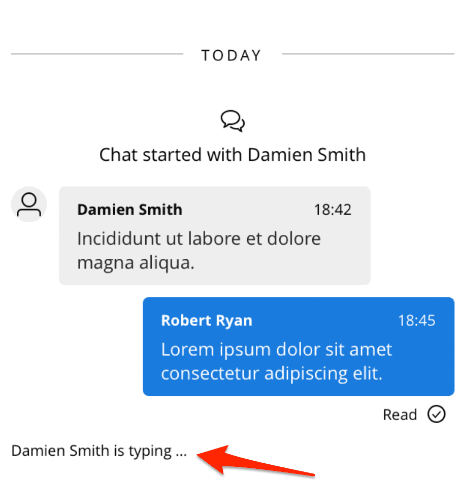
- Default template for second line of TaskListItem of WebChat tasks now includes string "typing ..." if there are participants typing in that chat.
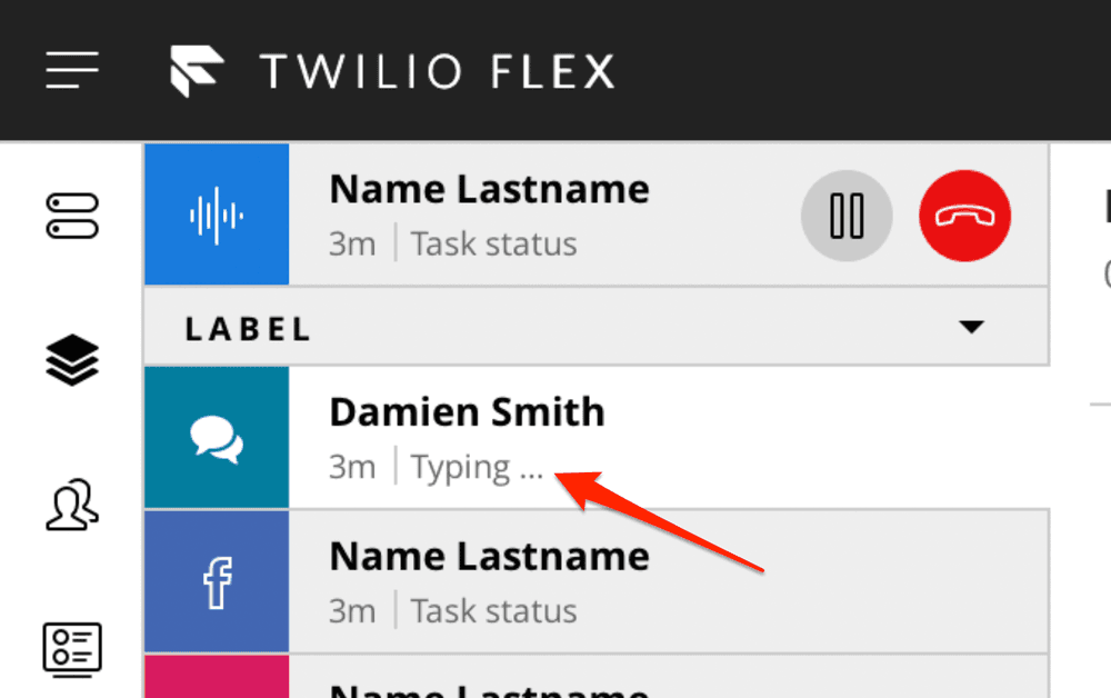
- Typing indicator in WebChat MessagingCanvas now shows count of people typing if that number is above 1.
Unread message count and badges
-
TaskListItemandSideNavnow has supports for showing Badges.- TaskListItem will show a badge with count if there are unread messages in the task
- SideNav will show a badge without a count if there are new unaccepted tasks or unread messages in any of the active messaging tasks in Agent Desktop View
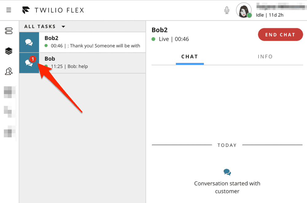
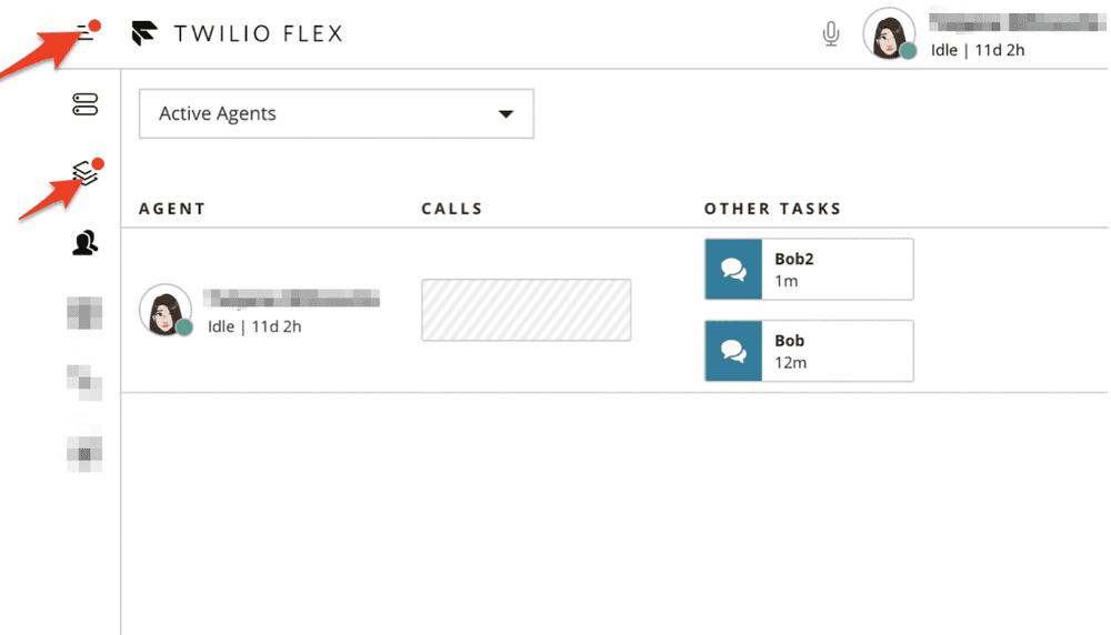
- The content of these badges is TaskChannel dependent and can be customized by updating its
componentProps.TaskListItem.Badge.childrenproperty. If the content equal to zero or undefined, no badge is going to be shown.
1myTaskChannelDefinition.componentProps.TaskListItem.Badge.children = (2appState: AppState,3context: TaskListItemProps & TaskContextProps4) => {5const badgeContent: number = applyCustomLogic(appState, context); // just an example6return badgeContent;7};
SideNavhas 2 new static properties (AgentDesktop &Teams) which represents link components for each view. It can be accessed to change the defaultBadgeproperty.
1Flex.SideNav.AgentDesktop.defaultProps.Badge = {2children: 23};
Markdown
Info
As of version 1.14.1 of Flex UI, numbered list support for Markdown has been temporarily suspended
Markdown
- Flex UI now has basic markdown support for WebChat tasks. A user can use Flex standard markdown syntax when typing a WebChat message and it will be displayed to agent and WebChat user as formatted text
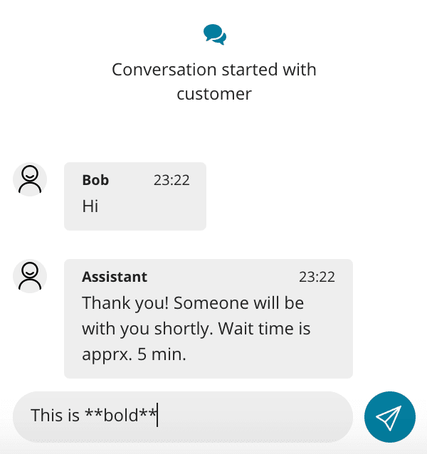
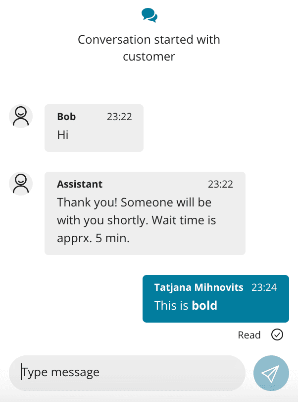
- Messages with using markdown syntax can also be sent with Programmable Chat REST API into the chat channel using the same Flex markdown syntax and they will displayed for Flex and WebChat users as formatted text.
- WebChat user must be using WebChat V2.2 or later
- Flex standard markdown syntax:
| Options | Syntax |
|---|---|
| Bold | **Bold** |
| Italic | *Italic* |
| Strikethrough | ~Strikethrough~ |
| Bullet list | * List * List * List |
| Numbered list | 1. One 2. Two 3. Three |
- Find out more about Markdown support here
Other
-
Introduced
ChatChannelHelperclass to wrap all Chat Channel specific helper methods. An instance of a task can be obtained fromTaskHelper.chatproperty.TaskHelper.lastChatMessagemethod was deprecated, useChatChannelHelper.lastMessageinstead. Now a developer can get access to Task last message, customer presence and typers (array of members who are typing in the channel). Available properties for this class:isCustomerOnline- Returns true if customer is online, false if notlastMessage- Gets helper for last chat messagetypers- Gets all channel members which are currently typing (except you)
-
Function
withTaskContextnow returns a correctly typed component instead of any. Therefore it may not be used as a class decorator anymore, but it must be called. This change may also result in new TypeScript errors surfacing incorrect prop types or similar issues. -
Content of localization strings changed:
TaskHeaderStatusAccepted- this string is no longer used for WebChat tasks. A new string has been introduced for thatTaskHeaderWebChatStatusAcceptedTaskLineChatAssigned- this string is no longer used for WebChat tasks. A new string has been introduced for thatTaskLineWebChatAssigned
-
"Login with Twilio" link on the Login View will open a Twilio login in a new window if Flex is rendered in an iframe element.
-
Improvements to Action Framework error handling:
invokeActionnow returns an Error when the Promise is rejectedToggleMute,HoldCall,UnholdCallandHangupCallto throw an Error instance instead of just an error string in case of a failure. This will allow to provide more detailed error description in the future and improves error tracing down the stack and identify which SDK the error came from.
-
The
useLocalStateprop ofMessageInputis enabled by default for performance improvement
- Update 'How to configure' CRM docs link URL
- Message Input now supports Input Method Editor, allowing to use characters and symbols that are not directly represented on the keyboard itself (like Chinese characters).
@twilio/flex-ui@1.13.0
release date AUG 29, 2019
- Custom Task Channel Definitions for Chat tasks which were not using chat as TaskRouter task channel, could have caused Flex not to load and initialize the chat channels for accepted tasks in previous sessions.
- All failures that occur during a call transfer will now be shown to a user as notifications
-
UI performance improvements
- We will now unmount WorkersDataTable when user navigates away from Teams View. This allows us to avoid performance consuming updates on Teams View, if user does not have it opened.
release date AUG 15, 2019
Contact center managers can now view a conversation of any messaging task (like Flex WebChat, SMS, WhatsApp, Facebook) between the agent and the customer in real-time. This feature allows managers to gain valuable insight, effectively train agents, solve problems and ensure that the contact center is meeting customer service standards.
@twilio/flex-ui@1.12.1
release date AUG 15, 2019
- Resolved
@types/uuidpackage causing issues withnpm installcommand on Windows platform
@twilio/flex-ui@1.12.0
release date AUG 14, 2019
- We have added an
AudioPlayerManager API,which makes it easier to add sound playback to your custom code when extending Flex UI. Read about it here. ChatOrchestratorobject now supports setting orchestrations based on a task. This will allow you to decide how to handle chat based tasks on per task basis.
1const orchestrationsCallback = (task: ITask) => {2if (task.sid === "WT12345") {3return [];4}5};6Flex.ChatOrchestrator.setOrchestrations("accepted", orchestrationsCallback);7
-
We have added ability to send DTMF tones during a voice call to all parties on the call. This includes:
- A new button to call toolbar to display DTMF Dialpad
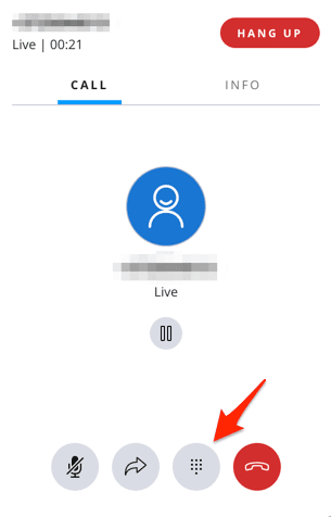
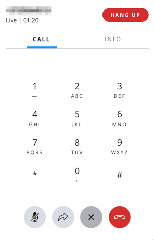
- A reusable Dialpad UI component
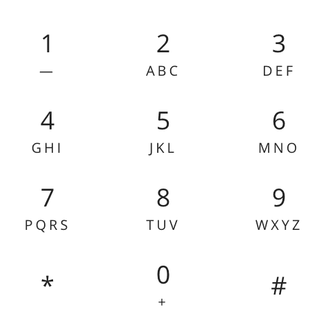
1export type DialpadButtonClickCallback = (value: string) => void;2export interface DialpadProps {3onClick: DialpadButtonClickCallback;4}5
-
2 new actions are introduced:
- An action
ToggleDTMFDialpadto open and closed Dialpad in the CallCanvas. - An Action
SetDTMFDialpadDigitsto set digits in the DTMF
- An action
Go to Actions Framework page for more details on actions and their payload.
IncomingTaskCanvasaction buttons are now a programmable componentIncomingTaskCanvasActions.You can now add, replace or remove these using programmable components content property or Task Channel Definitions API.
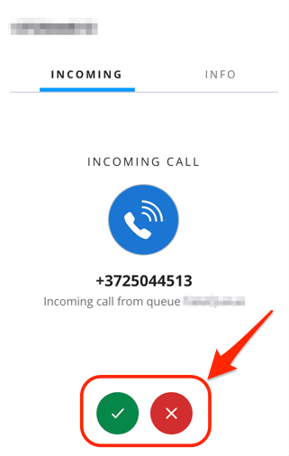
Example: Add an eye-iconed button to the end of the list of incoming task canvas actions using content property
Flex.IncomingTaskCanvasActions.Content.add(<IconButton key="hi" icon="Eye" />);
Example: Add an eye-iconed button to the end of the list of incoming task canvas actions using Task Channel Definitions API
1Flex.DefaultTaskChannels.Call.addedComponents = [{2target: "IncomingTaskCanvasActions",3component: <IconButton key="hi" icon="Eye" />,4}];5
-
Add new exports to refer to workers instead of agents:
WorkersDataTable, WorkerListFilterSelect, WorkersDataTable, WorkersDataTableProps and WorkerListFilter. -
Aria props properties to the following components to support accessibility:
-
MessageInput:
sendButtonAriaProps• AriaProps • Send button aria props ({ ariaLabel: "Send Message" }by default).textAreaAriaProps• AriaProps • Text area aria props ({ ariaLabel: "Enter your message here to get help" }by default)
-
MessageList:
listContainerAriaProps• AriaProps • List container aria props ({ ariaLive: AriaLive.Off }by default).
-
EntryPoint:
collapsedIconAriaProps• AriaProps • Collapsed icon aria props ({ariaLabel: "Click here to open Web Chat and get help."}by default).openedIconAriaProps• AriaProps • Opened icon aria props ({ariaLabel: "Hide Chat"}by default).
-
Example on how to set aria attributes:
1FlexWebChat.MessageInput.defaultProps.sendButtonAriaProps = {2ariaLabel: "Send Message",3ariaLive: FlexWebChat.AriaLive.Polite4};56FlexWebChat.MessageInput.defaultProps.textAreaAriaProps = {7ariaLabel: "Enter your message here to get help",8ariaLive: FlexWebChat.AriaLive.Assertive9};
- Chat "Send message" button can now be themed with
theme.Chat.MessageInput.Buttonand allows adding text
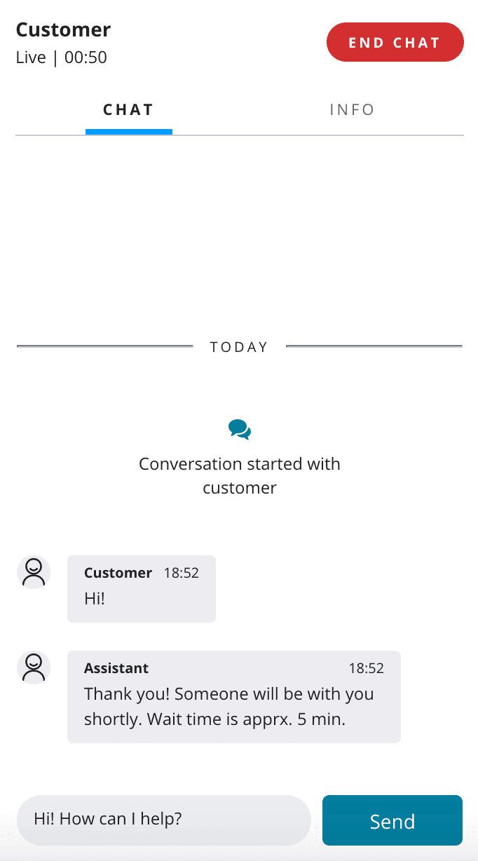
Example on how to change the icon for a text:
1appConfig = {2<...>3colorTheme: {4overrides: {5Chat: {6MessageInput: {7Button: {8borderRadius: "5px",9width: "100px",10fontSize: "10px",11svg: {12display: "none"13},14":after": {15content: '"Send"'16}17}18}19}20}21<...>
-
Facebook channel definition now expects channel type to be
Facebook -
Workers in Team View
WorkersDataTablewill now be correctly sorted and will maintain its proper position -
Team View performance improvements
- Fixed a bug that upon network reconnect started calling for Teams View info twice for every time needed resulting in deteriorating experience.
- Removed the need for all components that showed animating time to have its own timers which consumed resources and hit performance.
- Resolved root cause of occasional crashes that surfaced when user was trying to show more than 200 workers.
- Introduced throttling Sync queries for tasks and workers
-
Fixed exception thrown when rendering table rows
-
IconButtonnow has default hover tone dependent on whether theme is dark or light. -
Fixed chat crashing when media message is received.
MessageBubblenow displaysMediaMessageErrorstring on such message. -
Notifications.dismissNotificationByIdwill now dismiss ALL notifications by that ID
release date AUG 6, 2019
The Flex Plugin Builder v3 is now in Beta. This release enables you to build and deploy your plugins directly from the CLI by leveraging the Functions & Assets API. You can integrate the release of your hosted Flex plugins within a CI/CD pipeline.
To opt into the newest version, check our upgrade guide for using the Plugin Builder.
@twilio/flex-ui@1.11.2
release date JULY 4, 2019
- Agents in Team View now get correctly sorted and keep position.
@twilio/flex-ui@1.11.1
release date JULY 1, 2019
- Fixed issues with
Twilio.Flex.runDefault()removing search string from query path.
@twilio/flex-ui@1.11.0
release date JUNE 25, 2019
- [twilio-taskrouter] to version 0.4.0
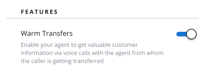
- Voice warm transfers - now an agent can have a consult call a conference call with a customer and another agent, and transfer the call to another agent. You can read more about voice warm transfers here. Warm transfers are released in public beta with an option of opt in/out via a feature flag. Go to the Flex UI versions page in Twilio Console to turn warm transfer on or off.
- A
legacyproperty toContextProvidercomponent. This resolves conflicts between multiplereact-reduxversions for self-hosted applications. We suggest not to use multiplereact-reduxversions, but if you need to use multiple versions, pass legacy={true}, then FlexContextProviderinstance will be rendered even with custom Redux store. - A
theme.FormComponents.SelecttoThemeto customize theSelect input item - A new property
useSeparateInputStoreintroduced in the payload for actionSetInputText. Setting it totrue, will store the message text in separate state and improves performance of typing in Chat/Messaging/SMS dialog when handling a task. From the next major release of Flex, this prop will be defaulted totrue. This can be changed by setting the new default propertyuseSeparateInputStoreofMessageInput.
Flex.MessageInput.defaultProps.useSeparateInputStore = true;
- Added
tasksAandtasksBarguments toAgentsDataTable.defaultProps.initialCompareFunction. This will allow to sort the list of agents based on task attributes rather than worker attributes. For example, you can do initial sort of the agents based on longest duration of the task.
Example:
1Flex.AgentsDataTable.defaultProps.initialCompareFunction = (a: Flex.IWorker, b: Flex.IWorker, tasksA: Array<Flex.ITask>, tasksB: Array<Flex.ITask>) => {2return tasksA.length - tasksB.length;3}
- Flex now loads only those chat channels that a worker is a member of and has an associated task with to optimize the loading time.
- Call task canvas will now go to new list mode if participants would not otherwise fit.
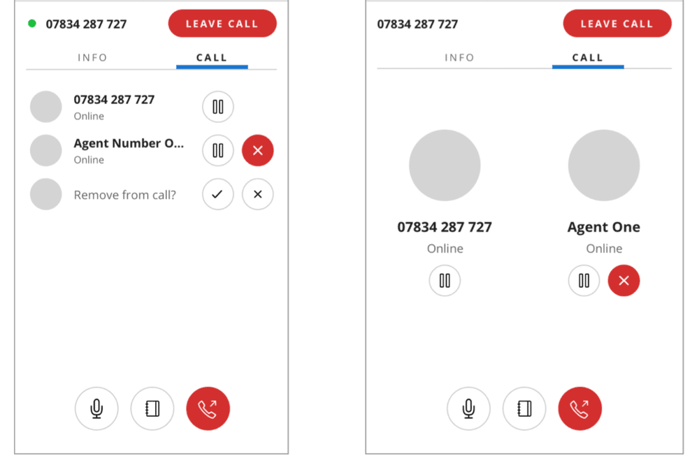
In order to change ParticipantCanvas when it is in list mode, developer will need to use ParticipantCanvas.ListItem.
Example: Adding a button to the bottom of the normal participant
Flex.ParticipantCanvas.Content.add(<button key="key">Hi</button>);
Example: Adding a button to the end of participant that is shown in a list
Flex.ParticipantCanvas.ListItem.Content.add(<button key="key">Hi</button>);
theme.FormComponents.TextAreanow applies to thetextareacontainer, not directly to the element itself. This is to enforce consistency between form item.
- Components properly inherit font property of the
RootContainer, thus allowing to change font consistently in whole application:
Example: How to set custom font for the whole Flex application
1appConfig = {2<...>3colorTheme: {4baseName: "FlexLight",5overrides: {6RootContainer: {7"font-family": "MyCustomFont"8}9}10}11
- Removed
colssupport for text area. - Removed export of
connectfunction which did not connect to correct Redux store. - Removed optional configuration URLs from TypeScript Config interface.
@twilio/flex-ui@1.10.0
release date JUNE 05, 2019
CallCanvasActionscomponent that is a set of buttons in the call canvas is now programmable. Now you can add, replace or remove buttons from the Call Canvas. This will allow you to add custom actions to live calls or remove actions you don't want users to take on a live call.
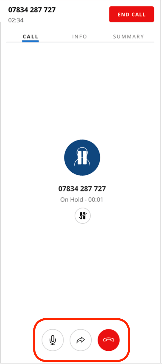
You can add and remove buttons using Content objectadd and remove methods or using Task Channel Definition API
Example: Add an eye-iconed button using Content object
Flex.CallCanvasActions.Content.add(<IconButton key="hi" icon="Eye" />)
Example: Add an eye-iconed button using Task Channel Definition API
1Flex.DefaultTaskChannels.Call.addedComponents = [{2target: "CallCanvasActions",3component: <IconButton key="hi" icon="Eye" />,4}];5
Supervisor.TaskCanvas.HeaderandSupervisor.WorkerCanvas.SectionCaptioncomponents were missing keys to override their themes. Now you can style TaskCanvas header and sub section header in WorkerCanvas respectively using Theme object
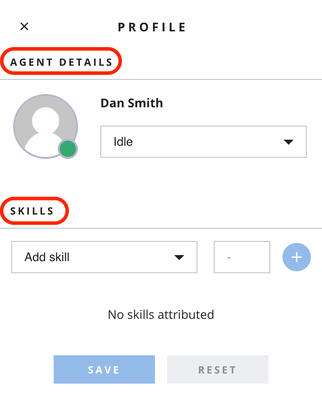
Supervisor.WorkerCanvas.SectionCaption
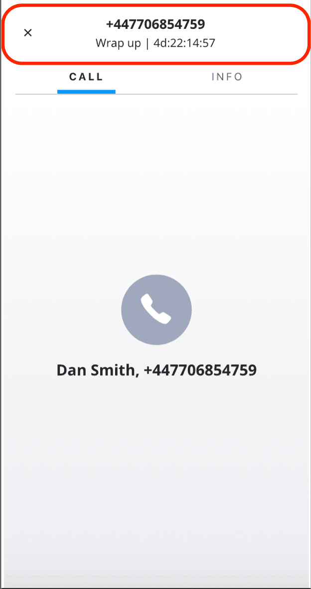
Supervisor.TaskCanvas.Header
@twilio/flex-ui@1.9.2
release date JUNE 03, 2019
- Resolves a situation that could result in an error when initiating supervisor monitoring
- Hold button was displayed in the opposite state to the actual call hold state
@twilio/flex-ui@1.9.1
release date MAY 28, 2019
initialFirstPanelSizecan be set withinConfigurationfor theAgentDesktopView.Panel1component
@twilio/flex-ui@1.9.0
release date MAY 20, 2019
- [twilio-chat] to version 3.2.3
- [twilio-client] to version 1.7.2
- [twilio-sync] to version 0.11.0
- [twilio-taskrouter] to version 0.3.1
- [@material-ui/core] to version 3.9.3
Setting component state
A new action SetComponentState has been added. This action alters the current state of the component. Component states is a componentName => key/value pairs dictionary in Redux store that this action manipulates. Read more about this action in Actions Framework.
Additional reducers
We have added 2 new methods to support adding additional reducers:
- Store enhancer
flexStoreEnhancerto support adding additional reducers.
Example:
1const myReduxStore = createStore(2reducers,3compose(4applyFlexMiddleware(),5flexStoreEnhancer // <-- Add enhancer part of compose6)7);
addReducerapi tomanager.storeto add additional reducer.
Example:
manager.store.addReducer("new", newReducer);
Chat Orchestration
ChatOrchestrator object can now be used to disable default chat orchestration.
-
There are three chat orchestrations that are supported and enabled by default:
AddToChatChannel- Request agent to be added to the chat channel (by default runs on theacceptedevent fromReservation)DeactivateChatChannel- Mark chat channel status asINACTIVE(by default runs onWrapupTaskandCompleteTaskactions and on thewrapupandcompletedevent fromReservationobject if it was not done already)LeaveChatChannel- Remove agent from the chat channel (by default runs onCompleteTaskaction and on thecompletedevent fromReservationobject if it was not done already)
-
Orchestrations can be disabled completely by invoking
ChatOrchestrator.clearAllOrchestrations(). -
Orchestrations can be enabled or disabled by Reservation events (
accepted,wrapup,completed) which affects corresponding actions as well. For example:- Disable orchestrations for
acceptedevent:Flex.ChatOrchestrator.setOrchestrations("accepted", []); - Disable marking chats channels as inactive:
Flex.ChatOrchestrator.setOrchestrations("wrapup", []); - Enable removing agent on
completedevent:Flex.ChatOrchestrator.setOrchestrations("completed", ["LeaveChatChannel"]);
- Disable orchestrations for
Setting activity state
Agents can move to an unavailable activity state even if they have pending reservations, and supervisors can set agents with pending reservations to an unavailable state. This capability can be disabled by setting the configuration option rejectPendingReservations to false or overriding it in the SetActivity action payload:
1Actions.addListener("beforeSetActivity", (payload) => {2payload.options.rejectPendingReservations = true;3});
-
AgentDesktopView.Panel1got a new default propertysplitterOrientationthat determines whether orientation of the content will be vertical, horizontal or automatic ("auto") based on content size. -
New localization strings added
TaskTabSupervisorCallLabel- Call task tab label in Supervisor task canvas.TaskTabSupervisorChatLabel- Chat task tab label in Supervisor task canvas.TaskHeaderStatusPending- Describes task that is in pending state. It's used in TaskCanvasHeader.TaskHeaderGroupCallAccepted- Describes conference call task that is in accepted state. It's used in TaskCanvasHeader.TaskHeaderStatusAccepted- Describes task that is in accepted state. It's used in TaskCanvasHeader.TaskHeaderStatusWrapup- Describes task that is in wrapup state. It's used in TaskCanvasHeader.TaskHeaderStatusCompleted- Describes task that is in completed state. It's used in TaskCanvasHeader.
-
TaskCanvasHeadernow accepts a new propsecondLineTemplateCode. By default it describes the status of the task. -
Added
callSidto Participant object inConferencesstate.
-
Chat orchestration failure now can prevent action invocations:
- If chat orchestration fails to mark the chat channel inactive, then
WrapupTaskaction will fail. - If chat orchestration fails to remove agent from chat channel, then
CompleteTaskaction will fail.
- If chat orchestration fails to mark the chat channel inactive, then
-
Chat orchestration will update chat channels as inactive on the Reservation
wrapupevent (if it did not happen inWrapupTaskaction already) -
Custom components are encouraged to use
withThemedecorators to injectthemeprop -
Following type definitions are changed for consistency:
CallCanvasPropsrenamed toCallCanvasChildrenPropsTaskCanvasPropsrenamed toTaskCanvasChildrenPropsNoTaskCanvasPropsrenamed toNoTaskCanvasChildrenPropsParticipantsCanvasPropssplit in aParticipantsCanvasPropssubset andParticipantsCanvasChildrenPropsTaskCanvasHeaderPropssplit in aTaskCanvasHeaderPropssubset andTaskCanvasHeaderChildrenPropsTaskCanvasTabsPropssplit in aTaskCanvasTabsPropssubset andTaskCanvasTabsChildrenPropsTaskInfoPanelPropssplit in aTaskInfoPanelPropssubset andTaskInfoPanelChildrenPropsMainHeaderPropssplit in aMainHeaderPropssubset andMainHeaderChildrenPropsAgentDesktopViewPropssplit in aAgentDesktopViewPropssubset andAgentDesktopViewChildrenPropsLoginViewPropssplit in aLoginViewPropssubset andLoginViewChildrenPropsTeamsViewPropssplit in aTeamsViewPropssubset andTeamsViewChildrenPropsCRMContainerPropssplit in aCRMContainerPropssubset andCRMContainerChildrenPropsLiveCommsBarPropsrenamed inLiveCommsBarChildrenPropsMainContainerPropssplit in aMainContainerPropssubset andMainContainerChildrenPropsMuteButtonPropssplit in aMuteButtonPropssubset andMuteButtonImplPropsRootContainerPropsrenamed inRootContainerChildrenPropsSideNavPropssplit in aSideNavPropssubset andSideNavImplPropsTaskListButtonsPropsrenamed inTaskListButtonsChildrenPropsViewCollectionPropssplit in aViewCollectionPropssubset andViewCollectionImplProps
-
SupervisorTaskCanvastabs title changed from "Overview" to "Call" or "Chat" based on the type of task.
@twilio/flex-ui@1.8.2
release date MAY 8, 2019
- Resolves a situation that could cause Flex to error while logging in
@twilio/flex-ui@1.8.1
release date MAY 6, 2019
- Hold/Unhold buttons on CallCanvas correctly call
HoldCall/UnholdCallActions
@twilio/flex-ui@1.8.0
release date APR 26, 2019
TaskListButtonscomponent that is the set of buttons in a tasklist item is now programmable (buttons can be added/removed). Example that shows a button as the last button for call tasks that have status as "accepted":
1const shouldShow = (props) => {2return props.task.status == "accepted";3};45Flex.DefaultTaskChannels.Call.addedComponents = [{6target: "TaskListButtons",7component: <IconButton key="eye_button" icon="Eye" />,8options: {if: shouldShow}}];
- Action buttons will be disabled after user click until the action execution is finished to prevent users from invoking the action twice.
- Actions
ToggleSidebarare introduced with following payload:
1{2open?: boolean; // used to explicitly open or close the sidebar.3}
- Restored backwards compatibility with the first versions of the Dialpad plugin
- General Flex UI styles (like headers, paragraphs or links) are now applied only to HTML elements that have a class starting with
Twilioor their direct descendants without any class. The CSS attributes that are meant to be inherited are now under theTwilio-CommonStylesclass.
@twilio/flex-ui@1.7.4
release date MAY 8, 2019
- Resolves a situation that could cause Flex to error while logging in
@twilio/flex-ui@1.7.3
release date MAY 6, 2019
- Resolves JS error when a messaging task is accepted
- Hold/Unhold buttons on CallCanvas correctly call
HoldCall/UnholdCallActions
@twilio/flex-ui@1.7.2
release date APR 26, 2019
- Restored backwards compatibility with the first versions of the outbound dialer plugin
@twilio/flex-ui@1.7.1
release date APR 5, 2019
- New template
TaskLineTitleused for default task channel inIncomingTaskCanvas
- Incoming task canvas failed to render for generic/custom task channels
@twilio/flex-ui@1.7.0
release date MAR 29, 2019
This release contains several minor fixes, some internal refactoring and foundational work for Warm Transfers
@twilio/flex-ui@1.6.2
release date APR 26, 2019
- Restored backwards compatibility with the first versions of the outbound dialer plugin
@twilio/flex-ui@1.6.1
release date MAR 28, 2019
- Breaking issues with
historypackage imports (affected the self-hosted builds) - Mitigation for multiple reservation events after connection drops
@twilio/flex-ui@1.6.0
release date MAR 12, 2019
- Call monitor works on calls delivered to agents on non-client endpoints, like hardphone or SIP
- Visual update for voice call stage
@twilio/flex-ui@1.5.0
release date FEB 18, 2019
- WFO identity client integrated and exposed through
Twilio.Flex.Wfo.Identity - New 'untrustedDomain' exception on login attempts from non-whitelisted domains
- TaskSid and ReservationSid are added to Task Info Panel for easier troubleshooting
- Flex now requires
<meta name="referrer" content="no-referrer">element to be present in<head>section of HTML. If such element does not exists then Flex will issue additional browser redirect in login flow after returning from IdP (and token is present in the URL). - Deprecated
ReservedandAssignedkeys inTaskStatusBasedTypeBasefor task channel definitions. Use newAcceptedkey for reservation accepted state. - On logout, try to detect 'Offline' activity by "sid" (
serviceConfiguration.attributes.taskrouter_offline_activity_sidand, if that's not provided, fallback to the name. You can now change the name of the 'Offline' activity and users will still be set that activity on logout, or choose a completely different activity that users should be set to on logout, by changingserviceConfiguration.attributes.taskrouter_offline_activity_sidin the Configuration Service
- Use
Pendingtask based status key from task channel definition if bothPendingandReservedwere defined forTaskStatusBasedTypeBase - Agent status in Agent Profile of Teams View now updates correctly, even if Agent is no longer shown in the list
@twilio/flex-ui@1.4.1
release date FEB 6, 2019
- "Active Agents" filter on the Teams View will find all agents in any activity that is
available
@twilio/flex-ui@1.4.0
release date JAN 11, 2019
- Transfers call disconnect issue has now been fixed. Call Tasks will now be accepted with
endConferenceOnExitset totrue, so when agent ends the call the call will be ended for the customer as well. There is no reason anymore to override theacceptTaskaction to achieve this.
- Removed the
disabledTransfersconfig option as it is obsolete due to the fixed know issue with Transfers call disconnect
- Supervisor will now be able to change any agent's activity state in the Teams View
- Agent activity duration will now be shown for the agent in the Main Header of the app and for supervisor in the Teams view
- Plugin service will now be enabled by default
@twilio/flex-ui@1.3.3
release date JAN 10, 2019
- When clicking in the middle of the entered text in the chat input field, cursor automatically jumped to the end
- Started consuming v0.2.15 of TaskRouter JS SDK
@twilio/flex-ui@1.3.2
release date JAN 9, 2019
- Insert global Flex styles into the head of the document even if other styles are not there
- When loginPopup is configured, two SSOLoginHandlers become active, which cause side effects for logout action and token updates
@twilio/flex-ui@1.3.1
release date DEC 20, 2018
- Race condition that resulted in "no-current-call" error when accepting a call
@twilio/flex-ui@1.3.0
release date DEC 19, 2018
Voice
- Global mute button indicated muted state even after the call had ended.
Messaging
- Fixed UI issues with Chat input when shift+enter is pressed.
Plugins
- New FlexEvent
FlexEvents.pluginsLoadedthat fires after all plugins have finished loading. - Exposed common dependencies like
React,ReactDOM,ReduxandReactReduxto window object for plugins to depend on.
Actions
MonitorCallaction payload got a new paramextraParamsthat is the equally named TR SDK param forReservation.monitorcall. It is optional and UI does not set it, but developer can alter it via programmability if need be.- Error notification when browser is unable to access microphone.
- New option
isolateforrouterconfiguration section: whenever set to true, Flex will ignore any navigation action (including URL change) except for internal. - Registered a
beforeSendMessageaction to check if the message exceeds the limit and handle it accordingly. - Support for promises to Actions framework. Now, if a before-action listener returns a Promise, the Actions framework will wait for it to be resolved before completing the action. This change is back-compatible, so a lister can still return nothing.
SendMessageaction got optionalmessageAttributesproperty to its payload that, if specified, will be used as the equally named property of the Chat SDKsendMessagecall.
Views and routing
- Default route may now be changed via
componentPropsby settingdefaultLocationproperty forViewCollection. - Flex navigation action type is exposed through
FLEX_LOCATION_CHANGEconstant. It can be used to listen to Flex navigation actions or do dispatch Flex-specific navigation actions.
Voice
disableBrowserVoiceoption for configuration. When specified Twilio Client SDK (for Browser voice capability) will not be initialized. Attempting to accept a task that is voice and with worker'scontact_urinot pointing to a phone number, the attempt is blocked and warning is shown.
Messaging
-
Character limit added to messages sent by agent. Character count indicator will be shown below text input when agent exceeds the limit. Character limits per channel:
- SMS - 1600 characters
- Web chat - 32768 characters (32 kB)
- Channels (Facebook, Line, WhatsApp) - 4000 characters
-
Character limit information added to Task Channel Definition API as a new prop
charLimit
SSO login
- SSO login in pop-up window support added.
config.sso.loginPopup = truecan be set to enable it. To gracefully handle blocked popups, newLoginFormViewReact component orprovideLoginInfoortryLoginTwilio.Flex API function can be used to launch it. Additionally pop-up window features forwindow.open()function can be set inconfig.sso.loginPopupFeaturesconfiguration variable as string. - New API functions to run or log user in to Flex using
Twilio.Flexinterface:
1/**2* Runs Flex with default setup.3* It will show loader and prompts for login information4* if it is not provided in configuration object.5*6* @param [config] configuration object7* @param [nodeOrSelector] DOM node or selector string where to render Flex8* @returns {Promise<void>}9*/10export function runDefault(config: Config = {}, nodeOrSelector: string | Element = "body"): Promise<void>;1112/**13* Tries to log user in to Flex.14* Can redirect the current browser window to the IdP URL or15* open a new window to navigate to IdP URL if config.loginPopup is set.16*17* @param [config] SSO configuration object18* @return {Promise<boolean>} true if there is valid token and user can be logged in.19*/20function tryLogin(config: SSOConfig = {}): Promise<boolean>;2122/**23* Helper function to provide additional account and user info if it is not set.24* Updates the provided config object.25*26* Renders a LoginFormView component if accountSid is not provided or there are problems with signing user in.27*28* @param [config] configuration object29* @param [nodeOrSelector] DOM node or selector string where to render the component30* @returns {Promise<void>} if resolved, then Flex instance can be created with31* provided config object.32*/33function provideLoginInfo(config: Config = {}, nodeOrSelector: string | Element = "body"): Promise<void>;
- New
LoginFormViewReact component to be used to provide account / user info with the following props:
1interface LoginFormViewProps {2onSuccess: (determinedConfig: Config) => any;3userConfig: Config;4}
- New strings for
LoginFormViewcomponent:
1LoginContinue: "Continue anyway",2LoginLaunch: "Launch",3LoginTitle: "Twilio Flex",4LoginErrorDomain: "Oops! Your runtime domain is incorrect.",5LoginErrorDomainDetails: "Find your runtime domain " +6"<a href='https://www.twilio.com/console/runtime/overview'>here</a>",7LoginErrorSso: "Hmm, Single Sign-On has not been configured.",8LoginErrorSsoDetails: "Find out how to configure Single Sign-On " +9"<a href='https://www.twilio.com/console/flex/users/single-sign-on'>here</a>",10LoginErrorPopupBlocked: "Sorry, pop-ups are blocked.",11LoginErrorPopupBlockedDetails: "Find out how to enable pop-ups in your browser",12LoginErrorGeneric: "Oops! Well, that didn't work :( Please double check your configuration.",13LoginIsAdmin: "Flex Admin?",14LoginWithTwilio: "Login with Twilio.",
Views and routing
Viewnow has multiple route path support. By defaultnameprop is taken as string to be added to the path of the specifiedView. One can add alternative routes withrouteprop.
Example:
1<View key="teams" name="teams" route={{ path: "/supervisor" }}> // both http:/domain/teams and http://domain/supervisor will work23<View key="teams" name="teams" route={{ path: ["/supervisor", "something"] }}> // both http:/domain/teams and http://domain/supervisor and http://domain/something will work
ViewCollectionwas not using DynamicComponent properly so all manipulations of it other thanaddvia programmability did not work.
Voice
- Global mute button will be disabled if there are no active calls.
- Moved reset CSS to top of head to allow any custom CSS to override it.
@twilio/flex-ui@1.2.0
release date NOV 22, 2018
- Use react and react-dom version 16.5.2
- Performance optimization for Teams view
baseNamestheme names changed
| Deprecated name | New Theme name |
|---|---|
| DarkTheme | GreyDark |
| MediumTheme | GreyLight |
| BlueMediumTheme | FlexLight |
| BlueDarkTheme | FlexDark |
- "Active agents" filter is set as default in Teams View
- Switch from
icontolabelinTablabel components in agentTaskCanvasTabsand supervisorTaskCanvas
- New localization strings for TaskTabAgentIncomingLabel, TaskTabAgentCallLabel, TaskTabAgentChatLabel, TaskTabAgentInfoLabel, TaskTabSupervisorInfoLabel and TaskTabSupervisorOverviewLabel
1export interface Strings<T = string> extends FrameStrings<T> {2...3TaskTabAgentIncomingLabel?: T;4TaskTabAgentCallLabel?: T;5TaskTabAgentChatLabel?: T;6TaskTabAgentInfoLabel?: T;7TaskTabSupervisorInfoLabel?: T;8TaskTabSupervisorOverviewLabel?: T;9}
ViewsofViewCollectiongot a new propmountRule. If specified,keepMountedprop value is ignored. Definition of the prop is as follows:
1export enum ViewMountRule {2Always = "Always", // View is mounted from the start of the application and never unmounted3WhenActive = "WhenActive", // Views is mounted when activated and unmounted when deactivated4WhenHasBeenActive = "WhenHasBeenActive" // View is mounted when first activated and never umounted5}
@twilio/flex-ui@1.1.0
release date NOV 6, 2018
- TypeScript definitions of the package were referencing some missing files
- Regular agents were not able to open up directory button for transfers
- MainHeader now again accepts changing logoUrl default property
- CRMContainer and MessagingCanvas did not pass props down to their custom children
- Issues with broken UI when using custom store
- Ability to transfer calls to a Queue from Directory Component (previously only workers were present there)
- Action
TransferTaskwas introduced. As with all other Task specific actions, if calling it, eithertaskorsidmust be specified, the other is autofilled then accordingly. When tapping into the action either with events or task replacement, both will be filled at execution time. Payload of the action:
1{2sid?: string; // sid of the ITask to transfer3task?: ITask; // ITask object representing the Reservation being transferred4targetSid: string; // sid of the Worker or Queue where the task should be transferred to5options?: Object // options passed over to TaskRouter SDK transfer call. Refer to TaskRouter SDK documentation on Task.transfer option values.6}
- Add optional
labelproperty to theTabcomponent. When provided, it will display a label into theTabelement. If the value matches a code in language strings array, the contents of the language string is used as template. Otherwise the value is used as just string. Iflabelis not provided,iconproperty is considered and used. - Add optional
alignmentproperty toTabs. When provided, it will change the tabs alignment. Possible values areleftorcenter. Default iscenter.
Info
New GA version of Flex UI has been released and are now available on NPM
- @twilio/flex-ui@1.0
- Tasks can now be transferred to another available agent from Call Canvas via new Worker Directory.
- To enable call transfers, calls will be currently accepted with
endConferenceOnExitset tofalse, meaning that the call will not stop for customer when agent stops the call. - As alternative to the above,
disableTransfersconfig options was created. By defaultfalse, if set to true, theendConferenceOnExitwill be enabled but transfers to other agents will not be available. - Agent Skilling. Can be disabled by setting
WorkerCanvascomponent propshowSkillstofalse. public_identityfrom worker attributes gets set to agent's chat user friendly name. If that is not set, thenfull_nameattribute is used.- Call recording can be enabled from configuration service.
-
All actions that had
taskSidin payload will now expectsidinstead. Potential breaking change! -
Task object in Actions framework got new field
sourceObjectwhich will be pointing to the actual SDK object. Reservation in case of TaskRouter, InsightsObject in case of Insights (Supervisor views).sourceis still there but is deprecated. -
Some actions got changed payload
SetActivitycan now be called with justactivityNamein the payload.SelectTaskInSupervisornow expects/provides object as payload in form of{task?: ITask, taskSid?: string}. Providing either will autofill the other also so both will be available for whoever taps into the action via Actions framework.SelectWorkerInSupervisornow expects/provides object as payload in form of{worker?: ITask, workerSid?: string}. Providing either will autofill the other also so both will be available for whoever taps into the action via Actions framework.MonitorCallnow expects/provides object as payload in form of{task?: ITask, taskSid?: string}. Providing either will autofill the other also so both will be available for whoever taps into the action via Actions framework.
-
Chat channels need to be created by channel orchestration service for agent to be able to join them.
-
Templates and channel definitions use
channelTypeattribute from task to detect chat channel type.
- Styling
- Avatar callback
Changed
- Consume @twilio/flex-ui@0.14.0
Changed
SetActivityaction now has payload in the form of{activitySid: string; activityName?: string; activityAvailable?: boolean}. OnlyactivitySidis used in default implementation and are required when invoking the action by user, but other two are filled for better context for users who override the action and need more information on what the new activity will be.- Property
tasktype changed toITaskfor task based components. Previously TaskState interface was used which had onlysourceandreservationproperties. Propertiessourceandreservationstay the same as they used to, but now attributes and other task properties can be accessed fromtaskobject itself. For examplethis.props.task.attributescan be used where applicable and there should be no need to usesourcesub property anymore which is referring to Task Router SDK object. - Consume TR 0.2.8 with Reservation based task completion. Special account flag needed for everything to work properly.
- Tasks in store are referenced by reservation sid now
Added
- Components can be removed using Task Channels API:
1export type TaskChannelComponentRemoveRequest = {2target: keyof FlexComponents;3key: React.Key;4options?: RemoveComponentCallOptions;5};6TaskChannelDefinition.removedComponents?: Array<TaskChannelComponentRemoveRequest>;78// For example:9myOwnChatChannel.removedComponents = [10{ target: "TaskCanvasTabs", key: "info" }11];
- TaskContext - Flex sets up Task Context using React Context API where it knows about an active or selected task. If Task has been selected in Agent Desktop View or Teams View then it can be obtained from Context. Interface of the TaskContext is shown below. Also
withTaskContexthelper function has been added that creates a HOC which adds the properties to the wrapped component.
1export interface TaskContextProps {2task?: ITask; // Task we are referring to, undefined if there is no task in context3call?: PhoneCallState; // Call state that current task if related to, undefined if there is no task in context or there is no call for a task4chatChannel?: ChatChannelState.ChannelState; // Chat channel state that current task if related to, undefined if there is no task in context or there is no chat for a task5channelDefinition?: TaskChannelDefinition; // Matched task channel definition for a task, undefined if there is no task in context6}
- Using
TaskContext.Consumer:
1import { withTaskContext } from "@twilio/flex-ui";23const MyComponent: (props) => {4return (5<div>{props.task.attributes.someAttribute}</div>6);7}89const MyComponentWithTask = withTaskContext(MyComponent);10// Register MyComponentWithTask component to Flex instead of MyComponent11
- Using
withTaskContext:
1import { withTaskContext } from "@twilio/flex-ui";23const MyComponent: (props) => {4return (5<div>{props.task.attributes.someAttribute}</div>6);7}89const MyComponentWithTask = withTaskContext(MyComponent);10// Register MyComponentWithTask component to Flex instead of MyComponent
Added
Component.Content.remove to allow removing components from dynamic component children (both native and programmatically added ones).
Syntax:
Component.Content.remove(key: string, options: {if?: (props: any) => boolean})
where
key- key of the component to be removedif- Boolean expression that decides at any given moment whether the removal should be active.propsparameter is the object of all properties passed by the main component to children.
Example: removes avatar from the canvas that shows "you have no tasks", but only if the user's name is not Bob.
Flex.NoTasksCanvas.Content.remove("avatar", {if: props => props.worker.attributes.full_name !== "Bob"});
Changed
- Consume @twilio/flex-ui@0.13.0
Removed
- Individual module files in the NPM module removed. All sources bundled into a single module bundle file referenced by the
mainfield in package.json. - Components
TaskListChatItemandTaskListCallItem- can be customized not using Task Channels API. Or useTaskListItemto use them all. - Theme property
AltContainerandIconArea; and component propertyalternateColorsremoved fromTaskListItemcomponent. - Theme property
colors.channelColorsremoved. Channel colors are defined in Task Channel now.
Changed
- Rendering tasks from all channels now in TaskList using default task channel definition.
- All channels are defined by Task Channels API.
Added
- Incoming call notification bar
- In case of pending tasks Nav Bar is going to show red dot on top of main and agent-view button
- Task Channels API. See below for more detailed description and information about usage,
All task channels that Flex handles are defined and registered by Task Channels API. Flex registers its default Task Channel definitions (see below), but users and plugins can register their own. When Flex task based components are rendered, the first matching channel definition for a given task will be used. If there is more than one channel definition match for a task, then most recently registered definition will be used (so that you can register more specific channel definition).
See below interface TaskChannelDefinition for what can be set up. All parameters are optional meaning that ones from Default task channel definition will be used if not specified. The most important property of a task channel definition is isApplicable callback function. The callback receives a task as argument and must return Boolean true if this definition can be used to handle given task.
In a task channel definition you can specify:
- callback to determine which tasks are applicable
- strings (templates) to use in different Flex components based on task status
- colors to be used in task list based on task status
- icons to be shown in task list, tabs and canvases based on task status
- custom components to be added to task based components if channel is applicable
- custom components to be replaced in task based components if channel is applicable
Predefined Task Channels definitions are available via Twilio.Flex.DefaultTaskChannels objects for reference. Channels that are defined by default:
- Call -
Twilio.Flex.DefaultTaskChannels.Call - Chat -
Twilio.Flex.DefaultTaskChannels.Chat - Chat SMS -
Twilio.Flex.DefaultTaskChannels.ChatSMS - Chat Line -
Twilio.Flex.DefaultTaskChannels.ChatLine - Chat Messenger -
Twilio.Flex.DefaultTaskChannels.ChatMessenger - Chat WhatsApp -
Twilio.Flex.DefaultTaskChannels.ChatWhatsApp - Default -
Twilio.Flex.DefaultTaskChannels.Default
It is not recommended to change Twilio.Flex.DefaultTaskChannels them at runtime. You should create your own definition and register it instead.
Flex has the following helper functions to create channel definitions with default values for chat, call and generic: Chat channel creation with default chat templates:
1Flex.DefaultTaskChannels.createChatTaskChannel(name: string, isApplicable: TaskChannelApplicableCb,2icon: string | React.ReactNode = "Message", iconActive: string | React.ReactNode = "MessageBold", color: string = defaultChannelColors.chat): TaskChannelDefinition
Call channel creation with default templates. Call channel definition uses callbacks to determine the icon and colors (based on call state and destination to render):
Flex.DefaultTaskChannels.createCallTaskChannel(name: string, isApplicable: TaskChannelApplicableCb):: TaskChannelDefinition
Default channel creation with default templates.
Flex.DefaultTaskChannels.createDefaultTaskChannel(name: string, isApplicable: TaskChannelApplicableCb, icon: string | React.ReactNode = "GenericTask", iconActive: string | React.ReactNode = "GenericTaskBold", color: string = defaultChannelColors.custom): TaskChannelDefinition
To register a task channel definition use Flex.TaskChannels.register(definition: TaskChannelDefinition, mergeWithDefaultChannel = true). You must register your channel definitions before Flex starts up.
Example:
1const myOwnChatChannel = Flex.DefaultTaskChannels.createChatTaskChannel("myChat",2(task) => task.taskChannelUniqueName === "chat" && task.attributes.somethingSpecial === "mycCustom");3// can modify myOwnChatChannel here45Flex.TaskChannels.register(myOwnChatChannel);
Also new the following API exists: Flex.TaskChannels.unregister(myOwnChatChannel); - to unregister previously registered channel Flex.TaskChannels.getRegistered(); - to get all registered task channelsFlex.TaskChannels.getForTask(task: ITask); - to get a matching task channel definition for a task
Interface of TaskChannelDefinition:
1export enum TaskChannelCapability {2Info = "Info", // whether channel has info panel3Call = "Call", // whether channel has call canvas capabilities4Chat = "Chat", // whether channel has chat canvas capabilities5Video = "Video", // whether channel has video calling capabilities6Wrapup = "Wrapup" // whether channel needs to go to Wrapup state before can be completed7}89export type TaskCallbackType<T> = (task: ITask, componentType: React.ComponentType, ...args) => T;10export type TaskStatusBasedTypeBase<T> = {11Reserved: T;12Assigned: T;13Wrapping: T;14Completed: T;15Canceled: T;16Pending: T;17};18export type TaskStatusBasedType<T = string> = T | TaskCallbackType<T> | TaskStatusBasedTypeBase<T>;19export type TaskChannelApplicableCb = (task: ITask) => boolean;2021export type TaskChannelComponentRegistration = {22target: keyof FlexComponents;23component: React.ReactChild;24options?: ContentFragmentProps;25};2627/**28* Defines a task channel29*30* @export31* @interface TaskChannelDefinition32*/33export interface TaskChannelDefinition {3435name: string;3637/**38* Used in TaskList, TaskCard, Canvases39*/40colors?: {41main?: TaskStatusBasedType<string>;42};4344/**45* Returns whether this task channel is applicable for a given task.46* @param task task instance to evaluate the channel for47*/48isApplicable: TaskChannelApplicableCb;4950/**51* Icons to render to the task channel52*/53icons?: {54/**55* List icon to be used in TaskList and TaskCardList56*/57list?: TaskStatusBasedType<string | React.ReactNode>;58/**59* Icon to be used in Tab headers if tab is not selected60*/61main?: TaskStatusBasedType<string | React.ReactNode>;62/**63* Icon to be used in Tab headers if tab is selected and in Task Canvases as the main icon64*/65active?: TaskStatusBasedType<string | React.ReactNode>;66};6768/**69* Templates for components70*/71templates?: {72IncomingTaskCanvas?: {73firstLine?: TaskStatusBasedType<string>;74secondLine?: TaskStatusBasedType<string>;75};76CallCanvas?: {77firstLine?: TaskStatusBasedType<string>;78secondLine?: TaskStatusBasedType<string>;79};80TaskListItem?: {81firstLine?: TaskStatusBasedType<string>;82secondLine?: TaskStatusBasedType<string>;83extraInfo?: TaskStatusBasedType<string>;84};85TaskCanvasHeader?: {86title?: TaskStatusBasedType<string>;87endButton?: TaskStatusBasedType<string>;88};89TaskCard?: {90firstLine?: TaskStatusBasedType<string>;91secondLine?: TaskStatusBasedType<string>;92};93TaskInfoPanel?: {94content: TaskStatusBasedType<string>;95};96Supervisor?: {97TaskCanvasHeader?: {98title?: TaskStatusBasedType<string>;99endButton?: TaskStatusBasedType<string>;100};101TaskInfoPanel?: {102content: TaskStatusBasedType<string>;103};104TaskOverviewCanvas: {105firstLine?: TaskStatusBasedType<string>;106secondLine?: TaskStatusBasedType<string>;107}108}109};110111/**112* Set of capabilities, used to render Tabs113*/114capabilities: Set<TaskChannelCapability>;115116/**117* Custom components to be added for this task channel. E.g. custom Tabs. Supports only components that have a static "Content" property118*/119addedComponents?: Array<TaskChannelComponentRegistration>;120121/**122* Custom components to be replaced for this task channel. Supports only components that have a static "Content" property123*/124replacedComponents?: Array<TaskChannelComponentRegistration>;125126}
Changed
- Requiring key property for all custom components passed to
Component.Content.register/add. E.g.<div key="custom-key"/>.
Removed
- Individual module files in the NPM module removed. All sources bundled into a single module bundle file referenced by the
mainfield in package.json.
Added
- Add Circular Progress component
Changed
- Consume @twilio/flex-ui@0.12.0
- Custom redux store sample updated
Changed
- An optional SSO config option
sso.tokenRefreshIntervalMschanged tosso.tokenRefreshThresholdMsto specify a threshold in milliseconds when token will be updated before it is expired - TaskListContainer will now render only a single TaskList with static filter set as a property
- TaskList is animating now when task come and go
- "HoldCall" will no longer toggle the hold state but will be meant only for call holding. Separate "UnholdCall" action was added.
SupervisorDesktopViewcomponent renamed toTeamsView- Template
SideNavSupervisorViewrenamed toSideNavTeamsView
Added
-
Showing a notification bar when session token expires.
-
Added
staticFilterprop added to TaskList for stand-alone use. -
Show a call bar to indicate an ongoing call when not viewing Agent Desktop
-
Added a few containers to Theme to accommodate more theming
- MainContainer - CSS props for lowest level container that includes the whole application except Main Header and SideNav
- Supervisor.Container - CSS props for main container in Supervisor Desktop
-
Added "UnholdCall" action to unhold calls. Payload same as HoldCall, including task. - Added support for views routes, which includes
-
New actions to navigate the browser to different locations in the way similar to HTML5 History API:
HistoryPushHistoryReplaceHistoryGoHistoryGoBackHistoryGoForward
-
New property
routeforViewcomponent to mount a view to a route different from its name -
Support for browser and memory history that is configurable through configuration file
-
Flex store enhancer for creating a custom store:
-
1import { applyMiddleware, combineReducers, createStore, compose } from "redux";2import { createLogger } from "redux-logger";3import { FlexReducer, applyFlexMiddleware } from "@twilio/flex-ui";4import { myAppReducer } from ".MyRootReducer";56const reducers = combineReducers<MyStoreState>({7flex: FlexReducer,8myApp: myAppReducer9});1011const middleware = applyMiddleware(createLogger());1213export const myReduxStore = createStore(14reducers,15compose(16middleware,17applyFlexMiddleware()18)19);
Changed
- Global CSS styles under
.Twilioclass name for standard HTML tagsa,p,h1,h2,h6,hr,iframeandpare set now. - CSS reset included. Resetting browser defaults for standard HTML elements.
Added
- Support for recursive componentProps is configuration: Can be used like:
1componentProps: {2CRMContainer: {3uri: "http://twilio.com"4},5Supervisor: {6TaskCanvas: {7Header: {8titleTemplateCode: "MyOwnHeaderTemplate"9}10}11}12}
Changed
- Consume @twilio/flex-ui@0.11.0
Removed
- No longer include the
Open Sansfont sinceflex-uiwill handle it
Fixed
- Global
Twilio.Flexvariable not overwritten anymore
Removed
-
Removed support for insecure login:
insecureLoginaction is removed- Only JWE tokens are now supported
workerDefaultIdandworkerDefaultPasswordconfiguration options are now obsolete
Added
-
PluginManager - as a part of Flex initialization plugin loading can be enabled.
- Can be enabled by setting
configuration.pluginService.enabledtotrue. - Plugins can be initialized by calling
Twilio.Flex.Plugins.init(MyPlugin).
- Can be enabled by setting
-
A new method for Manager's instances
fetchConfigurationasynchronously retrieves a configuration from Flex Configuration service -
A new method for Manager's instance
updateConfigmerges provided configurations on top of existing configuration
Changed
-
Manager's instance configuration behavior:
- Whenever a new instance of Manager is created, it will fetch the remote configuration from Flex Configuration service. Local configuration will be applied on top of remote configuration
- Manager's instance
configurationsetter is deprecated
-
Theming was reworked and config parameters changed. User now has 4 distinct levels available to theme their application.
-
Not specifying a predefined theme, in that case
BlueMediumThemeis chosen automatically. -
Specifying predefined theme - either
colorTheme:"DarkTheme"orcolorTheme: {name: "DarkTheme"}. Available themes areMediumTheme,DarkTheme,BlueMediumThemeandBlueDarkTheme. A predefined theme specifies base colors used and also whether the theme is considered light or dark, which influences text and hover colors unless they are specifically changed. -
Overriding all or a selection of colors and/or the lightness of the theme that was set by the predefined theme (note, specifying predefined theme was not compulsory, but in
BllueMediumThemewas then used as default).-
colors - variables base1..base11 are colors provided by the predefined theme that set the tone of the theme. User can override all (preferred) or some of those colors. User can also override any of the theme independent hardcoded colors like for example the red color of hangup button.
-
Available colors to override are:
base1, base2, base3, base4, base5, base6, base7, base8, base9, base10, base11, defaultButtonColor, lightTextColor, darkTextColor, buttonHoverColor, tabSelectedColor, connectingColor, disconnectedColor, notificationBackgroundColorInformation, notificationBackgroundColorSuccess, notificationBackgroundColorError, notificationBackgroundColorWarning, notificationIconColorError, notificationIconColorWarning, userAvailableColor, userUnavailableColor, errorColor, callColor, holdColor, declineColor, acceptColor, declineTextColor, acceptTextColor, completeTaskColor, liveCommsBackgroundColor, liveCommsContentColor, channelColors.inactive, channelColors.call, channelColors.video, channelColors.sms, channelColors.chat, channelColors.facebook, channelColors.line, channelColors.whatsapp, channelColors.custom
-
-
light - Default text color, hover colors and rule of which base color is chosen for SideNav and MainHeader depend on this Boolean.
-
-
The above mentioned parameters together with the built in
color -> component css propsmapping result in final theme where each component has a set of color specific css props. Should this not suffice there is a final step of providingoverridesproperty that allows for overriding any parts of this result. Documenting that object is beyond the scope of this changelog, it is easiest to just monitor that object in debugger and decide on what parameters to change.
Examples:
-
1// Picks the default blue dark theme2config.colorTheme = "BlueDarkTheme";3// Picks dark theme, changes all of its base colors to new ones and tells the system that we still expect it to take the theme as dark (light parameter)4config.colorTheme = {5name: "DarkTheme",6colors: {7base1: "blue",8base2: "orange",9base3: "yellow",10base4: "black",11base5: "white",12base6: "pink",13base7: "red",14base8: "blue",15base9: "brown",16base10: "black",17base11: "white"18},19light: false;20}
Changed
- Theming was redone. Each theme now uses the same base color to component mapping, just the colors will vary. baseplate0..baseplate6 variables that user could also override were removed and replaced by base1..base11.
- Overall chat look and feel in terms of colors was changed.
Tabcomponent property namedvisiblechanged tohidden. Tabs component looks only the new property of a tab.
Fixed
- Include 'Open Sans' font in production mode
Changed
- Consume @twilio/flex-ui@0.9.0
Fixed
- Include Open Sans font in index.html
- Sample code for theme branding fixed
Changed
- Changed
Manager.createmethod signature (first accountSid parameter dropped). Old signature will work until next release though. - Renamed ContactCenterManager to Manager
- "HangupCall" and "HoldCall" actions will now accept optional parameters taskSid:string or task:ITask in payload object. Actions will work without them also if just one call is available, but it is advised to use those parameters to be more specific for future multi call scenarios. Even if the task/taskSid are not specified, when adding listeners or overriding these actions, those parameters are filled out automatically.
Fixed
- Ensure that user roles (manager.user.roles) is always an array
Removed
- showSupervisorDesktopView setting from configuration object. Supervisor desktop depends on
supervisorrole of the user.
Added
- Exported
VERSIONconstant to indicate the version of the package