Interpreting Expert Insights
The Expert Insights report contains delivery and engagement metrics from email sent through SendGrid. The report is divided into four sections:
- At a Glance
- Sent
- Delivered
- Opened and Clicked
Info
When you subscribe to Expert Insights, you get access to email strategies and best practices curated by our experts, including step-by-step instructions for how to resolve issues highlighted in the report.
In the Expert Insights report, we primarily use unique rates instead of raw numbers. We report the percentage of unique messages that were clicked or opened instead of dividing the number of opens or clicks by the number of messages. This is done to avoid double counting multiple opens or clicks of the same message. For example, if someone takes a link you included in your email and posts it on Twitter where it is clicked thousands of times, it will look like your open or click rate is much higher than 100% and it will skew your understanding of your actual open and click rate.
You might notice that the data in these reports differ from data that you see in SendGrid's user interface (UI). That's because, in these reports, we look at what was sent during the reporting period and what happened to those specific campaigns. Our UI displays activity statistics by date and not by message so that senders have a snapshot of the performance of all campaigns in a given time frame.
Info
For privacy reasons, your first Expert Insights report will cover 37 days of data, or as much time as you've been a SendGrid customer. Areas of the report that look back past 37 days will be populated over time.
In order to make the report as digestible as possible, we have coded your data using the following grading scale:
| Color | Description |
|---|---|
| Green | Indicates that a metric has stayed approximately the same or improved slightly since the last report and no changes are needed. |
| Yellow | Indicates that a metric has decreased slightly since the last report so you should monitor its performance and make suggested changes. |
| Red | Indicates that a metric has decreased significantly enough since the last report to warrant your attention and changes are strongly recommended. |
| Gray | Neutral. |
Each segment of your report has its own thresholds. See table below for specific thresholds.
Threshold per segment in report
| Element of Report | Green | Yellow | Red | Neutral |
|---|---|---|---|---|
| Email Funnel - Sent | --- | --- | --- | Always Neutral |
| Email Funnel - Delivered | >= 98% | 95% - 98% | <= 95% | --- |
| Email Funnel - Delivered % Change | >0% | 0% - 20% Decrease | >= 20% Decrease | 0% |
| Email Funnel - Opened | >0% | 0% - 20% Decrease | >= 20% Decrease | 0% |
| Email Funnel - Clicked | >0% | 0% - 20% Decrease | >= 20% Decrease | 0% |
| MSP Performance | --- | 95% - 98% (98 Not inclusive) | <= 95% | --- |
| MSP Variance - Delivered % Change | >0% | 0% - 20% Decrease | >= 20% Decrease | 0% |
| MSP Variance - Opened | >0% | 0% - 50% Decrease | >= 50% Decrease | 0% |
| MSP Variance - Clicked | >0% | 0% - 70% Decrease | >= 70% Decrease | 0% |
| Category - Sent (30 Days) | --- | --- | --- | Always Neutral |
| Category - Delivered (30 Days) | >0% | 0% - 20% Decrease | >= 20% Decrease | 0% |
| Category - Opened (30 Days) | >0% | 0% - 50% Decrease | >= 50% Decrease | 0% |
| Category - Clicked (30 Days) | >0% | 0% - 70% Decrease | >= 70% Decrease | 0% |
| Category - Sent (90 Days) | --- | --- | --- | Always Neutral |
| Category - Delivered (90 Days) | >= 98% | 95% - 98% | <= 95% | --- |
| Category - Opened (90 Days) | --- | --- | --- | Always Neutral |
| Category - Clicked (90 Days) | --- | --- | --- | Always Neutral |
| Emails Not Reaching the Inbox | >0% | 0% - 20% Decrease | >= 20% Decrease | 0% |
| ISP - Blocks (change from last period) | >0% | 0% - 20% Decrease | >= 20% Decrease | 0% |
| Bounces | <= 1% | 1% - 3% | >= 3% | --- |
| Spam Traps - Pristine | Neg Infinity to 0% (inclusive) | 0% - 20% Increase | >= 20% Increase | --- |
| Spam Traps - Pristine | Neg Infinity to 0% (inclusive) | 0% - 20% Increase | >= 20% Increase | --- |
| Spam Traps - Recycled | Neg Infinity to 0% (inclusive) | 0% - 20% Increase | >= 20% Increase | --- |
| Spam Traps - Typo | Neg Infinity to 0% (inclusive) | 0% - 20% Increase | >= 20% Increase | --- |
| Unsubscribes - Category (change from last period) | >0% | 0% - 20% Decrease | >= 20% Decrease | 0% |
| Spam Complaints - Category (change from last period) | >0% | 0% - 20% Decrease | >= 20% Decrease | 0% |
| Open Rate - 30 Days | >0% | 0% - 50% Decrease | >= 50% Decrease | 0% |
| Click Rate - 30 Days | >0% | 0% - 70% Decrease | >= 70% Decrease | 0% |
Throughout the report, we provide data on how your email is performing at top mailbox providers. A mailbox provider or ISP (inbox service provider) is an organization that provides services for recipients to receive mail and send one-to-one communication. In this report, we include:
- Gmail (gmail.com)
- Microsoft (hotmail.com, outlook.com, live.com, msn.com)
- Yahoo (yahoo.com, ymail.com)
- AOL (aol.com, aim.com)
- 'Other' (all remaining domains, including business and international domains)
- 'All' (all domains combined) - we'll assess the performance of your mailbox providers by comparing them to the 'All' category as your baseline.
In this section of the report, you'll see a snapshot of your overall deliverability health and email marketing performance. You'll see:
| Term | Definition |
|---|---|
| Total Sent | This refers to the total messages we attempt to deliver to mailbox providers after we remove the addresses listed in your suppression list. |
| Total Delivered | This is calculated by dividing the total volume of emails delivered by the total volume of emails sent. Note: "delivered" doesn't necessarily mean your email hit the inbox—just that it was accepted by the receiving server and wasn't bounced or rejected. Mailbox providers can accept "delivery" of a message and place it in the spam folder or other destinations outside of your main/primary inbox. |
| Total Unique Opened | This is the total unique opens percentage is the number of unique individuals that have opened your emails. The unique open rate is that number divided by the total number of delivered messages. |
| Total Unique Clicked | This is the total unique clicks percentage is the number of unique individuals that have clicked the links in your emails. The unique click rate is that number divided by the total number of delivered messages. |
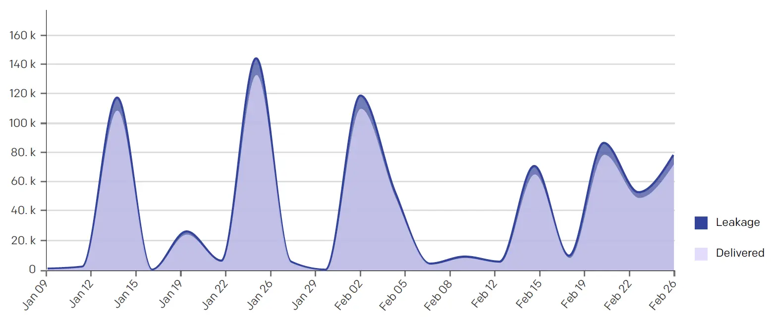
This section analyzes the volume of emails sent during this reporting period. The volume of email sent on any given day influences deliverability metrics and can give insight into why certain deliverability metrics may be higher or lower than in previous periods.
In the Is your Email Volume Impacting Deliverability chart, we show you how your sending volume might be impacting leakage. We calculate leakage by combining your bounced and blocked emails. Senders who are experiencing an issue with leakage will see a thicker purple line, as in the chart below.
This section analyzes the factors that contribute to your sender reputation. Typically, an email is not delivered to a recipient's inbox because it is either bounced or blocked by the mailbox service provider. High bounce rates are commonly caused by misspelled or nonexistent email addresses. High block rates occur when the recipient email address is valid but something else about this message caused the message to be undeliverable, which can be as simple as a mailbox being full or more urgent like being added to a deny list.
In the IP Health by Delivered Rate chart, we determine your IP health based on numerous backend metrics and health indicators.
In the Top and Bottom Performing Subject Lines by Category charts, we highlight your top and bottom performing campaigns so that you can identify the best practices for your audience and apply them throughout your email program. We've made these calculations by weighing your higher volume campaigns more on engagement than lower volume campaigns and scoring your lower volume campaigns towards the median, thus removing your 1:1 transactional or smaller marketing campaigns.
In the Unique Opens by Device chart, we define the categories as follows:
| Device | Description |
|---|---|
| Desktop | Email software on desktop computer I.E. Outlook, Sparrow, or Apple Mail. |
| Webmail | A web-based email client (Yahoo, Google, AOL, Outlook.com, etc.). |
| Phone | A smartphone (iPhone, Android, Blackberry, etc.). |
| Tablet | A tablet computer (iPad, android based tablet, etc.). |
| Other | An unrecognized device. |
Info
Need additional help? SendGrid's team of Email Consultants have over 95 years of combined email experience. If you're having any email issues or would like advice on how to optimize engagement, talk to one of our consultants today!