Unified Profiles Container (Public Beta)
Public Beta
Unified Profiles in Flex is currently available as a Public Beta product and the information contained in this document is subject to change. This means that some features are not yet implemented and others may be changed before the product is declared as Generally Available. Public Beta products are not covered by a Twilio SLA.
Not a HIPAA Eligible Service or PCI Compliant
Unified Profiles in Flex is not a HIPAA Eligible Service or PCI compliant and should not be used in Flex or Segment workflows that are subject to HIPAA or PCI.
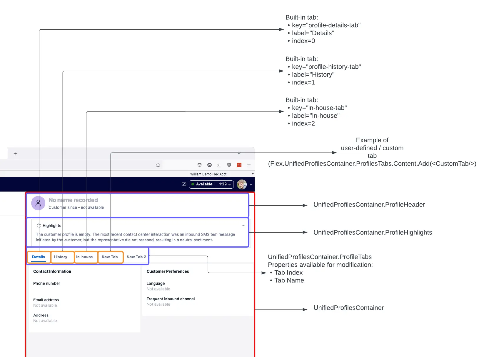
The Unified Profiles container is the parent container for all Unified Profiles-related UI components:
- Customer header
- Customer details
- Customer history
- Custom highlights (provided by Agent Copilot)
The Unified Profiles container is turned off by default, meaning that none of these UI components are visible to your agents until you turn on the Unified Profiles container.
In the agent desktop components hierarchy, the Unified Profiles container replaces Panel2 when enabled.
Use Unified Profiles container capabilities to programmatically customize your agent experiences in Unified Profiles.
With the UnifiedProfilesContainer.ProfileTabs component, you can:
- Add a new custom tab
- Update the tab display name
- Remove an existing tab by child key
- Update the order (index) of the built-in tabs
All normal programmability actions (add, remove, replace) are also available for this component and its content.
Visit Flex's programmability docs to learn more about how to update Flex UI programmatically.
If you want to use the right side of your agent desktop for tabbed content (for example, multiple plugins and custom tabs), we recommend adopting the Unified Profiles container. This provides an out-of-the-box way to integrate Twilio-provided UI components with your custom plugins in a tabbed panel. It also enables admin-level control over the built-in UI components from the Flex Console, without needing code changes to your contact center to turn components on or off.
Additionally, you can use the Unified Profiles container solely as a tabbed container for the Flex UI, without adopting any of the Twilio-provided Unified Profiles UI components. We recommend this over creating your own tabbed container, as this approach makes it easier to enable Twilio-provided UI components (like Customer details or Customer history) going forward. To do so, follow the documentation below to add your custom tabs.
If you're not going to use the Unified Profiles container now, there are steps you can take to make Unified Profiles or other tabbed content on the right side of the Flex agent desktop easier to adopt in the future.
If you're customizing the Panel2 area of the agent desktop, we recommend putting your customizations into the CRMContainer component (and not replacing the whole Panel2). This provides future flexibility to switch to the Unified Profiles container and allows your customizations to automatically move to the In-house tab.
After you've connected your Unified Profiles space, you need to turn on the Unified Profiles container, which is off by default. This allows your agents to use the Unified Profiles-related agent UI.
To turn on the Unified Profiles container:
- In Console, navigate to Flex > Contact center settings > Unified Profiles.
- Toggle on Enable Unified Profiles container in Flex UI to turn on the Unified Profiles container.
In the agent desktop components hierarchy, enabling the Unified Profiles container will apply these changes:
- The Unified Profiles container replaces Panel2.
- The CRMContainer, a child component of the Panel2, moves from Panel2 into the In-house tab of the Unified Profiles container.
12// With Unified Profiles container off. Any customizations outside of this CRMContainer will be replaced if you turn on the Unified Profiles container.34<Panel2>5<crmContainer></crmContainer>6</Panel2>78// With the Unified Profiles container on. Custom content inside the CRMContainer is moved into a tab within the Unified Profiles container.910<Panel2>11<UnifiedProfilesContainer>12<ProfileTabs>13<InHouseTab>14<crmContainer></crmContainer>15</InHouseTab>16</ProfileTabs>17</UnifiedProfilesContainer>18</Panel2>19
If you had previously placed Flex UI customizations onto the Panel2 level (and not in the CRMContainer level), your customizations are hidden when the Unified Profiles container is on.
- If you have agent UI customizations for your Flex instance, test the effect of turning on the Unified Profiles container in your staging environment or during periods of reduced activity first.
- If enabling the Unified Profiles container unexpectedly hides any of your customizations, update your plugin code to attach the customizations to either the CRMContainer, which becomes the In-house tab, or add them as a custom tab on the Unified Profiles container.
Info
If turning on the Unified Profiles container has any adverse effects on your Flex agent UI, you can use the same toggle as above to turn it off again. Note that Unified Profiles UI components such as Customer details and Customer history are not displayed when the Unified Profiles container is off.
The Unified Profiles container has the following child keys:
| Name | Key | Notes |
|---|---|---|
| Alert Banner | alert |
|
| Loading View | loading-view |
|
| Profile Header and Link Menu | profile-header-and-link-menu |
|
| Profile Highlights | profile-highlights |
|
| Profile Connector Tabs | profile-connector-tabs |
|
| Profile Not Found View | profile-not-found-view |
|
| Profile Unlink Modal | profile-unlink-modal |
|
| Search View | search-view |
|
Use ProfileHighlights to update the highlights component in your container.
Profile Highlights has the following child keys:
| Name | Key | Notes |
|---|---|---|
| Highlights Icon | highlights-icon |
|
| Highlights Title | highlights-title |
|
| Highlights Chevron | highlights-chevron |
|
| Highlights Summary | highlights-summary |
|
You can use ProfileHeader to update the profile header. For example:
Flex.UnifiedProfilesContainer.ProfileHeader.Content.remove("header-avatar");
Profile Header has the following child keys:
| Name | Key | Notes |
|---|---|---|
| Header Avatar | header-avatar |
|
| Header Text | header-text |
|
You can use ProfileHeaderText to update the profile header name and subtitle. For example:
Flex.UnifiedProfilesContainer.ProfileHeaderText.Content.remove("header-name");Flex.UnifiedProfilesContainer.ProfileHeaderText.Content.remove("header-subtitle");
Profile Header Text has the following child keys:
| Name | Key | Notes |
|---|---|---|
| Header Name | header-name |
|
| Header Subtitle | header-subtitle |
|
To reorder an In-house tab first in the container and rename it, add the following code to your plugin:
1Flex.UnifiedProfilesContainer.ProfileTabs.defaultProps.crmViewTabProps = {2label: "Custom CRM",3index: 14};56Flex.UnifiedProfilesContainer.ProfileTabs.defaultProps.timelineViewTabProps = {7index: 28};910Flex.UnifiedProfilesContainer.ProfileTabs.defaultProps.profileViewTabProps = {11index: 312};
Note that you must set all container tabs together to reorder them.
Depending on your use case, you might want to add a custom tab alongside the tabs provided out of the box, giving you more control over your experience.
To create a custom tab, first create a new Tab component in your plugin code:
1import React from "react";2//IMPORTANT: The top most element in your component must be the <Tab> from "@twilio/flex-ui", or the custom tab will not work.3import { Tab } from "@twilio/flex-ui";45export const CustomUnifiedProfilesTab = (props: any) => (6<Tab key={props.label} uniqueName={props.uniqueName} data-testid="my-new-tab" label={props.label}>7<div style={{ backgroundColor: props.color, height: 80, width: 80 }} />8//Add any additional content you want. The div above this creates an 80X80 pixel box, colored by the prop, so that you can more easily visualize the content area of your new tab.9</Tab>10);11
Next, import the component and add it to the ProfileTabs:
1import { CustomUnifiedProfilesTab } from "./MyCustomTabComponent";23//Other plugin boilerplate456Flex.UnifiedProfilesContainer.ProfileTabs.Content.add(7<CustomUnifiedProfilesTab8label="New Tab"9uniqueName="Unique Name 1"10key="New Tab"11color="red"12index={0}13/>14);
This displays a new custom tab in the far-left (first) position of all of the tabs, with a red 80x80 pixel square. You can add whatever custom properties you want to pass in data, customize the look and feel, and more.