Overview of Flex UI programmability options
The Flex Manager is the access point for controlling your Flex instance and all of the underlying Twilio products used for communications and assigning tasks. This means that within your Flex project, you can access the TaskRouter or Chat client directly through the Flex manager.
Aside from Flex itself, Manager also gives you access to the Conversations, Sync, Voice, and TaskRouter SDKs.
You can access the manager as follows:
In the init method of your plugin:
1init(flex, manager) {2// use manager here3}
In your app, by calling the getInstance method:
Flex.Manager.getInstance()
By calling the create method when initializing Flex:
1return Flex2.provideLoginInfo(configuration, "#container")3.then(() => Flex.Manager.create(configuration))4.then(manager => {5// use manager here6})7.catch(error => handleError(error));
You can check out the sample project on how to initialize Flex.
For the detailed description of Manager visit our Flex UI API docs.
Flex UI's configuration allows you to control the way the overall app loads, as well as the behavior of individual Flex Components.
Flex Components can be modified in two ways:
- With
componentPropsin the Configuration Object - With the
defaultPropsAPI
The following is an example of using componentProps in the Configuration Object:
1var appConfig = {23componentProps: {4CRMContainer: {5uriCallback: (task) => task6? `https://www.bing.com/search?q=${task.attributes.name}`7: "http://bing.com"8}9},10};
You may also configure default properties for components within a Plugin by using the React defaultprops API programmatically:
componentProps: { [Component Name]: { [Prop Name]: [PropValue] } }
For example:
1flex.CRMContainer2.defaultProps3.uriCallback = (task) => task4? `https://www.bing.com/search?q=${task.attributes.name}`5: "http://bing.com/";67flex.MainHeader8.defaultProps9.logoUrl = "https://static0.twilio.com/marketing/bundles/archetype.alpha/img/logo-wordmark--red.svg";
Go to Flex UI API docs for the full description of Configuration object and Component props.
Learn how to modify configuration for flex.twilio.com using API in our documentation.
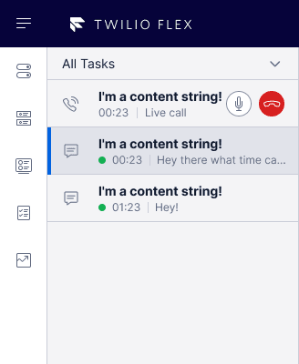
You can override any string by editing the strings object on the Flex Manager instance:
flex.Manager.getInstance().strings.TaskLineCallAssigned = "I am a content string!";
For the full list of UI strings, see Flex UI API docs.
Flex uses Handlebars for templating and supports Mustache-style syntax and expressions within content strings, ie. embedding value placeholders between double braces. Here's an example:
1manager.strings.TaskInfoPanelContent = `2<h1>TASK CONTEXT</h1>3<h2>Task type</h2>4<p>1{{task.attributes.title}}</p>5<p>2{{task.title}}</p>6<h2>Task created on</h2>7<p>{{task.dateCreated}}</p>8<h2>Task priority</h2>9<p>{{task.priority}}</p>10<h2>Task queue</h2>11<p>{{task.taskQueueName}}</p>12<hr />13<h1>CUSTOMER CONTEXT</h1>14<h2>Customer name / phone number</h2>15<p>{{task.attributes.name}}</p>16`;
Within the context of each component and string, additional dynamic content is available: for example, by accessing Task properties or attributes.
Within the context of each component and string, additional dynamic content is available: for example, by accessing Task properties or attributes.
Here's an example of the use in a template of a couple of the properties and attributes listed above:
manager.strings.TaskExtraInfo = "My task {{task.attributes.name}} was created on {{task.dateCreated}}";
Helper functions provide you with a way to customize text with dynamic information. Here is an example of the use of a helper function to enable dynamic updates:
manager.strings.TaskExtraInfo = "Time since last update: {{helper.durationSinceUpdate}}";
You can find all available helper functions in Flex UI API docs.
Flex UI theming interface closely maps to the Twilio Paste design system. This structure is based on the concept of design tokens, a set of variables that you can modify. This structure promotes both consistency, customization and web accessibility.
Theme config
Theme configuration is done with config key called config.theme with the following structure:
1interface ThemeConfigProps {2isLight?: boolean; // Represents if light or dark theme3tokens?: Tokens; // Paste tokens4componentThemeOverrides?: Object; // Object containing styles of the component which is to be overridden.5}
Component theming
For components which receive the theme as props, props.theme.tokens can be used.
Custom tokens
Use custom tokens to pass your own custom tokens to theme using the example below.
1appconfig = {2theme: {3tokens: {4custom: {5myCustomToken: "#ccc"6}7}8}9}
Paste tokens
Similarly, you can override default design tokens when using Twilio Paste for your plugin.
1appConfig = {2theme: {3tokens: {4backgroundColors: {5colorBackgroundPrimaryStrongest: "tomato",6},7},8},9};
ThemeProvider
An API Flex.setProviders() can be used to load providers on the root level once and don't have to worry about wrapping again as the context will correctly set. Now to use Paste in Flex plugins, developers will not need to wrap Paste ThemeProvider over all its components. Explore the API in our Flex UI API docs.
When using Paste, developers need to pass the CustomizationProvider from Paste to Flex using Flex.setProviders API as below. By doing this, we'll wrap Flex with the passed Provider and developers don't have to worry about fetching the right theme and passing it on.
1import { CustomizationProvider } from "@twilio-paste/core/customization";23Flex.setProviders({4PasteThemeProvider: CustomizationProvider5});67Flex.AgentDesktopView.Panel1.Content.add(8<PasteButton key="A" variant="primary">9Paste Button10</PasteButton>11);1213Flex.AgentDesktopView.Panel1.Content.add(14<PasteButton key="B" variant="primary">15Paste Button16</PasteButton>17);
Flex.setProviders() also allows developers to pass their own custom provider which is needed to be set on the root level. They can do it as below:
1Flex.setProviders({2CustomProvider: (RootComponent) => (props) => {3return (4<Context.Provider value={{ test: "123" }}>5<RootComponent {...props} />6</Context.Provider>7);8}9});1011Flex.AgentDesktopView.Panel1.Content.add(12<Context.Consumer>13{(value) => {14<div>{value.foo}</div> // Will print 12315}}16</Context.Consumer>17);
The below example shows how to use a custom provider for styling Material UI components. Ensure this is done before declaring any components.
1import { StylesProvider, createGenerateClassName } from '@material-ui/core/styles';23Flex.setProviders({4CustomProvider: (RootComponent) => (props) => {5return (6<StylesProvider generateClassName={createGenerateClassName({7productionPrefix: 'pluginXYZ',8seed: 'pluginXYZ',9})}>10<RootComponent {...props} />11</StylesProvider>12);13}14});15
Not every component you build needs to start from scratch. Existing React component libraries can help you use components that have already been built with browser compatibility, responsive screen sizes, and accessibility in mind. Internally, flex-ui leverages Twilio Paste for many of its components. You can similarly use Paste to create components that start with a similar style to Flex's existing layout.
Paste is already a dependency of flex-ui but if you choose to include it explicitly, ensure the plugin doesn't have multiple versions of Paste in its dependency tree.
Flex UI is a library of programmable or dynamic components that expose a Content property and allows you to add, replace and remove any component and its children. Each immediate child of a component has a key (required for the add and replace methods) and a set of properties that will be inherited by its children. To see the full list of components, find a component's key or explore component props, go to Flex UI API docs.
To learn more how to work with components and props, see our developer guide.
The Flex UI is constantly emitting event data that describes how the user is interacting with the Flex UI. As you write plugins, the Actions Framework allows you to harness these events and define your own logic to describe how you want the Flex UI, CRM Data, or any other data, to change. You can register events before or after an action fires, or even replace the behavior of an Action.
Learn how to use the Actions Framework in our developer documentation.
Flex UI provides a client-side API to manage notifications in Flex UI.
A notification is an alert that tells the user what state change or error has occurred to a component or page when they are no longer viewing that component or page
Users can be notified in Flex using a Notification Bar or Browser notifications or both.
- Register custom notifications including browser notifications
- Customize standard notifications
- Turn off standard UI notifications
- Override standard notifications per Task Channel definition
- Customize how standard UI notifications are displayed
- Register your custom UI notifications and specify how to render them
To learn how to work with notifications, see our developer guide.
The full reference for the Notification Manager and a list of standard notifications are available in Flex API docs.
Flex UI 2.0 includes the Redux Toolkit and some new APIs for managing your internal state. These tools provide some guardrails for your state management, helping you set up boilerplate code with better defaults.
We recommend using single Redux store, either let Flex UI create its own store or pass a custom store using Manager.create() API
A wrapper around Redux's useSelector method. It exposes the same API but adds some Flex validations to ensure Flex's internal state is usable. This selector is specific for working with Flex state itself. Outside of accessing Flex state, we recommend using the default useSelector.
1import { useFlexSelector } from "@twilio/flex-ui";23const MyComponent = (props) => {4const viewState = useFlexSelector(state => state.flex.view);5return (6viewState.isSideNavOpen &&7<div>My Custom Code</div>8)9}
The selector takes the current view state for the custom component. The selector guarantees that the state being selected is safe to read and can be used in the application without side effects. This couldn't be guaranteed with useSelector.
A wrapper around Redux's useDispatch method. It prevents dispatches from causing side effects to Flex's state, ensuring your changes work as expected. Use this hook for interacting with Flex's state. You can use the native useDispatch method outside of Flex's state.
1import { useFlexDispatch, useFlexSelector } from "@twilio/flex-ui";23const MyComponent = (props) => {4const viewState = useFlexSelector(state => state.flex.view);5const dispatch = useFlexDispatch();6return (7viewState.isSideNavOpen &&8<button onClick={() => dispatch({type: "close_side_bar"})}>My Custom Code</button>9)10}
To learn more, visit our Redux developer guide.
Flex is a multichannel contact center. We support a number of channels out-of-the-box, and are constantly adding more. We support the following native channels:
- Voice
- SMS with MMS support
- WebChat with Media Attachments
With the Task Channel Definition API you can also add custom channels and override the behavior of existing ones.
Learn more about working with Task Channel Definitions in the developer guide.
The insightsClient provide access to the Twilio Sync SDK. For Flex accounts, this gives access to workers and tasks data through the use of two classes:
- LiveQuery class: to query Flex data and receives pushed updates whenever new (or updated) records would match the given expression
- InstantQuery class: to get a static snapshot of Flex data
Both classes needs two arguments:
- Index name: data set the query is executed against. Currently supported index names for Flex are:
tr-task,tr-worker,tr-reservation,tr-queue. - Query: this is the query used to filter the data from the index. The syntax for the query is documented here. The query can be an empty string: in this case the whole data set is returned (e.g. all workers.)
In this example, the insightsClient is used to query the workers with activity_name set to Available and subscribe to changes. That means that every time a worker change its status to Available, an event itemUpdated is fired. If a worker changes its status from Available to any other status, the itemRemoved event is fired.
1Flex.Manager.insightsClient2.liveQuery('tr-worker', 'data.activity_name == "Available"')3.then(function (args) {4console.log(5'Subscribed to live data updates for worker in "Available" activity'6);7args.on('itemRemoved', function (args) {8console.log('Worker ' + args.key + ' is no longer "Available"');9});10args.on('itemUpdated', function (args) {11console.log('Worker ' + args.key + ' is now "Available"');12});13})14.catch(function (err) {15console.log('Error when subscribing to live updates', err);16});17
In this example, the insightsClient is used to query the workers with specific skills inside its attributes. This returns an array of workers that can be used to provide static data.
1manager.insightsClient.instantQuery('tr-worker').then((q) => {2q.on('searchResult', (items) => {3// Do something with the results4});5q.search('data.attributes.languages contains "english"');6});