Basic Statistics in Python with NumPy and Jupyter Notebook
Time to read:
October 31, 2017
Written by

While not all data science relies on statistics, a lot of the exciting topics like machine learning or analysis relies on statistical concepts. In this tutorial, we’ll learn how to calculate introductory statistics in Python.
What is Statistics?
Statistics is a discipline that uses data to support claims about populations. These “populations” are what we refer to as “distributions.” Most statistical analysis is based on probability, which is why these pieces are usually presented together. More often than not, you’ll see courses labeled “Intro to Probability and Statistics” rather than separate intro to probability and intro to statistics courses. This is because probability is the study of random events, or the study of how likely it is that some event will happen.
Environment Setup
Let’s use Python to show how different statistical concepts can be applied computationally. We’ll work with NumPy, a scientific computing module in Python.
This guide was written in Python 3.6. If you haven’t already, download Python and Pip. Next, you’ll need to install the numpy module that we’ll use throughout this tutorial:
Since we’ll be working with Python interactively, using Jupyter Notebook is the best way to get the most out of this tutorial. You already installed it with pip3 up above, now you just need to get it running. Open up your terminal or command prompt and entire the following command:
And BOOM! It should have opened up in your default browser. Now we’re ready to go.
A Quick Note on Jupyter
For those of you who are unfamiliar with Jupyter notebooks, I’ve provided a brief review of which functions will be particularly useful to move along with this tutorial.
In the image below, you’ll see three buttons labeled 1-3 that will be important for you to get a grasp of — the save button (1), add cell button (2), and run cell button (3).
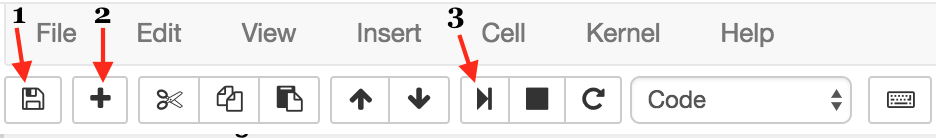
The first button is the button you’ll use to save your work as you go along (1). I won’t give you directions as when you should do this — that’s up to you!
Next, we have the “add cell” button (2). Cells are blocks of code that you can run together. These are the building blocks of jupyter notebook because it provides the option of running code incrementally without having to to run all your code at once. Throughout this tutorial, you’ll see lines of code blocked off — each one should correspond to a cell.
Lastly, there’s the “run cell” button (3). Jupyter Notebook doesn’t automatically run your code for you; you have to tell it when by clicking this button. As with add button, once you’ve written each block of code in this tutorial onto your cell, you should then run it to see the output (if any). If any output is expected, note that it will also be shown in this tutorial so you know what to expect. Make sure to run your code as you go along because many blocks of code in this tutorial rely on previous cells.
Descriptive vs Inferential Statistics
Generally speaking, statistics is split into two subfields: descriptive and inferential. The difference is subtle, but important. Descriptive statistics refer to the portion of statistics dedicated to summarizing a total population. Inferential Statistics, on the other hand, allows us to make inferences of a population from its subpopulation. Unlike descriptive statistics, inferential statistics are never 100% accurate because its calculations are measured without the total population.
Descriptive Statistics
Once again, to review, descriptive statistics refers to the statistical tools used to summarize a dataset. One of the first operations often used to get a sense of what a given data looks like is the mean operation.
Mean
You know what the mean is, you’ve heard it every time your computer science professor handed your midterms back and announced that the average, or mean, was a disappointing low of 59. Woops.
With that said, the “average” is just one of many summary statistics you might choose to describe the typical value or the central tendency of a sample. You can find the formal mathematical definition below. Note that μ is the symbol we use for mean.

Computing the mean isn’t a fun task, especially if you have hundreds, even thousands or millions of data points to compute the mean for. You definitely don’t want to do this by hand, right?
Right. In Python, you can either implement your own mean function, or you can use NumPy. We’ll begin with our own implementation so you can get a thorough understanding of how these sorts of functions are implemented.
Below, t is a list of data points. In the equation above, each of the elements in that list will be the x_i’s. The equation above also states the mean as a summation of these values together. In Python, that summation is equivalent to the built-in list function
sum() . From there, we have to take care of the 1/n by dividing our summation by the total number of points. Again, this can be done with a built-in function len.
Luckily, Python developers before us know how often the mean needs to be computed, so NumPy already has this function available through their package. Just like our function above, NumPy mean function takes a list of elements as an argument.
Returns the output:
Variance
In the same way that the mean is used to describe the central tendency, variance is intended to describe the spread.

The xi – μ is called the “deviation from the mean”, making the variance the squared deviation multiplied by 1 over the number of samples. This is why the square root of the variance, σ, is called the standard deviation.
Using the mean function we created above, we’ll write up a function that calculates the variance:
Once again, you can use built in functions from NumPy instead:
Returns:
Distributions
Remember those “populations” we talked about before? Those are distributions, and they’ll be the focus of this section.
While summary statistics are concise and easy, they can be dangerous metrics because they obscure the data. An alternative is to look at the distribution of the data, which describes how often each value appears.
Histograms
The most common representation of a distribution is a histogram, which is a graph that shows the frequency or probability of each value.
Let’s say we have the following list:
To get the frequencies, we can represent this with a dictionary:
Now, if we want to convert these frequencies to probabilities, we divide each frequency by n, where n is the size of our original list. This process is called normalization.
Why is normalization important? You might have heard this term before. To normalize your data is to consider your data with context. Let’s take an example:
Let’s say we have we have a comma-delimited dataset that contains the names of several universities, the number of students, and the number of professors.
You might look at this and say, “Woah, Cornell has so many professors. And while 650 is more than the number of professors at the other universities, when you take into considering the large number of students, you’ll realize that the number of professors isn’t actually much better.
So how can we consider the number of students? This is what we refer to as normalizing a dataset. In this case, to normalize probably means that we should divide the total number of students by its number of professors, which will get us:
Turns out that Cornell actually has the worst student to professor ratio. While it seemed like they were the best because of their higher number of professors, the fact that those professors have to handle so many students means differently.
This normalized histogram is called a PMF, “probability mass function”, which is a function that maps values to probabilities.
As we mentioned previously, it’s common to make wrongful assumptions based off of summary statistics when used in the wrong context. Statistical concepts like PMFs provide a much more accurate view of what a dataset’s distribution actually looks like.
That’s the Very Basics of Stats, Folks
I could go on forever about statistics and the different ways in which NumPy serves as a wonderful resource for anyone interested in data science. While the different concepts we reviewed might seem trivial, they can be expanded into powerful topics in prediction analysis.
If you liked what we did here, follow @lesleyclovesyou on Twitter for more content, data science ramblings, and most importantly, retweets of super cute puppies.

Related Resources
Twilio Docs
From APIs to SDKs to sample apps
API reference documentation, SDKs, helper libraries, quickstarts, and tutorials for your language and platform.
Resource Center
The latest ebooks, industry reports, and webinars
Learn from customer engagement experts to improve your own communication.
Ahoy
Twilio's developer community hub
Best practices, code samples, and inspiration to build communications and digital engagement experiences.