A Great Looking Star Ratings Chart for your React Application
Time to read:
August 29, 2022
Written by
Reviewed by

Every blog post and documentation page on the Twilio website lets readers rate the content with a 1 to 5 star rating. But what do we do with these ratings? We actually track them using an in-house tool, along with other content-related metrics. Initially, this tool showed the average rating for each page as a decimal number, but we soon realized that showing just a number is not sufficient. Our documentation pages, for example, are constantly being expanded and improved, so it is useful to see how the more recent ratings fare against the older ones.
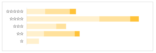
I hoped to find a star ratings chart component for React that can show star ratings in greater detail, but sadly I could not find any. In fact, I could not even find good examples of sites that visualize their star ratings categorized by their age. In the end, I designed and built my own widget, which you can see below.
In this article, I’m going to discuss the implementation of this React component in detail.
Where is the code?
If you just want the code, you can find it in this example application on CodeSandbox. If you are interested in learning how the component works, and my thought process when creating it, then read on!
Prototyping with chart.js
A star ratings chart is nothing more than a bar chart turned sideways, so I started my journey by going to the react-chartjs-2 website, the React wrapper for my favorite charting library. Browsing through the examples, I settled on the horizontal bar chart as the closest one to use as a starting point.
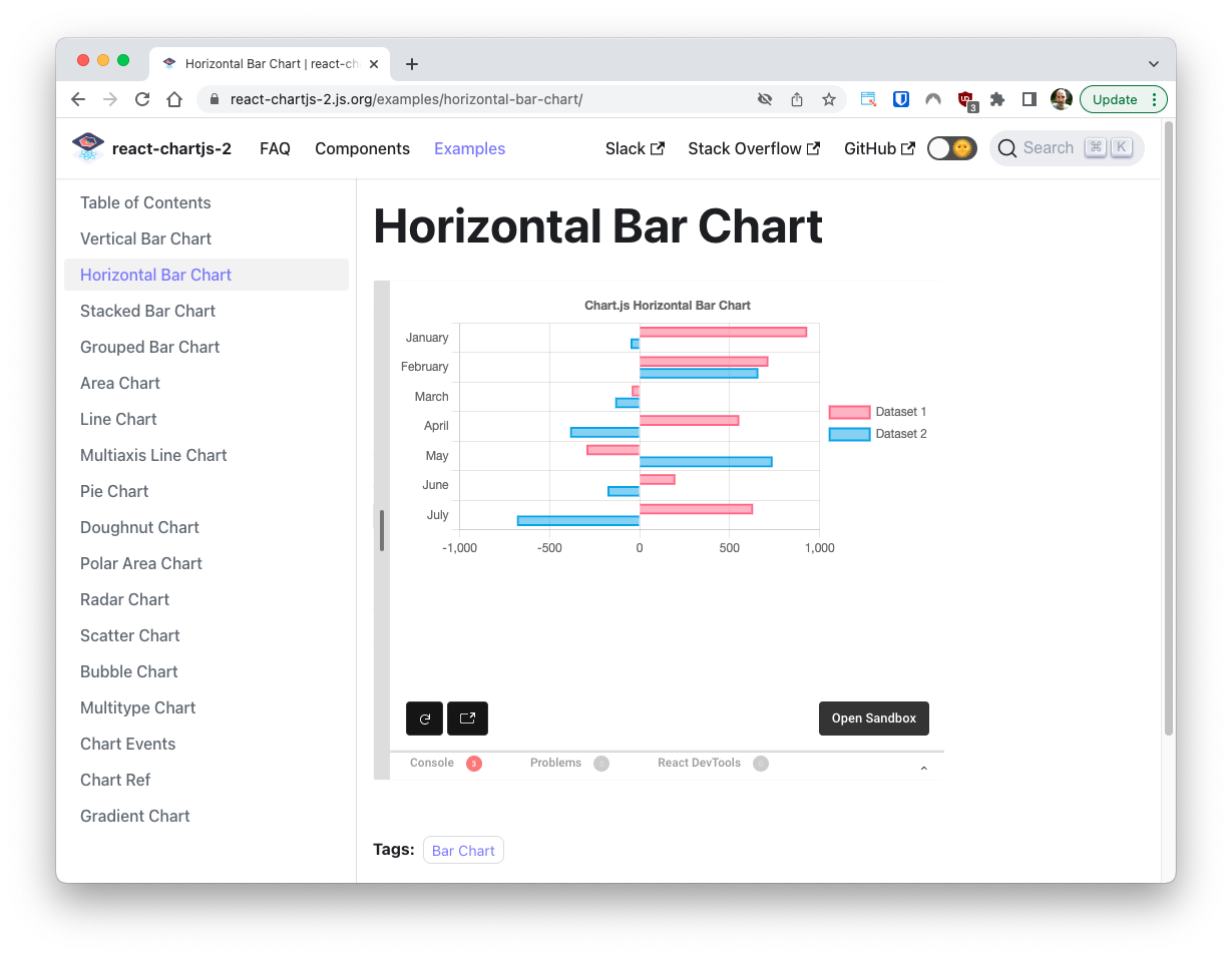
The bar chart is rendered with the <Bar> component, which takes two props: options and data. The appearance of the chart is entirely controlled by these two props. The example above uses the following values:
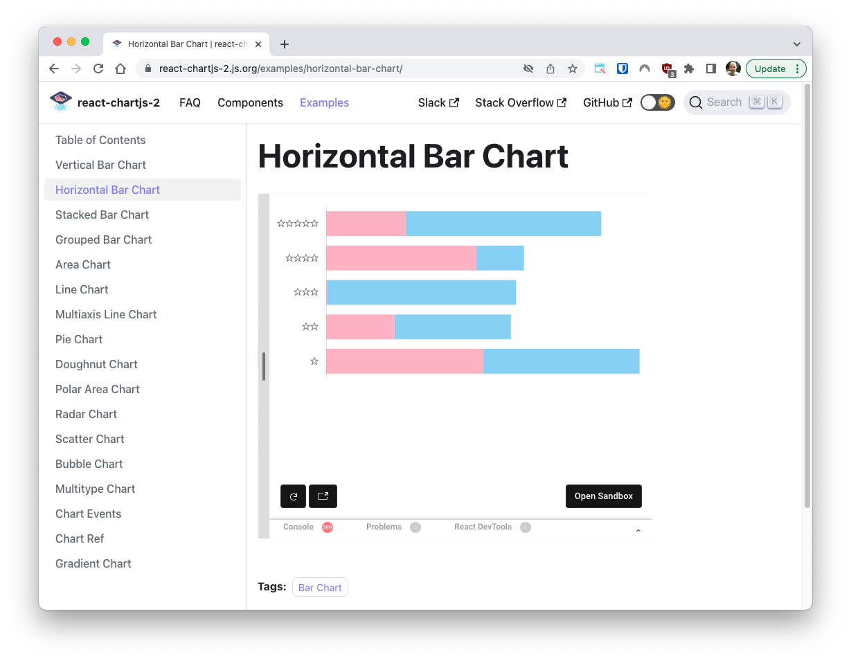
The nice thing about these chart examples is that they are all interactive and can be modified in real time, so using the chart.js documentation as a reference, I started making changes to make it look more like the ratings chart that I needed.
I’ve made the following changes:
- Removed the chart’s title and legend.
- Changed the month labels that appear on the Y axis to stars, starting from 5 in the first row, down to 1 in the last.
- Removed the border for the bars.
- Changed the red and blue bars in each row to stack instead of appearing side by side.
- Removed the X axis and the background grid.
- Changed the random number generator in the example to generate only positive numbers.
- Change the dataset labels to “Total” and “Last Year”.
With these changes, the chart looked like this:
The modified options object that produce this look are below:
With these changes I had a decent prototype to move into the actual implementation.
Writing the React component
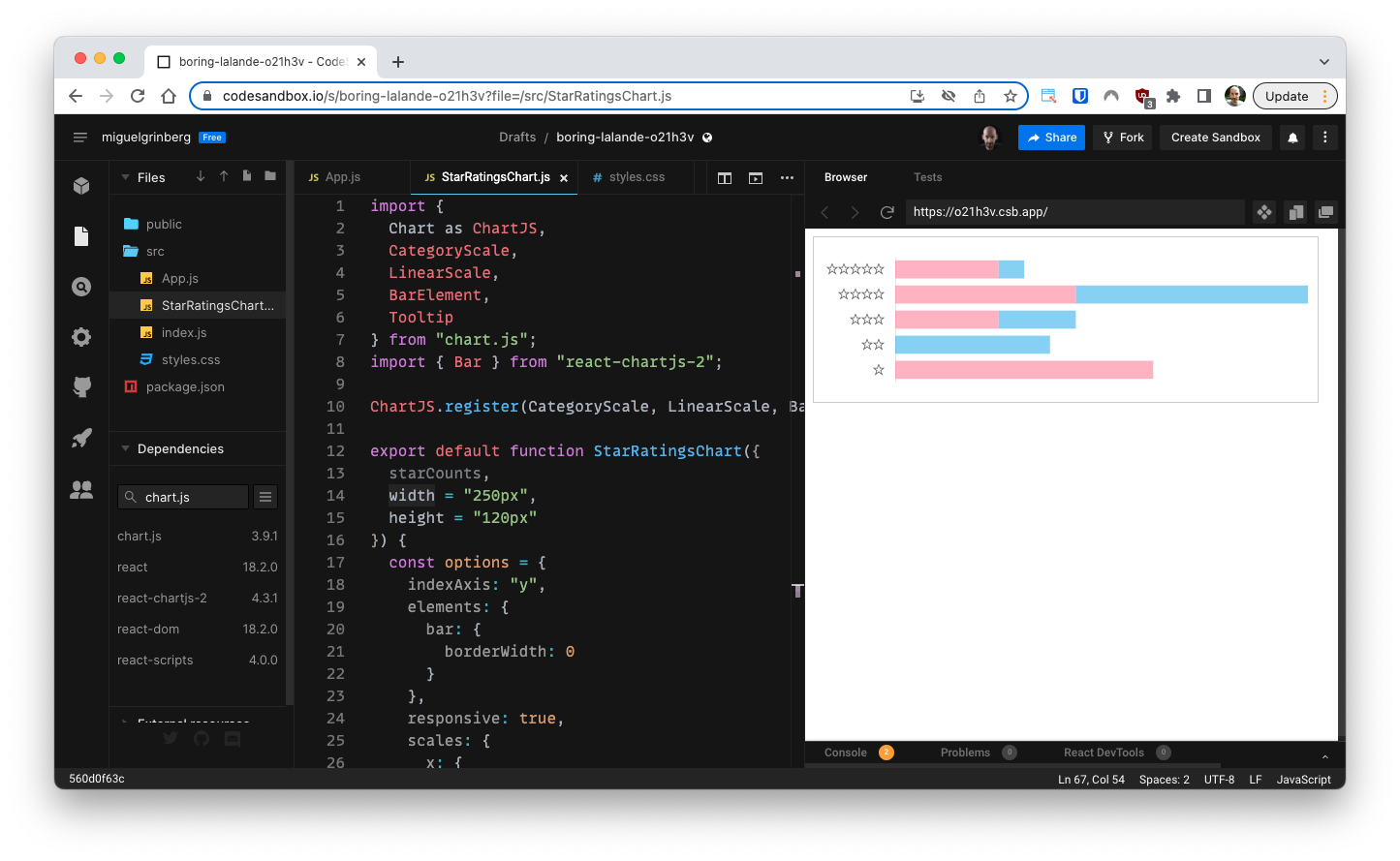
To create the component I fired up an instance of the React template in CodeSandbox, which is nice because it runs entirely in the browser, without the need to create a local project. My intention was to use this cloud-based environment to design the component, which I would then move into the actual application.
This project needs two third party dependencies: chart.js and react-chartjs-2. I added both to the project.
Next, in the src directory, I created an empty StarRatingsChart component in a StarRatingsChart.js file, following standard React component naming conventions.
The starCounts prop would be where the parent component passes the data for the chart, and width and height would determine the chart’s dimensions on the page.
I then added this component to App with some made-up data:
My thinking was that the starCounts object would have a key for each age group to show in the review. The first group would be the larger one, including the totality of the reviews, and the following groups would represent more recent subsets of these reviews, as desired. For this example I defined three groups for the total, last year and last month reviews.
The value for each key in the starCounts object is an array with five elements, providing the number of reviews in the group for 1, 2, 3, 4 and 5 stars respectively.
Adding the chart prototype
The prototype I created over at the react-chartjs-2 site is a complete running application, so most of the code can be directly incorporated into the project.
The imports that are specific to the chart.js library can be added to the StarRatingsChart.js file. The library requires the modules that are used to be registered, so the registration call can be copied as well.
The options and data objects from the example can also be copied directly into the new project, but because I intend to generate parts of these objects dynamically, I need to declare them inside the component function. The data object contains references to the faker library, which the chart.js example uses to generate random numbers. I do not need that in this project, so I replaced the random numbers with hardcoded ones for now. The borderColor property in each series is also unnecessary and can be removed, since I disabled bar borders in options.
Here is the first version of the component:
Note that for brevity the options object is not included again in the above listing, as it does not require any changes from the version shown before.
As you can see above I have put the <Bar> component inside a <div> that has a class name, and receives the width and height props as style. The chart.js library can sometimes be hard to size properly, and I have found that having a parent element sized appropriately often helps. The dimensions are also passed to the chart.
The component can be given a border and some padding through CSS. These changes go in the styles.css file:
And with this, a first version of the chart is now integrated into the application.
Processing the input data
And now comes the interesting part. The StarRatingsChart component receives the data that needs to be displayed in the chart in the starCounts prop, but some processing is necessary to transform this data into the correct format for the chart.
Let’s look at the example data passed by the App component:
For convenience, I decided that each group would define the total number of stars, including those that belong to smaller groups that come after. In the example above, there are a total of 40 5-star reviews, 25 of those were added in the last year, and 5 of those 25 were added in the last month. This is important, because when generating the chart, the lengths of the segments need to be adjusted to remove duplicates. The 5-star bar in this example would need its segments to have lengths of 15, 20 and 5 respectively, to match the total of 40 reviews.
The following snippet of code generates the datasets attribute of data in a for-loop, applying the necessary adjustments, and also generating colors that are based on the same RGB root but in darker tones towards the right.
Let’s review what this code does. First, the labels constant is initialized with the list of review age names, and numSets is assigned how many of them were given. For the data shown above, labels would be set to [‘Total’, ‘Last Year’, ‘Last Month’] and numSets would be set to 3.
The for-loop iterates over the review groups using i as an index. In each iteration, the series local variable is assigned the lengths for the bar segments in that age group.
When looking at the last group, the segments will use the numbers given in starCounts for that group:
For all the groups except the last, an adjustment needs to be made to remove duplicates, as discussed above. This is achieved by subtracting the number of reviews for the same number of stars in the next group:
The dataset entry for the group is then assembled with the label, the series array, and a little bit of extra logic to calculate a color:
The color uses (255, 195, 0), a dark shade of yellow, as the base color, which will be assigned to the right-most group in each bar. For each previous group, the alpha component is halved, so that the shade of each review age group becomes lighter towards the left of the chart.
This is how the ratings chart looks now:
Improving the tooltips
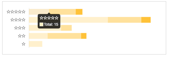
The chart.js library automatically adds tooltips when you hover with the mouse pointer over any segment of the chart. The problem is that because of the adjustments made to the data, the values reported are now incorrect.
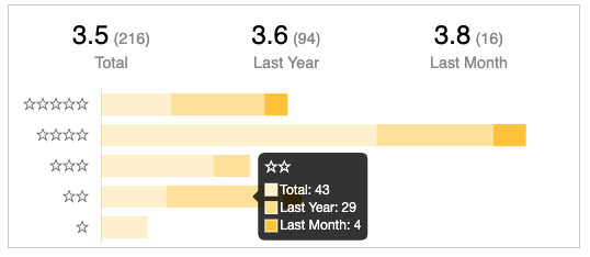
Below you can see that the 5-star amount for the “Total” group is now 15, while for this specific type of chart it would make more sense to show the total of 40.
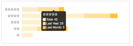
Luckily, the content of the tooltips can be customized in the options object, as shown below:
The mode setting tells chart.js which parts of the chart should be included in the tooltip. By default only the section under the cursor is shown, but using a mode of y all the segments that intersect horizontally with the cursor position will be reported together. This is actually much more useful for this chart, as it effectively shows a single tooltip per bar, with all the review counts by their age.
The callbacks setting is used to provide custom contents for the different parts of the tooltip. The label callback is called by chart.js to generate the text that is displayed for each segment of the bar. The logic in this callback function uses the original data arrays from the starCounts prop to generate the correct number of reviews.
Adding a header
For the final touch, I wanted to have the average star ratings for each age group displayed in a header. To calculate these averages I added some logic to the component function, right above the return statement:
This snippet of code generates the ratings array, where each element is an object with label, rating, and count keys. To calculate the rating I add the number of stars and divide by the number of reviews, formatting the result with one decimal place.
What’s left to do is to render this information above the chart. This is the updated return statement for the component:
With this change, an HTML table is created above the chart, with a single row. Each cell renders the rating information for a group, including the average star rating, the number of reviews included, and the name of the group.
Note that I reduced the dimensions passed down to the bar, to account for the header on the height and some padding on the width. The “50” amount assumes a size for the header that is actually very small. I have added some more CSS definitions to compress the header and make it fit within the assigned space:
And there you have it. That is the complete star ratings chart component!

Conclusion
I hope this was a useful tutorial that encourages you to experiment and build your own customized chart components. The complete code for this project is available on a CodeSandbox project at this location: https://codesandbox.io/s/star-ratings-chart-1dgdn6. Feel free to fork it and continue experimenting with it!
Miguel Grinberg is a Principal Software Engineer for Technical Content at Twilio. Reach out to him at mgrinberg [at] twilio [dot] com if you have a cool project you’d like to share on this blog!


Related Resources
Twilio Docs
From APIs to SDKs to sample apps
API reference documentation, SDKs, helper libraries, quickstarts, and tutorials for your language and platform.
Resource Center
The latest ebooks, industry reports, and webinars
Learn from customer engagement experts to improve your own communication.
Ahoy
Twilio's developer community hub
Best practices, code samples, and inspiration to build communications and digital engagement experiences.