Working with Xcode Auto Layout in Swift and iOS Projects
Time to read:
May 04, 2018
Written by

Have you ever had trouble designing an application to look good in both landscape and portrait orientation? Do not despair! Auto Layout is here to the rescue.
Originally Apple had only one screen size, which was developer friendly since they did not have to be terribly flexible fitting into different screen sizes. Fast forward to today, it has become quite frustrating to design an app that supports different screen sizes. To make this transition easier, Apple introduced Auto Layout. It’s a relatively new concept and may be confusing to use for the very first time, but all it does is simply make your app look good across all devices. It has therefore become imperative to master this concept and we shall be going through the knowledge required to flex.
By the end of this tutorial, we will have learned:
- Why Auto layout is important
- Different sections on Xcode
- How to use auto layout in the interface builder
- Auto layout and constraints
- The Auto layout menu
- How to resolve layout issues
- How to examine and edit constraints
Why Auto Layout?
Auto Layout assists in dynamically calculating the size and position of all the views, in your view hierarchy based on the constraints placed. For instance, look at the UILabel below, it looks centrally placed in portrait view right? But when switched to landscape, it gets displaced. Auto layout will help keep the button central in different orientations and devices.
It is a constraint-based layout system that allows developers to create an adaptive interface, that responds appropriately to changes in screen size and device orientation.
Setting up the project
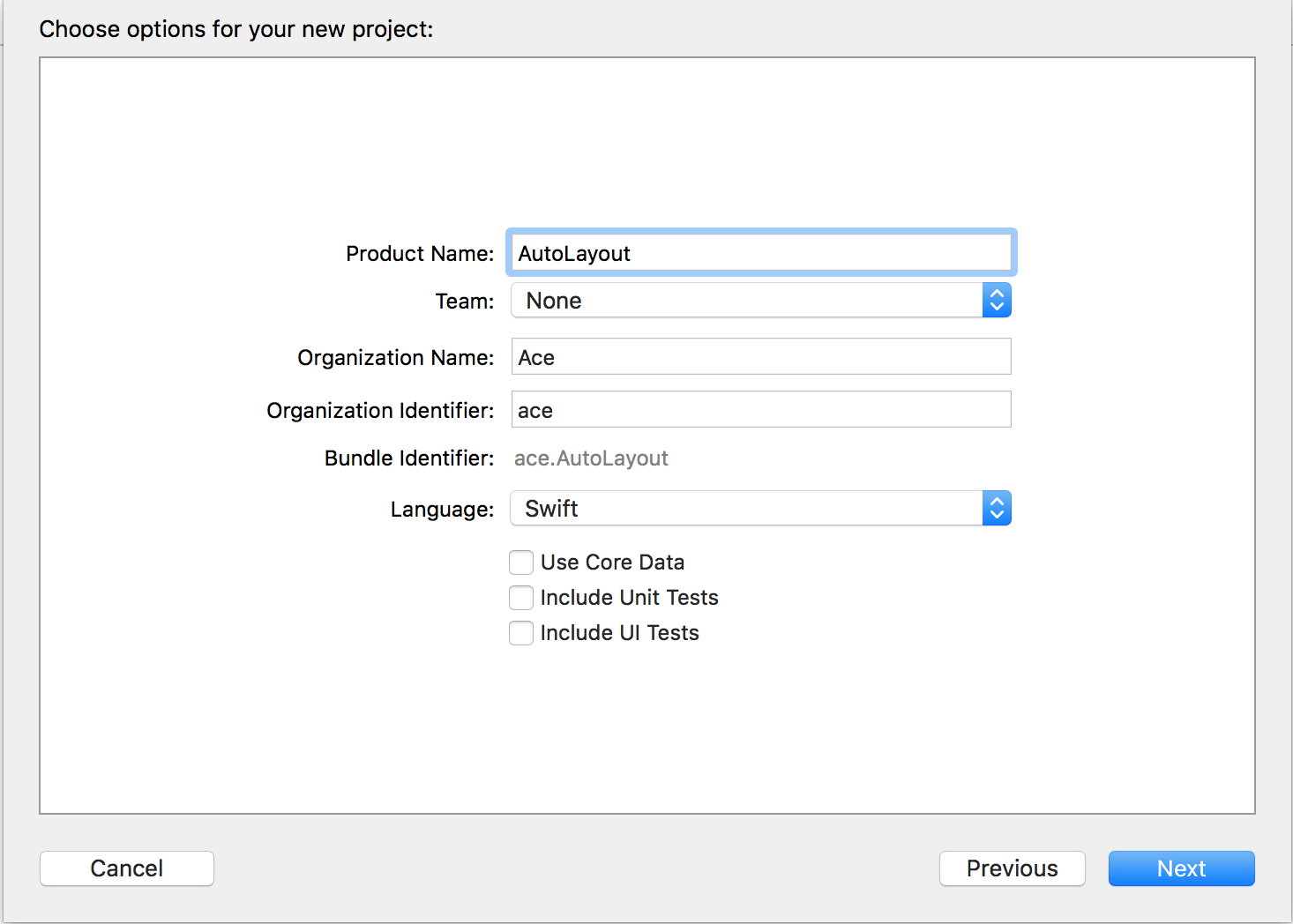
Create a new Xcode project. Select Single view app and name it AutoLayout. Leave the defaults unchecked:
- Use core data
- Include Unit Tests
- Include UI Tests
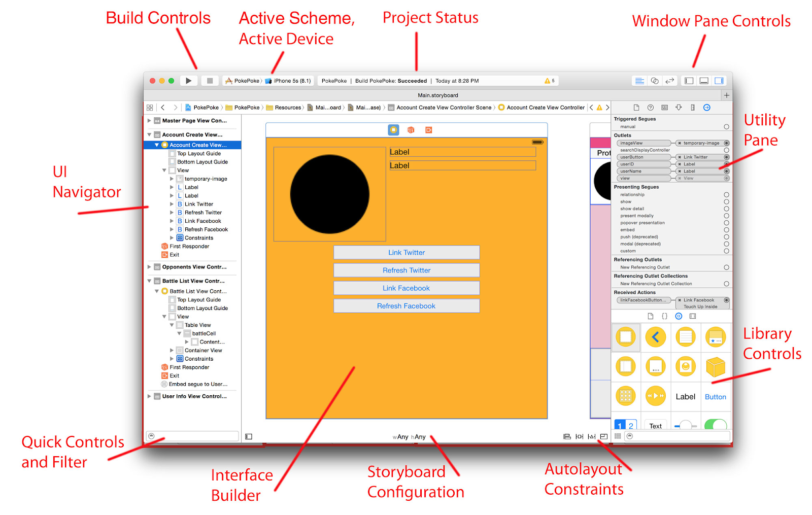
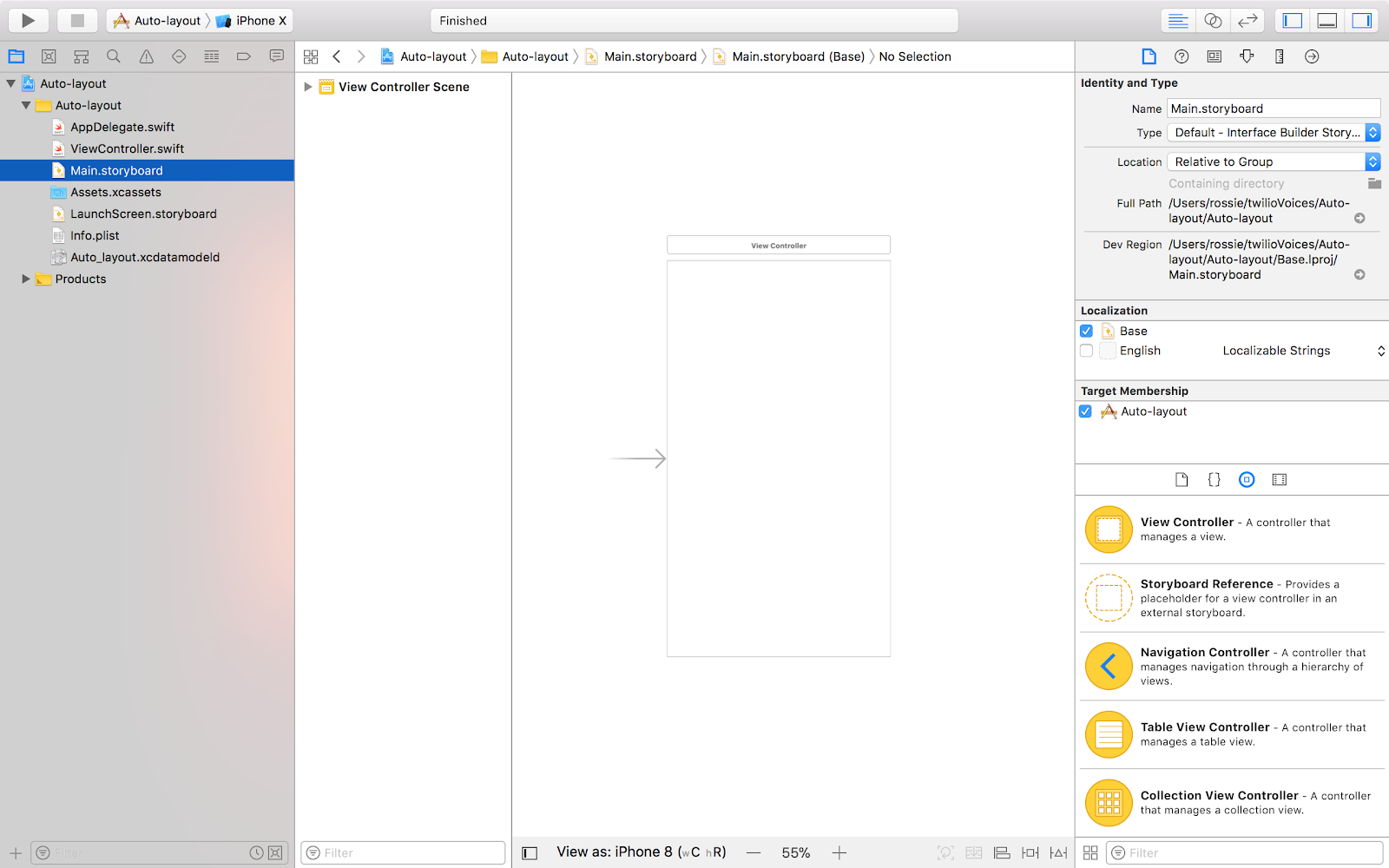
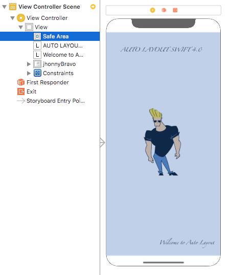
If we open Main.storyboard, it is empty. That’s because we have not added any elements to it yet. To add elements, head on to the Library Controls and choose the Object library option. Your Xcode should look this.
Let’s now add a few elements from the library. Drag the following onto the view controller:
- A label
- A button
- An image view
If we move either of them within the view controller, you will notice some blue lines appear. These lines mark the screen layout.
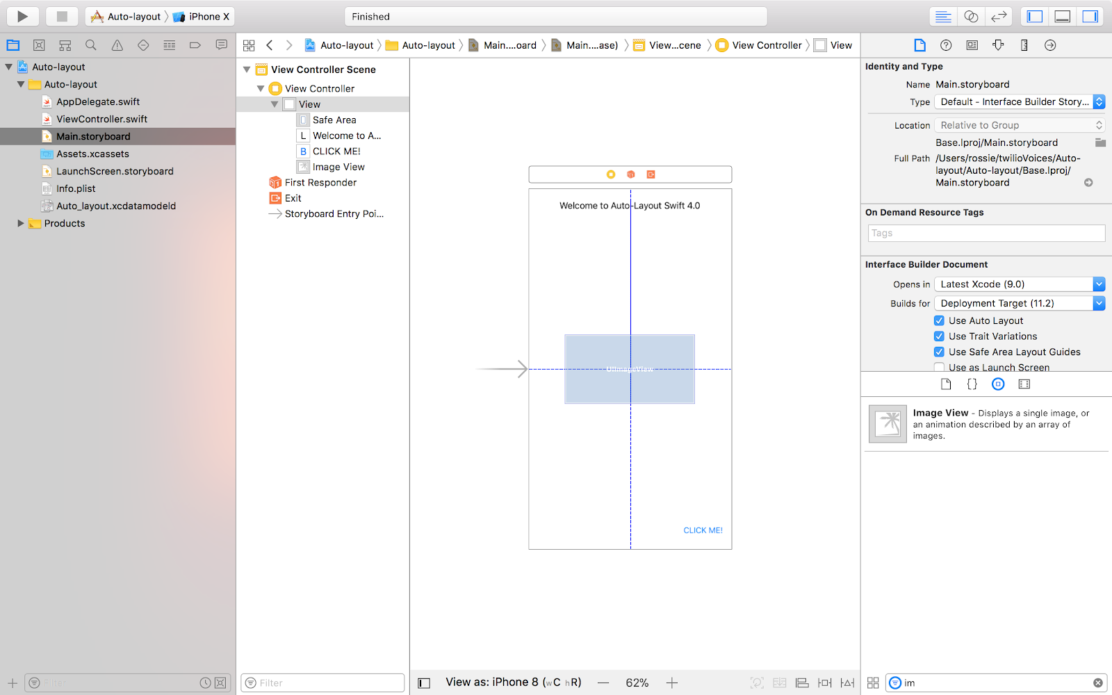
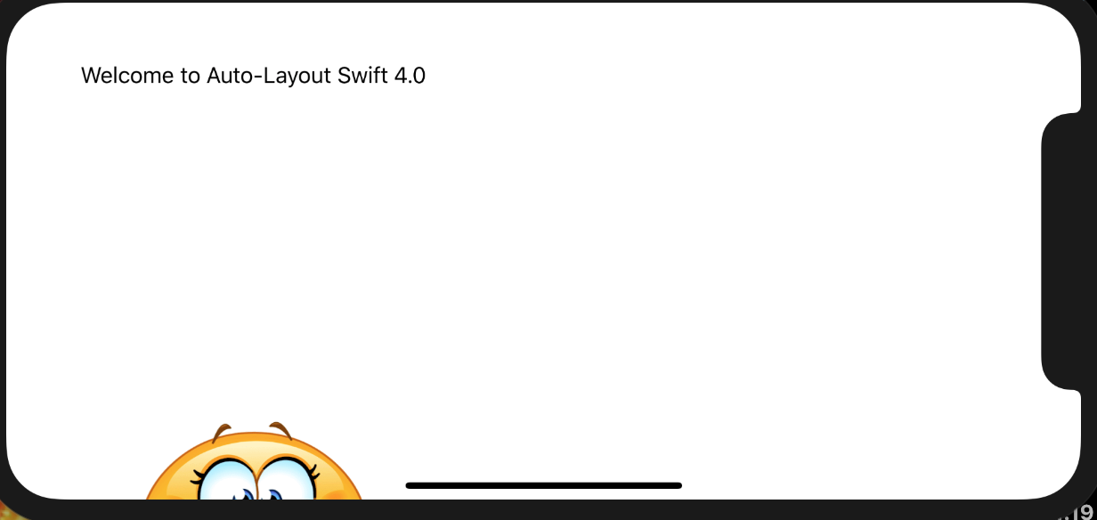
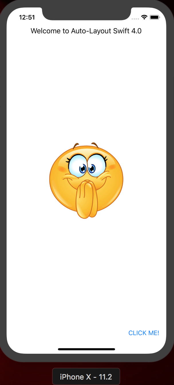
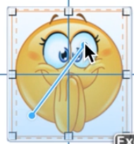
Try positioning the image view at the center of the screen, you should see blue lines cutting across the screen both horizontally and vertically. Now position the button at the bottom right most side of the screen and change its text to Click Me! and the label in the middle of the top most part of the screen with its text as Welcome to Auto Layout Swift 4.0.
Use the layout lines for guidance like in the image. Your view controller should be similar to the figure below.
Add this image to Assets.xcassets.
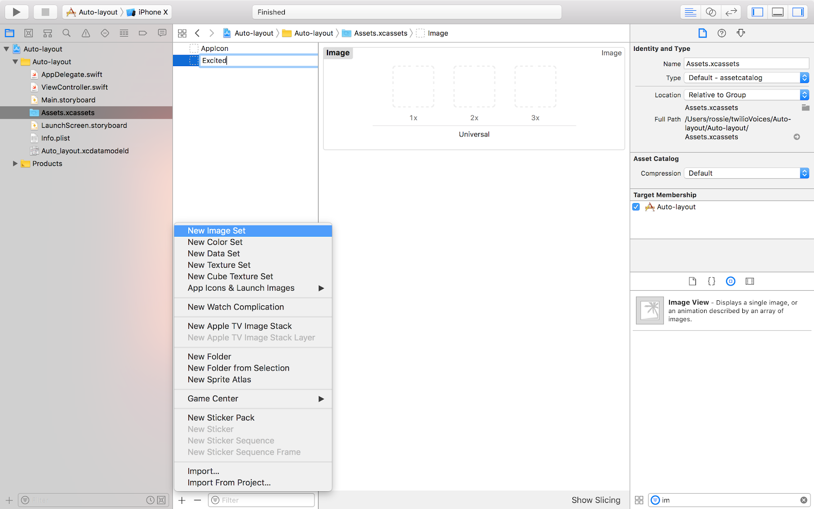
To add the image, click the button at the bottom of the screen not the one at the bottom of the project outline though. Add a new image set as in above. Control drag the image from the file directory and place on the 3x option.
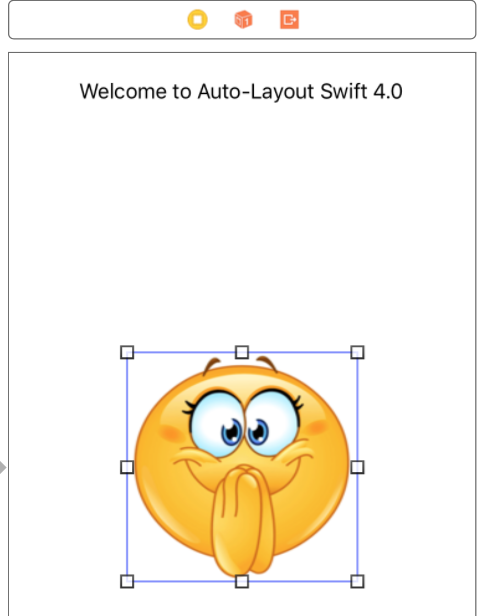
Going back to Main.storyboard, click on the image view, go to the Utility Panel and click the Attributes Inspector icon. Click the down arrow on the first option (image) and select Excited. This will add the image to the Image View.
Woohoo! We have successfully set up our project! Run the project using iPhone X.
Everything looks good in portrait mode but try rotating on either side to landscape mode with command right/left arrow. Not so good now, is it? This is why we need Auto Layout.
Tip: We could save ourselves some trouble by live previewing our application without needing to run it. Here’s how we’ll do it.
Live Previewing in the Interface Builder
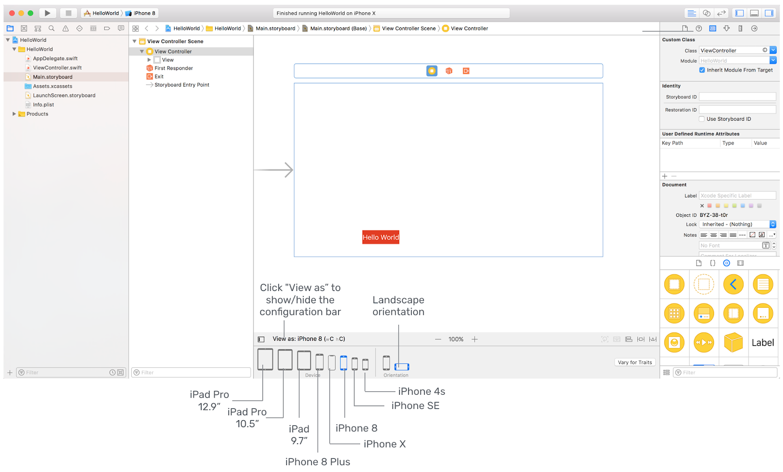
By default, the Interface Builder is set to preview the UI on iPhone 8 (4.7-inch). To see how the app looks on other devices, click View as: iPhone 8 button to reveal the configuration bar and then choose your preferred iPhone/iPad devices to test. You can also alter the device’s orientation to see how it affects our app’s UI.
To achieve multiple live previewing of different screens, go to the window pane controls.
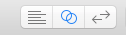
Click the Assistant Editor, the two overlapping circles. A preview of the view controller’s code will be seen.

Select the two overlapping circles with the option
Automatic. The menu below will appear, select the preview option to view the current screen.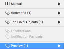
To add more screens like below, click the button.
Using auto layout in the interface builder
Let’s add some constraints! Currently, we are displaying three UI elements. Let’s constrain each of them using the control-drag method.
Center the label horizontally by dragging it across the screen till the blue line appears.
We want our label to be centrally constrained therefore while it’s still selected, hold down the control button and drag a line to the left side of the screen then release it, a pop up menu will appear with this constraint options:
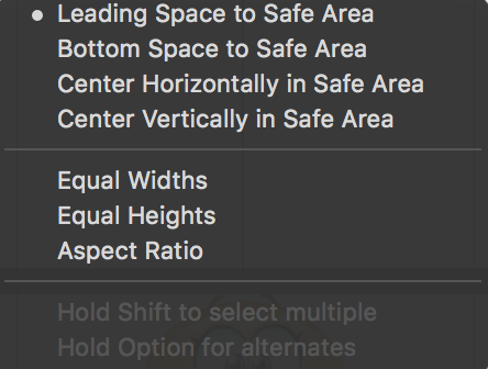
Select Center Horizontally in Safe Area. Hold down the control button and drag a line to the screen’s safe area and select Top space to Safe Area.
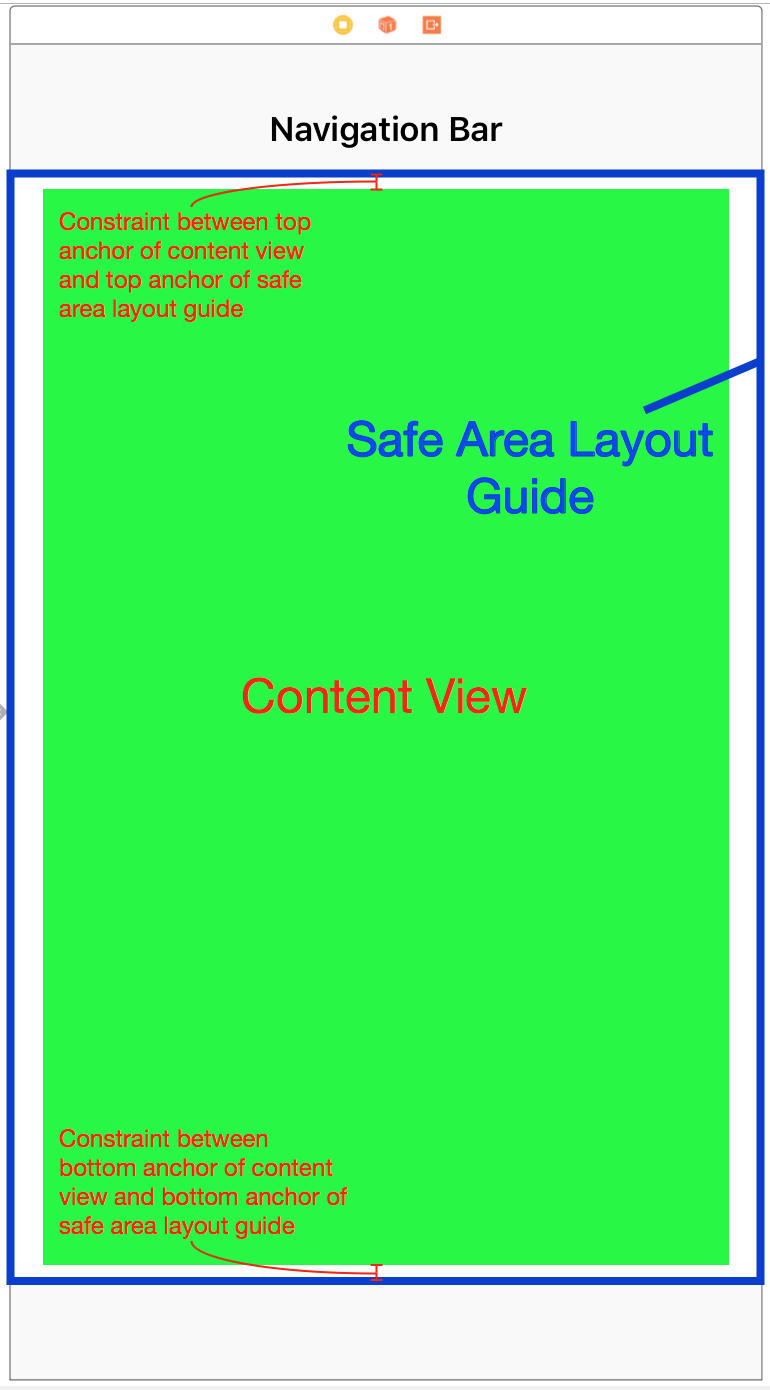
You will notice that some of the menu options have changed. This is due to the constraint’s position against the safe area but what is this safe area anyway? This is the visible square area of the screen. And it is clearly defined in the document outline.
The image will be centrally place in the screen. While the image view is selected, hold down the control button and drag a line to the left or right side of the screen. Select Center Horizontally in the Safe Area. Drag another line to either the top or bottom of the screen and select Center Vertically in the Safe Area.
The image is at the center but to avoid ambiguity, we will add the width and height of the image view. To do this, control-drag a line inside the image bounds. Add both height and width.
Position the button at the bottom right most side of the screen then control-drag a line to the right side of the screen and select Trailing Space to Safe Area and another line to the screen’s bottom and select Bottom Space to Safe Area.
Voilà! We have successfully used control-drag method to constrain our elements.
Click here to see how we add all the constraints.
Auto Layout Bar
Xcode provides two ways to define auto layout constraints:
- Control-drag method
- Auto Layout menu
We have already used control-drag method. It’s the laxest way to add constraints; you simply control-drag from any view to another view to set constraints between each other.
The Auto Layout menu is another way to add constraints with ease. At the bottom-right corner of the Interface Builder editor, you should find five buttons as shown below. These buttons are from the layout bar. You can use them to define various types of layout constraints and resolve layout issues.
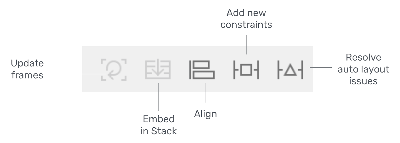
- Add new Constraints:- This is used for adding new constraints to UI elements such as buttons.
- Align:- This quickly aligns items in one’s layout.
- Resolve Auto Layout Issues:- It provides a number of options for fixing common Auto Layout issues ie Upper half of the menu affects only the currently selected views while the bottom half affects all views in the scene.
- Embed in Stack:- It allows one to quickly create a stack view.
- Update frames:- Updates the frame’s position and size in reference to the given layout constraints.
Creating a segue
Before we begin, let’s add another screen. Click on the object library and drag a view controller to the Interface Builder. To create a segue between our two view controllers, click on our button, control-drag a line from the button to the next view controller. A pop-up menu will appear with a few of options. Choose from Action Segue the option Show. This just allows us to view the second view controller.
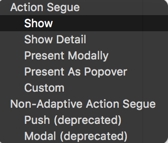
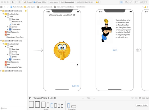
Figure: Creates a segue between two view controllers using a button.
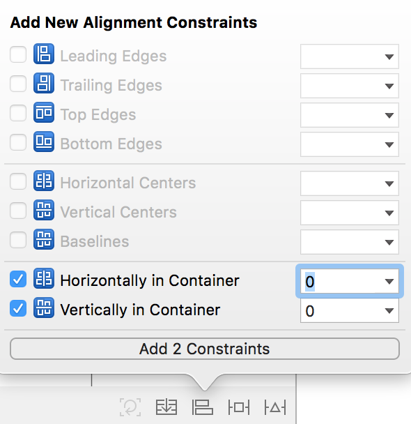
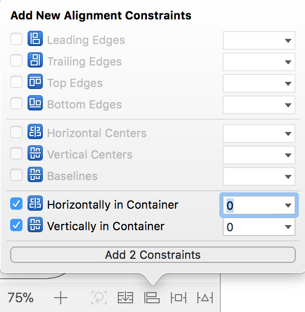
Align Tool
In our view controller, control drag a button from the object library and rename it “OKAY”. To create constraints select the button and click the Align icon in the auto layout menu. A popover menu will appear, check both “Horizontal in container” and “Vertically in container” options to center the button on the screen. Then click the “Add 2 Constraints” button. Run the application.
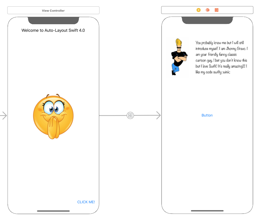
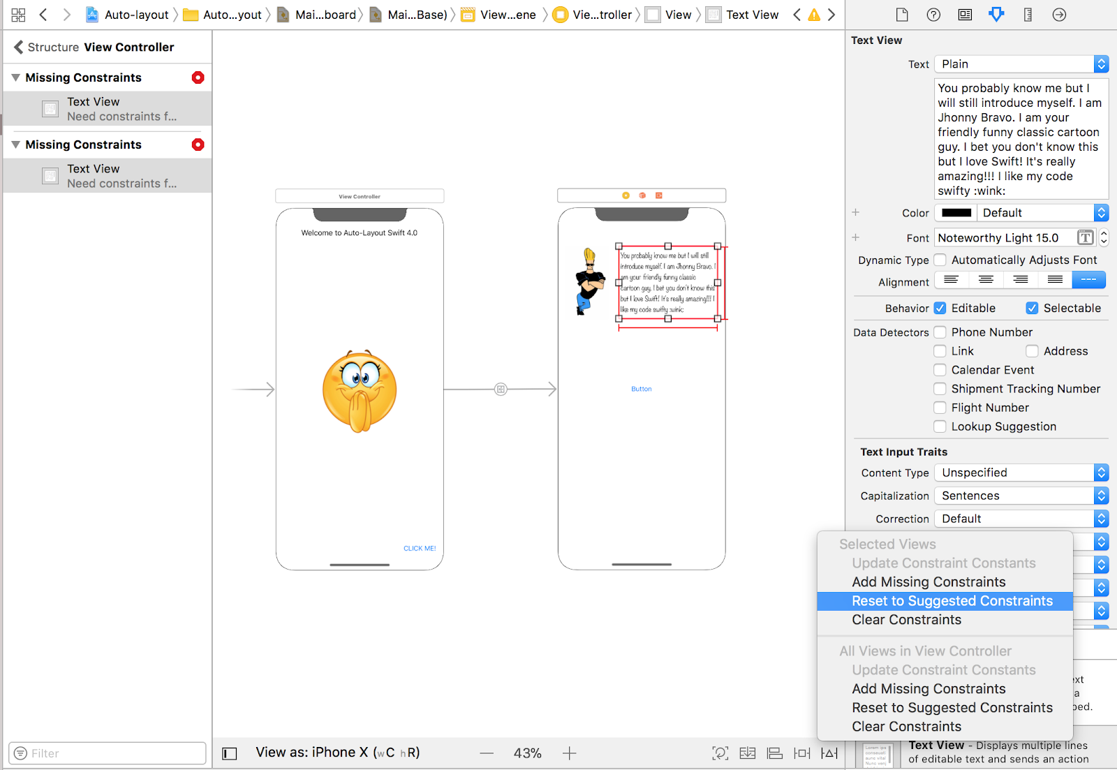
Next we’ll add new constraints. Control-drag an Image view and text view onto the view controller. Disable editable and selectable actions for the text view in the Attributes Inspector as they are selected by default.
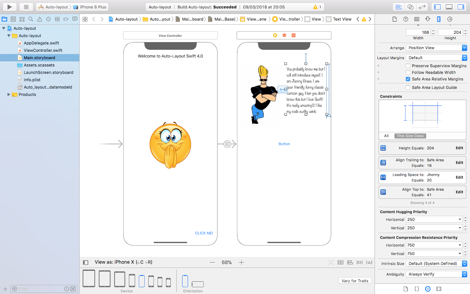
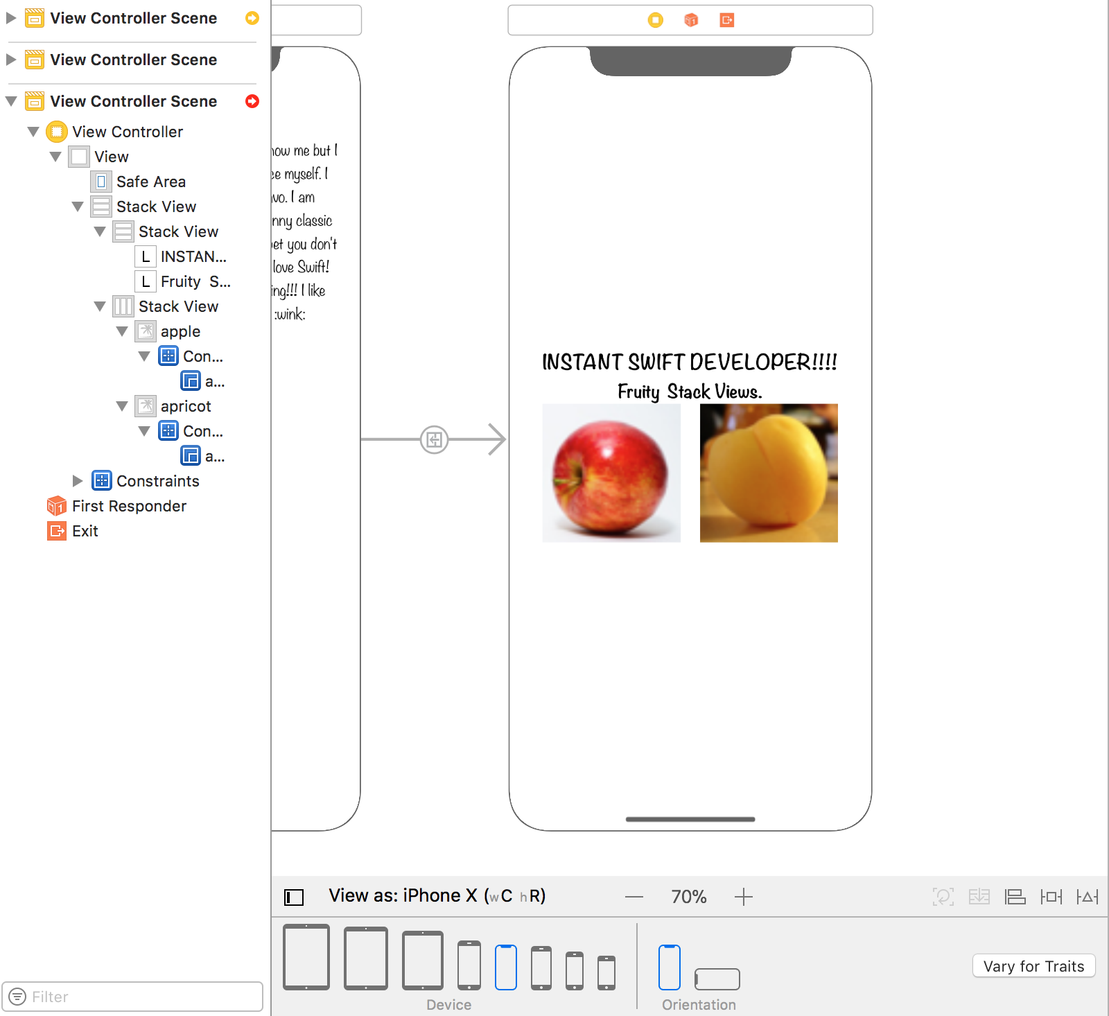
We will add this image to assets. Name it “Johnny” then add it to the image view.
As for the textview add the following text “You probably know me but I will still introduce myself. I am Johnny Bravo. I am your friendly funny classic cartoon guy. I bet you don’t know this but I love Swift! It’s really amazing!!! I like my code swifty :wink: “ The view controllers should look like this now.
To add constraints, select the text view. Click the Add new constraints icon. This popover menu will appear:
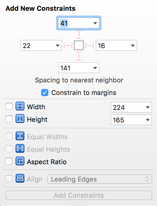
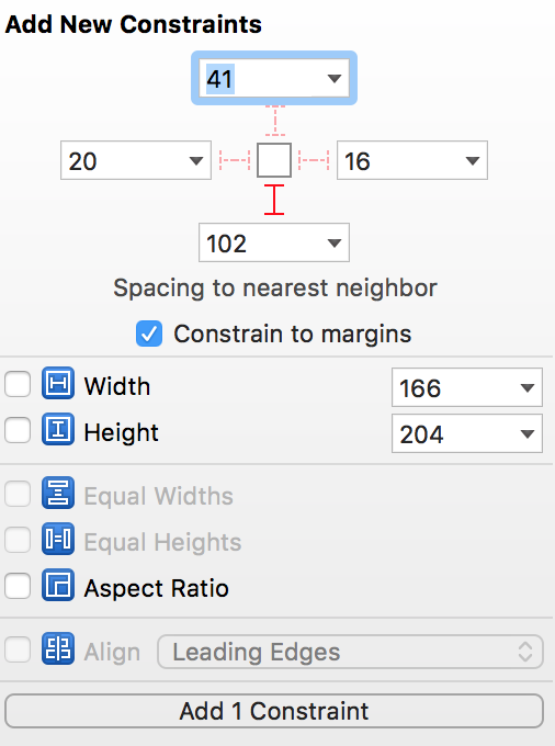
It comes with the width and height already predetermined from the size of the view. If the text or image view appear too big, just resize them to a good fit. Select height and width and Add 2 Constraints. The element’s size is now fixed but notice that we have some errors in our constraints as seen from the Document outline?
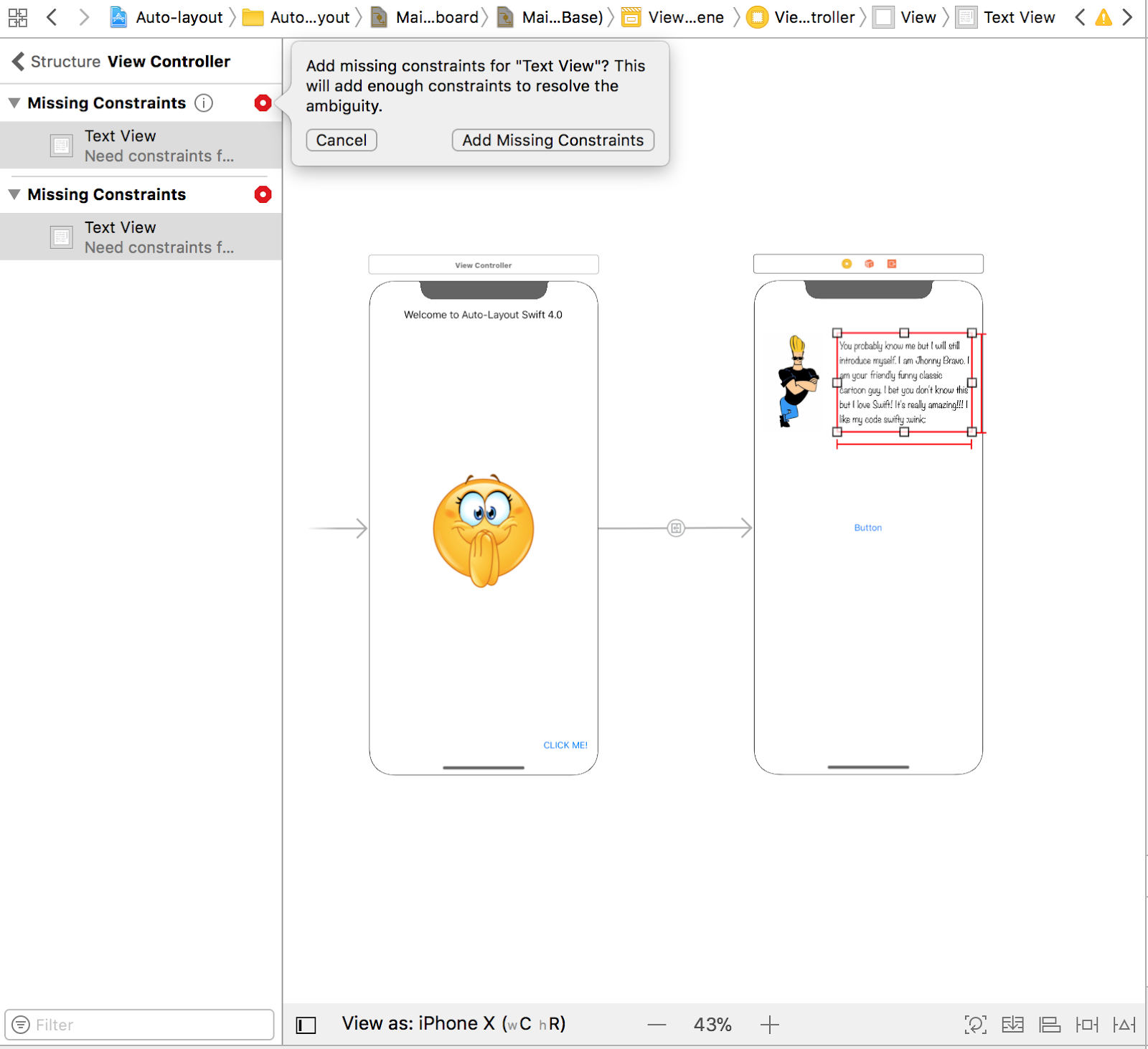
Resolving Constraints
When a layout issue emerges, the Document Outline displays a disclosure arrow (red/orange).
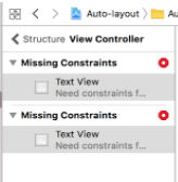
This helps to identify if it is an error or an misplaced constraint.
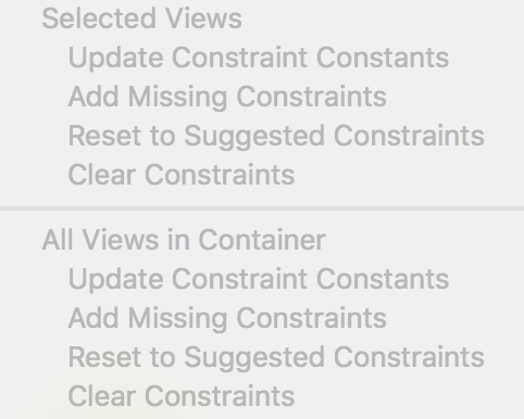
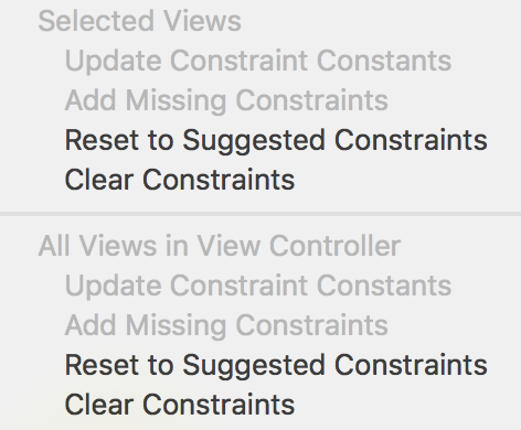
To resolve these errors, we could either add missing constraints by going to the document outline and selecting of the error icon: warning icon for misplaced constraints and selecting Add missing constraints button or click the Resolve constraint issues icon in the Auto Layout menu. Remember, you have to select a view otherwise all the buttons will be disabled. Having the latter selected, choose Reset to suggested constraints option for the view selected. No need to worry, they both do the same thing!
Figure: With selected view
Now live preview the constraints. There are a number of screens that don’t have a satisfying look right. Resolving constraints is one way of debugging constraints but this will not work in our case. To properly set up the constraints in our project, first clear all the constraints.
Looking at the figure above there are two sections of Resolving auto layout issues button. The first section is only for selected elements. If you select on the text view alone and clear the constraints, the button and image will still retain their constraints. However, clearing constraints in the second section will clear all constraints for all elements in the view controller.
NB: In auto layout when we give height and width, well mostly we will be constraining our view to a particular size. Think about it for a second.
Say we are working with an iPad and have an image that covers half the screen, if that same image is ran on a smaller device it will appear bigger and will have gone beyond the screen’s scope. As much as it’s good practice to add height and width to a view, it’s just as important to know when to add them. Overdoing constraints is actually a thing.

Now, let’s properly add our constraints.
Select the image view and click on add constraints. The popover below will appear. Keep the constrain to margins checkbox selected. We want to constrain our view according to our other views and what this checkbox means is that it will constrain your view to the screen’s edges (Safe Area).
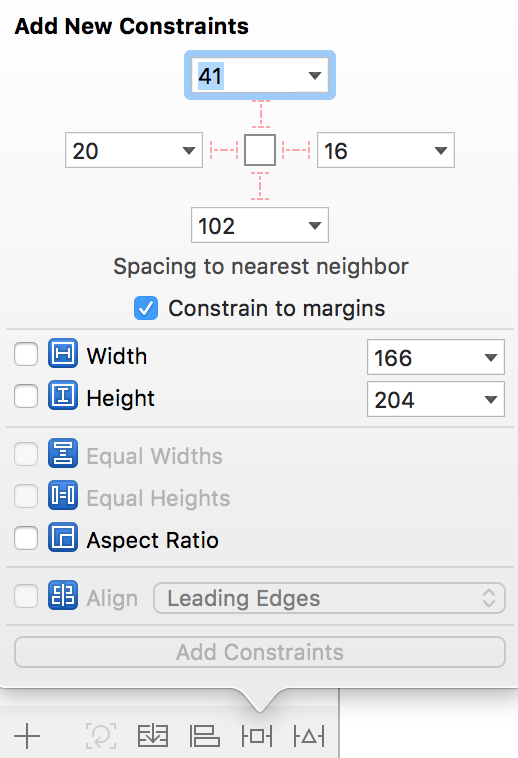
Add these two constraints for the image:
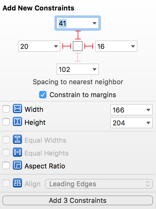
Add these constraints for the text view:
Notice that the image has only blue lines while the text view has both blue and red lines.
The red lines mean that there is an error in the constraints while the blue lines means all constraints are good. In our case, we don’t have enough constraints for the text view. To silence this error add the bottom constrained spacing to the nearest neighbor.
To add constraints for the button, click on the Align icon. Then center it horizontally and vertically. It should like this.
And we are all done!

Debugging
We did debugging when we resolved our constraints but let’s understand some debugging features. Try to drag the OKAY button to the lower-left part of the screen. Xcode immediately detects some layout issues and the corresponding constraint lines turn orange that indicate a misplaced item whereas a red line appears that indicates ambiguous constraints.
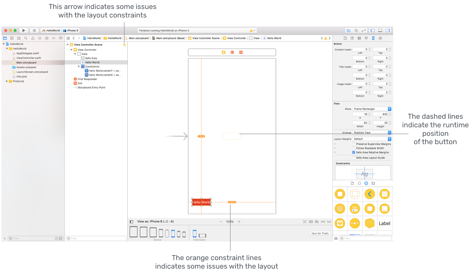
Auto layout issues occur when we create ambiguous or conflicting constraints. Here we said the button should be vertically and horizontally centered in the view. However, the button is now placed at the lower-left corner of the view. The Interface Builder found this confusing, therefore it uses orange lines to indicate the layout issues and red lines to indicate errors such as ambiguity or inadequate constraints. The dash lines indicate the expected position of the button.
When there is any layout issue, the Document Outline displays a disclosure arrow (red/orange). Now click the disclosure arrow to see a list of the issues. For some layout issues like this one, the Interface Builder is smart enough to resolve the layout issues for us. Click the indicator icon next to the issue and a popover shows you a number of solutions.
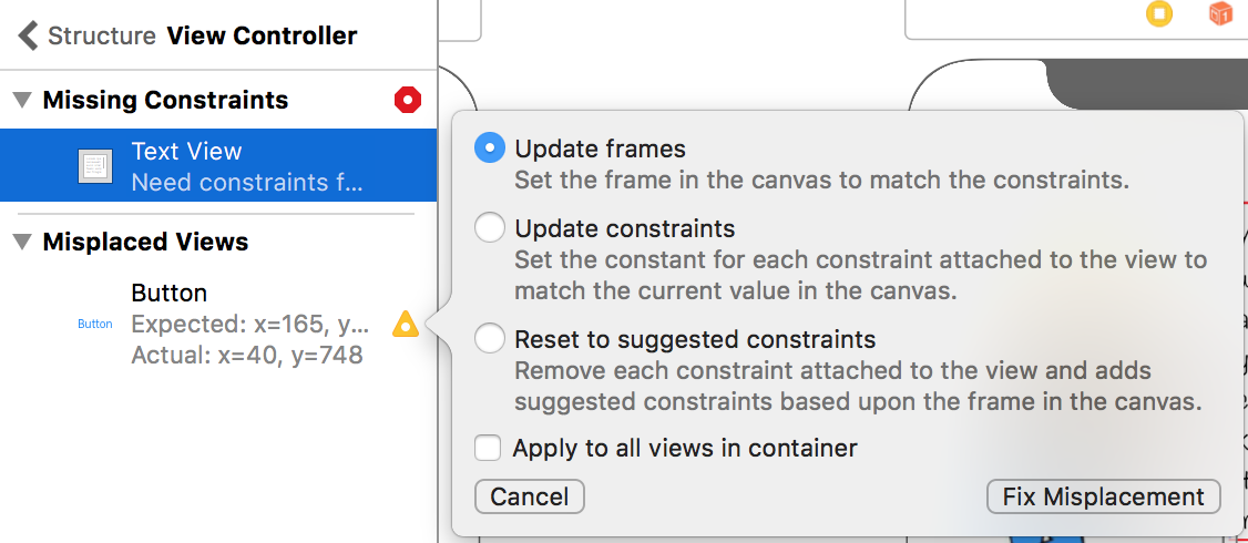
In this case, select the “Update frames” option and click “Fix Misplacement” button. The button will then be moved to the center of the view.
Next, click the indicator icon next to the missing constraints.
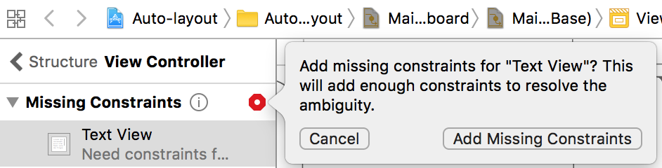
In this case, select the “Add Missing Constraints” option. The text view’s constraints will stop being ambiguous and turn blue. But if you are good, lets edit some constraints!
Examining and Editing Constraints
We have learnt so much about constraints but where are they found exactly?
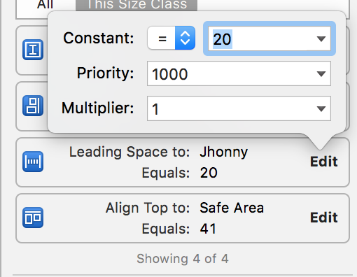
Well, click any view, say, the TextView. Make sure the Utility Panel is shown and that you are viewing the Show size Inspector icon. Here you will see a list of the constraints we have created. They will be found at the bottom so we have to scroll down to find them. Also try to hover over some of the constraints, notice how the constraints are being highlighted in the view controller. That helps us know which constraint we are on about.
Time to edit some constraints. While you are on the “Leading Space to: Johnny” constraint, click the edit button. A popover will appear showing three properties. Edit the Constant property by changing the value from 20 to 25. Notice that constraint change is reflected by the increment of the distance between the two views.
Anatomy of a Constraint
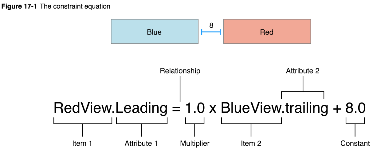
We have two views, red and blue. The constraint above states that the red view’s leading edge must be 8.0 points after the blue view’s trailing edge. Its equation has a number of parts:
- Item 1:- A graphic element that the constraint is applied to. In our case, it’s the RedView, but it could be anything else (button, label, image view, etc). The item must be either a view or a layout guide.
- Attribute 1. Is the type of constraint we set (like leading, trailing, top, bottom, etc). In our case, the RedView’s leading edge.
- Relationship. The relationship between the left and right sides. The relationship can have one of three values: equal, greater than or equal, or less than or equal. In this case, the left and right side are equal. It’s the relation between the first attribute and the modified second attribute in a constraint.
- Multiplier. The value of attribute 2 is multiplied by this floating point number. In this case, the multiplier is 1.0.
- Item 2. The second item in the equation, in our case, it’s the BlueView. Unlike the first item, this can be left blank.
- Attribute 2. The attribute to be constrained on the second item—in this case, the BlueView’s trailing edge. If the second item is left blank, this must Not be an Attribute.
- Constant. A constant, floating-point offset—in this case, 8.0. This value is added to the value of attribute 2.

Let’s talk Stack!
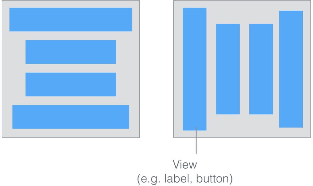
For this, we are going to understand a few things about Stack Views. First things first, what is a Stack View? A stack view provides a streamlined interface for laying out a collection of views in either a column or a row that is, horizontally or vertically.
It manages the layout of its subviews and automatically applies layout constraints for you. Don’t get me wrong though, we still need Auto Layout.
Xcode provides two ways to use Stack Views:
- We can drag a Stack View (horizontal / vertical) from the Object library, to the storyboard. Then drag and drop view objects such as labels, buttons, image views into the stack view.
- Alternatively, we can use the Stack option in the Auto Layout menu. For this approach, select two or more view objects and then choose the Stack option. The Interface Builder then embeds the objects into a stack view and resizes it automatically. Ideally we could just go to the toolbar, select Editor option, click on ‘Embed in’ option and select stack views.
Now a simple exercise. All we need to do is to add to add two images in a horizontal stack view and two labels in a vertical stack view then nest them into one whole stack view. The layout should look like this, regardless of the image used.
Some hints:
- So first, decide whether to use a vertical or horizontal stack view for the labels
- Decide how you want to present the labels. Xcode provides several attributes, for instance
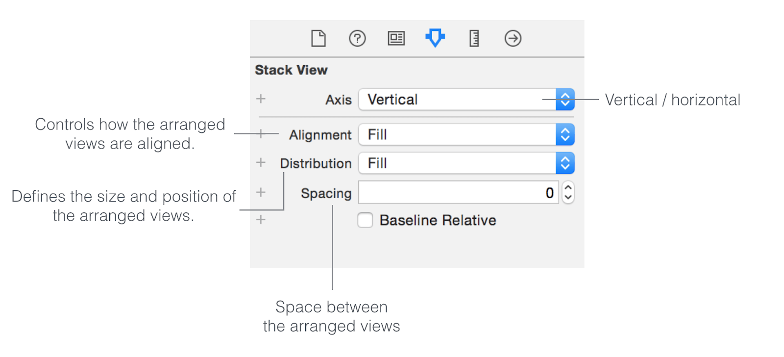
A bit about each property:
- Axis – Indicates whether the arranged views should be layout vertically or horizontally.
- Alignment – Controls how the arranged views are aligned. For example, if it is set to Leading, the stack view aligns the leading edge (left) of its arranged views along its leading edge.
- Distribution – Defines the size and position of the arranged views. By default, it’s set to Fill. In this case, the stack view tries its best to fit all subview in its available space. If it is set to Fill Equally, the vertical stack view distributes elements equally so that they are all the same size along the vertical axis. NB:Let the images be filled equally. Remember that we are designing the UI for different screen sizes therefore if we do not explicitly set the distribution to Fill Equally, Xcode will layout the Image Views using the default setting which may not look good on other screens.
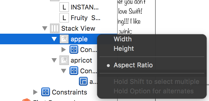
- Select Aspect Ratio for each image. This will help retain the size of each image as you transition to different screens. Control drag on the image in the Document Outline and select aspect ratio option.
Happy Coding!
Auto Layout is powerful once you grasp the basics. If you’ve made it this far into the tutorial, congratulations – you now know what Auto Layout is all about, and have experimented enough! However, there’s a lot left to learn as you’ll see when we learn about more advanced features of Auto Layout.

Now grasshopper, go build adaptive UIs to fit multiple screen sizes.
About the Author
Rose is a full-time iOS Engineer and she likes to think about software development as problem solving rather than being a language. You can find her on LinkedIn, Twitter and Instagram.
Related Posts
-
Orchestrate an AI-to-Human Agent Handoff with Twilio Agent Connect, Conversations Orchestrator, Studio, and FlexKinshuk Kar Sarang Shah
-
Introducing the Twilio MCP Server and Skills: Give Your Coding Agents Native Access to 1,800+ Twilio APIsSeline Chen Christopher Lintz
-
Introducing Ola: An Agent-Native Communication Channel and Oversight Platform from Twilio ForwardRikki Singh Ryan Ferguson
Related Resources
Twilio Docs
From APIs to SDKs to sample apps
API reference documentation, SDKs, helper libraries, quickstarts, and tutorials for your language and platform.
Resource Center
The latest ebooks, industry reports, and webinars
Learn from customer engagement experts to improve your own communication.
Ahoy
Twilio's developer community hub
Best practices, code samples, and inspiration to build communications and digital engagement experiences.