Introducing Windows Presentation Foundation (WPF) Animations
Time to read:
October 14, 2020
Written by
Reviewed by
This post is part of Twilio’s archive and may contain outdated information. We’re always building something new, so be sure to check out our latest posts for the most up-to-date insights.

When it comes to web pages, HTML is the tool to present the elements and CSS to provide the styling. Sure, there are exceptions and embellishments but, in short, that is how it boils down. If you want to implement some sort of animation or have something move, and it’s more complex than the simple animations supported by CSS, you generally have to fall back on JavaScript. In contrast, these aspects of presentation, styling, and animation are all an integral part of the Windows Presentation Foundation XAML.
XAML stands for Extensible Application Markup Language, and it is a declarative language that describes WPF’s elements, relationships, and behaviors. XAML elements map directly to Common Language Runtime (CLR) object instances and XAML attributes correspond to the properties and events of CLR objects.
In this tutorial, you will explore the various ways to animate visual elements in WPF. The case study application you’ll build will implement three buttons that respond to the mouse hovering over them with an animation.
All of the coding for this tutorial is accomplished using only XAML. If you ever have an application that will run on Windows, you may find it easier and faster to implement using WPF rather than a collection of tools used in a browser environment. Of course there are trade offs, but WPF may be the right tool for the job.
Animations are nothing more than manipulations of properties over time. To define an animation, you have to tell it the following:
- What property will be modified
- When it should do it
- How much it should change or what it will change to
- How fast to do it
Prerequisites
You’ll need the following tools and resources to build and run this project:
Windows 10 – It puts Windows in the Windows Presentation Foundation.
.NET Core SDK 3.1 – The SDK includes the APIs, runtime, and CLI.
Visual Studio 2019 with the following workloads and individual components:
- .NET desktop development workload (Includes C#)
- GitHub Extension for Visual Studio (If you want to clone the companion repository.)
You should have a general knowledge of Visual Studio and the C# language syntax. You will be adding and editing files and debugging code.
There is a companion repository for this post available on GitHub. It contains the complete source code for the tutorial project.
Creating the project
Begin this tutorial by creating a WPF App (.NET Core) project for C# named WpfAnimationIntro. You can put the solution and project folders wherever it’s most convenient for you.
The only file that will be modified will be MainWindow.xaml; open that file and replace the boilerplate code with the following:
At this point, your XAML designer window should look like this:
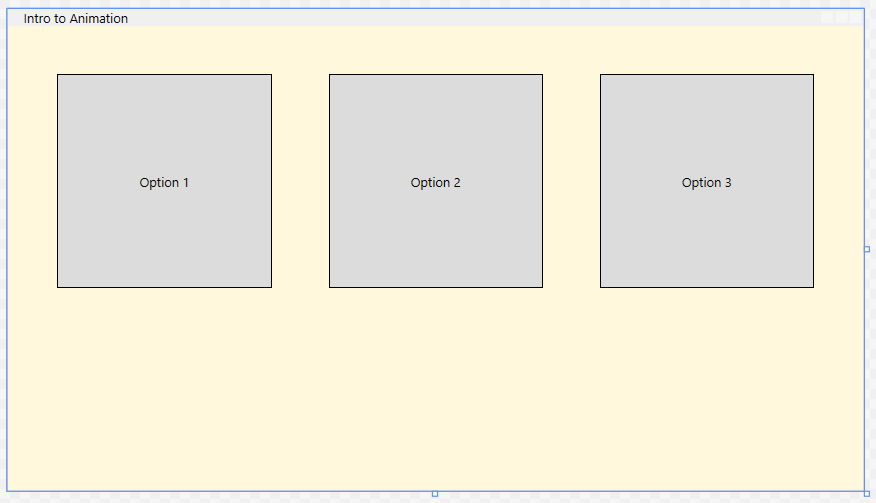
Examine the code and find the two major sections to the XAML; the Window.Resources section and the StackPanel. Working from the top down, you’ll see the declaration of the Style:
A Style is being defined here with the name of Selection. The Style element has a property called TargetType that lets you specify the type of element that the style is being applied to. In this case, the target is of type Button:
Next is a bunch of Setters. Setter is also a property of Style. Setters typically associate a particular property with a value. In this case, eight properties are assigned values. When this Style is used, the Properties will be applied to that element. It is important to note that these properties must be DependencyProperties.
The next Setter looks different, but is very similar to the others in that it assigns a value to a property:
Here the Property RenderTransform is assigned a value of RotateTransform with a Center of 100, 100. RotateTransform is one of several different transforms with RenderTransform. Later, the angle of rotation of the element will be animated, but you must first declare the specific transform. Failure will result in the angle property not being found.
Having defined all of the properties you will assign in the Style, the next section will define Triggers. Triggers are conditional objects that allow changes. These conditions are Trigger conditions. In the example here, when the mouse hovers over the element, the state of IsMouseOver equals true. Then, the trigger becomes active and performs the actions defined in the Trigger.EnterAction. Likewise, when the trigger becomes inactive, the actions described in the Trigger.ExitActions are executed. In general terms, when the mouse hovers over the element, it will perform the actions specified in the EnterActions. When the mouse is no longer hovering over the element, it will perform the actions specified in the ExitActions attribute.
The next section defines the actions that occur when the mouse moves over the element. The animation is usually set up with a BeginStoryboard and contains a Storyboard class, which is the Timeline. Here is where you will define the properties to animate.
There are several animation objects and the one to use depends on what property is modified. The first one you will use is DoubleAnimation, and it is named that way because it will animate a property whose value is a double. The current width of the buttons defined in the Setter is 200. Animating the width to 210 will cause the button to become wider. The following command does that:
This simply states that a double value of Width will animate to a value of 210 over a period of 0.2 seconds. The code makes a similar changed for the height:
Here, the Height will animate to a value of 210 over 0.2 seconds.
Next, the markup animates the thickness of the border. However, the value of the thickness of a border is not a double, but rather a Thickness object. For that, WPF has another type of animation command, ThicknessAnimation:
A more exact way of doing this would be:
The latter example clearly shows the thickness for the left, top, right, and bottom sides. In this case, both representations are identical.
Next, the code animates the button’s color; and for that, there is another animation command, ColorAnimation:
Here, the background color (which is a solid color) will change to aquamarine for 1 second. The FillBehavior defines what will happen once the animation reaches its end and, in this case, the animation will stop.
The rotation angle is the last property that is animated in this sequence:
The rotation angle of the element is rotated -2 degrees for 0.1 seconds.
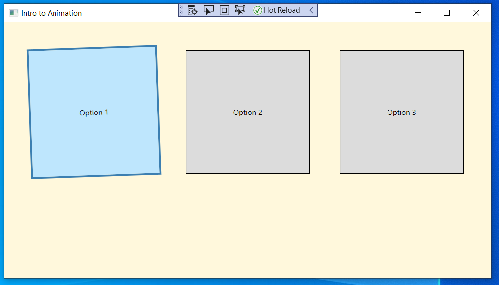
So with the Storyboard defined, when the mouse is over the element, it will get wider, taller, change color and rotate to the left a bit. But what happens when the mouse is no longer over the element? That is where ExitActions come into play. The Trigger.ExitActions in this case will put everything back the way it was.
The only section left is the StackPanel. After setting up a UniformGrid, three buttons are declared, applying the style that was defined above. All the pieces are now tied together, and the application ready for testing.
Testing the completed application
Build and run the application. You will see three buttons. Hovering the mouse over any one of the buttons triggers the EnterActions, and moving the mouse away triggers the ExitActions.
Potential enhancements
There are many ways to enhance this demonstration. You could add additional properties to animate. Possibly you may want the rotation animation to continue spinning. You could ever explore animating the color with gradient fills rather than solids.
Summary
The animation capabilities in WPF are compelling. This simple demonstration showed you the fundamentals. There are many other features, parameters, and options that make this framework incredibly useful. At times it seems overly verbose, but those same characteristics make it precise and flexible.
Additional resources
The following resources will enable you to explore other aspects of the technologies discussed in this post:
Getting Started with Windows Presentation Foundation (WPF) in .NET Core – The first post in this series introduces the basic concepts of WPF and walks you through creating a working example.
Understanding WPF Routed Events In .NET Core – The sophisticated event handling system in WPF is one of its many strengths. This post introduces you to event handling concepts like bubbling and tunneling.
How to: Implement Property Change Notification – This article in the docs.microsoft.com Desktop Guide describes how to set up OneWay and TwoWay binding and provides a code sample.
Events and routed events overview – Although this article is written for UWP rather than WPF, the fundamental concepts of event handling and routing are similar. Read for conceptual understanding and refer to WPF-specific pages for functional reference material. (Note that as of this writing the .NET 5.0 documentation for WPF is a work in progress.)
Using Twilio Lookup in .NET Core WPF Applications – Learn how to use the Twilio Lookup API to verify phone numbers and find caller information for numbers entered in a WPF application.
TwilioQuest – If you’d like to learn more about programming C# and other languages, try this action-adventure game inspired by the 16-bit golden era of computer gaming.
Jeffrey Rosenthal is a C/C++/C# developer and enjoys the architectural aspects of coding and software development. Jeff is an MCSD and has operated his own company, The Coding Pit, since 2008. When not coding, Jeff enjoys his home projects, rescuing dogs, and flying his drone. Jeff is available for consulting on various technologies and can be reached via email, Twitter, or LinkedIn.

Related Resources
Twilio Docs
From APIs to SDKs to sample apps
API reference documentation, SDKs, helper libraries, quickstarts, and tutorials for your language and platform.
Resource Center
The latest ebooks, industry reports, and webinars
Learn from customer engagement experts to improve your own communication.
Ahoy
Twilio's developer community hub
Best practices, code samples, and inspiration to build communications and digital engagement experiences.