Bringing Cohesion to the Twilio Product Suite: Part II, Navigation
Time to read:
August 01, 2023
Written by
Reviewed by
This follows our first blog post of this series, “Bringing Cohesion to the Twilio Product Suite: Part I”, where we dove into the research and motivation behind Twilio’s initiative to create a cohesive design language that paves the way for a unified product experience.
The next part of this journey begins with aligning how customers navigate within and between all of our product offerings.
Navigation experiences across Twilio products have widely varied looks, feels, and functions. There are inconsistencies across the board in how sidebars expand and collapse, how information architecture is represented visually, and how we align terminology like workspaces and accounts.
Our UX Infrastructure team set out to create a UI kit of React components and Figma assets to unify how navigation looks and feels across Twilio products.
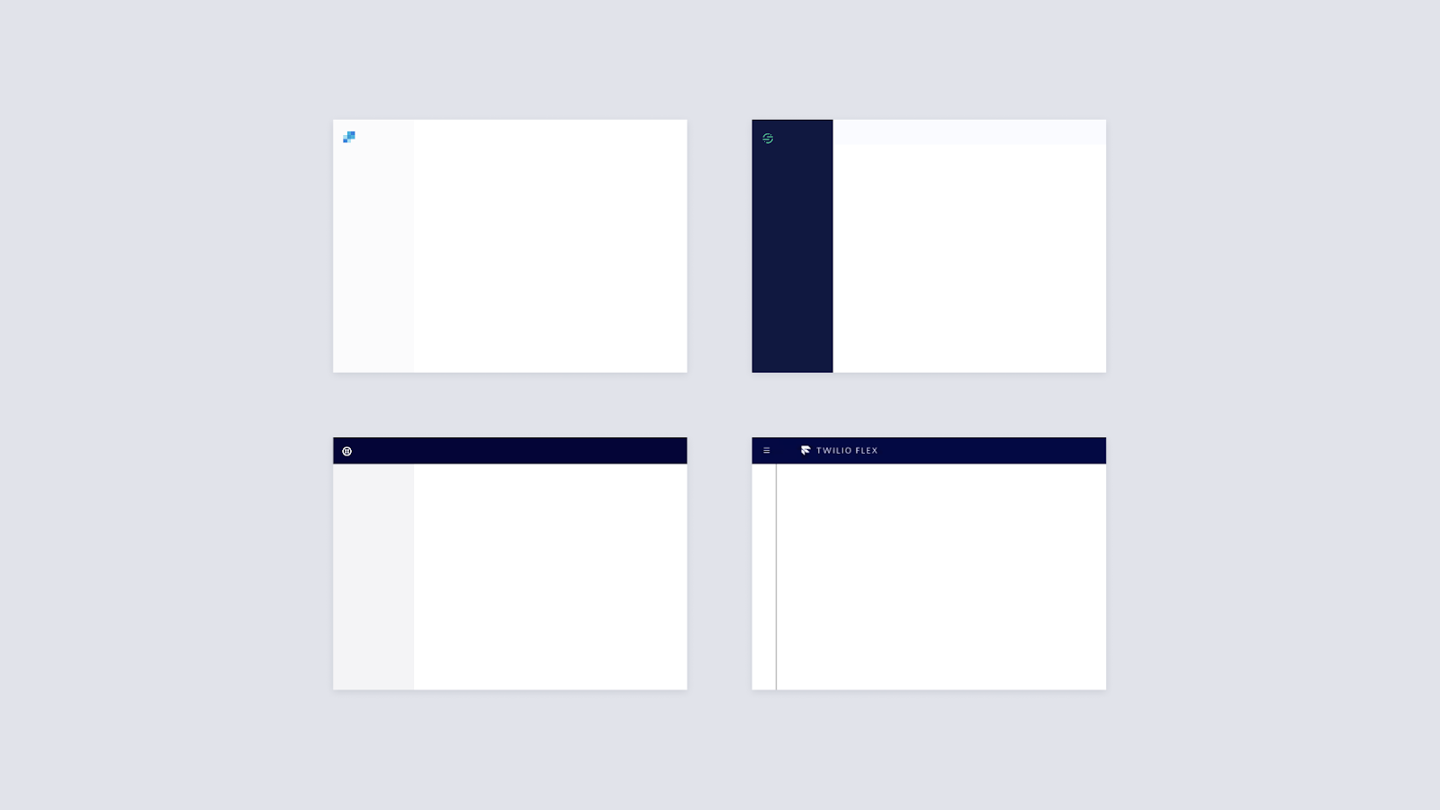
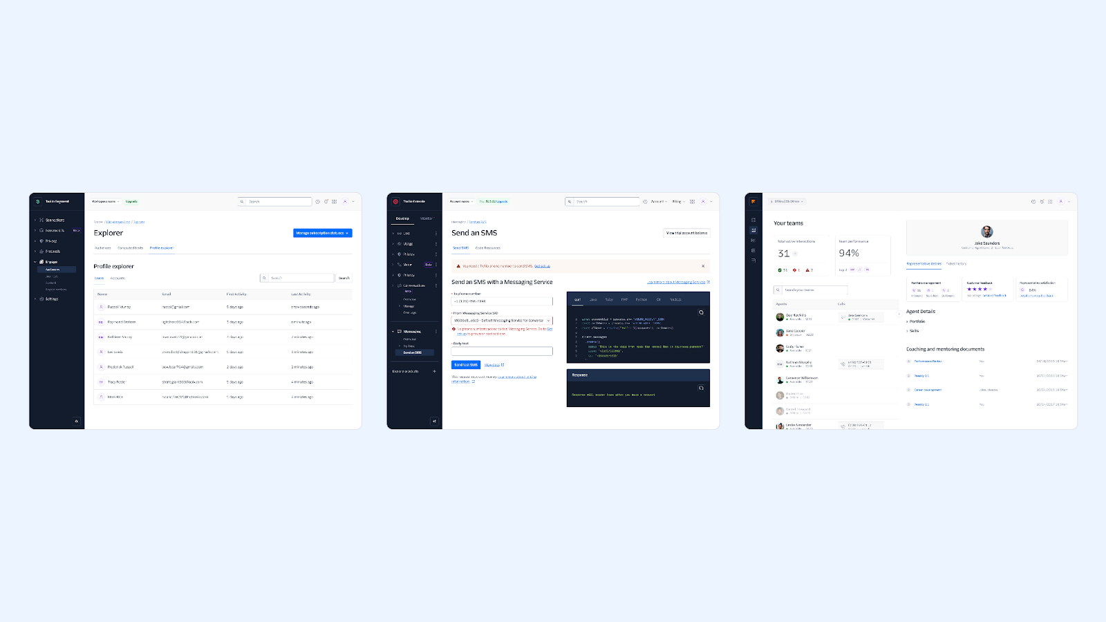
The navigation components are specifically designed to accommodate all of the existing features across Console, Segment, Flex, and SendGrid. We set out to craft purely presentational components as building blocks that are easy to use and implement into existing technical implementations.
A refresh on the research
In early 2022, we conducted a survey with ~50 customers across varying roles, product usage levels, and tenures who have used at least 2 Twilio products.
We shared product screenshots and asked customers questions around the visual design language and cohesiveness of the products. We also asked customers about cross-product workflows and what other product suites they use and what they think of them.
One of the key findings from that survey was how customers rated cohesion among Twilio products. Respondents ranked cohesion across Segment, SendGrid, Console, and Flex at 2.47 out of 5. In fact, 61.22% of respondents (30 out of 49) said they disagreed or strongly disagreed that the products looked cohesive.
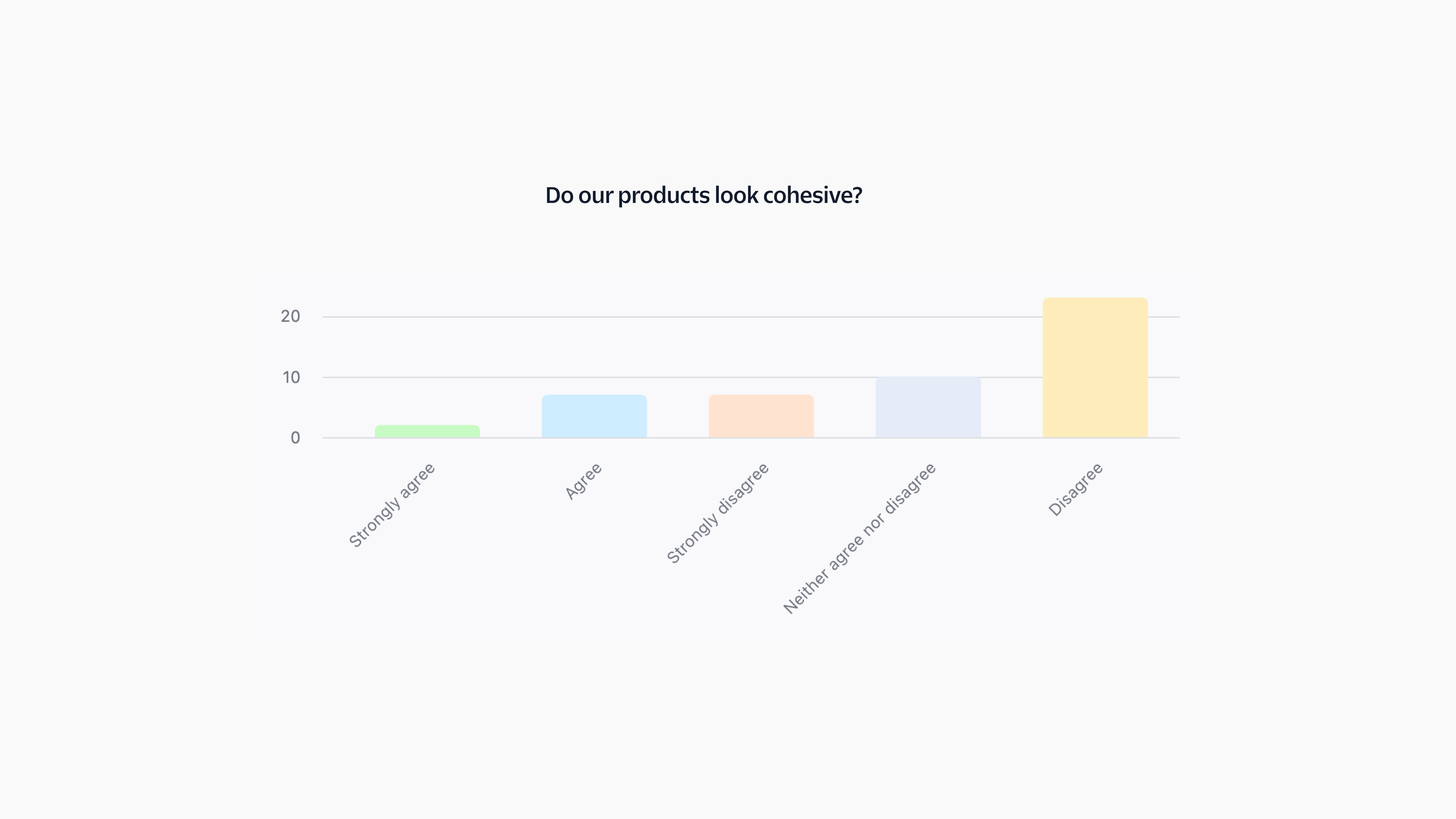
Cohesion is a weakness across our products, though this hardly comes as a surprise. In comments, 10 respondents specifically called out the different navigations. It was clear that the inconsistencies across navigation experiences were negatively impacting perceived cohesion, and that a unified navigation would significantly improve our customer experience.
Scoping the work
With customer research proving the need for unified navigation, we had to define the acceptance criteria of the project.
Our constraints
- Embrace how products function today. Create components as building blocks for product teams to rebuild their navigations, without losing any existing functionality, to make adoption seamless.
- Use our design system as much as possible. Don’t break what works. Make use of Paste components and patterns before turning to custom implementations.
- Leverage existing research for validation. For example, we found in earlier research that customers prefer a dark sidebar. We used that as a baseline for the work and avoided re-innovating for the sake of it.
Establishing a common ground
We started by taking a look at products to distinguish between static, interactive, and common elements. The common elements we identified helped us narrow down a list of components to build for the UI kit.
Some of the common elements we identified were:
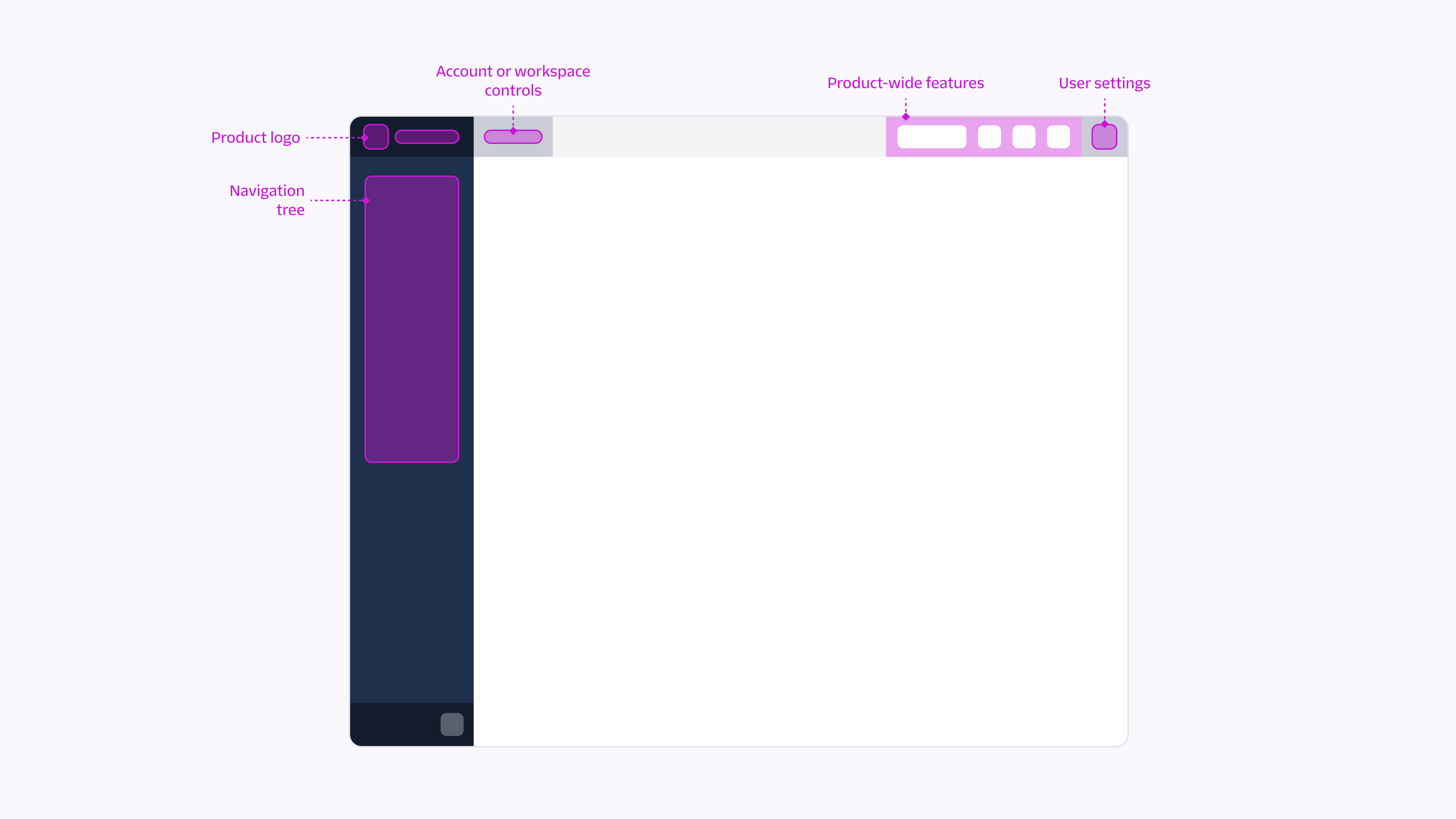
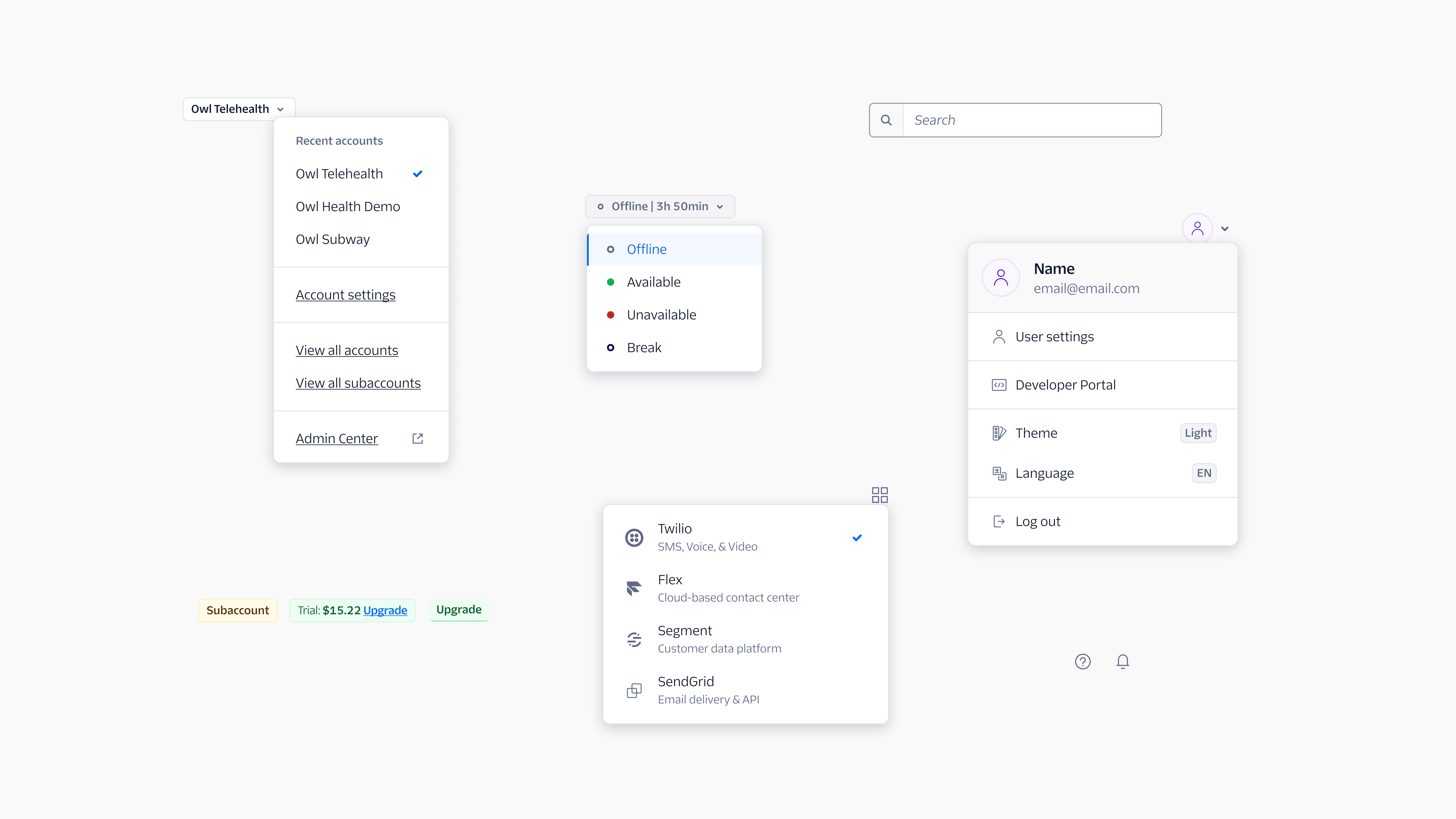
- Sidebar Navigation: a group of styled links that navigate between pages in an application.
- Account Switcher: a menu to swap between users’ accounts or workspaces.
- User Dialog: a dialog for any profile-related actions.
- Product Switcher: a menu to switch between Twilio products. This doesn’t exist in our products today and was added to the project based on conversations with product leads on desired future functionality.
We explored different layouts of the navigation frame. After an initial round of feedback with stakeholders, we landed on a combined concept with higher priority actions at the top level and lower priority actions nested in menus.
From there, we dove into design explorations of each component while taking into account the unique navigation needs of each product, and crafted a solution that works seamlessly across all of them.
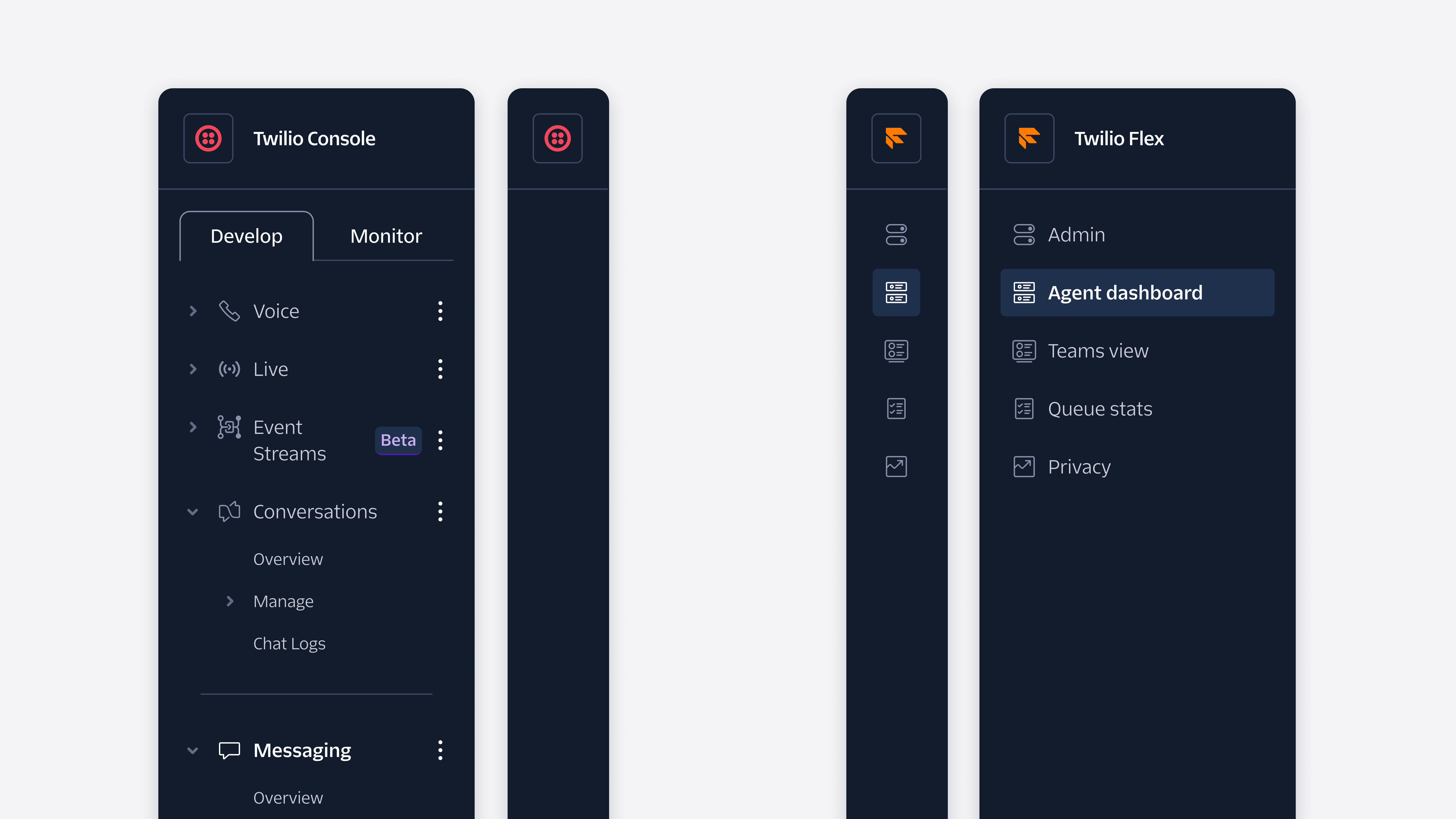
The Sidebar Navigation component has the most varied use cases between products. In Console, feature pages are accessed through disclosures, and the sidebar isn't visible when collapsed. In Flex, the sidebar is collapsed by default and features icon-only navigation items when collapsed. Our solution? A flexible component with variants that accommodates all of these use cases with ease.
The final outcome
We led a navigation review meeting for approval from ~20 stakeholders including product managers, software engineers, and product designers. We asked stakeholders to rate their support for the unified navigation out of 5 and received a unanimous approval score of 5 out of 5.
Our deliverables
The main deliverables of the UI kit included:
- React components that can be composed into any web-based user experience, regardless of complexity, including Sidebar and Topbar.
- Figma assets that visually match our React UI, and can be used to create visual explorations and prototypes efficiently.
- A pattern with layout and composition guidance on structuring navigation components in each product in a unified way.
What’s next?
We’re really happy with how the unified navigation turned out, and are excited to see it roll out to Twilio products in the coming months. We’re also collaborating with product teams on establishing design subsystems for their product’s navigation, with components built atop those of the UI kit.
If you’re interested in using the navigation components in your own project, you can check out the Paste website and ask the team questions in GitHub Discussions. Let us know if you do! We can’t wait to see what you build.


Related Resources
Twilio Docs
From APIs to SDKs to sample apps
API reference documentation, SDKs, helper libraries, quickstarts, and tutorials for your language and platform.
Resource Center
The latest ebooks, industry reports, and webinars
Learn from customer engagement experts to improve your own communication.
Ahoy
Twilio's developer community hub
Best practices, code samples, and inspiration to build communications and digital engagement experiences.