Build a cross-platform desktop application with Go and Wails

February 20, 2023
Written by
Joseph Udonsak
Contributor
Opinions expressed by Twilio contributors are their own
Reviewed by

Build a Cross-Platform Desktop Application With Go and Wails

Electron was (and still is) a big hit for a number of reasons. First, its cross-platform functionality enables developers to support Linux, Windows, and macOS from a single codebase. On top of that, it has a lean learning curve for developers familiar with Javascript.

While it has its downsides — with application size and memory consumption the most prominent — it has opened up a wealth of possibilities for creating cross-platform desktop apps.

However, since its release, a number of alternatives have come into the fray. This article explores one such alternative - Wails, a project which makes it possible to write desktop apps using Go and web technologies such as React and Vue. A major selling point for Wails is that it does not embed a browser, but instead uses the native rendering engine for the platform. This makes it a lightweight alternative to Electron.

To get familiar with Wails, you will build a GitHub desktop client which will interact with the GitHub API, providing the following features:

  1. View public repositories and Gists
  2. View private repositories and Gists for an authenticated user
  3. Create a new Gist for the authenticated user.

While the backend will be written in Go, React and Vite will be used for the frontend. The UI components will be created using Ant Design (AntD).

How it works

As mentioned earlier, Wails works by combining a backend written in Go with a frontend written using either a Javascript library/framework, or with Vanilla HTML and Javascript. Even though your functions and data types are declared on the backend, Wails makes it possible for them to be called on the frontend. What’s more, where a struct is declared on the backend, Wails is able to generate a TypeScript model for use on the frontend. The result of this is seamless communication between the frontend and backend. You can read more about how Wails works here.

Prerequisites

To follow this tutorial, you will need the following:

Getting started

Create a new Wails project by running the following command.

wails init -n github_demo -t react

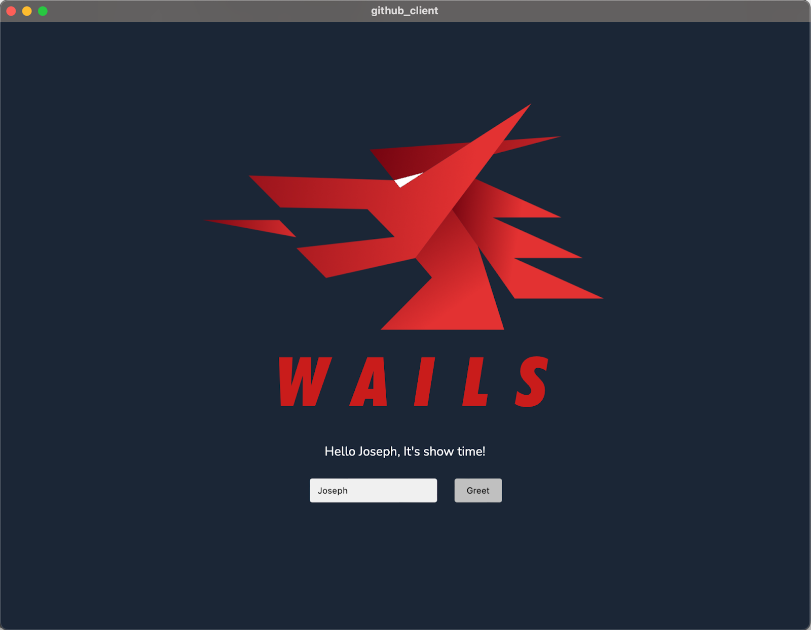
This scaffolds a new project using Go for the backend and React + Vite for the frontend. Once the scaffolding process is completed, navigate into the newly created folder and run the project, by running the commands below.

cd github_demo
wails dev

This will run the application as seen in the image below.

The initial Wails app running on macOS

Close the application and open the project directory in your preferred editor or IDE, to get started with adding features to the application.

Build the backend

Add functionality for API requests

The first thing the app needs to have is the ability to send GET and POST requests to the GitHub API. In the root directory of the application, create a new file named api.go. In this file, add the following code.

package main
import (
        "bytes"
        "fmt"
        "io"
        "net/http"
)
func makeRequest(requestType, url, token string, payload []byte ) ([]byte, error){
        client := &http.Client{}

        var request *http.Request
        if payload != nil {
                requestBody := bytes.NewReader(payload)
                request, _ = http.NewRequest(requestType, url, requestBody)
        } else {
                request, _ = http.NewRequest(requestType, url, nil)
        }

        request.Header.Set("Accept", "application/vnd.github+json")

        if token != "" {
                request.Header.Set("Authorization", fmt.Sprintf("Bearer %s", token))
        }

        response, err := client.Do(request)
        if err != nil {
                return nil, fmt.Errorf("request failed: %w", err)
        }

        body, _ := io.ReadAll(response.Body)
        return body, nil
}

func MakeGetRequest(url string, token string) ([]byte, error) {
        return makeRequest("GET", url, token, nil)
}

func MakePostRequest(url, token string, payload []byte) ([]byte, error){
        return makeRequest("POST", url, token, payload)
}

The makeRequest() function is used internally to make a request to a specified URL. In addition to specifying the URL, the request type, token, and payload are passed to the function. Using these, the request is prepared and sent with the API response returned by the function.

The MakeGetRequest() and MakePostRequest() functions wrap around the makeRequest() function to send GET and POST requests respectively.

Bind helper functions to the app

With the API functionality in place, you can declare some helper functions which will be bound to the frontend. This is done by adding receiver functions for the App struct.

You can see an example of this at the end of app.go, where a receiver function named Greet() is declared.

func (a *App) Greet(name string) string {
        return fmt.Sprintf("Hello %s, It's show time!", name)
}

Now, add the following code to app.go.

type APIResponse []interface{}
type Gist struct {
        Description string      `json:"description"`
        Public      bool        `json:"public"`
        Files       interface{} `json:"files"`
}

const BaseUrl = "https://api.github.com"

var githubResponse APIResponse

func (a *App) GetPublicRepositories() (APIResponse, error) {
        url := fmt.Sprintf("%s/repositories", BaseUrl)
        response, err := MakeGetRequest(url, "")

        if err != nil {
                return nil, err
        }

        json.Unmarshal(response, &githubResponse)
        return githubResponse, nil
}

func (a *App) GetPublicGists() (APIResponse, error) {
        url := fmt.Sprintf("%s/gists/public", BaseUrl)
        response, err := MakeGetRequest(url, "")

        if err != nil {
                return nil, err
        }

        json.Unmarshal(response, &githubResponse)
        return githubResponse, nil
}

func (a *App) GetRepositoriesForAuthenticatedUser(token string) (APIResponse, error) {
        url := fmt.Sprintf("%s/user/repos?type=private", BaseUrl)
        response, err := MakeGetRequest(url, token)

        if err != nil {
                return nil, err
        }

        json.Unmarshal(response, &githubResponse)
        return githubResponse, nil
}

func (a *App) GetGistsForAuthenticatedUser(token string) (APIResponse, error) {
        url := fmt.Sprintf("%s/gists", BaseUrl)
        response, err := MakeGetRequest(url, token)

        if err != nil {
                return nil, err
        }

        json.Unmarshal(response, &githubResponse)
        return githubResponse, nil
}

func (a *App) GetMoreInformationFromURL(url, token string) (APIResponse, error) {
        response, err := MakeGetRequest(url, token)

        if err != nil {
                return nil, err
        }

        json.Unmarshal(response, &githubResponse)
        return githubResponse, nil
}

func (a *App) GetGistContent(url, token string) (string, error) {
        githubResponse, err := MakeGetRequest(url, token)

        if err != nil {
                return "", err
        }

        return string(githubResponse), nil
}

func (a *App) CreateNewGist(gist Gist, token string) (interface{}, error) {
        var githubResponse interface{}

        requestBody, _ := json.Marshal(gist)
        url := fmt.Sprintf("%s/gists", BaseUrl)
        response, err := MakePostRequest(url, token, requestBody)

        if err != nil {
                return nil, err
        }
        json.Unmarshal(response, &githubResponse)
        return githubResponse, nil
}

Then, add "encoding/json" to the imports list at the top of the file, if your text editor or IDE doesn't do it for you automatically.

In addition to the existing code, it declares two new types: APIResponse and Gist. These will be used to model a response from the API and the structure of a Gist respectively. Next, it declares the receiver functions for the App struct:

  • The GetPublicRepositories() function retrieves a list of public repositories from the GitHub API via a GET request. Since this route does not require authentication, an empty string is passed as the token.
  • The GetPublicGists() function retrieves a list of public Gists from the GitHub API via a GET request. Authentication is also not required, hence an empty string is passed as the token.
  • The GetRepositoriesForAuthenticatedUser() function is used to get a list of the authenticated user’s private repositories. This function takes the token as a parameter.
  • The GetGistsForAuthenticatedUser() function is used to retrieve the authenticated user’s Gists. This function also takes a token as a parameter.
  • The GetMoreInformationFromURL() function is used to get more information on a repository. This information could be the commit history, list of contributors, or list of users who have starred the repository. It takes two parameters, the url to be called and the authentication token. For public repositories, the token will be an empty string.
  • The GetGistContent() function is used to get the content of a Gist. This function takes the URL for the Gist’s raw content and an authentication token (an empty string for public Gists). It returns a string corresponding to the content of the Gist.
  • The CreateNewGist() function is used to create a new Gist for the authenticated user. This function takes two parameters, the Gist to be created as well as the authentication token for the user.

Build the frontend

All the code for the frontend is stored in the frontend folder. But before writing any code, add the JavaScript dependencies using the following commands.

cd frontend
npm install antd @ant-design/icons react-router-dom prismjs

The dependencies are as follows:

  1. Ant Design - This helps designers/developers to build beautiful and flexible products with ease
  2. Ant-design icons - This gives you access to AntD’s SVG icon collection
  3. React-router - This will be used to implement client-side routing
  4. Prismjs - This will be used to implement syntax highlighting for the Gists

Next, create a folder in the frontend/src folder named components.

Add authentication

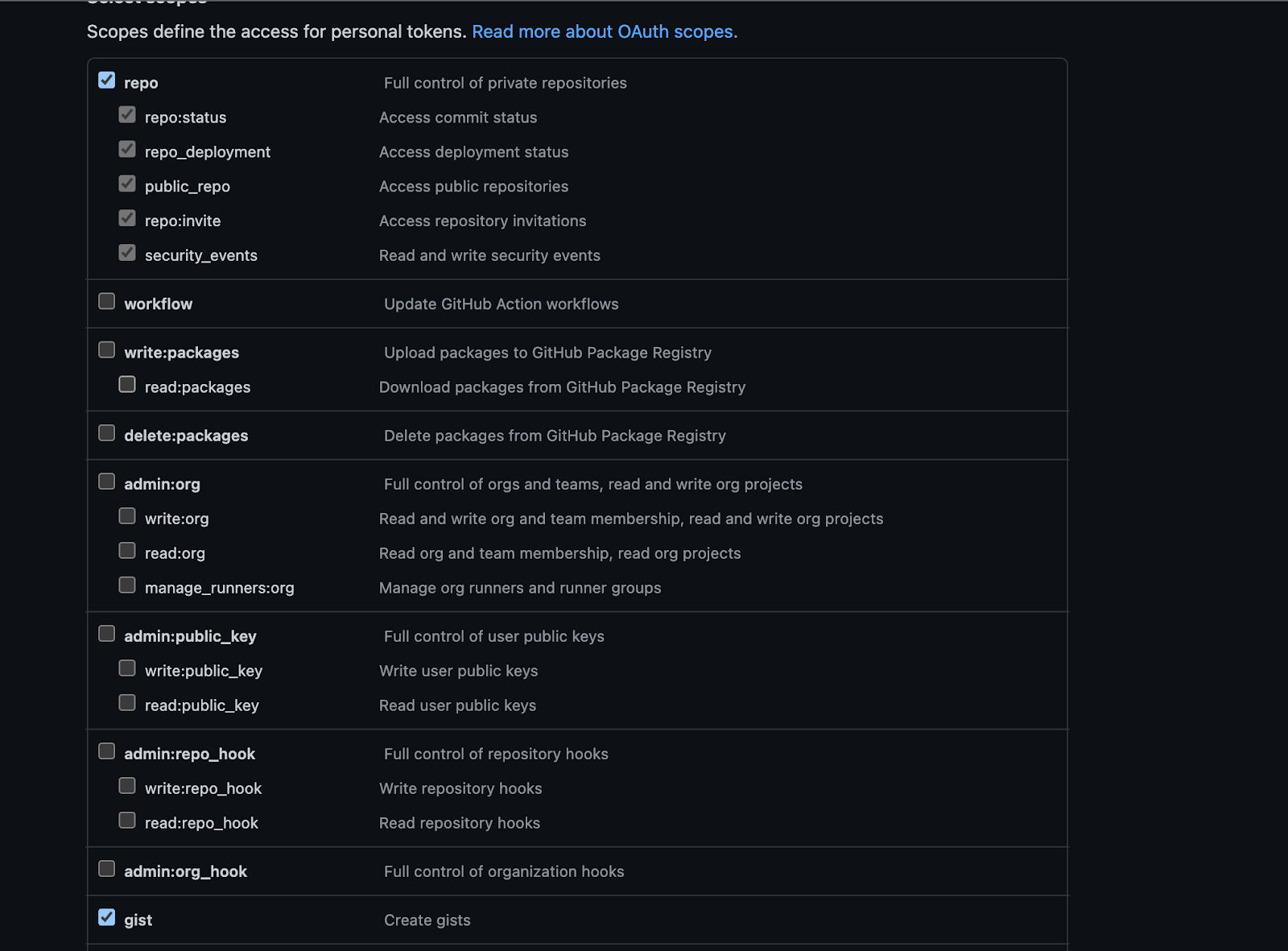
For authentication, the user will be required to provide a GitHub Personal Access Token. The token is included in the header of requests to endpoints requiring authentication. Create one if you don’t have one — however, you must set the following permissions for your token to be useful for this project.

The required GitHub Personal Token settings

For this project, the React Context API will be used to store the token for an hour after which the user will have to re-authenticate by providing the token again.

In the frontend/src/components folder, create a new folder named context. In that folder, create a new file named AuthModal.jsx and add the following code to it.

import {Form, Input, Modal} from "antd";
import {EyeInvisibleOutlined, EyeTwoTone} from "@ant-design/icons";

const AuthModal = ({shouldShowModal, onSubmit, onCancel}) => {
    const [form] = Form.useForm();

    const onFormSubmit = () => {
        form.validateFields().then((values) => {
            onSubmit(values.token);
        });
    };

    return (<Modal
            title="Provide Github Authentication Token"
            centered
            okText="Save"
            cancelText="Cancel"
            open={shouldShowModal}
            onOk={onFormSubmit}
            onCancel={onCancel}
        >
            <Form
                form={form}
                name="auth_form"
                initialValues={{
                    token: "",
                }}
            >
                <Form.Item
                    name="token"
                    label="Token"
                    rules={[{
                        required: true, message: "Please provide your Github Token!",
                    },]}
                >
                    <Input.Password
                        placeholder="Github Token"
                        iconRender={(visible) => visible ? <EyeTwoTone/> : <EyeInvisibleOutlined/>}
                    />
                </Form.Item>
            </Form>
        </Modal>);
};

export default AuthModal;

This component renders the authentication form. The form has a single field for the user to paste and save a token. The shouldShowModal prop is used to conditionally render the form while the onSubmit and onCancel props are used to respond to the user’s action.

Next, in the context folder again, create a new file named AuthContext.jsx and add the following code to it.

import {Button, Result} from "antd";
import React, {createContext, useContext, useEffect, useState} from "react";
import AuthModal from "./AuthModal";
import {useNavigate} from "react-router-dom";

const AuthContext = createContext({});

const AuthContextProvider = ({children}) => {
    const [token, setToken] = useState(null);
    const [shouldShowModal, setShouldShowModal] = useState(true);

    const navigate = useNavigate();

    useEffect(() => {
        const timer = setTimeout(() => {
            if (token !== null) {
                setToken(null);
                setShouldShowModal(true);
            }
        }, 3600000);
        return () => clearTimeout(timer);
    }, [token]);

    const onSubmit = (token) => {
        setToken(token);
        setShouldShowModal(false);
    };

    const onCancel = () => {
        setShouldShowModal(false);
    };

    if (!shouldShowModal && !token) {
        return (
            <Result
                status="error"
                title="Authentication Failed"
                subTitle="A Github token is required to view this page"
                extra={[
                    <Button
                        type="link"
                        key="home"
                        onClick={() => {
                            navigate("/");
                        }}
                    >
                        Public Section
                    </Button>,
                    <Button
                        key="retry"
                        type="primary"
                        onClick={() => {
                            setShouldShowModal(true);
                        }}
                    >
                        Try Again
                    </Button>,
                ]}
            />
        );
    }

    return (
        <>
            {shouldShowModal && (
                <AuthModal
                    shouldShowModal={shouldShowModal}
                    onSubmit={onSubmit}
                    onCancel={onCancel}
                />
            )}
            <AuthContext.Provider value={{token}}>{children}</AuthContext.Provider>
        </>
    );
};

export const useAuthContext = () => {
    const context = useContext(AuthContext);
    if (context === undefined) {
        throw new Error("useAuthContext must be used within a AuthContextProvider");
    }
    return context;
};

export default AuthContextProvider;

There are two exports in this file. The first is the useAuthContext hook. This hook will be used to retrieve the token saved in Context. The second is the AuthContextProvider component. This component is responsible for rendering the authentication form (either on page load or when the token has “expired” after 1 hour).

It also renders an error page if the user clicks “Cancel” on the authentication form. This component takes a JSX element (named children) as a prop and wraps it with a context provider — thus giving the child element access to the value of the token.

Add the Master-Detail layout

For displaying repositories and Gists, the master-detail layout will be used. A list of items will be rendered and clicking on one item will display more information on the selected item beside the list.

In the components folder, create a new file named ListItem.jsx and add the following code to it.

import { useEffect, useState } from "react";
import { Avatar, Card, Skeleton } from "antd";

const ListItem = ({ item, onSelect, selectedItem, title }) => {
  const [loading, setLoading] = useState(true);
  const [gridStyle, setGridStyle] = useState({
    margin: "3%",
    width: "94%",
  });

  useEffect(() => {
    const isSelected = selectedItem?.id === item.id;
    setGridStyle({
        margin: "3%",
        width: "94%",
      ...(isSelected && { backgroundColor: "lightblue" }),
    });

  }, [selectedItem]);

  const onClickHandler = () => {
    onSelect(item);
  };

  useEffect(() => {
    setTimeout(() => {
      setLoading(false);
    }, 3000);
  }, []);

  return (
    <Card.Grid hoverable={true} style={gridStyle} onClick={onClickHandler}>
      <Skeleton loading={loading} avatar active>
        <Card.Meta
          avatar={<Avatar src={item.owner.avatar_url} />}
          title={title}
          description={`Authored by ${item.owner.login}`}
        />
      </Skeleton>
    </Card.Grid>
  );
};

export default ListItem;

This component renders a single item in the list using the AntD Card component. The title of the card is provided as a component prop. In addition to the title, this component receives three other props:

  • The onSelect prop is used to notify the parent item that the card has been clicked
  • item corresponds to the gist or repository which will be rendered on the card
  • selectedItem is used by the component to determine if the rendered item was clicked by the user; in which case a light blue background is added to the card styling.

Next, create a new file named MasterDetail.jsx in the components folder and add the following code to it.

import {useState} from "react";
import {Affix, Card, Col, Row, Typography} from "antd";
import ListItem from "./ListItem";

const MasterDetail = ({title, items, getItemDescription, detailLayout}) => {
    const [selectedItem, setSelectedItem] = useState(null);

    return (<>
            <Row justify="center">
                <Col>
                    <Typography.Title level={3}>{title}</Typography.Title>
                </Col>
            </Row>
            <Row>
                <Col span={6}>
                    <Affix offsetTop={20}>
                        <div
                            id="scrollableDiv"
                            style={{
                                height: "80vh", overflow: "auto", padding: "0 5px",
                            }}
                        >
                            <Card bordered={false} style={{boxShadow: "none"}}>
                                {items.map((item, index) => (<ListItem
                                        key={index}
                                        item={item}
                                        onSelect={setSelectedItem}
                                        selectedItem={selectedItem}
                                        title={getItemDescription(item)}
                                    />))}
                            </Card>
                        </div>
                    </Affix>
                </Col>
                <Col span={18}>{selectedItem && detailLayout(selectedItem)}</Col>
            </Row>
        </>);
};

export default MasterDetail;

This component is responsible for rendering the list of items in one column and the details of the selected item in another column. The items to be rendered are provided as a prop to the component.

In addition to that, the getItemDescription() prop is a function to get what will be displayed under the user avatar; this is the repository name or the Gist description.

The detailLayout() prop is a function provided by the parent component which returns the JSX content for the detail section based on the provided item. This allows Gists and repositories to have entirely different layouts while using the same child component for rendering.

Next, in the components folder, create a new folder named Repository to hold components related to a repository. Then, create a new file named RepositoryDetails.jsx and add the following code to it.

import {useEffect, useState} from "react";
import {Avatar, Card, Divider, List, Spin, Timeline, Typography} from "antd";
import {GetMoreInformationFromURL} from "../../../wailsjs/go/main/App";

const UserGrid = ({users}) => (<List
    grid={{gutter: 16, column: 4}}
    dataSource={users}
    renderItem={(item, index) => (<List.Item key={index} style={{marginTop: "5px"}}>
        <Card.Meta
            avatar={<Avatar src={item.avatar_url}/>}
            title={item.login}
        />
    </List.Item>)}
/>);

const RepositoryDetails = ({repository, token = ""}) => {
    const [commits, setCommits] = useState([]);
    const [contributors, setContributors] = useState([]);
    const [stargazers, setStargazers] = useState([]);
    const [isLoading, setIsLoading] = useState(true);

    useEffect(() => {
        const getRepositoryDetails = async () => {
            setIsLoading(true);
            const stargazers = await GetMoreInformationFromURL(repository.stargazers_url, token);
            const commits = await GetMoreInformationFromURL(repository.commits_url.replace(/{\/[a-z]*}/, ""), token);
            const contributors = await GetMoreInformationFromURL(repository.contributors_url, token);
            setCommits(commits);
            setContributors(contributors);
            setStargazers(stargazers);
            setIsLoading(false);
        };
        getRepositoryDetails();
    }, [repository]);

    return (<Card
        title={repository.name}
        bordered={false}
        style={{
            margin: "1%",
        }}
    >
        {repository.description}
        <Divider/>
        <Spin tip="Loading" spinning={isLoading}>
            <Typography.Title level={5} style={{margin: 10}}>
                Contributors
            </Typography.Title>
            <UserGrid users={contributors}/>
            <Divider/>
            <Typography.Title level={5} style={{marginBottom: 15}}>
                Stargazers
            </Typography.Title>
            <UserGrid users={stargazers}/>
            <Divider/>
            <Typography.Title level={5} style={{marginBottom: 15}}>
                Commits
            </Typography.Title>
            <Timeline mode="alternate">
                {
                    commits.map((commit, index) => (
                        <Timeline.Item key={index}>{commit.commit?.message}</Timeline.Item>)
                    )
                }
            </Timeline>
        </Spin>
    </Card>);
};

export default RepositoryDetails;

Next, create the component for rendering public repositories. In the components/Repository folder, create a new file named PublicRepositories.jsx and add the following code to it.

import {useEffect, useState} from "react";
import {GetPublicRepositories} from "../../../wailsjs/go/main/App";
import RepositoryDetails from "./RepositoryDetails";
import MasterDetail from "../MasterDetail";
import {message} from "antd";

const PublicRepositories = () => {
    const [repositories, setRepositories] = useState([]);
    const [messageApi, contextHolder] = message.useMessage();

    useEffect(() => {
        const getRepositories = async () => {
            GetPublicRepositories()
                .then((repositories) => {
                    setRepositories(repositories);
                })
                .catch((error) => {
                    messageApi.open({
                        type: "error", content: error,
                    });
                });
        };
        getRepositories();
    }, []);

    const title = "Public Repositories";
    const getItemDescription = (repository) => repository.name;
    const detailLayout = (repository) => (<RepositoryDetails repository={repository}/>);

    return (<>
            {contextHolder}
            <MasterDetail
                title={title}
                items={repositories}
                getItemDescription={getItemDescription}
                detailLayout={detailLayout}
            />
        </>);
};

export default PublicRepositories;

This component makes the call to retrieve public repositories from the GitHub API. It does this using the GetPublicRepositories() function declared in app.go which is automatically bound to the frontend by Wails.

Functions exported in this manner are asynchronous and return a Promise. Using the MasterDetail and RepositoryDetails components, the returned response is rendered accordingly.

Next, create another file named PrivateRepositories.jsx in the Repository folder and add the following code to it.

import { useEffect, useState } from "react";
import { useAuthContext } from "../context/AuthContext";
import { GetRepositoriesForAuthenticatedUser } from "../../../wailsjs/go/main/App";
import RepositoryDetails from "./RepositoryDetails";
import MasterDetail from "../MasterDetail";
import { message } from "antd";

const PrivateRepositories = () => {
  const { token } = useAuthContext();
  const [repositories, setRepositories] = useState([]);
  const [messageApi, contextHolder] = message.useMessage();

  useEffect(() => {
    const getRepositories = async () => {
      if (token) {
      GetRepositoriesForAuthenticatedUser(token)
        .then((repositories) => {
          setRepositories(repositories);
        })
        .catch((error) => {
          messageApi.open({
            type: "error",
            content: error,
          });
        });
      }
    };
    getRepositories();
  }, [token]);

  const title = "Private Repositories";
  const getItemDescription = (repository) => repository.name;
  const detailLayout = (repository) => (
    <RepositoryDetails repository={repository} token={token}/>
  );

  return (
    <>
      {contextHolder}
      <MasterDetail
        title={title}
        items={repositories}
        getItemDescription={getItemDescription}
        detailLayout={detailLayout}
      />
    </>
  );
};

export default PrivateRepositories;

This component is very similar to the PublicRepositories component but for two key things. First, this component will be wrapped with an AuthContextProvider, which makes it possible to retrieve the saved token via the useAuthContext hook. Second, it uses another bound function GetRepositoriesForAuthenticatedUser() to get the repositories for the user whose token was provided.

Next, in the components folder, create a new folder named Gist to hold components related to a Gist. Then, in that new folder, create a new file named GistDetails.jsx and add the following code to it.

import { Carousel, Col, Row, Spin, Typography } from "antd";
import React, { useEffect, useState } from "react";
import "prismjs/themes/prism-okaidia.min.css";
import Prism from "prismjs";
import { GetGistContent } from "../../../wailsjs/go/main/App";

const GistDetails = ({ gist }) => {
  const [snippets, setSnippets] = useState([]);
  const [isLoading, setIsLoading] = useState(true);

  useEffect(() => {
    Prism.highlightAll();
  }, [snippets]);

  useEffect(() => {
    const getSnippets = async () => {
      setIsLoading(true);
      const snippets = await Promise.all(
        Object.values(gist.files).map(async (file) => {
          const fileContent = await GetGistContent(file.raw_url, "");
          return {
            language: file.language?.toLowerCase() || "text",
            content: fileContent,
          };
        })
      );
      setSnippets(snippets);
      setIsLoading(false);
    };
    getSnippets();
  }, [gist]);

  return (
    <Spin tip="Loading" spinning={isLoading}>
      <Row justify="center">
        <Col>
          {gist.description && (
            <Typography.Text strong>{gist.description}</Typography.Text>
          )}
        </Col>
      </Row>
      <div>
        <Carousel
          autoplay
          style={{ backgroundColor: "#272822", height: "100%" }}
        >
          {snippets.map((snippet, index) => (
            <pre key={index}>
              <code className={`language-${snippet.language}"`}>
                {snippet.content}
              </code>
            </pre>
          ))}
        </Carousel>
      </div>
    </Spin>
  );
};

export default GistDetails;

This component renders the code in the file(s) for a given Gist. Every Gist response comes with a files key. This is an object containing all the files for the Gist. Each file object contains the URL to the file’s raw content and the language associated with the file. This component retrieves all the files using the GetGistContent() function and renders them in a Carousel. Prism is used to render the code as would be found in an IDE.

Next, in the Gist folder, create a file named PublicGists.jsx and add the following code to it.

import { useEffect, useState } from "react";
import GistDetails from "./GistDetails";
import { GetPublicGists } from "../../../wailsjs/go/main/App";
import MasterDetail from "../MasterDetail";
import { message } from "antd";

const PublicGists = () => {
  const [gists, setGists] = useState([]);
  const [messageApi, contextHolder] = message.useMessage();

  useEffect(() => {
    const getGists = async () => {
      GetPublicGists()
        .then((gists) => {
          setGists(gists);
        })
        .catch((error) => {
          messageApi.open({
            type: "error",
            content: error,
          });
        });
    };
    getGists();
  }, []);

  const title = "Public Gists";
  const getItemDescription = (gist) =>
    gist.description || "No description provided";
  const detailLayout = (gist) => <GistDetails gist={gist} />;

  return (
    <>
      {contextHolder}
      <MasterDetail
        title={title}
        items={gists}
        getItemDescription={getItemDescription}
        detailLayout={detailLayout}
      />
    </>
  );
};

export default PublicGists;

Just as was done for the rendering of public repositories, the GetPublicGists() function declared in app.go is used to retrieve public Gists from the Github API and pass them to the MasterDetail component, along with the functions to get the Gist description and display more information on the Gist when selected.

Next, create a new file named PrivateGists.jsx in the Gist folder and add the following code to it.

import { useEffect, useState } from "react";
import { useAuthContext } from "../context/AuthContext";
import { GetGistsForAuthenticatedUser } from "../../../wailsjs/go/main/App";
import MasterDetail from "../MasterDetail";
import GistDetails from "./GistDetails";
import { message } from "antd";

const PrivateGists = () => {
  const [gists, setGists] = useState([]);
  const { token } = useAuthContext();
  const [messageApi, contextHolder] = message.useMessage();

  useEffect(() => {
    const getGists = async () => {
      if (token) {
        GetGistsForAuthenticatedUser(token)
          .then((gists) => {
            setGists(gists);
          })
          .catch((error) => {
            messageApi.open({
              type: "error",
              content: error,
            });
          });
      }
    };
    getGists();
  }, [token]);

  const title = "Private Gists";
  const getItemDescription = (gist) =>
    gist.description || "No description provided";
  const detailLayout = (gist) => <GistDetails gist={gist} />;

  return (
    <>
      {contextHolder}
      <MasterDetail
        title={title}
        items={gists}
        getItemDescription={getItemDescription}
        detailLayout={detailLayout}
      />
    </>
  );
};
export default PrivateGists;

This component will be wrapped with an AuthContextProvider component, thus giving it access to the provided token. Using the token, an asynchronous call is made to the GitHub API via the GetGistsForAuthenticatedUser() function. The results are then passed to the MasterDetail component along with the other required props for appropriate rendering.

The last Gist related component to be built is the form to create a new Gist. To do this, create a new file named CreateGist.jsx in the Gist folder and add the following code to it.

import { useAuthContext } from "../context/AuthContext";
import { Button, Card, Divider, Form, Input, message, Switch } from "antd";
import { DeleteTwoTone, PlusOutlined } from "@ant-design/icons";
import { CreateNewGist } from "../../../wailsjs/go/main/App";
import { useNavigate } from "react-router-dom";

const CreateGist = () => {
  const { token } = useAuthContext();
  const [messageApi, contextHolder] = message.useMessage();
  const navigate = useNavigate();

  const onFinish = async (values) => {
    const { description, files, isPublic } = values;

    const gist = {
      description,
      public: !!isPublic,
      files: files.reduce(
        (accumulator, { filename, content }) =>
          Object.assign(accumulator, {
            [filename]: { content },
          }),
        {}
      ),
    };

    CreateNewGist(gist, token)
      .then((gist) => {
        messageApi.open({
          type: "success",
          content: `Gist ${gist.id} created successfully`,
        });
        navigate("/gists/private");
      })
      .catch((error) => {
        messageApi.open({
          type: "error",
          content: error,
        });
      });
  };

  const onFinishFailed = (errorInfo) => {
    console.log("Failed:", errorInfo);
  };

  return (
    <>
      {contextHolder}
      <Card title="Create a new Gist">
        <Form
          name="gist"
          onFinish={onFinish}
          onFinishFailed={onFinishFailed}
          autoComplete="off"
        >
          <Form.Item name="description">
            <Input placeholder="Gist description..." />
          </Form.Item>
          <Form.Item
            label="Make gist public"
            valuePropName="checked"
            name="isPublic"
          >
            <Switch />
          </Form.Item>
          <Form.List
            name="files"
            rules={[
              {
                validator: async (_, files) => {
                  if (!files || files.length < 1) {
                    return Promise.reject(
                      new Error("At least 1 file is required to create a Gist")
                    );
                  }
                },
              },
            ]}
          >
            {(fields, { add, remove }, { errors }) => (
              <>
                {fields.map((field) => (
                  <div key={field.key}>
                    <Form.Item
                      shouldUpdate={(prevValues, curValues) =>
                        prevValues.area !== curValues.area ||
                        prevValues.sights !== curValues.sights
                      }
                    >
                      {() => (
                        <div>
                          <Divider />
                          <Form.Item
                            {...field}
                            name={[field.name, "filename"]}
                            rules={[
                              {
                                required: true,
                                message: "Missing filename",
                              },
                            ]}
                            noStyle
                          >
                            <Input
                              placeholder="Filename including extension..."
                              style={{ width: "90%", marginRight: "5px" }}
                            />
                          </Form.Item>

                          <DeleteTwoTone
                            style={{
                              fontSize: "30px",
                              verticalAlign: "middle",
                            }}
                            twoToneColor="#eb2f96"
                            onClick={() => remove(field.name)}
                          />
                        </div>
                      )}
                    </Form.Item>
                    <Form.Item
                      {...field}
                      name={[field.name, "content"]}
                      rules={[
                        {
                          required: true,
                          message: "Missing content",
                        },
                      ]}
                    >
                      <Input.TextArea rows={20} placeholder="Gist content" />
                    </Form.Item>
                  </div>
                ))}
                <Form.Item
                  wrapperCol={{
                    offset: 10,
                  }}
                >
                  <Button
                    type="dashed"
                    onClick={() => add()}
                    icon={<PlusOutlined />}
                  >
                    Add file
                  </Button>
                  <Form.ErrorList errors={errors} />
                </Form.Item>
              </>
            )}
          </Form.List>
          <Form.Item
            wrapperCol={{
              offset: 10,
            }}
          >
            <Button type="primary" htmlType="submit">
              Submit
            </Button>
          </Form.Item>
        </Form>
      </Card>
    </>
  );
};

export default CreateGist;

The request to create a new Gist has three fields:

  1. description: Where provided, this will describe what the code in the Gist aims to achieve. This field is optional and is represented in the form by an input field
  2. public: This is a required field and determines whether or not the Gist has public access. In the form you created, this is represented by a switch which is set to off by default. This means that unless otherwise specified by the user, the created Gist will be secret and only available to users who have its link.
  3. files: This is another required field. It is an object and for each entry in the object, the key is the name of the file (with the extension included) and the value is the content of the file.
    This is represented in the form you created as a dynamic list with each list item consisting of a text field for the file name and a text area for the file content. By clicking the Add File button, you have the ability to add multiple files. You also have the ability to delete a file. Note that you will be required to have at least one file and if you do not, an error message will be displayed.

When the form is properly filled out and submitted, the onFinish() function is used to create an object conforming to the Gist struct declared in app.go and a call is made to the CreateNewGist() receiver function.

Because this component is wrapped with the AuthContextProvider, the saved token can be retrieved and passed alongside the Gist as required by the function. Once a successful response is received, the app redirects to the list of Gists for the authenticated user.

Put the pieces together

Add navigation

With all the individual components in place, the next thing to add is navigation - a means by which the user can move around the application. To add this, create a new file in the components folder named NavBar.jsx and add the following code to it.

import { LockOutlined, UnlockOutlined } from "@ant-design/icons";
import { Layout, Menu } from "antd";
import { Link } from "react-router-dom";
import logo from "../assets/images/logo-universal.png";

function getItem(label, key, icon, children, type) {
  return {
    key,
    icon,
    children,
    label,
    type,
  };
}
const items = [
  getItem("Public Actions", "sub1", <UnlockOutlined />, [
    getItem(
      "Repositories",
      "g1",
      null,
      [
        getItem(
          <Link to={"repositories/public"}>View all repositories</Link>,
          "1"
        ),
      ],
      "group"
    ),
    getItem(
      "Gists",
      "g2",
      null,
      [getItem(<Link to={"gists/public"}>View all gists</Link>, "3")],
      "group"
    ),
  ]),
  getItem("Private Actions", "sub2", <LockOutlined />, [
    getItem(
      "Repositories",
      "g3",
      null,
      [
        getItem(
          <Link to={"repositories/private"}>View my repositories</Link>,
          "5"
        ),
      ],
      "group"
    ),
    getItem(
      "Gists",
      "g4",
      null,
      [
        getItem(<Link to={"gists/private"}>View my gists</Link>, "6"),
        getItem(<Link to={"gist/new"}>Create new gist</Link>, "7"),
      ],
      "group"
    ),
  ]),
];

const NavBar = () => {
  return (
    <Layout.Header theme="light" style={{ background: "white" }}>
      <div
        className="logo"
        style={{
          float: "left",
          marginRight: "200px",
          padding: "1%",
        }}
      >
        <Link to="/">
          <img src={logo} style={{ width: "50px" }} />
        </Link>
      </div>
      <Menu
        defaultSelectedKeys={["1"]}
        mode="horizontal"
        items={items}
        style={{
          position: "relative",
        }}
      />
    </Layout.Header>
  );
};

export default NavBar;

This component renders a navigation bar at the top of the window with two main items - Public Actions and Private Actions. Each item then has sub-items, which are links that will eventually render the component associated with the sub-item. With this in place, you can add routing to your application.

Add routing

In the frontend/src folder, create a new file named routes.jsx and add the following code to it.

import App from "./App";

import CreateGist from "./components/Gist/CreateGist";
import PrivateGists from "./components/Gist/PrivateGists";
import PublicGists from "./components/Gist/PublicGists";

import PrivateRepositories from "./components/Repository/PrivateRepositories";
import PublicRepositories from "./components/Repository/PublicRepositories";
import AuthContextProvider from "./components/context/AuthContext";

const routes = [
  {
    path: "/",
    element: <App />,
    children: [
      { index: true, element: <PublicRepositories /> },
      {
        path: "repositories/public",
        element: <PublicRepositories />,
      },
      {
        path: "gists/public",
        element: <PublicGists />,
      },
      {
        path: "gist/new",
        element: (
          <AuthContextProvider>
            <CreateGist />
          </AuthContextProvider>
        ),
      },
      {
        path: "repositories/private",
        element: (
          <AuthContextProvider>
            <PrivateRepositories />
          </AuthContextProvider>
        ),
      },
      {
        path: "gists/private",
        element: (
          <AuthContextProvider>
            <PrivateGists />
          </AuthContextProvider>
        ),
      },
    ],
  },
];

export default routes;

Here, you specified the routes in the application as well as the component to be rendered for each path. In addition to that, you have wrapped the components which require the user to provide a token with the AuthContextProvider component.

Next, open App.jsx and update the file's code to match the following.

import NavBar from "./components/NavBar";
import { FloatButton, Layout } from "antd";
import { Outlet } from "react-router-dom";

const { Content } = Layout;

const App = () => {
  return (
    <Layout
      style={{
        minHeight: "100vh",
      }}
    >
      <NavBar />
      <Layout className="site-layout">
        <Content
          style={{
            background: "white",
            padding: "0 50px",
          }}
        >
          <div
            style={{
              padding: 24,
            }}
          >
            <Outlet />
            <FloatButton.BackTop />
          </div>
        </Content>
      </Layout>
    </Layout>
  );
};

export default App;

Here, you have included the NavBar component you declared earlier. You also declared an Outlet component which is provided by react-router-dom to render child route elements.

Finally update the code in main.jsx to match the following.

import React from 'react'
import {createRoot} from 'react-dom/client'
import { createHashRouter, RouterProvider } from 'react-router-dom'
import routes from './routes'

const container = document.getElementById('root')

const root = createRoot(container)

const router = createHashRouter(routes, {basename:'/'})

root.render(
    <React.StrictMode>
        <RouterProvider router={router}/>
    </React.StrictMode>
)

A HashRouter is the officially recommended approach for routing. This is created via the createHashRouter() function. Using the routes object you declared earlier, all router objects are passed to this component to render your app and enable the rest of the APIs. With this in place, your application will render the index page once it loads.

Test that the application works

You’ve successfully built your first app with Wails. Run the application again and take it for a spin by running the following command from the project's top-level folder.

wails dev

By default, when the app loads, you will be greeted with a list of public repositories. Using the navigation menu, you can view public (and private) repositories and Gists by clicking the corresponding menu item.

When you select a menu item for a private repository or private Gist, a pop-up will be displayed asking for your GitHub token as shown below.

The personal access token dialog visible in front of the Wails application.

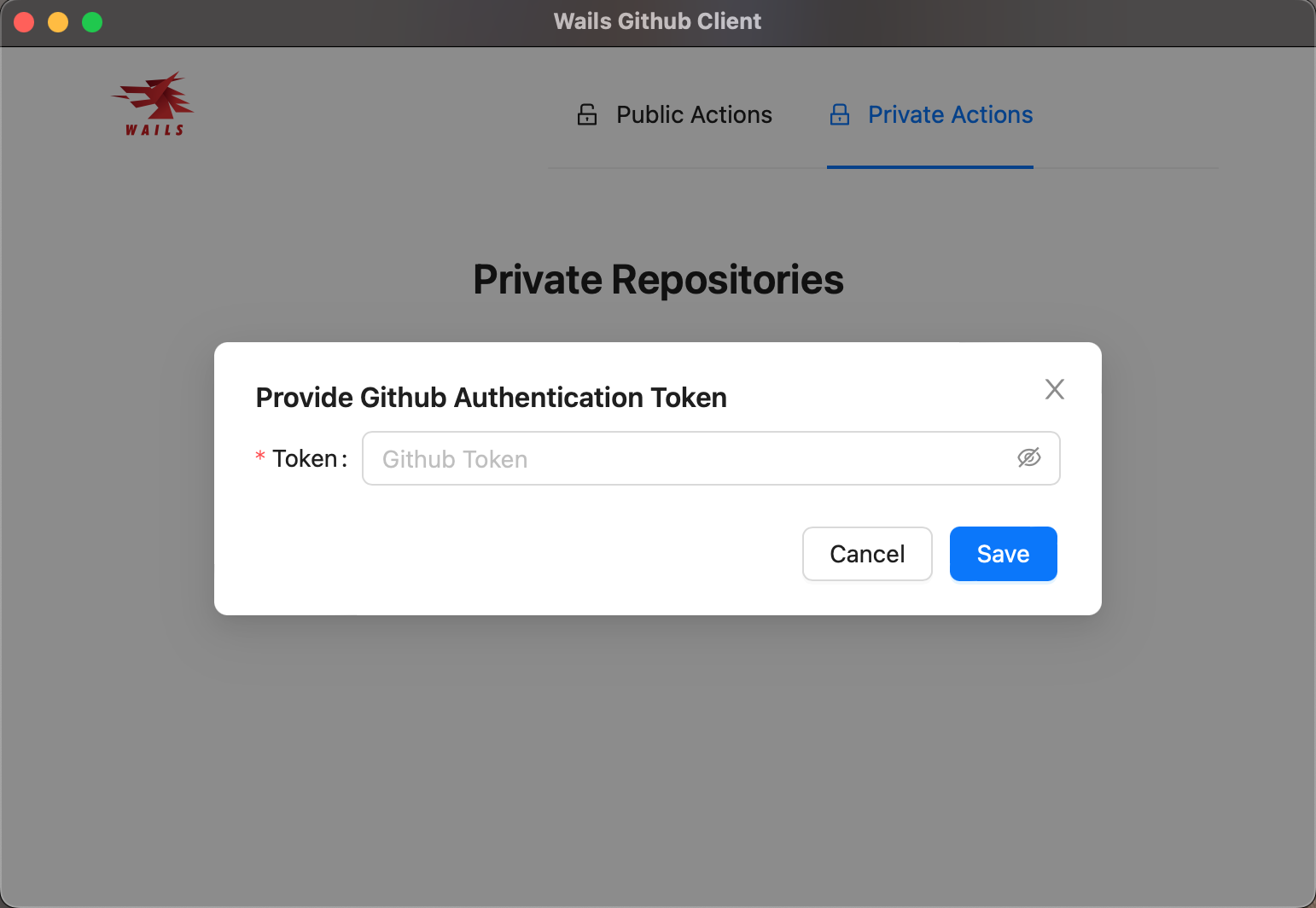
Paste your Personal Access Token (PAT) and click Save. Your repositories (or Gists as the case may be) will then be rendered. You will be able to navigate around the private section of the app without having to re-enter your token for a few minutes.

And that's how to build a cross-platform desktop application with Go and Wails

There’s still a lot you could do. For example, how would you handle ensuring that the token provided by the user is valid before trying to perform authenticated actions?

What other features do you think you can add to the application? Did you know that you could make further customizations to the app such as the width and height, or even start off in full-screen mode? Have a look at the Options documentation to see how you can further configure your app.

In case you get stuck at any point, feel free to access the codebase here.

I’m excited to see what more you come up with. Until next time ✌🏾

Joseph Udonsak is a software engineer with a passion for solving challenges – be it building applications, or conquering new frontiers on Candy Crush. When he’s not staring at his screens, he enjoys a cold beer and laughs with his family and friends.