Style your Website with Tailwind CSS
Time to read:
April 29, 2021
Written by
Reviewed by

Defining the look & feel of a website is hard. The CSS (Cascading Style Sheets) language that is used to describe the presentation of HTML documents is long, confusing and inconsistent, and the implementation by different browsers isn’t always aligned. To reduce the pain points of working with CSS, a number of CSS frameworks provide reusable user-interface components for which the styling has been carefully designed and tested. However, when you use one of these frameworks it is very hard to make your site look different from the multitude of others built with the same framework.
In this article I’m going to introduce you to Tailwind CSS, a low-level CSS framework that gives you a complete set of cross-browser and reusable utility classes, with which you can build your site and give it its own distinctive look and feel.
A Tailwind CSS playground
The easiest way to familiarize yourself with Tailwind CSS is to create a blank HTML page, include the official Tailwind CSS definitions, and start playing with it. Keep in mind that this is not the recommended way to deploy Tailwind CSS on a production website. I’ll cover deployment options later in this article.
For now, a short HTML file like the one below is a good starting point:
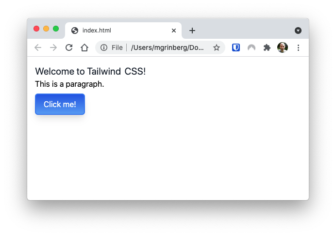
Copy the above HTML page, paste it into your text editor or IDE, and save it as index.html on your computer. Then use the “Open File…” option from your web browser to open it as a local file.
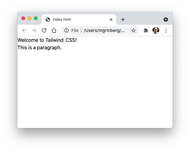
This is unexpected, right? The HTML page defines <h1> and <p> elements, but both appear to have the same font size. While this seems wrong, it is done on purpose. Tailwind CSS resets the styles of all the elements to their most basic, so that all elements start from a well known state. In particular, this reset procedure eliminates size and style differences between text elements, and for that reason headings render exactly the same as normal text.
Text styling
So how do we make the <h1> heading look like a proper heading? Tailwind CSS comes with several classes that control font size, such as text-xs, text-sm, text-base, text-lg, and text-xl. To change the size of the heading, we just need to apply one of these classes to the <h1> element:
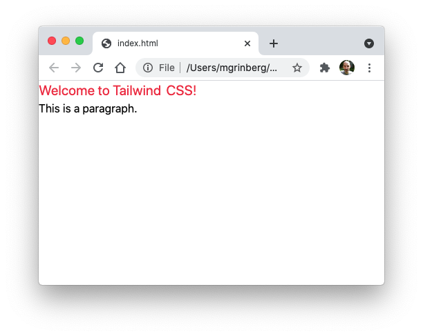
It is also possible to change the text color. To change the color of this heading to a medium red, you can add a text-red-500 class to the <h1> element.
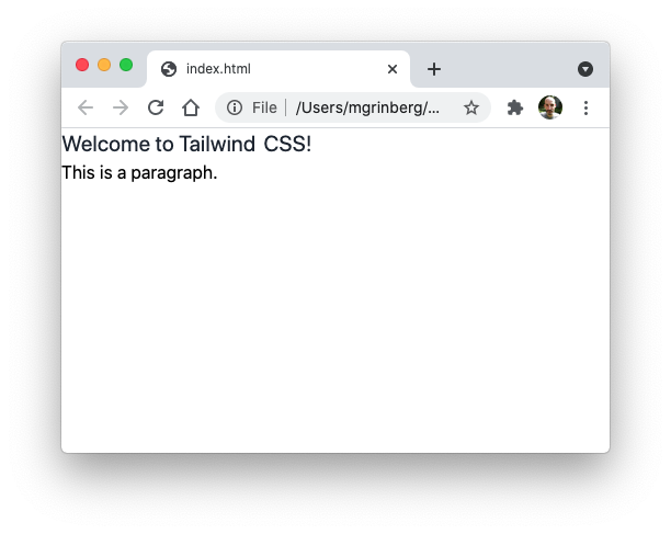
There are classes for all the main colors, each in several shades. Let’s replace the unusual red with a more traditional 80% gray:
In the same way as size and color, there are classes to define text alignment, opacity, decoration, overflow and more. Feel free to play around with these.
Containers, borders, margins and padding
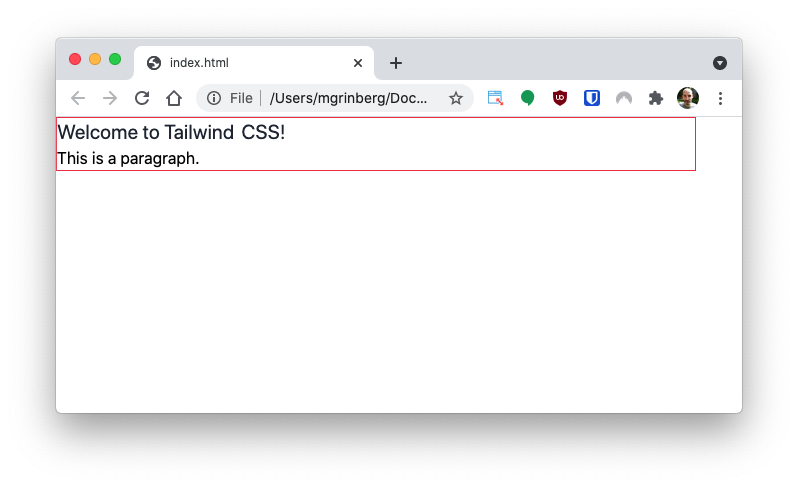
Another aspect of the styling reset that Tailwind CSS applies is that all margins and padding are removed. You can see in the screenshots above that the text sticks to the top and left borders of the page.
Since we have two elements in the page that need a common margin, we are first going to wrap them in a container <div>:
The container class in Tailwind CSS is similar to those in other CSS frameworks. This class automatically sets its width to one of a few predefined values matching common screen sizes.
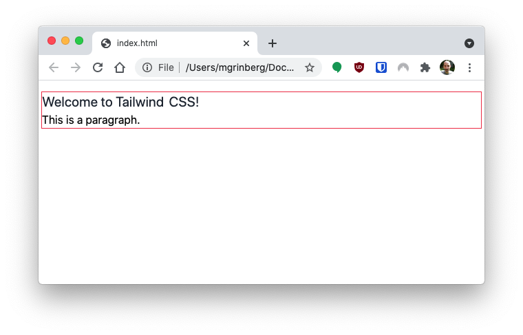
But since the container is invisible, you will not be able to see its extent. A nice trick to see the dimensions of an element is to add a border to it. As you can guess, Tailwind CSS provides classes that define all the attributes of borders including width, radius, color, opacity and style.
Let’s add a red border to help us visualize the container. This is done with the border class, which adds a 1 pixel wide border on the element, and the border-red-500, which sets a medium red color on it.
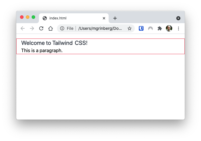
Now as you resize the window, you can see the container resizing and jumping through its predefined sizes. But if you are familiar with container divs in other frameworks, you will notice that the container in Tailwind CSS remains aligned to the left border of the page, while in most cases you will want it to appear centered.
To center an element horizontally, the mx-auto class can be used, which sets the margin in the horizontal direction to auto. This is a standard CSS technique to center an element horizontally on its parent.
Now that the contents of our page are wrapped in a container, we can add proper margins to add a bit of space between the top of the page and the heading.
Tailwind CSS has several options for margins:
- The
m-{size}classes control margins around all four borders. - The
mx-{size}classes control horizontal margin. - The
my-{size}classes control vertical margin. - The
mt-{size}classes control the top margin. - The
mb-{size}classes control the bottom margin. - The
ml-{size}classes control the left margin. - The
mr-{size}classes control the right margin.
The size of the margin is given in ¼ rem units, so for example, class m-1 sets the margin to 0.25rem, while class m-4 sets it to 1rem. Is this the first time you hear about “rem” units? This is one of the relative CSS units, along with the more popular “em”. A rem is equivalent to the font size of the root element of the page (i.e. the <html> element). The difference between rem and em is that em units are based on the font size of the parent element, so they change according to the content. The rem units are constant throughout the page, but they are relative to the base font size configured in the <html> element.
Let’s add a my-4 class to the container:
Now the page looks a little better:
When you resize the page horizontally, you‘ll find that at certain widths the mx-auto isn’t sufficient to separate the text from the left window border. One way to address this problem is to add padding to the container. The difference between margin and padding is that the margin exists outside of the element, while the padding is inside.
To control padding, Tailwind CSS provides p, px, py, pt, pb, pl and pr classes that work exactly like the margin counterparts. Let’s add some left and right padding:
Now there is a nice margin on the left border at all window sizes:
With the container having the correct margins and padding we can remove the border and border-red-500 classes:
Buttons
Now that you have familiarized yourself with the basics of working with Tailwind CSS, you are ready to look at a more interesting example. In this section we are going to create and style a button.
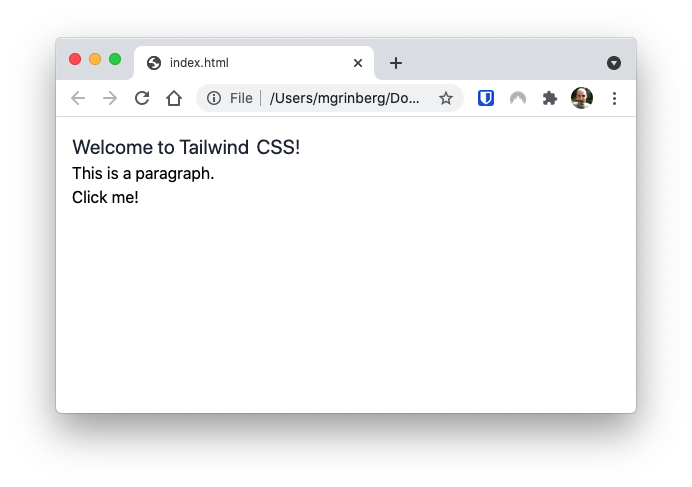
To begin, add a <button> element to the index.html page:
I’m sure by now it is not going to be a surprise to you how the button is going to look:
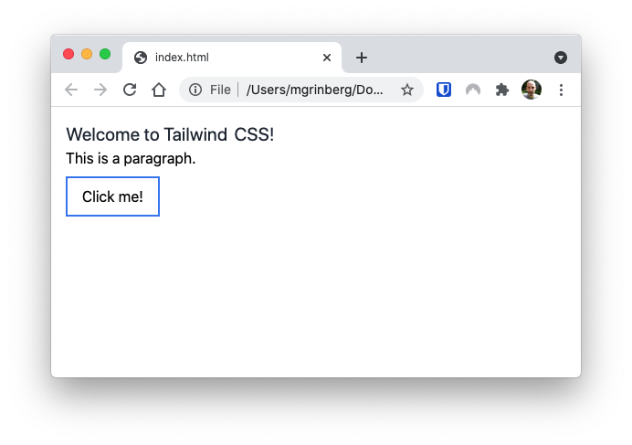
Buttons have their styles reset back to a plain text default, same as headings. We can start designing the look of the button by adding margins, padding and border:
What do these classes do? The my-2 class adds a 0.5rem margin on top and bottom, the px-4 class adds 1rem of padding on the left and right, and the py-2 class adds 0.5rem of padding on the top and bottom. The border-2 class adds a border that is 2 pixels wide, and border-blue-500 sets the border color to a medium blue. This is how the button looks now:
That is starting to look like a button, but a couple of small improvements we can make would be to make the border round, and also to fill the background with color. Let’s add the rounded-md and bg-blue-400 classes, as follows:
And the button now finally looks like a button:

But since we are experimenting, why don’t we change the solid color background into a gradient?
The bg-gradient-to-b class makes the background of the element a gradient from top to bottom (the to-b part determines its direction), and the from- and to- classes set what colors to use. With these changes the button has a gradient between two shades of blue. Since the background is now quite dark, the text-white class changes the color of the text to white. And the shadow-lg class adds a shadow, which helps separate the button a bit from the background.
Hover styles
The button we created in the previous section looks great in its default form, but nothing happens when you hover the mouse pointer over it, which is not what most people expect from a button. With Tailwind CSS, the styling classes can be given a hover: prefix and then they only apply when the mouse is over the element.
Let’s lighten the background gradient of the button on mouse hover:
Note the two new hover: classes, which are highlighted in the listing above. Also notice that to avoid a long class list I have now split the classes into multiple lines.
The hover: prefix is just one of several state modifiers that you can use to apply conditional styles. There is also a set of responsive modifiers that allow you to apply styles only for certain screen sizes.
If you are interested in seeing more common user interface elements built from scratch with Tailwind CSS, the examples section of their documentation is a good place to visit.
Optimizing the size of your CSS file
So far you’ve learned how to use Tailwind CSS as a standard CSS library, by including it in the <head> section of your HTML documents. This, however, is not the optimal way to use Tailwind CSS.
Have you wondered how big this CSS file needs to be to include all those little classes, many of which you don’t even use? The minified CSS file is somewhere between 3 and 4MB, down to about 280KB when compression is used. For a CSS file, even the compressed size is unusually large and not something you’d want to have in a production deployment of your website.
Tailwind CSS can be installed as a plugin for the PostCSS CSS transformation tool, and one of the most important benefits that you get when doing this is the ability to build an optimized CSS file for your website that only includes the classes that you use. The Tailwind CSS documentation includes installation guides for several frameworks.
Criticism of Tailwind CSS
By far the most common argument against Tailwind CSS is that specifying a long list of CSS classes each achieving one small thing is no different than using inline styles.
This is only partially accurate, for two reasons. First of all, while both approaches give you a wide range of choice, Tailwind CSS constrains things such as margins, paddings and colors to a useful subset of all the possibilities, making it easier to stay consistent within the page.
A more important benefit of the approach taken by Tailwind CSS is that it allows you to specify conditional styles, for example for mouse hovering or for specific screen sizes, something that is impossible to do with inline styles.
An often reported annoyance is that the class lists can get very long, making pages hard to read and manage. You’ve seen a bit of this in the button example above. This can be addressed in two ways, however.
Managing class lists with templates
The Tailwind CSS developers recommend that you use the templating features of your framework to create partial templates (sometimes also called sub-templates) or components that encapsulate the HTML elements with all the styling classes. Following through with the button example, you would create a button HTML partial template that might look like the following:
Then in your HTML pages you would just import or include this template whenever you need to use a button, and as an end result the long class list exists only once in the entire project.
Managing class lists with CSS wrapper classes
Another way to deal with long lists of classes, especially when they repeat in a lot of elements, is to create wrapper CSS classes for them. Unfortunately, inheritance of classes is not something that is supported natively in CSS so this requires a CSS preprocessor. There is a straightforward implementation, however, through the @apply directive when installing Tailwind CSS in the recommended way as a PostCSS plugin. Using this approach, a btn class could be defined in a .css file as follows:
And then a button would be defined just with the btn class.
Next steps
Do you want to learn more about Tailwind CSS? The official documentation site has a number of additional resources, including examples, screencasts, and tutorials.
Or maybe you’ve seen enough and would like something more traditional? If so, Bootstrap is a safe bet.
Miguel Grinberg is a Principal Software Engineer for Technical Content at Twilio. Reach out to him at mgrinberg [at] twilio [dot] com if you have a cool project you’d like to share on this blog!

Related Resources
Twilio Docs
From APIs to SDKs to sample apps
API reference documentation, SDKs, helper libraries, quickstarts, and tutorials for your language and platform.
Resource Center
The latest ebooks, industry reports, and webinars
Learn from customer engagement experts to improve your own communication.
Ahoy
Twilio's developer community hub
Best practices, code samples, and inspiration to build communications and digital engagement experiences.