Unlocking the Secrets of Twilio Flex’s Programmable UI
Time to read:
January 11, 2019
Written by

Twilio Flex is an application platform for contact centers that allows customers to deploy, customize, and manage their own contact centers on top of existing Twilio infrastructure. What you may not know is that Flex is the first product from Twilio that comes with a user interface. Flex comes with an agent, admin, and supervisor UI that you can use, deploy, and modify, which massively reduces the time it takes to get a Twilio-powered contact center up and running.
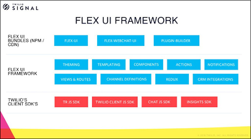
The Flex UI is completely programmable. We built the Flex UI framework with a set of capabilities (and APIs that allow you to tap into those capabilities) which we exposed through a set of front-end SDKs bundled with Twilio Front-End SDKs for further flexibility. Our goal was to make the UI just as flexible as the APIs.
In their session at SIGNAL, Tanya Mihnovits and Hando Tint from the Flex UI team gave us a look under the hood to demonstrate how to use the programmable UI framework.
Here are some of the basics you’ll gain from watching this session:
Theming and Styling
In the admin interface, you can choose from pre-defined themes, add a splash of brand colors, and style your user interface however you like. Under the hood, when you select a theme or set of colors, the admin interface creates a JSON object representing your choices. hat JSON object specifies how the UI for Flex is styled. Want to make more granular changes, like styling the color of the navigation bar, switching the background image, or making components transparent? You can specify your own themes with our SDK.
Example of overriding MainHeader and SideNav component background
Template Strings
The next simple thing you can do with a programmable UI is change any string in the user interface that allows you to customize the UI to the business language your agents are used to. This brings more relevant context to your contact center users. These strings can be just plain text or HTML. We're using the templating engine ”Handlebars” under the hood, which also allows you to use Mustache syntax. We include a few built-in helpers and provide access to relevant context objects (e.g. the task, channel info) to let you insert relevant information about the task. With Handlebars you can also use helper functions that allow you to dip into any data store and dynamically load and display content for the users.
Example of overriding the first line of the TaskListItem
Programmable Components
To get beyond simple customizations into real programmability, we need to go into a deeper layer. Since Flex’s user interface is built on React, everything in the user interface is essentially a component. React allows us to build the user interface in a modular way and reuse the components. We built the UI as a programmable components library, with every component exposing a set of properties.
We expose some of these defaultProps as things you can change. Two ways we think about defaultProps: configuration settings that determine how or if something is displayed and display behavior that is typically a mapped function or a callback.
The true programmability however comes from ability to reassemble the user interface to your requirements. Every programmable component in the UI exposes a Content property which has a set of methods that allow you to add a custom component anywhere in the UI, replace a native component with your custom components, and remove any child of the parent component and the UI.
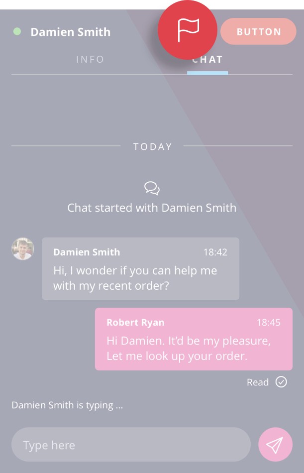
Example of adding a custom button to the TaskCanvasHeader
Actions Framework
Another important part of the Flex UI is the Actions Framework. Actions map to functions that you can do with the Flex UI, such as accepting a task, sending a chat message, or changing the active view. The Actions Framework allows you to modify the behaviour of UI elements without having to re-implement them yourself. For example, you could modify the CompleteTask action to prompt the user with a warning if they have have marked a certain disposition.
The framework also allows you to invoke Actions within your own custom components, tap into pre- and post-Action events, and also define your own custom Actions for re-use with your own custom components.
Example of adding a listener before AcceptTask action and showing a confirmation alert to the user
And So Much More...
Want to learn more about the innovative customer experiences you can create with Flex? Start prototyping now for free, or watch a demo to learn how to get started with Flex in minutes.
Resources
- Flex docs to get started at: Twilio.com/docs/flex
- Plug-in builder: github.com/Twilio/Flex-Plugin-Builder
- Sample projects: github.com/Twilio/Flex-UI-Sample


Related Resources
Twilio Docs
From APIs to SDKs to sample apps
API reference documentation, SDKs, helper libraries, quickstarts, and tutorials for your language and platform.
Resource Center
The latest ebooks, industry reports, and webinars
Learn from customer engagement experts to improve your own communication.
Ahoy
Twilio's developer community hub
Best practices, code samples, and inspiration to build communications and digital engagement experiences.