Enhance the Flex Queues View with Custom Data Tiles
Time to read:
June 28, 2023
Written by
Reviewed by
The Flex Real Time Queues View provides a few standard Data Tiles that aggregate the Queue data at the contact center level:
- Active Tasks: The number of tasks that are currently being handled.
- Waiting Tasks: The number of tasks that are waiting to be handled.
- Longest Wait: The amount of time in seconds for the longest waiting task.
These three Data Tiles are contained within the AggregatedDataTiles component at the top of the Queues View page. This rectangular box also contains the bar chart with the breakdown of the agents by status (unavailable, available, or offline).
The Queues View also provides SLA Metrics per Queue, but not at the contact center level.
As shown in our Flex documentation, you can add custom DataTiles to display custom metrics and KPIs. Twilio documentation provides an example that uses the existing AggregatedDataTile Flex UI component to calculate and display the total number of wrapping Tasks in a new Data Tile.
Having additional Data Tiles available with useful aggregated metrics or KPIs gives the contact center supervisor better visibility into the traffic levels and performance per Channel as well as per Queue. Using tiles with color-coded backgrounds provides better visual cues and improve the overall UI.
In this blog post, I will provide sample code for several custom Data Tiles in order to demonstrate how you could display KPIs such as Active Chats, Active Calls, or SLA % per Channel (Chat or Voice).
Prerequisites
To be able to implement the plugin code in this blog post you should be familiar with Flex Plugin development as well as JavaScript, React (JavaScript UI framework), and Redux (for application state management). We also recommend that you review our Flex Plugin development documentation.
To create this Flex plugin you will need the following:
- A Twilio account (sign up for a free Twilio account here)
- A Twilio Flex instance (more info on how to Setup a Twilio Flex Account)
- Node.js 16+ installed on your development system.
- Your favorite code editor (we like Visual Studio Code)
- Twilio CLI + Flex Plugins CLI
Flex Queues View data
As you can see from this example in our Flex documentation, you can connect a custom Data Tile to the Flex Redux application store using connect from React-Redux. You need to provide the equivalent of a mapStateToProps function and return an object with props. Alternatively, in Flex v2 you can now leverage the useFlexSelector wrapper method to extract the real time queues data from the Flex Redux store for use in a React component.
Before we can build custom Data Tiles, we need to better understand the Queue data that is available in the Flex Redux store. You can either use the Redux Dev Tools in Chrome or use this command in the Chrome console to inspect the real-time Queue data in the Flex Redux store via the Flex Manager:
Twilio.Flex.Manager.getInstance().store.getState().flex.realtimeQueues
Below is a condensed summary of the important Queue data properties and data types.
Queue data attributes
| Name | Type | Description |
|---|---|---|
| friendly_name | string | Queue Name |
| key | string | Queue Sid (WQ…) |
| total_available_workers | number | Available Workers in this queue |
| total_eligible_workers | number | Total Number of Workers associated with this queue |
| activity_statistics | Array of { sid: string,friendly_name: string,workers: number } | Count of workers in each Activity |
| tasks_by_status | Object: {reserved: number, pending: number, assigned: number, wrapping: number} | Breakdown of Task Counts by State: Pending (Waiting), Reserved, Assigned and Wrapping. |
| total_tasks | number | Total Tasks in this Queue |
| longest_task_waiting_sid | string | null | Task Sid of longest waiting task |
| longest_task_waiting_from | string | null | |
| channels | Array of | Breakdown of Queue stats by Task Channel. See Channel object definition below |
| sla_30_mins | Object: | See SLA Metrics |
| sla_today | Object: | See SLA Metrics |
| Name | Type | Description |
|---|---|---|
| unique_name | string | voice, chat, sms etc |
| sid | string | Task Channel Sid (TC…) |
| sla_30_min | Object: | See SLA Metrics |
| sla_today | Object: | See SLA Metrics |
| tasks_now | Object: { reserved_tasks: number, active_tasks: number,pending_tasks: numberwaiting_tasks: number, assigned_tasks: number, wrapping_tasks: numbertotal_tasks: number } | Breakdown of Task Counts by State: See Task LifeCycle for more details. |
Data available in each SLA Metrics Object.
| Name | Type |
|---|---|
| abandoned_tasks_count | number |
| abandoned_tasks_percentage | number between 0 and 1 (100%). -1 if not available |
| handled_tasks_count | number |
| handled_tasks_within_sl_threshold_count | number |
| handled_tasks_within_sl_threshold_percentage | number between 0 and 1 (100%). -1 if not available |
| short_abandoned_tasks_count | number |
| short_abandoned_tasks_percentage | number between 0 and 1 (100%). -1 if not available |
| sla_percentage | number between 0 and 1 (100%). -1 if not available |
| total_tasks_count | number |
Now that you have a good understanding of the Queue data available for aggregation, you can start working on the Flex Plugin code for the data aggregation functions, and the new React Components for the custom Data Tiles.
In the remainder of this blog post we will provide a few different examples of custom Data Tiles to display Metrics/KPIs that may be useful to contact center supervisors.
Building our Flex Plugin
Active and waiting tasks by channel Data Tiles
To be able to display the Active and Waiting Tasks for a specific Task Channel (e.g voice, chat, sms), we would first need to calculate these totals by aggregating the Channels data for all Queues.
Step 1. Task count aggregation function
The utility method to accomplish this could be as follows:
Step 2. Create channel task count Data Tile component
Leveraging the getTaskCountsByChannel utility method from above, we can create our custom Channel Data Tile component. This component is similar to the AggregatedDataTile component available in Flex with the a small enhancement to be able to change the tile background color:
Step 3. Add new channel task count Data Tile component to Queues View
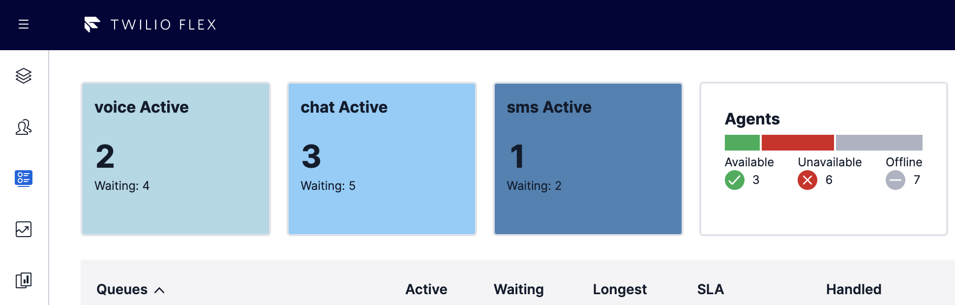
And finally, we can add three new tiles (one each for the voice, chat, and sms channels) to the AggregatedDataTiles component on the QueuesStatsView.
Adding all the above code in a Flex plugin and running this locally (or deploying the plugin to your Flex account), the Flex Real-Time Queues View now shows these additional Data Tiles with the Active Task Count and Waiting Task Count per channel. Optional background colors can be applied as a visual cue and to enhance the UI.
Complete Flex Plugin source code can be found here: https://github.com/ldvlgr/queues-view-data-tiles
Channel SLA Data Tile
The Flex Real Time Queues View shows the SLA % for each Queue (and further broken down by Channel, if available). If there are a large number of Queues, it may be preferable to display the SLA % aggregated by Channel.
Step 1. Channel service level aggregation function
Here is the code for a utility method to calculate the Service Level metrics per Channel (across all queues):
Step 2. Create Channel SLA Data Tile component
Leveraging this utility method, we can now create our custom Channel SLA Data Tile:
Step 3. Customize threshold levels and colors
To implement dynamic background colors (red, yellow, green) based on configurable SL Threshold values, we can enhance the styled component with a function that returns the background color:
With this code, SLA Values >= 90 are rendered with a green background, values between 61 and 90 are shown with a yellow background and values <= 60 are displayed with a red background. These levels can be customized as needed.
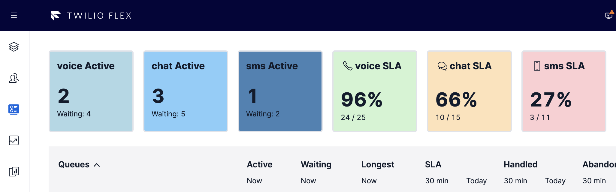
Step 4. Add new Channel SLA Data Tile component to Queues View
And finally, let’s add these three Channel SLA Tiles to the AggregatedDataTiles component on the QueuesStatsView.
After combining all the above code in a Flex plugin and running the plugin locally (or deploying to your Flex account), the Flex Real-Time Queues view should now show all six new Data Tiles:
Complete Flex Plugin source code can be found here: https://github.com/ldvlgr/queues-view-data-tiles
Custom pie chart Data Tiles
Since there is limited screen space at the top of the Queues View to add new Data Tiles, it may make sense to combine several metrics into a single data tile. The Flex plugin includes an example for creating a combined pie chart Data Tile that displays the Channel SLA metrics for all three channels (voice, chat, and sms):
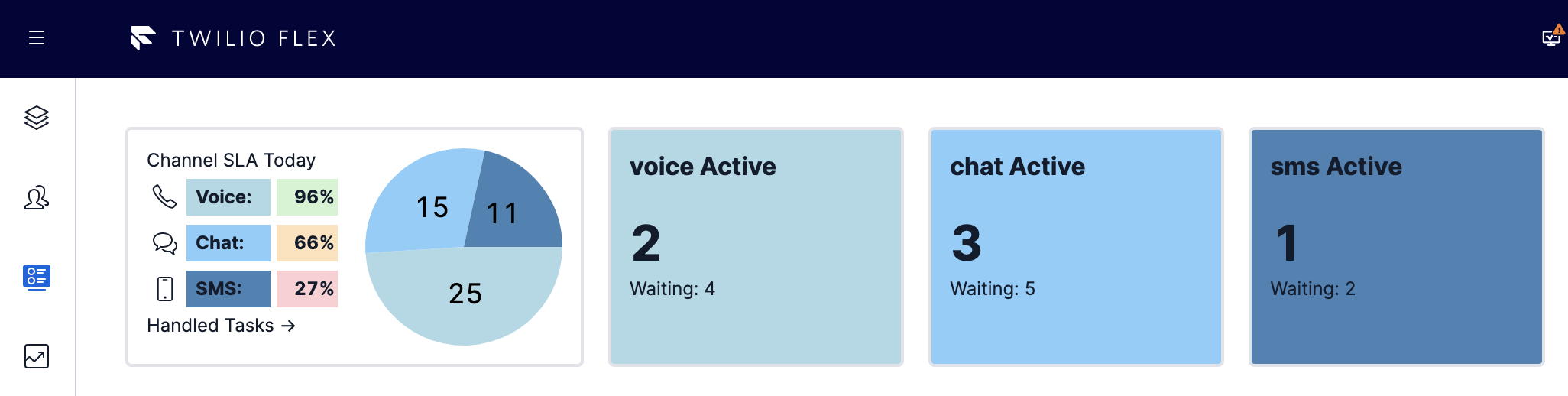
This pie chart Data Tile is just one possible visualization of this data. Other options include vertical bar charts or donut charts. There are a variety of chart libraries available in npm for inclusion in your plugin.
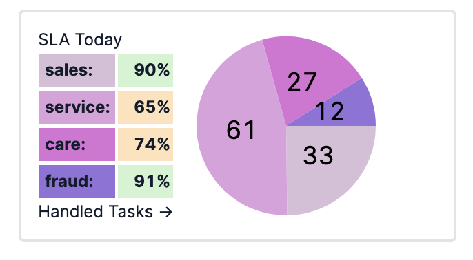
Furthermore, for large Flex implementations with dozens or even 100s of Queues, it may make sense to aggregate the data across a group of related Queues and calculate the SLA % for this group of Queues. To be able to aggregate the data across all Queues into groups, you would need to have a consistent Queue naming format where the group is a predetermined part of the Queue name (for example sales.mobile.voice.en). The sample Flex plugin provides additional code to show how you can accomplish this grouping. Here is an example of what this view could look like:
Customize your Twilio Flex Queues View
In this blog post I demonstrated how you can leverage the programmability of Flex and more specifically, of the Real-Time Queues View within Flex, to quickly create additional KPI Data Tiles to give Flex supervisors better operational visibility into their contact center. We can’t wait to see what you do with the sample code and make even better or more insightful custom Data Tiles, charts, or other data visualizations.
If your team would like assistance with any aspect of your solution, Twilio Professional Services is here to help. Reach out to learn more about our offerings.
Ludo Vlieger is a Staff Solutions Architect at Twilio’s NAMER Professional Services Team. Ludo enjoys enabling & educating Twilio customers & partners and building the best possible Flex Contact Centers. He can be reached at lvlieger [at] twilio.com.
Related Posts
-
 Integrating Twilio Agent Connect with Twilio Flex for Human HandoffSimran Aishwarya
 -
Script Adherence Using Real-time Conversation Intelligence with Twilio FlexCurtis Swartzentruber Ruma Nair
-
Orchestrate an AI-to-Human Agent Handoff with Twilio Agent Connect, Conversations Orchestrator, Studio, and FlexKinshuk Kar Sarang Shah
Related Resources
Twilio Docs
From APIs to SDKs to sample apps
API reference documentation, SDKs, helper libraries, quickstarts, and tutorials for your language and platform.
Resource Center
The latest ebooks, industry reports, and webinars
Learn from customer engagement experts to improve your own communication.
Ahoy
Twilio's developer community hub
Best practices, code samples, and inspiration to build communications and digital engagement experiences.