Creating and Publishing Web Components with Stencil
Time to read:
February 14, 2018
Written by
This post is part of Twilio’s archive and may contain outdated information. We’re always building something new, so be sure to check out our latest posts for the most up-to-date insights.

Web Components is a technology I’ve been excited about for years. The idea is that you can create your own UI components that are supported in the browser regardless of which framework you are using (or none at all for that matter). However, there wasn’t much traction around them until recently.
The web components APIs are pretty low level by themselves but projects like Polymer are trying to improve the developer experience and recently more tools came along to help with authoring web components. One of these tools is Stencil from the Ionic team.
If you are not yet familiar with web components, I suggest you check out this short introduction on webcomponents.org to get an idea of Custom Elements and Shadow DOM. If you want to have a better idea of why web components might be of interest for you, even if you don’t author a UI framework for the public, check out this talk Alexander Zogheb on how they used web components at EA.
In this blog post we’ll look at how we can develop a web component using Stencil, publish it to npm and consume it on a website.
Setup
We’ll develop a progress bar component called my-progress-bar that will allow us to pass the current value and optionally a maximum value as well as a “styling API” to alter the colors.
Before we get started make sure you have Node.js and npm or yarn installed.
Start a new project for our web component by running the following in your command-line:
Configure Stencil’s build system
Now that we have a new project set up and installed our two Stencil dependencies, we need to configure everything for building our component. First, create a stencil.config.js file in the root of your project and add the following to it:
In this configuration we specify the namespace in which Stencil will bundle all components as well as which components to place into bundles. Additionally we specify that we want to generateDistribution to make sure that Stencil generates files for us to distribute our component and disable generateWWW. This option is used if you would want to build an entire application using Stencil.
Stencil uses TypeScript, JSX and decorators for authoring web components, therefore we need to configure the TypeScript compiler accordingly. Create a tsconfig.json file in the root of your project and add the following configuration:
Lastly we need to add a few new entries to our package.json file in order to create a build command and specify which files should be consumed when someone installs our package. Modify package.json as follows:
Creating the actual component
Now that our setup is completed, it’s time to write our first component. For this, we’ll have to create two new files. One is a stylesheet to style our component, and one is a TypeScript file with our template and logic in it. Since we specified in the stencil.config.js file that our component is called my-progress-bar, we’ll have to create the files under the respective file path and file names as Stencil relies on a specific file structure.
Create a file under src/components/my-progress-bar/my-progress-bar.tsx and place the following code into it:
This creates a very basic component. The @Component() part in front of the class definition is a decorator that adds metadata to our class so that Stencil knows how to create this web component. In it we specify a tagName – this is the name we can use later in our HTML document to create such an element. In our case this would be . For forward-compatibility reasons we always have to use a - in the name of a custom element to not interfere with built-in elements.
We specify the path to our stylesheet using styleUrl and the last thing is shadow: true. This will tell Stencil that we want the content to be wrapped into a “shadow root”, aka use the Shadow DOM API. If a browser doesn’t support the Shadow DOM yet, Stencil will make sure to use the respective polyfill.
Inside the MyProgressBar class we have one method called render() that is responsible for determining what the custom element should render. For this we are using JSX annotations. In our first attempt we’ll just render a headline.
Before we test our new component, create a stylesheet file in src/components/my-progress-bar/my-progress-bar.scss and place the following code into it:
The :host is part of the Shadow DOM and makes sure that the styling of h1 won’t leak to the outside.
Compile your web component by running npm run build in your command-line. You should see a new dist/ folder being created with a variety of files. We’ll talk more about them later. For now all we need to know is that dist/my-web-components.js is the file we want to use if we want to consume our new component.
To test our component, create a new file example/index.html and place the following code into it:
Install serve to serve our current directory as a web server to test it:
Modify your package.json to add a new build script:
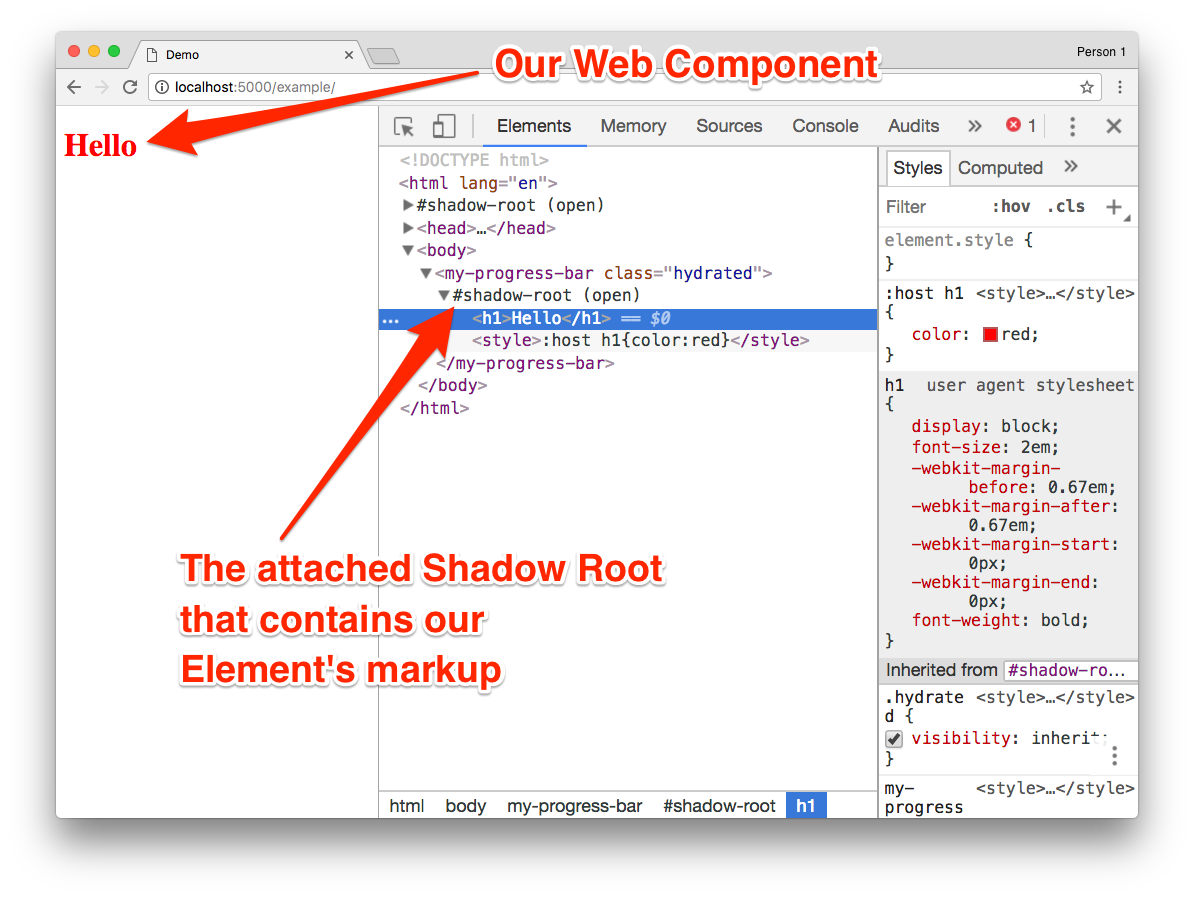
Run npm start, open http://localhost:5000/example and you should be greeted by your browser with Hello:
Adding properties
Right now we have a custom element that can’t be configured. It’s static but ideally, we want to pass information into it. For custom elements, just like for built-in elements, there are two ways to pass information. One is via attributes in the HTML, and the other is via properties using JavaScript:
The main difference is that attributes only allow you to pass “primitive” data types while properties allow you to pass rich data like arrays or objects. Stencil, however, is smart enough to do a bridge between the two for primitive data types. Meaning that if you set a value via an attribute, it will forward it to the respective property.
To create properties, we’ll use another one of the built-in Stencil decorators. Modify your my-progress-bar.tsx file:
Any property of the class that is prefixed with the @Prop() decorator will be turned automatically into a property on the custom element. Stencil will also watch any changes in this value and will cause a re-render by calling render() again. We also updated the code that is rendered to show the two values.
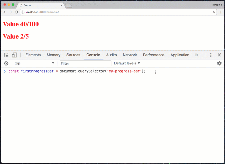
Re-compile your web component by running npm run build. To test the changes update your example/index.html to consume multiple instances of component:
Re-run npm start and check out the result on http://localhost:5000/example. Afterwards open the JavaScript console of your browser’s developer tools (here is how to do it in Chrome, Firefox and Edge) and type:
The change should be automatically reflected, similar to what you see here:
Styling your web component
So far we have a pretty boring web component and it’s nowhere near a progress bar. To change that we’ll have to do a few changes to our CSS.
To create the progress bar, we’ll be using CSS flexbox and calc meaning we have to somehow bring the values from our properties into the realm of CSS. At the same time we want to expose only a set of values that the developer using our web component can style. Both of these can be done with CSS Custom Properties. You can think of them as variables for your CSS that you can also set via JavaScript.
Start by modifying my-progress-bar.scss:
In this code we use var(--some-value, fallback) a few times. This allows us to read the value of a CSS custom property and specify a fallback in case it doesn’t exist. --current-value and --max-value are the two we’ll use from our component while the others can be used by the developer for styling.
We could set the width directly from our component rather than calculating it using calc in CSS but our JavaScript should really not be concerned with how the styles are implemented.
Now we need to update the HTML rendered as well as set the two custom properties. For this, we need access to the element that is being rendered. We can do this with the @Element() decorator. Update the my-progress-bar.tsx:
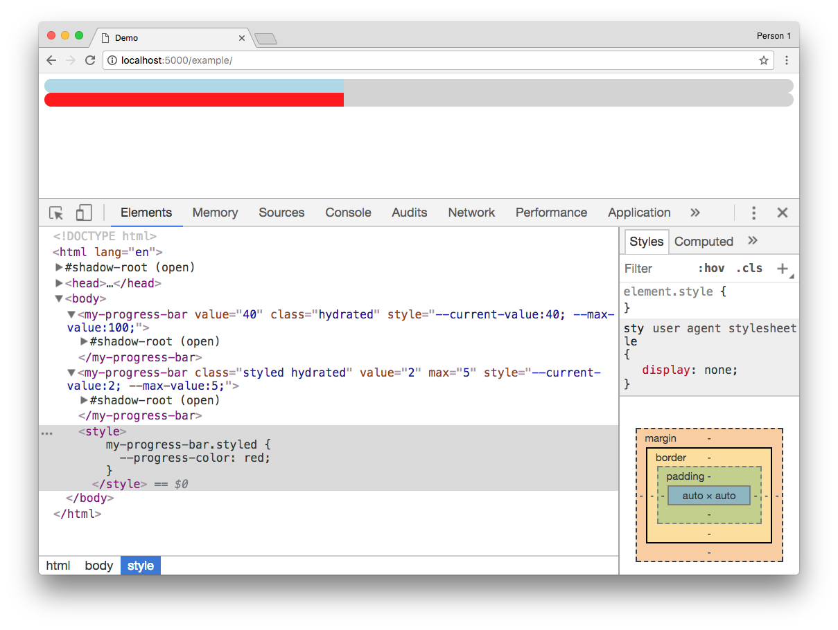
Re-compile your component using npm run build and update the example/index.html to test our new changes:
Run npm start and open http://localhost:5000/example. The result should look like this:
Publishing your new web component
Now that we have our web component written, it’s time to publish it. We already specified which files should be published in the package.json with the files entry. Namely anything in the dist/ folder. This folder contains three subdirectories and one file:
my-web-components.js. This is the entry file to our collection of web components
collection. This is a folder that is mainly useful if you are planning to build an entire application with Stencil as it allows to more efficiently consume these collectionsmy-web-components. This is the folder containing all the logic for our web components. This folder has to be copied when you want to use a component as these files are asynchronously loadedtypes. These are all the generated TypeScript definitions that help us when we want to use this web component in an environment that uses TypeScript
So every one of these files is important depending on the scenario and therefore we’ll just publish everything.
Before we can publish the package we should add a prepublish hook that builds the component just to be sure we have the latest version of the files. Additionally we need to update the name of the component. I would recommend using the new @scope feature of npm. Simply prefix the name with your username. For me this would be @dkundel/my-web-components. Open your package.json and change the file accordingly:
Publish your package to npm by running:
Once npm is done publishing the package our job is done and people can start consuming the files. The easiest way to test it on a standard HTML page is to pull the file from unpkg.com:
If you want to know how you can use these components in Angular or React, make sure to check out the documentation on stenciljs.com.
What’s next?
This was just a very basic web component to show the general concepts. If you want to build more complex components you should make sure to check out the Stencil website as it provides information on state management, events, methods, forms and even server side rendering.
If you want to start using web components in your framework of choice, I recommend you check out custom-elements-everywhere.com. It’s a website that constantly tests the support of custom elements in a variety of frameworks and highlights the existing issues if there are any.
Stencil is also not the only way to author web components. Others include Polymer, SkateJS and others. Also existing frameworks are looking into how you can turn your existing components into custom elements. Angular is working on Angular Elements and Vue Elements allows you to develop custom elements in Vue.
If you have any questions or would love to share your web components project, feel free to send me a message:
- Twitter: @dkundel
- Email: dkundel@twilio.com
- GitHub: dkundel


Related Resources
Twilio Docs
From APIs to SDKs to sample apps
API reference documentation, SDKs, helper libraries, quickstarts, and tutorials for your language and platform.
Resource Center
The latest ebooks, industry reports, and webinars
Learn from customer engagement experts to improve your own communication.
Ahoy
Twilio's developer community hub
Best practices, code samples, and inspiration to build communications and digital engagement experiences.