Embedding Maps with Python & Plotly
Time to read:
December 18, 2017
Written by
This post is part of Twilio’s archive and may contain outdated information. We’re always building something new, so be sure to check out our latest posts for the most up-to-date insights.
")
Data Visualization is an art form. Whether it be a simple line graph or complex objects like wordclouds or sunbursts, there are countless tools across different programming languages and platforms. The field of geospatial analysis is no exception. In this tutorial we’ll build a map visualization of the United States Electoral College using Python’s plotly module and a Jupyter Notebook.
Python Visualization Environment Setup
This guide was written in Python 3.6. If you haven’t already, download Python and Pip. Next, you’ll need to install the plotly module that we’ll use throughout this tutorial. You can do this by running the following in the terminal or command prompt on your operating system:
Since we’ll be working with Python interactively, using the Jupyter Notebook is the best way to get the most out of this tutorial. You installed it with pip3 above and now you just need to get it running. Open up your terminal or command prompt and run the following command:
And BOOM! It should have opened up in your default browser.
A Quick Note on Jupyter
For those of you who are unfamiliar with Jupyter Notebook, I’ve provided a brief review of which functions will be particularly useful to move along with this tutorial.
In the image below you’ll see buttons labeled 1-3 that will be important for you to get a grasp of:
- Save button
- Add cell button
- Run cell button
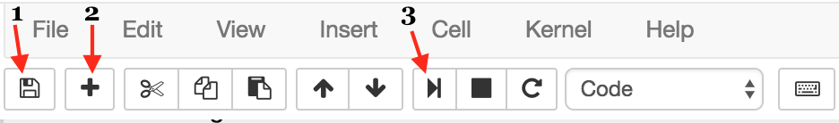
The first button is the button you’ll use to save your work as you go along (1). I won’t give you directions as when you should do this — that’s up to you!
Next, we have the add cell button (2). Cells are blocks of code that you can run together. These are the building blocks of Jupyter Notebook because it provides the option of running code incrementally without having to to run all your code at once. Throughout this tutorial, you’ll see lines of code blocked off — each one should correspond to a cell.
Lastly, there’s the run cell button (3). Jupyter Notebook doesn’t automatically run your code for you; you have to tell it when by clicking this button. As with add button, once you’ve written each block of code in this tutorial onto your cell, you should then run it to see the output (if any). If any output is expected, note that it will also be shown in this tutorial so you know what to expect. Make sure to run your code as you go along because many blocks of code in this tutorial rely on previous cells.
Setting Up Plotly
In order to use Plotly, you’ll need an account with your own API key. Click here to set up an account with Facebook, Twitter, GitHub, Google Plus or your email address.
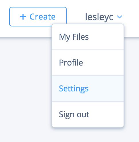
Once you’ve logged in, look for your username in the upper right corner of the page. If you hover over it, four options pop up in a rectangular box. Select the Settings option, highlighted in the picture below:
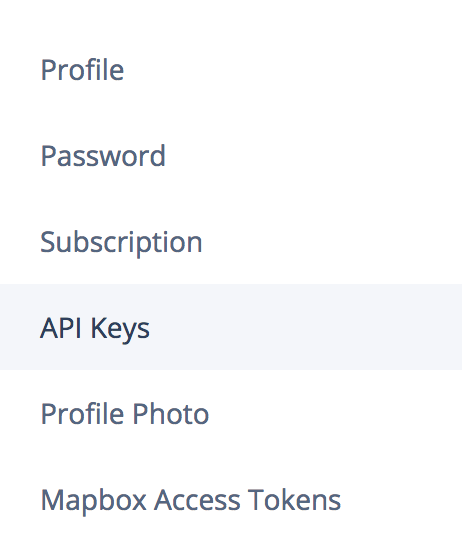
This will redirect you to your settings page, where you’ll find six options. Next choose API Keys, highlighted in the image below:
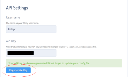
Finally, you have the page with all the needed information for this tutorial! In the image below, you’ll see two text boxes: one with your username and the other with your API key. These are the pieces of information you should store somewhere safely. The text in the API key should be protected, but since this is your first time using Plotly, you can go ahead and click the Regenerate Key button circled below. Copy and paste your username and API key somewhere safe for later.
Formatting Data in Plotly
First, as always, we import the needed modules. Then we initialize our session by signing into Plotly, using the username and API key we just got.
Plotly supports three types of maps: choropleths, atlas maps, and satellite maps. Using data from the electoral college, we’ll plot a choropleth map of the United States with a color scale. The darker the color, the greater number of votes.
First, we load in the electoral college data. Each number in the list of votes will correspond to a state label, which we’ll incorporate soon.
In the same ‘Data’ call, we include parameters that will be our sliding scale. This determines how light or dark a given state will be.
Now we’re ready to add labels for each state, making sure to keep the order in place so that states aren’t mislabeled.
Altogether, we have:
Now we’ve formatted our data. But of course, our code needs to know how to display this data. Luckily, we can just use plotly‘s Layout class. We’ll pass in color schemes and labels as parameters.
Displaying the Plotly Map
We’re almost done! The last step is to construct the map and use plotly to actually display it.
This should open up a link in your browser with our visualization on display. It should look like the following:
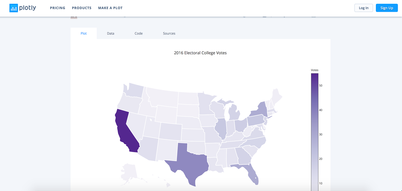
(You can also see my version of the visualization here.)
Now that we’ve generated our map on the Plotly website, let’s explore the different display options available. Take a look at the upper right corner of the visualization. You’ll notice a camera icon, which if you hover over says, “Download plot as a png.” This image allows you to download a static picture of your visualization, which you can then embed as you would any other photo.
Next, scroll to the bottom of the page. Notice the 5 icons on the lower right corner: Facebook, Google Plus, and Twitter logos, followed by a chain link graphic and “”. Click on that final one, “”.

It should have opened a modal that looks like this:
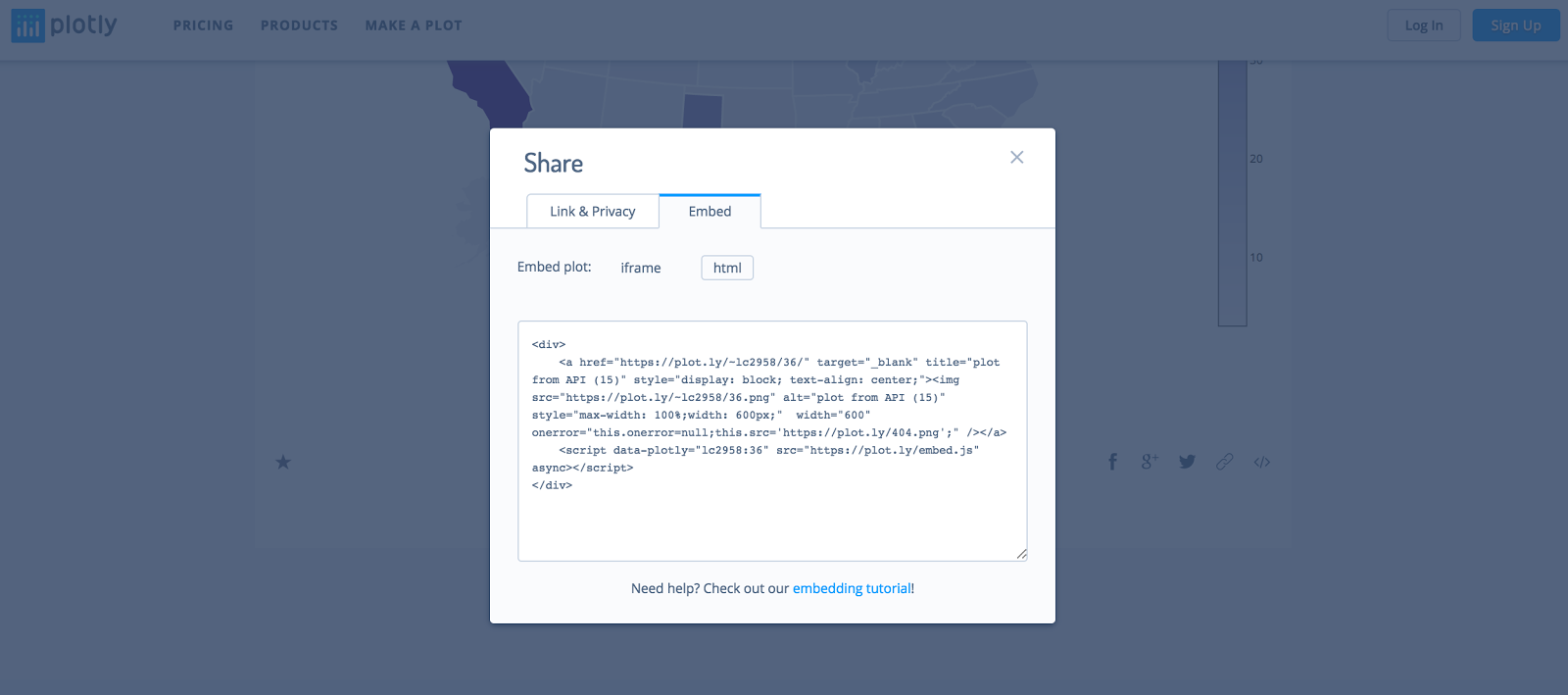
Now you can copy and paste that html snippet in any HTML file, and it will elegantly display the visualization. For example, the embed markup for my graph looks like this:
plotly is a useful Python module for displaying almost any type of data, whether that be numerical, text, or geospatial. In this tutorial, we focused on geospatial mapping, but if you’re interested in expanding your visualization toolkit, you can look here for more ideas.
If you liked what you did here, check out my GitHub (@lesley2958) and Twitter (@lesleyclovesyou) for more content!

Related Resources
Twilio Docs
From APIs to SDKs to sample apps
API reference documentation, SDKs, helper libraries, quickstarts, and tutorials for your language and platform.
Resource Center
The latest ebooks, industry reports, and webinars
Learn from customer engagement experts to improve your own communication.
Ahoy
Twilio's developer community hub
Best practices, code samples, and inspiration to build communications and digital engagement experiences.