Designing a Console That Matches the Customer Journey
Time to read:
April 07, 2021
Written by

A little history...
As a Twilio customer, you’ve probably seen our rapid development of many new products. Even if you don’t follow our product release announcements religiously, you’re bound to have seen the growing product menu in the Console. When the Console was launched in 2016, there were a handful of products. Now there are dozens, including everything from raw APIs through fully programmable applications, plus a suite of developer tools.
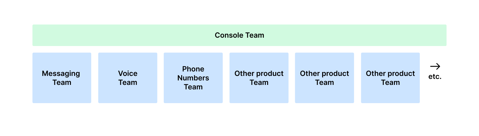
In order to scale quickly, the Console was intentionally architected to enable many small product teams to ship their frontend experiences autonomously. This strategy, while optimal for rapid growth, came with some UX tradeoffs. Having no centralized governance of the Console led to a lot of inconsistency and duplication across products. Our customers felt the pain of this as they built more multi-channel Twilio applications and were moving between different parts of the Console.
To address the confusion our customers were experiencing, a new small Console team was tasked with looking across the different products and creating a coherent experience that supported the way our customers work.
It was time for Twilio to look at the Console as more than the sum of its products.
The following is an overview of how we approached this process from a user experience perspective. We hope that other organizations with similar growth patterns find it helpful.
Wearing the customer’s shoes
One of Twilio’s core values is to “wear the customers’ shoes.” To begin the redesign, we looked across CSAT surveys, support tickets, and usability testing notes. We found a wealth of evidence that the Console’s information architecture wasn’t ideal. Despite high ratings for individual products, users felt lost in the Console and spent too much effort looking for the content they needed.
In addition, we heard that users didn’t feel comfortable exploring Twilio’s products because they were overwhelmed by the long, non-descriptive product menu. Because of this, it was common for regular Console visitors to be fully unaware of products that existed and directly applied to problems they needed to solve.
“The UI navigation doesn't seem organized into any logical fashion, or it’s too logical and done from the perspective of someone who knows deeply how the whole thing works.” - CSAT participant
As we looked at engagement metrics, we saw trends that reinforced these challenges. The vast majority of activity was occurring in a handful of product pages such as log and service pages. A large portion of other pages were getting <1% of overall product traffic. All these extra pages, many of which had duplicative content, likely added noise and cognitive load.
Exploring our users’ mental model
We wanted our information architecture to match the mental model of our users. We ran a type of research called card sorting, in which users were asked to categorize a variety of Twilio-related tasks in a manner that felt logical to them.
We saw that developers tended to sort content through the lens of the development lifecycle, rather than product vertical. At each phase of the journey, there were different goals and different types of content needed to accomplish those goals. They also categorized many of the administrative tasks in their own section outside of the development journey.
Rethinking the console’s information architecture
We explored a variety of ways to organize the Console in a manner that supported this journey and tested these variations to see what worked the best for customers. In addition to collecting developer feedback, we tested with technical support managers, product managers, IT admins, and billing managers, all of whom participate in this journey and rely on the Console to do their jobs.
The new Console segments information based on this model, with designated areas for each phase. By creating these separate sections, we were able to simplify the experience and remove roughly 10% of Console content which was duplicative and had been adding a lot of extra noise.
Creating the right terminology
Terminology was another critical part of the design. The names used to represent different sections didn’t need to be clever or jargony. They needed to clearly describe the type of content found there. We started by using some of the terms our customers had used in the card sorting research:
- “Develop”, “Build”, “Configure”
- “Monitor”, “Troubleshoot”, “Analyze”
- “Account”, “Admin”, “Identity and access”
- “Billing”, “Billing and Usage,” “Invoicing”
Naturally, we had a lot of our own opinions about what we should call these things. To make the right decisions for our customers, we ran click tests (seen in image below) using different labels to see which worked best for the most users across the most number of tasks. The top level sections we chose, based on this research, were “Develop”, “Monitor”, “Account”, and “Billing.”
Multi-product usage
The data showed that a large portion of customers are building solutions that require the use of more than a single product. For example, customers often build with multiple channels or use serverless products to power their applications.
Even at the most simplistic level of Twilio usage, users were moving back and forth between phone numbers and messaging. The multi-product nature of the way our users build compelled us to build a navigation structure that allowed for easy movement between product menus.
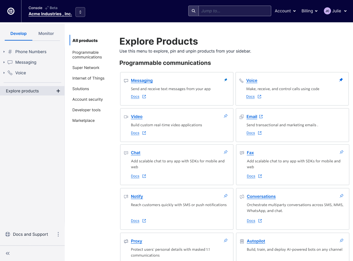
In addition, in the legacy Console, the product menu didn’t tell customers anything about Twilio products or how they could be useful. There was really no way for a customer to explore or learn about other offerings from the context of the Console. We’ve replaced this menu with a page that allows users to explore and learn a little bit about each product, giving customers more visibility into the full range of offerings.
In testing this page, we heard from developers that reading documentation is an important part of evaluating products, so we’ve added a direct link to each product’s documentation. This initial “Product Explorer” page serves as a foundation that will allow us to grow into our next round of improvements including more information about how products work together, suggested product groupings, and mapping products to specific solutions.
What’s next?
The Console redesign is a key first step towards building a better end-to-end experience that supports the journey customers take with Twilio. Now that the overall structure is in place, we are looking ahead to drive more Console-wide innovation and standardization in a number of key areas, from product evaluation through application monitoring.
To measure our progress, we have captured baseline customer satisfaction ratings around the things that our redesign seeks to address like the ability to find information, complete common tasks, and learn about new features. We will be using future ratings of these categories to gauge the success of our new Console and help prioritize additional investments.
Finally, we want to say thank you to our customers for your time and feedback throughout this project. We couldn’t have done this without you and we can’t wait to see what you build.
To participate in Twilio UX research and help shape the future of Twilio, please sign up here.


Related Resources
Twilio Docs
From APIs to SDKs to sample apps
API reference documentation, SDKs, helper libraries, quickstarts, and tutorials for your language and platform.
Resource Center
The latest ebooks, industry reports, and webinars
Learn from customer engagement experts to improve your own communication.
Ahoy
Twilio's developer community hub
Best practices, code samples, and inspiration to build communications and digital engagement experiences.