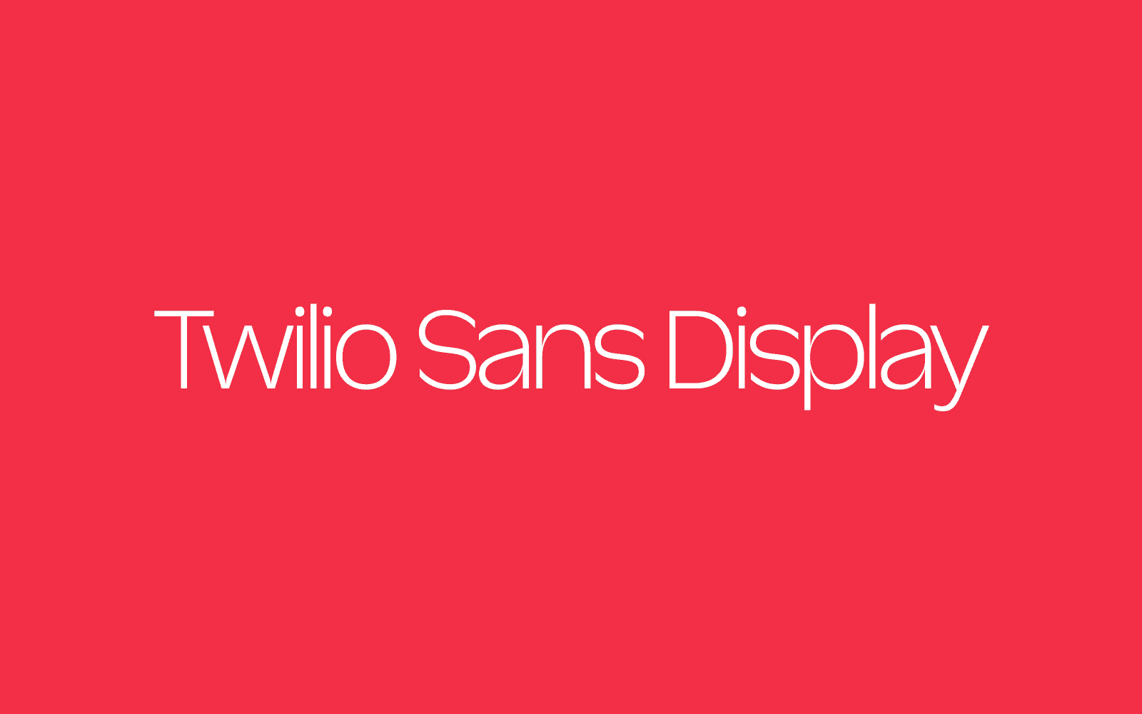
Say Ahoy to Twilio Sans
Time to read:
January 11, 2023
Written by
Reviewed by

You have probably started to see a new typeface appearing in Twilio ads recently. What you are seeing is Twilio Sans, and the culmination of months of strategy and design.
The Twilio Core Creative team partnered with the award winning foundry Sharp Type (no relation to the author of this post) to design a typeface from scratch just for Twilio. The final product is welcoming and incredibly adaptable. It can be big and bold or quiet and utilitarian. Wherever it shows up – whether in a code terminal or an airport terminal – it is distinctly Twilio.
A typeface is a collection of design characteristics that makes an alphabet visually unique. It is organized into different weights and styles called fonts.
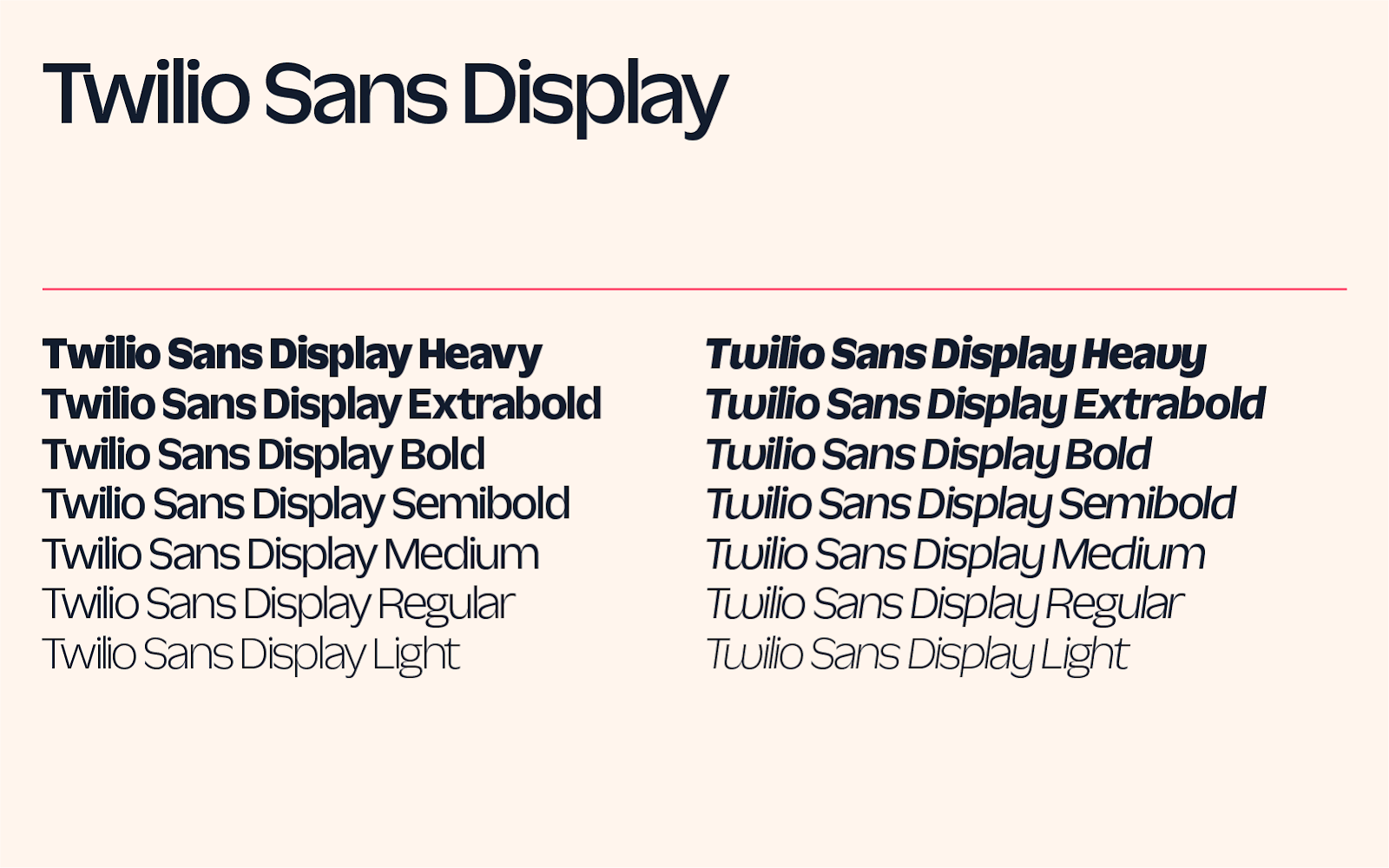
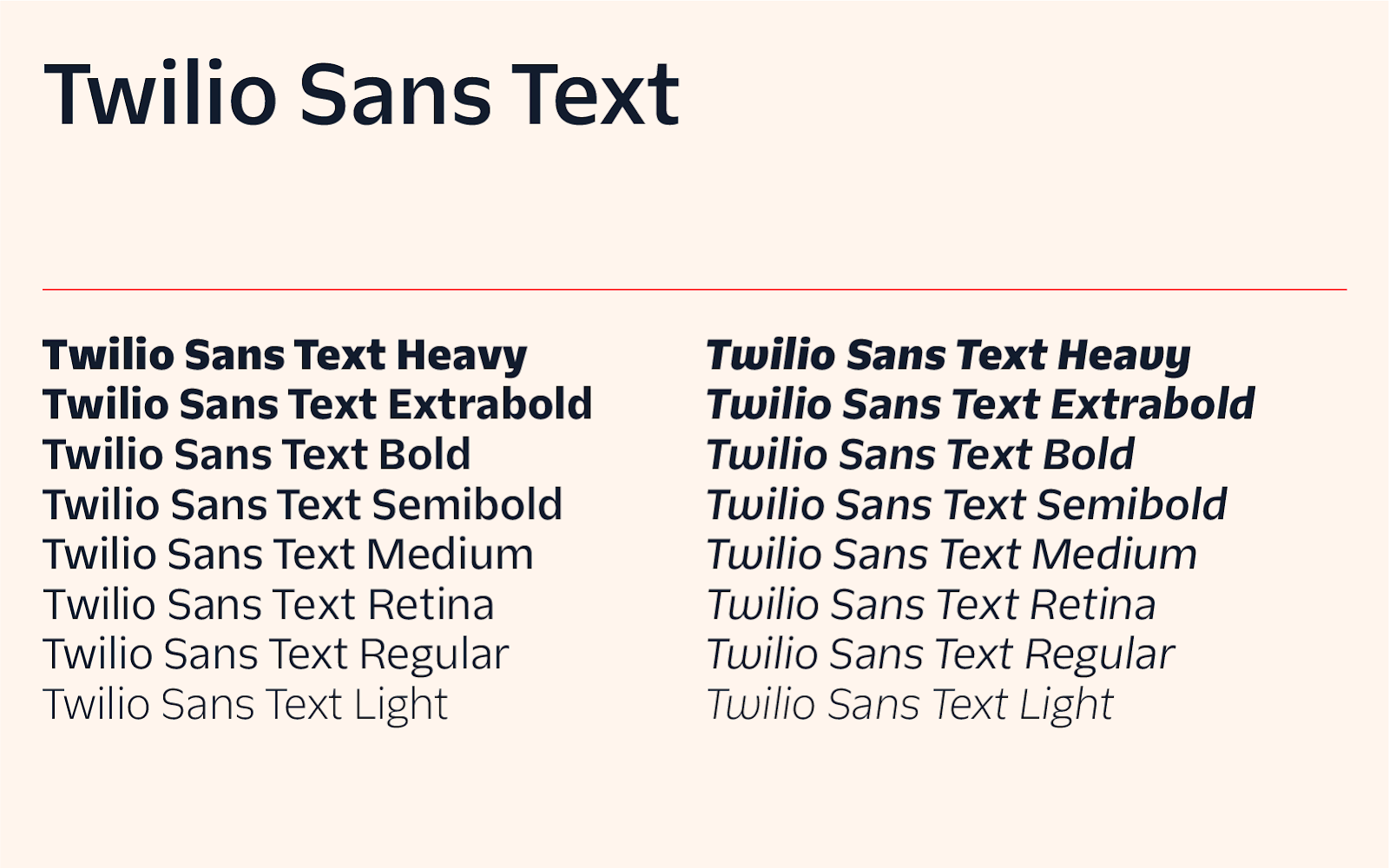
Our typeface is actually a superfamily composed of three related but distinct typefaces: Display, Text, and Mono. Each is designed for a specific function that is core to the Twilio brand.
In this post, I’m going to share the background of Twilio Sans and some insights into our design process.
The right time for a Twilio typeface
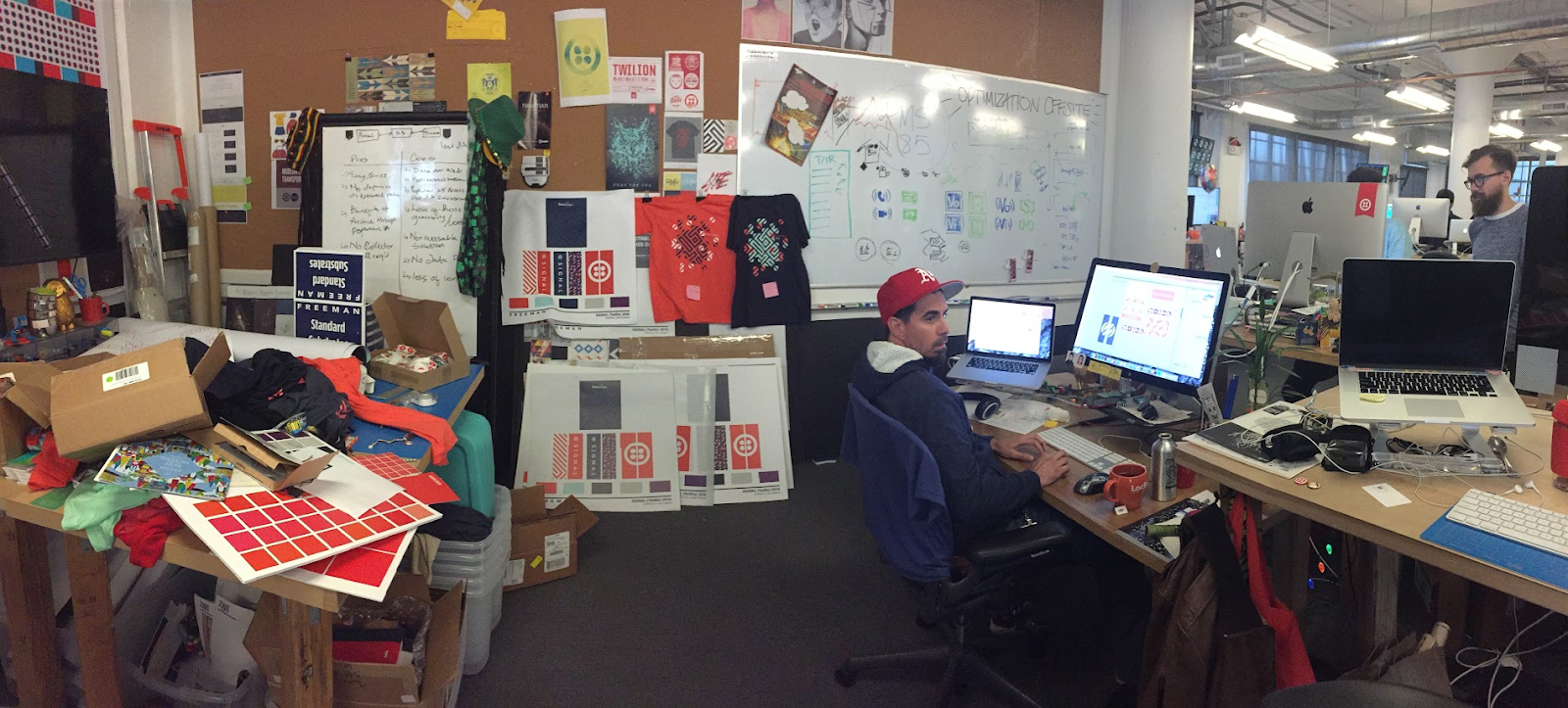
I don't remember when the notion of a Twilio typeface first appeared, or who suggested it. It could have been at the Beale Street office in San Francisco, in the oversized closet our small Brand Team had converted to a print workshop and swag gallery. But more likely it was before that.
When I was hired in 2015, Twilio was still a young startup of under 500 employees working from a warehouse space on Harrison Street. We barely had an inkling of what the future had in store. Sean McBride, a close friend and collaborator long before he convinced me to join his cohort of visual designers and became my boss, always encouraged us to go big—to dream beyond our circumstances and envision the artifacts we created alongside the giants of the industry. At the time, we certainly did not expect to ever have the opportunity to design a typeface, but we didn’t let that slow our ambitions.
Designing a typeface isn’t an uncommon dream for a graphic designer. In a field full of ephemera, whether printed or digital, a typeface offers a suggestion of permanence. The artifacts we create will dissolve, the messages change, but year after year upon new media and with new words the typeface persists, invisible, but ever present, the glass vessel from which the world consumes its stories.
From daydreams to decision time
Twilio in those early days still had the feeling of an idea taking form. Likewise, our typographic daydreams were imprecise.
Sean spoke admiringly of display letters that pushed the limits of height or width, that at times challenged perception, that leaned into vernacular idiosyncrasies, that were as eclectic as the paper scraps he had dotingly and obsessively collected over the years—bulging circus letters and woodtype as lean and weather-worn as an old cowboy.
I was fascinated with functional text typefaces whose main purpose was to be invisible, but which, upon closer inspection, revealed in their minutest details the character and wit of their creators and the thought and fashion of their times. To me, modest letters, easily read and as easily unseen, spoke a secret language that I hoped to decipher. Behind a curtain of tradition and expectation, their subtle curves and strokes played out their own drama free from any prying eyes.
By the time a custom typeface became a practical need for the company, Twilio was nearly 20 times as large as when I joined, and Sean had moved on to a new team. The business, the products, and the brand had all evolved in the intervening years and I was responsible for ensuring that the typeface would address the needs we were facing. I gathered a team to create something that could bridge the gap between the past, present, and future of the brand – a typeface that fit our current challenges while honoring the spirit of the early days.
Defining Twilio typographically
I admired the utility of modernist typographic systems which adhere to a single utilitarian typeface that functions adequately at all scales. These systems exude a calm, if cold, authority, as much from the strict discipline of its application as from the particulars of any given letter.
While we wanted to adopt some of the benefits of the modernist style, we also allowed ourselves to stretch it and play with it. We set out, quixotically, to blend the abundant joy of circus letters and playbills with the utility and authority of a unified type system.
Inspirational typefaces
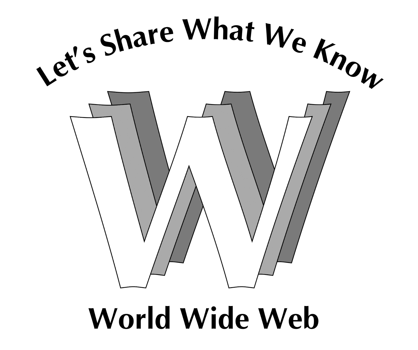
(More on Robert Cailliau)
We drew initial inspiration from a variety of sources. We looked back to the early days of web design and felt nostalgia for the charming naivety of Web 1.0. That period in the late 90’s and early 2000’s saw a revival of humanist typefaces distantly derived from handwriting. Typefaces like Optima, which had been out of favor for decades, were suddenly en vogue again. It was a wonderful aesthetic moment, but we felt that we needed something more sturdy and eye-catching.
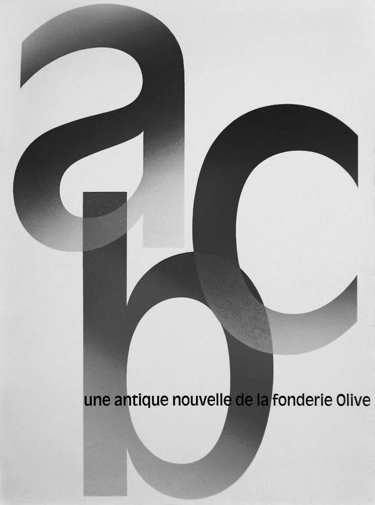
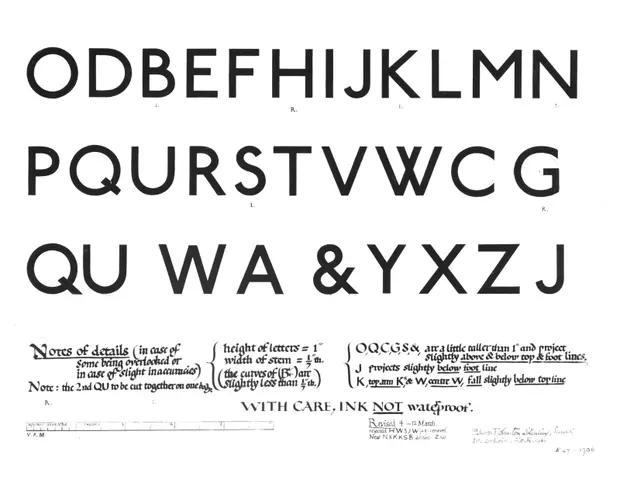
We also turned to other humanist typefaces, particularly Edward Johnston’s eponymous typeface from 1916 which introduced a calligraphic elegance to the sans serif lexicon, and to Roger Excoffon’s quirky Antique Olive of the early 1960s which he designed in response to the sterility of the Swiss style then dominating graphic design.
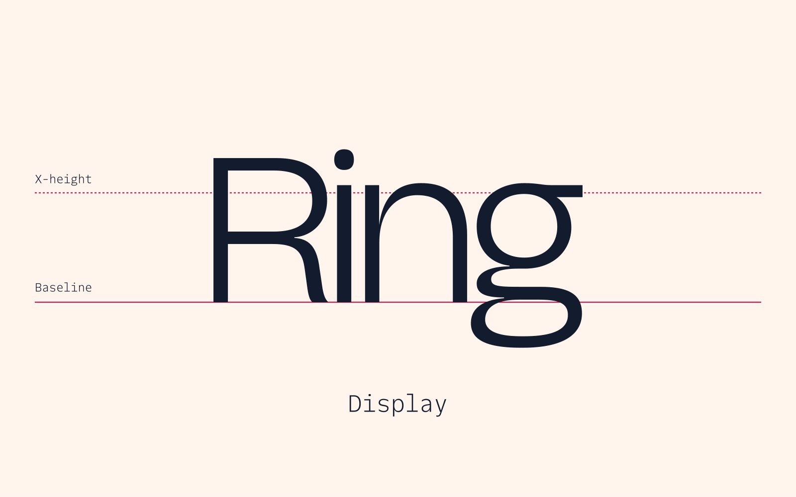
Designing Twilio Sans Display
Text fonts are typically the most practical and utilitarian fonts in a type family. We could have started with a text font, and adapted the design to work at large scales by adding detail. However, one of our objectives was to create a design with a distinct voice, so we began with the boldest style where the idiosyncrasies would shine — our Display.
As we refined and grew smitten with the elegant curves, bold strokes, and high-contrast pinches, we began to imagine Twilio Sans Display out in the world.
How would it look on a billboard on Interstate 101? How would our typeface work when wrapping around the walls of Moscone Center in San Francisco?
Twilio Sans Display demanded to be big and to be admired. It was loud and proud, and just what we were looking for.
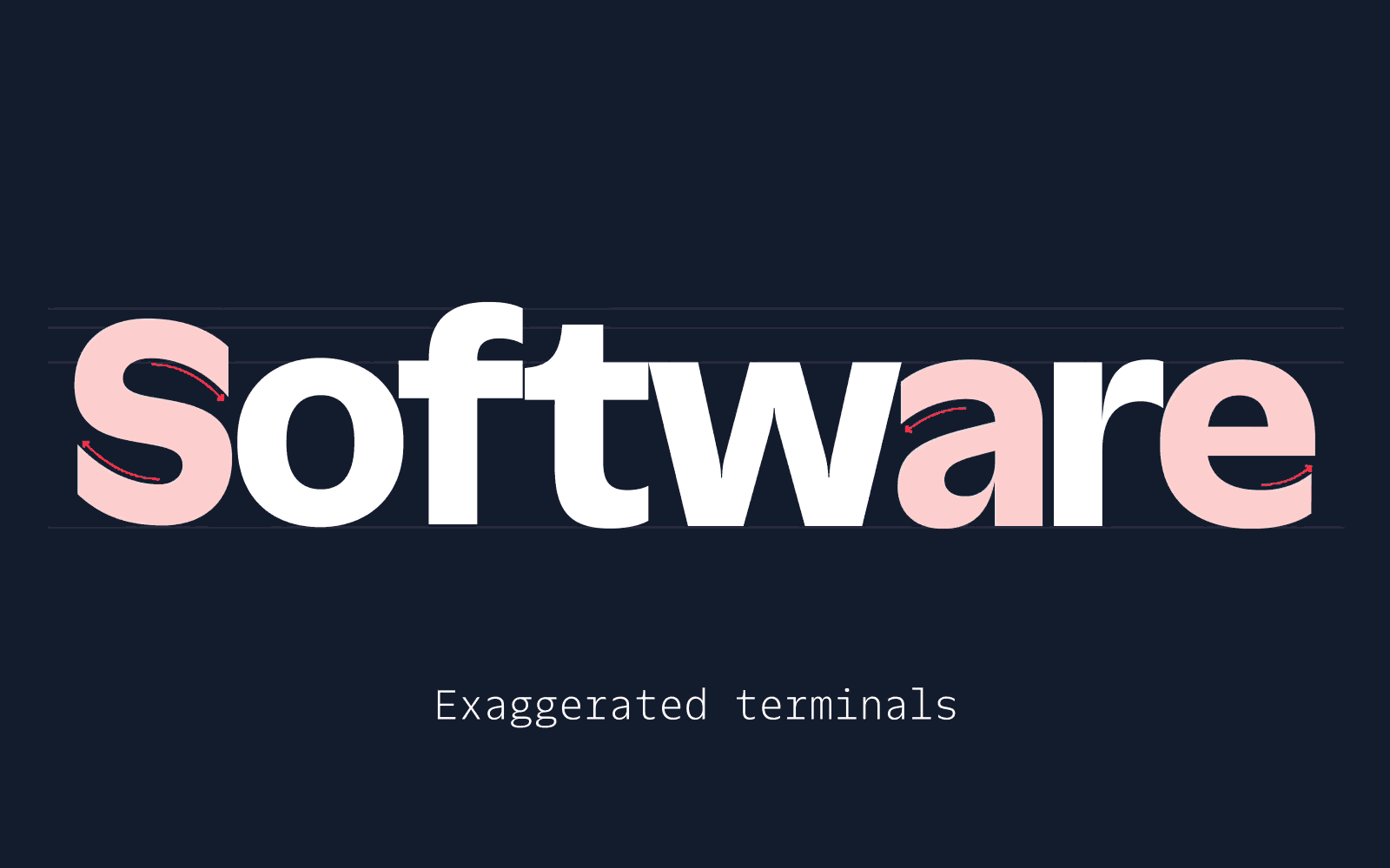
Twilio Sans Display harkens back to the early days of Twilio and Sean's interest in bold and unique fonts. The pinched stroke intersections were inspired by ink-traps–a design detail that improves the legibility of small text printed in phone books among other things–but are also reminiscent of the imaginative forms that were unleashed with the invention of photo typesetting in the 1930's. The technology gave rise to an era of typographic expression that was previously impractical.
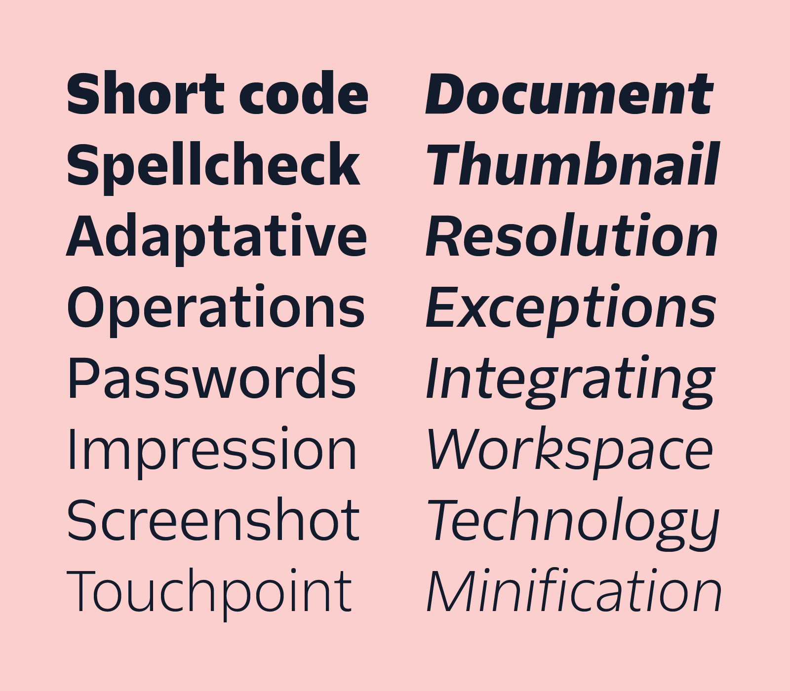
The expressive forms of Display serve a dual purpose of text and graphic; Twilio Sans Display is intended to be both read and noticed.
But this transmutation of text into graphic can only be properly admired at large scales. At small scales or in body copy, the charm of display fonts is diminished as the details become muddy and words become difficult to read.
Refining Display into Text
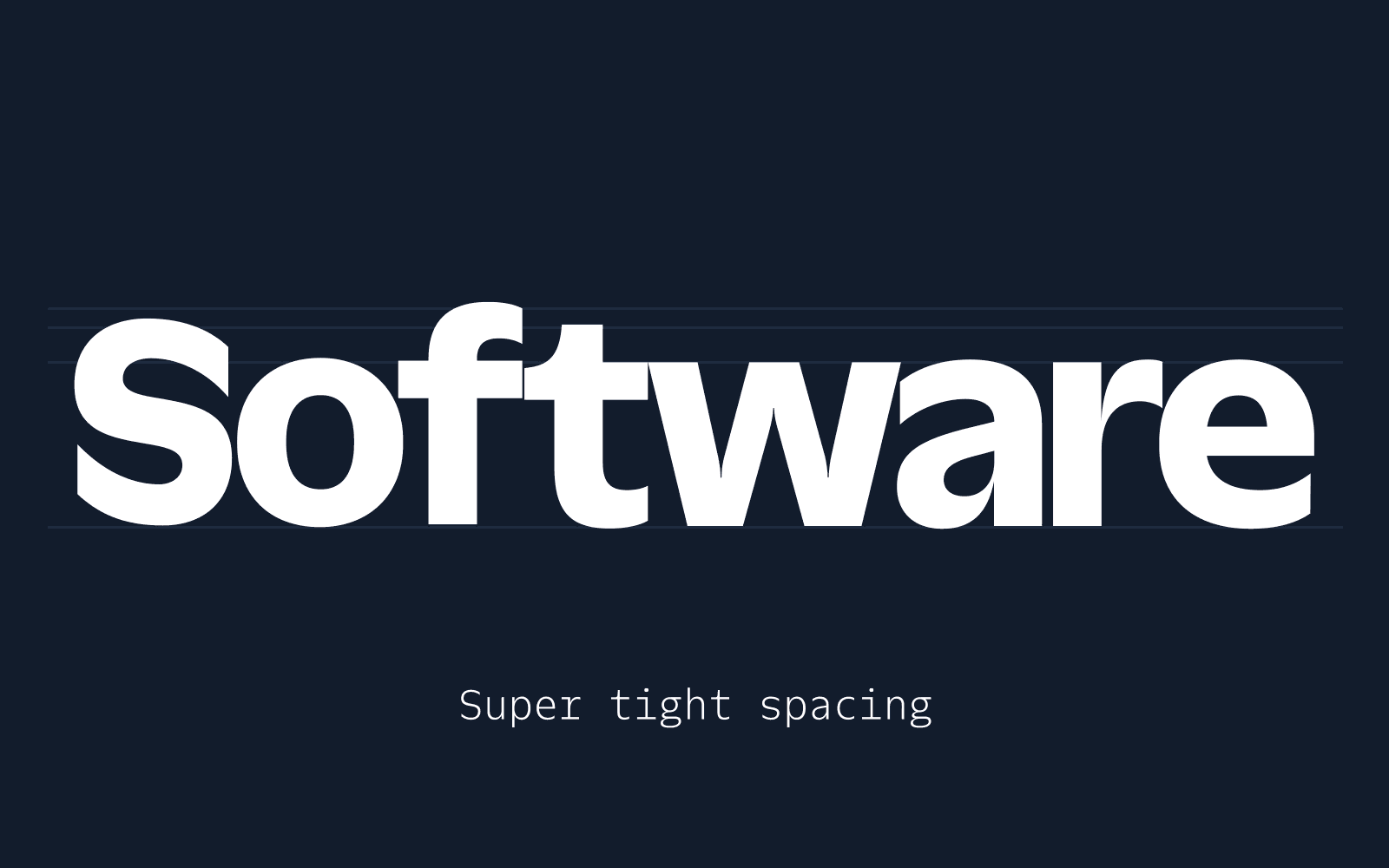
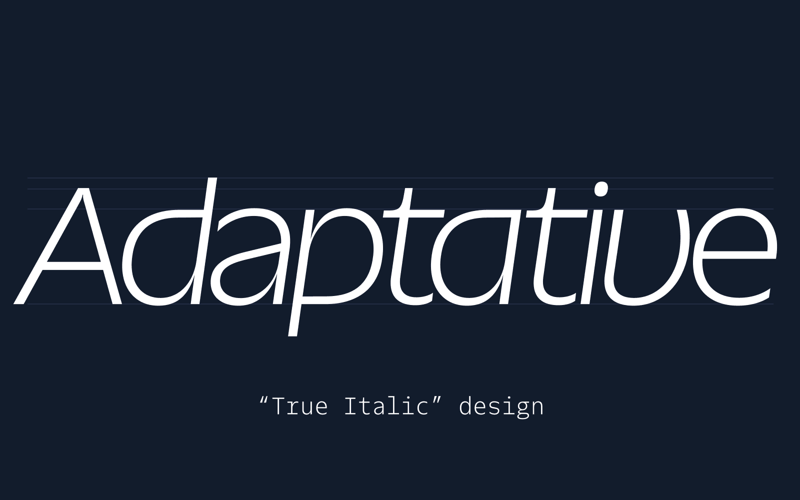
Once we built out the initial Display weights and italics, we worked backwards to the Text style, examining every detail.
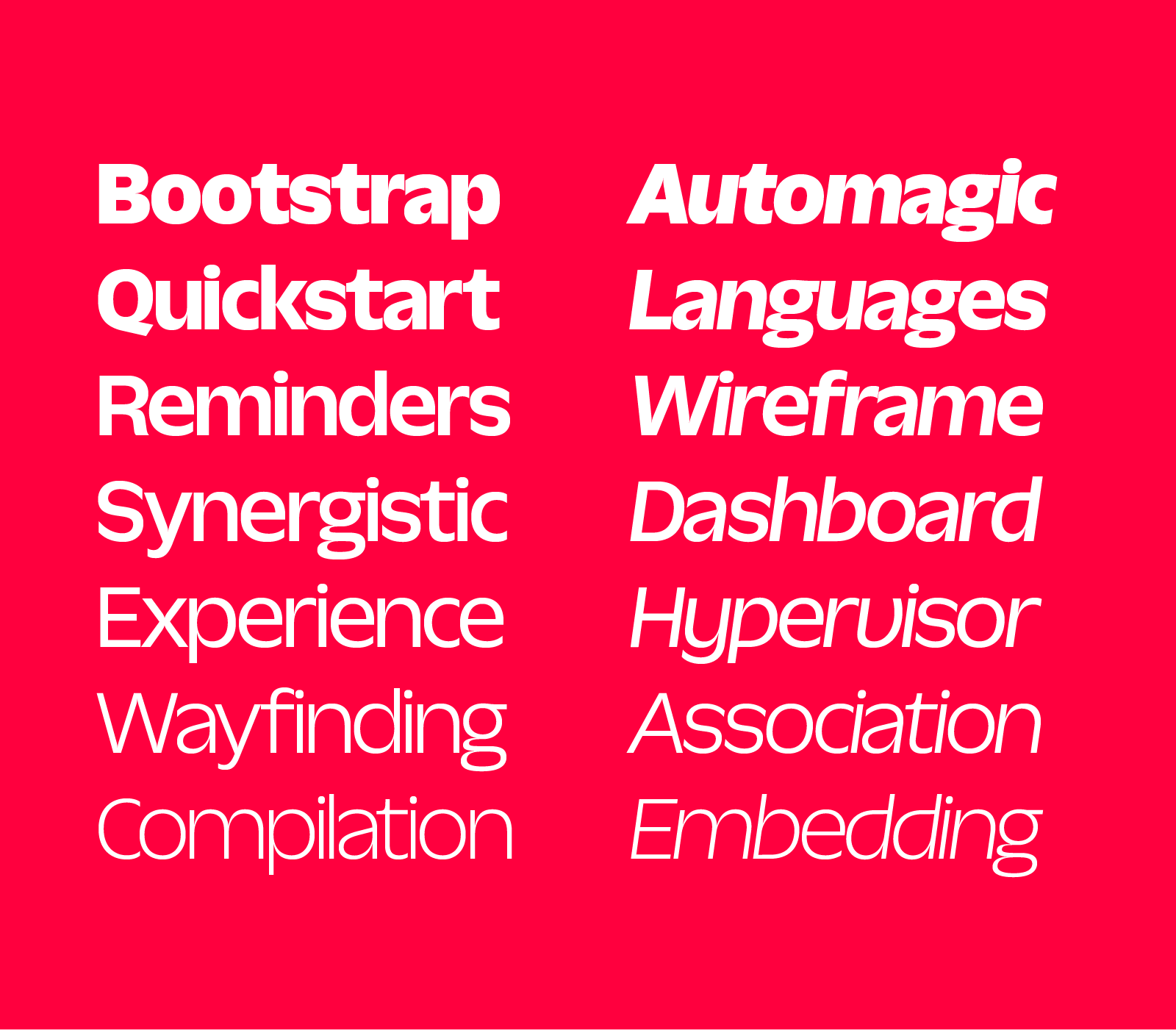
With Text, we reduced the extreme pinches, opened up the tight spaces, and reduced the x-heights until we achieved a family of Text fonts that were spiritually consistent but much more readable at smaller scales.
Where the role of the Display is to demand attention, the Text needs to be virtually invisible. We wanted it to be easy to use and a joy to read at length and we needed it to be accessible to all readers.
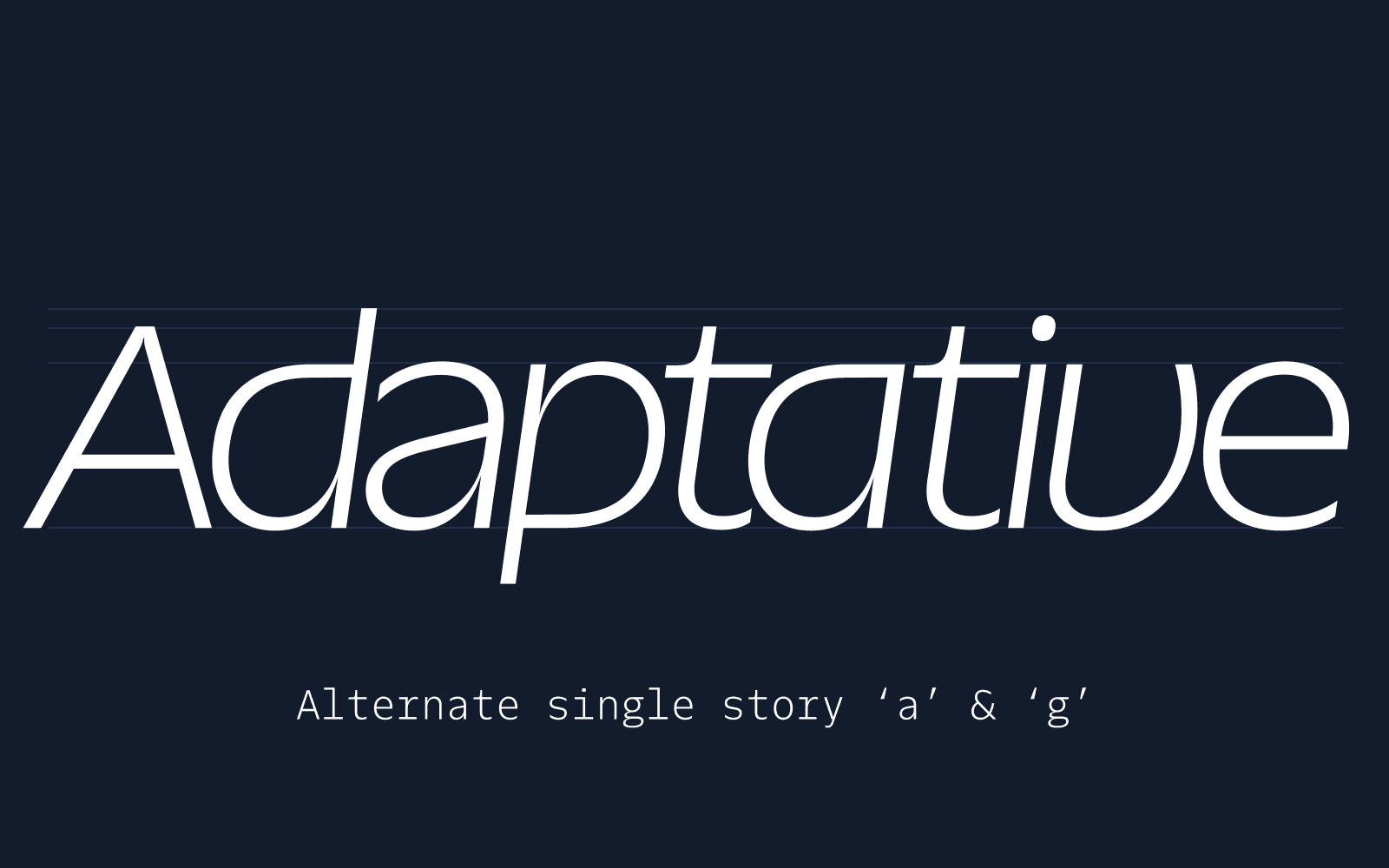
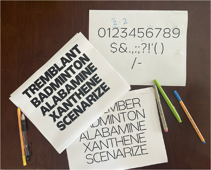
We obsessed over the heights of the ls, the Is, and the 1s and the mirroring of the bs, ds, ps, and qs. Getting these characters right not only improves their readability and scan-ability, but they are especially important for readers with dyslexia who sometimes have trouble telling these characters apart.
We printed pages of text out and read and reread them. Although there are plenty of recommendations on the matter, we learned that legibility and accessibility remains as much an art as a science – legibility is less a checklist of requirements than a careful balance of distinct letterforms with tradition and established reader habit.
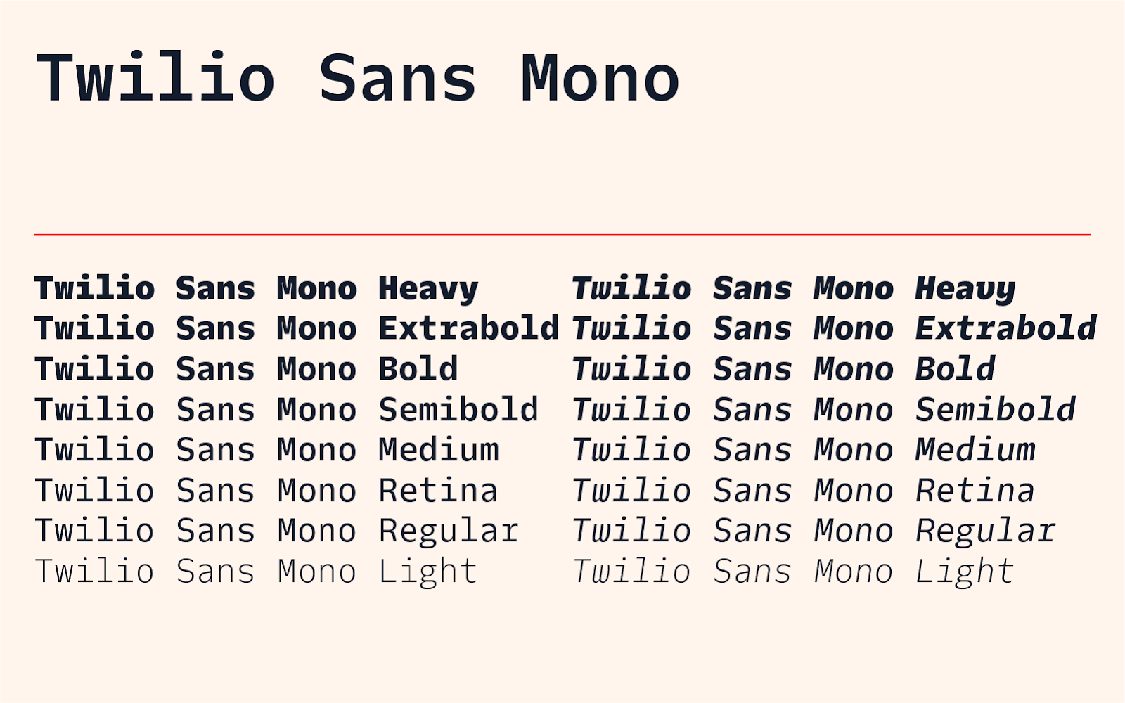
Completing the family with Twilio Sans Mono
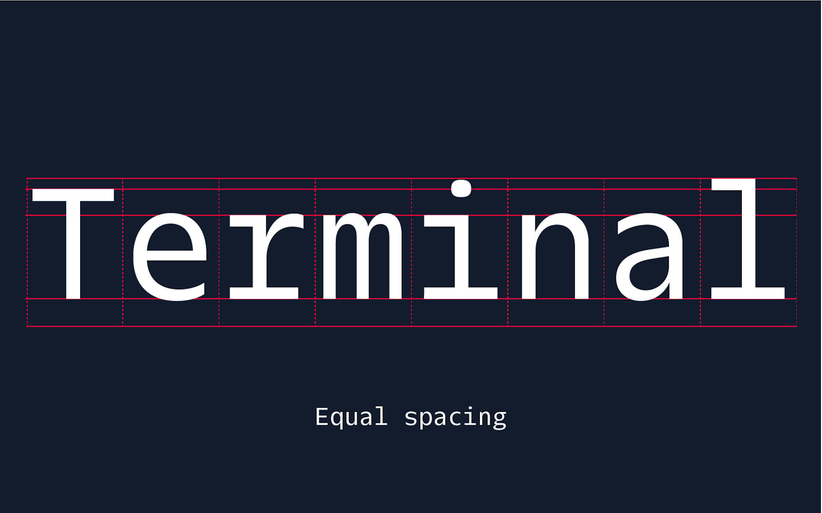
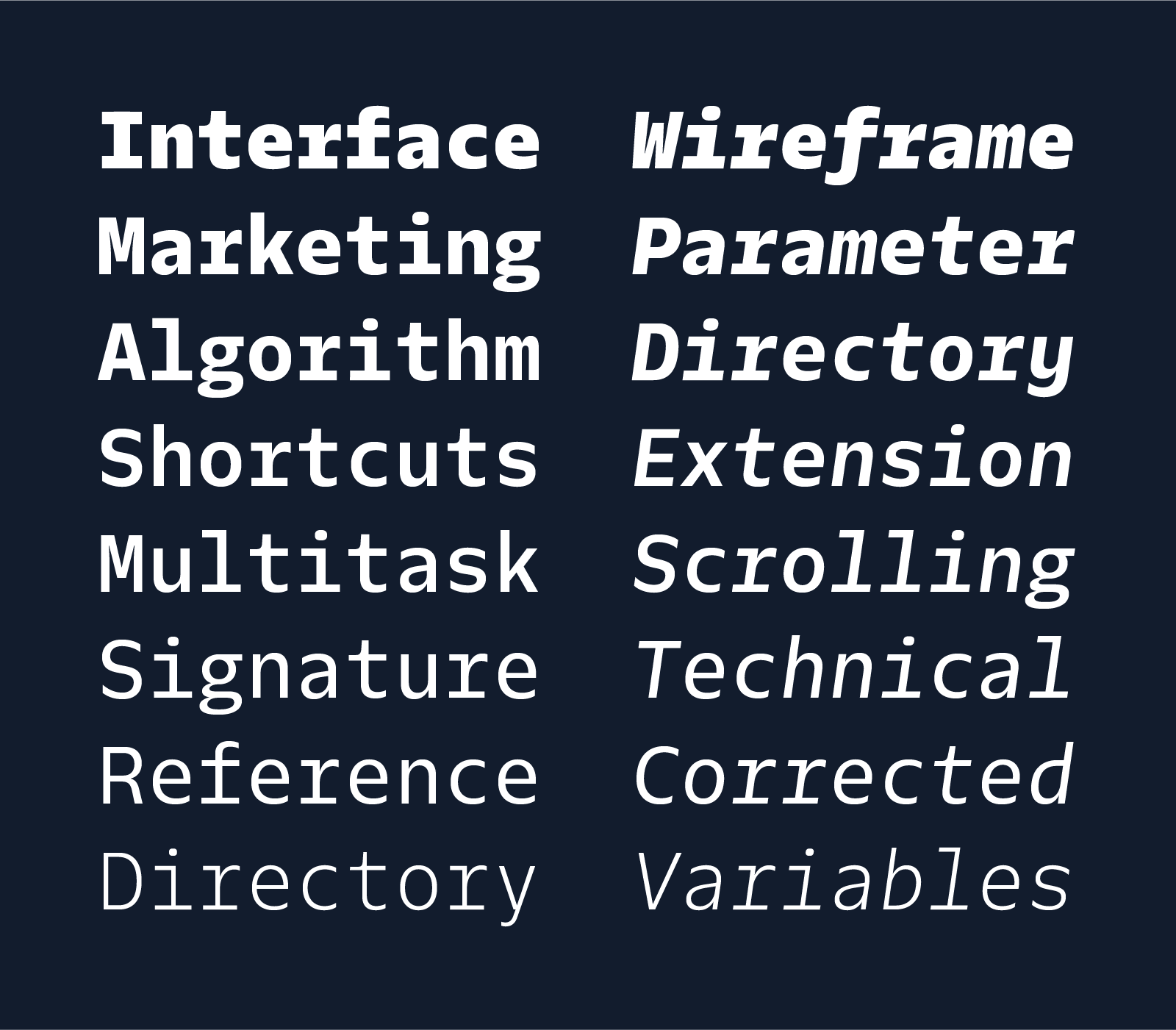
When the transformation of our brazen Display into our diligent Text was complete, we moved on to the monospaced fonts.
Monospaced or mono fonts are most commonly used in code editors today, but their existence is a result of the technological limitations of mechanical typewriters. Historically, the typewriter carriage shifted the page the same amount each time a key was pressed, so typewriter typefaces were designed so each letter would occupy an equal space. Our Mono is derived from the design of our Text family, but had to be completely rethought.
It was imperative that Twilio Sans Mono be a serious programming font while also feeling like a member of the Twilio Sans family. We collaborated closely with developers at Twilio to get this balance just right, and surveyed our developer community to learn what fonts they preferred in their code editors and why.

Early in the Mono design process, we tested versions of the typeface with several Twilio developers. They installed it in their code editors and provided valuable feedback to help us make improvements. This collaboration was critical in translating the design to the Mono fonts, as typography must always be considered within the context in which it appears, and the code environment is an evolving place with burgeoning conventions and expectations.
We believe that we build better when we build together and we wanted to share Twilio Sans Mono with our entire developer community. That is why we made it open source and available to download for free. Please make sure to tell us what you think and share a screenshot of Twilio Sans Mono in action over at @TwilioDevs on Twitter!
The future of the Twilio brand
Few companies grow at the pace that Twilio has in the last few years. Our early days were full of novel challenges, nascent ideas, and imaginative solutions. Reflecting on that time, I am pulled between two extremes: a longing to return and a desire to move on. It is a compelling, but false dichotomy, for I still find myself pursuing a vision of the future of Twilio by embracing the challenges and opportunities of the present while honoring and learning from our past.
I was lucky to find myself in the right place at the right time with the right people to help bring a beautiful typeface into existence. With this typeface, we celebrate the joys and passions of our startup days and embed that legacy into the bold future of our brand.
It takes a village to create a typeface. I would like to extend my heartfelt gratitude to everyone who was involved in bringing this idea to reality. Whether you provided feedback, tested the fonts, wrote checks, scheduled meetings, or signed contracts this couldn't have happened without you: Andres Krogh, Evan Huwa, Jennie Janzen, Katie Porter, Dominik Kundel, Kelly Kuhl, Jamie Wilson, Angel Kim, Riley West, Sean McBride, Serena Buxton, Laura Nicoara, Marisa Chen, and more.
And I would like to extend an extra special thank you to our creative partners at Sharp Type, the typography wizards who brought their A-game, understood Twilio, and delivered a stunning typeface design: Lucas Sharp, Huw Williams, Connor Davenport, My-Lan Thuong, and Chantra Malee.
Are you passionate about building things? Join us.
Nathan Sharp is an award-winning, multidisciplinary creative. Among other things, he is a cat dad, an amateur motorcycle mechanic, an explorer of sounds, a reader of fictions, a collector of cameras, a fixer of discarded things, and the Principal Visual Designer on the Core Creative Team at Twilio. He wants to thank you for reading this story. He can be reached at nsharp [at] twilio.com.

Related Resources
Twilio Docs
From APIs to SDKs to sample apps
API reference documentation, SDKs, helper libraries, quickstarts, and tutorials for your language and platform.
Resource Center
The latest ebooks, industry reports, and webinars
Learn from customer engagement experts to improve your own communication.
Ahoy
Twilio's developer community hub
Best practices, code samples, and inspiration to build communications and digital engagement experiences.