Build a Cross-Platform Desktop Application With Rust Using Tauri

March 29, 2023
Written by
Joseph Udonsak
Contributor
Opinions expressed by Twilio contributors are their own
Reviewed by

Build Cross-Platform Desktop Applications With Rust Using Tauri

The plethora of options available for building software applications is a testament to how far the software development industry has come. The area of desktop application development is no exception. For every Javascript enthusiast, there's Electron. For every Gopher, there's Wails. And if you have risen to the challenge of learning Rust — despite its reputation for being difficult to master — then Tauri is the perfect tool.

I recently wrote about building a cross-platform desktop application using Go. This time, I will show you how to do it using Rust. To get familiar with Tauri, you will build a GitHub desktop client which will interact with the GitHub API, providing the following features:

  1. View public repositories and Gists
  2. View private repositories and Gists for an authenticated user
  3. Create a new Gist for the authenticated user.

Rust will be used for the backend. React, Typescript, and Vite will be used for the front-end. The UI components will be created using Ant Design (AntD).

Prerequisites

To follow this tutorial, you will need the following:

Check the Tauri prerequisites to ensure that your development environment is ready.

How it works

Tauri uses a command system to expose functions to the front-end. Commands are simply functions with the #[tauri::command] annotation. On the front-end, Tauri provides a special function named invoke() which allows you to invoke your command. If your function takes any arguments, the arguments can be passed as a JSON object. The invoke() function returns a Promise, if your command returns data then the Promise resolves to the returned value.

The command can also return errors. While this may require some extra work, I will walk you through the process of doing that.

Getting started

Create a new Tauri project using the following command.

yarn create tauri-app

You will be prompted to answer a few questions. Respond as shown below (use the arrow keys to move)

✔ Project name · github_demo
✔ Choose which language to use for your frontend · TypeScript / JavaScript - (pnpm, yarn, npm)
✔ Choose your package manager · yarn
✔ Choose your UI template · React - (https://reactjs.org/)
✔ Choose your UI flavor · TypeScript

This scaffolds a new project using Rust for the backend and React, TypeScript, and Vite for the frontend. Once the process is completed, navigate into the newly created folder and run the project, by running the commands below.

cd github_demo
yarn
yarn tauri dev

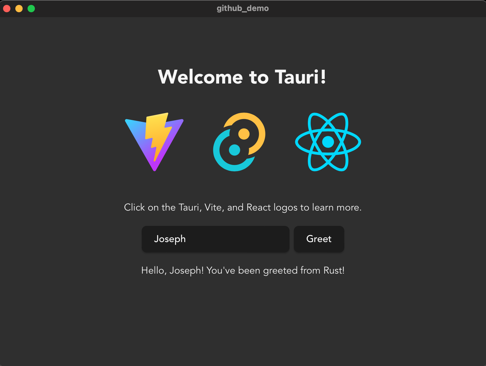
This command sequence will load dependencies for the front-end, download crates for the back-end, and build the binary for the back-end. Once the process is completed, the application will run as seen in the image below.

Initial Tauri application window

Close the application and open the project folder in your preferred editor or IDE, to get started with adding features to the application.

Build the backend

All the code for the backend is located in the src-tauri folder.

Add dependencies

For serialisation and deserialisation, Tauri comes with serde and serde_json out of the box. However, we need a crate to help with making API requests. For this, reqwest will be used. To install it, along with the `json` and `blocking` features, run the following command in the src-tauri directory.

cargo add reqwest --features=json,blocking

Allowing for the speed of your network connection, they’ll be installed relatively quickly.

Declare custom error

One thing to remember about Tauri is that everything returned from commands must implement serde::Serialize, including errors.

As mentioned earlier, API requests in this application are handled by Reqwest. In the event of an error during the process, a reqwest::Error will be returned in the result. This error can’t be serialised which means Rust will panic if a command returns this error. To fix this, a custom error will be written which will implement the <From reqwest::Error> trait. In doing so, you will be able to convert a reqwest::Error into your custom error. This error will also implement the serde::Serialize trait which means that your command can safely return it.

In src-tauri/src, create a new file namederror.rs and add the following code to it.

use std::fmt::{Display, Formatter};
use reqwest::StatusCode;

#[derive(Debug)]
pub struct TauriError {
    pub message: &'static str,
}

impl From<reqwest::Error> for TauriError {
    fn from(error: reqwest::Error) -> Self {
        let error_message = match error.status().unwrap() {
            StatusCode::FORBIDDEN => "This endpoint requires a token",
            StatusCode::BAD_REQUEST => "There was a problem with your request",
            _ => "Something went wrong handling this request"
        };
        TauriError {
            message: error_message
        }
    }
}

impl serde::Serialize for TauriError {
    fn serialize<S>(&self, serializer: S) -> Result<S::Ok, S::Error>
        where
            S: serde::ser::Serializer,
    {
        serializer.serialize_str(self.to_string().as_ref())
    }
}

impl Display for TauriError {
    fn fmt(&self, f: &mut Formatter<'_>) -> std::fmt::Result {
        f.write_str(&self.message)
    }
}

TauriError is a struct with one field named message. In addition to implementing the <From reqwest::Error> and serde::Serialize traits, it also implements the Display trait.

This approach may not be scalable if your application will encounter more than one kind of error in its operations. For such scenarios, you should consider using an enum implementation instead of a struct. You can read more on how to do it here.

Declare models

The application will have the following models:

  1. APIResult: This is a generic wrapper type around Rust’s in-built Result enum. The error arm will be the earlier declared TauriError.
  2. Commit: This corresponds to a GitHub commit response object.
  3. CommitNode: This corresponds to the inner commit object found in a GitHub Commit response object. It is important to note that, sometimes, this object may not be present in the response.
  4. Gist: This corresponds to a GitHub Gist response object.
  5. GistContent: A Gist is made up of one or more files (GistFile in this application). This model corresponds to the string content of a single GistFile.
  6. GistInput: This corresponds to the input required to create a new Gist.
  7. GistFile: This corresponds to a file associated with a Gist.
  8. GithubUser: This corresponds to a user on GitHub. In this application, this will contain only the user’s profile name and avatar URL.
  9. NewGistResponse: This corresponds to the response when a new Gist is created.
  10. Repository: This corresponds to a GitHub repository response object.
  11. URL: This is an enum that captures the two variants of URLs you will encounter in this application. Some URLs need to be appended to the base GitHub API URL while others are fully-qualified URLs that require no extra formatting. This enum provides variants for both and a method to return the appropriate URL for a request.

To implement these models, create a new file in src-tauri/src named models.rs and add the following code to it.

use std::collections::HashMap;

use serde::{Deserialize, Serialize};
use crate::error::TauriError;

pub type APIResult<T, E = TauriError> = Result<T, E>;

#[derive(Deserialize, Serialize)]
pub struct Commit {
    commit: Option<CommitNode>,
}

#[derive(Deserialize, Serialize)]
struct CommitNode {
    message: String,
}

#[derive(Deserialize, Serialize)]
pub struct Gist {
    id: String,
    description: Option<String>,
    owner: GithubUser,
    files: HashMap<String, GistFile>,
    public: bool,
}

#[derive(Deserialize, Serialize)]
struct GistContent {
    content: String,
}

#[derive(Deserialize, Serialize)]
pub struct GistInput {
    description: Option<String>,
    files: HashMap<String, GistContent>,
    public: bool,
}

#[derive(Deserialize, Serialize)]
struct GistFile {
    filename: String,
    language: Option<String>,
    raw_url: String,
}

#[derive(Deserialize, Serialize)]
pub struct GithubUser {
    login: String,
    avatar_url: Option<String>,
}

#[derive(Deserialize, Serialize)]
pub struct NewGistResponse {
    id: String,
}

#[derive(Deserialize, Serialize)]
pub struct Repository {
    id: i32,
    name: String,
    description: Option<String>,
    owner: GithubUser,
    stargazers_url: String,
    commits_url: String,
    contributors_url: String,
}

pub enum URL {
    WithBaseUrl(&'static str),
    WithoutBaseUrl(String),
}

impl URL {
    pub fn value(self) -> String {
        match self {
            URL::WithBaseUrl(url) => format!("https://api.github.com/{url}"),
            URL::WithoutBaseUrl(url) => url
        }
    }
}

The models that will be used to pass data between the frontend and API also implement serde’s Deserialize and Serialize traits. This allows for conversion of structs to/from JSON objects or strings as may be required.

An implementation function named value() is provided for the URL enum. Using this the actual URL to be called can be gotten.

Add functionality for sending API requests

Next, add the code to help with sending GET and POST requests. In the src-tauri/src folder, create a new file named api.rs and add the following code to it.

use reqwest::header::{ACCEPT, AUTHORIZATION, HeaderMap, HeaderValue, USER_AGENT};
use serde::Serialize;

use crate::models::{APIResult, URL};

fn construct_headers(token: Option<&str>) -> HeaderMap {
    let mut headers = HeaderMap::new();
    headers.insert(
        ACCEPT,
        HeaderValue::from_static("application/vnd.github+json"),
    );
    headers.insert(USER_AGENT, HeaderValue::from_static("Tauri Demo"));
    if let Some(token) = token {
        let token = format!("Bearer {token}");
        let header_value = HeaderValue::from_str(token.as_str())
            .expect("Could not generate header from value");
        headers.insert(AUTHORIZATION, header_value);
    }
    headers
}

pub fn make_get_request(url: URL, token: Option<&str>) -> APIResult<String> {
    let url = url.value();
    let client = reqwest::blocking::Client::new();
    let response = client.get(url).headers(construct_headers(token)).send()?;
    let response_body = response.text()?;
    Ok(response_body)
}

pub fn make_post_request<T: Serialize>(url: URL, token: Option<&str>, data: T)
                                       -> APIResult<String> {
    let url = url.value();
    let client = reqwest::blocking::Client::new();
    let response = client.post(url)
        .json(&data)
        .headers(construct_headers(token))
        .send()?;
    let response_body = response.text()?;
    Ok(response_body)
}

The construct_headers() function is used to generate a HeaderMap which contains the appropriate headers for every request. It is recommended that GitHub API requests have the Accept header set to application/vnd.github+json. Additionally, requests without a User-Agent header will not be accepted. This function starts by adding both headers to the map, which will be returned.

Additionally, there will be a need to make authenticated requests to retrieve information on private resources. This will require an Authorization header. However, this is not required for public resources. The construct_headers() takes one argument, token, which is an Option. The Some value of token is a string sequence corresponding to the authentication token. If present, an additional header will be generated and added to the map which will be returned.

The make_get_request() andmake_post_request() functions both take a URL enum and a token Option as arguments. Additionally, the make_post_request() function takes a third argument which is the data to be sent. The argument data is a generic type; however, the provided type must implement Serde’s Serialize trait.

Next, add the commands which will be invoked on the frontend. In the src-tauri/src folder, create a new file named command.rs and add the following code to it.

use crate::api::{make_get_request, make_post_request};
use crate::models::{
    APIResult, Commit, Gist, GistInput, GithubUser,
    NewGistResponse, Repository, URL,
};

#[tauri::command]
pub fn get_public_gists() -> APIResult<Vec<Gist>> {
    let response = make_get_request(URL::WithBaseUrl("gists"), None)?;
    let response: Vec<Gist> = serde_json::from_str(&response).unwrap();
    Ok(response)
}

#[tauri::command]
pub fn get_public_repositories() -> APIResult<Vec<Repository>> {
    let response = make_get_request(URL::WithBaseUrl("repositories"), None)?;
    let response: Vec<Repository> = serde_json::from_str(&response).unwrap();
    Ok(response)
}

#[tauri::command]
pub fn get_repositories_for_authenticated_user(token: &str)
                                               -> APIResult<Vec<Repository>> {
    let response = make_get_request(
        URL::WithBaseUrl("user/repos?type=private"),
        Some(token),
    )?;
    let response: Vec<Repository> = serde_json::from_str(&response).unwrap();
    Ok(response)
}

#[tauri::command]
pub fn get_gists_for_authenticated_user(token: &str) -> APIResult<Vec<Gist>> {
    let response = make_get_request(URL::WithBaseUrl("gists"), Some(token))?;
    let response: Vec<Gist> = serde_json::from_str(&response).unwrap();
    Ok(response)
}

#[tauri::command]
pub fn get_gist_content(url: String, token: Option<&str>) -> APIResult<String> {
    let response = make_get_request(URL::WithoutBaseUrl(url), token)?;
    Ok(response)
}

#[tauri::command]
pub fn get_users_associated_with_repository(url: String, token: Option<&str>)
                                            -> APIResult<Vec<GithubUser>> {
    let response = make_get_request(URL::WithoutBaseUrl(url), token)?;
    let response: Vec<GithubUser> = serde_json::from_str(&response).unwrap();
    Ok(response)
}

#[tauri::command]
pub fn get_commits_to_repository(url: String, token: Option<&str>) -> APIResult<Vec<Commit>> {
    let response = make_get_request(URL::WithoutBaseUrl(url), token)?;
    let response: Vec<Commit> = serde_json::from_str(&response).unwrap();
    Ok(response)
}

#[tauri::command]
pub fn create_new_gist(gist: GistInput, token: &str) -> APIResult<NewGistResponse> {
    let response = make_post_request(
        URL::WithBaseUrl("gists"),
        Some(token),
        gist,
    )?;
    let response: NewGistResponse = serde_json::from_str(&response).unwrap();
    Ok(response)
}

A function is created to handle each API interaction the application will be making. As mentioned earlier, each function is annotated with the #[tauri::command] attribute, which makes it available for invocation on the frontend.

The general flow of each function is as follows:

  1. Make a GET or POST request.
  2. Deserialize the response into a matching struct. The only exception is the get_gist_content which directly returns the response as a string.
  3. Return the response in a Result::OK variant.

Provide commands to the builder function

The last thing to do on the backend is to pass the earlier defined commands to the builder function in src-tauri/src/main.rs. To do this, open the file and update its code to match the following.

// Prevents additional console window on Windows in release, DO NOT REMOVE!!
#![cfg_attr(not(debug_assertions), windows_subsystem = "windows")]

use command::{
    create_new_gist,
    get_commits_to_repository,
    get_gist_content,
    get_gists_for_authenticated_user,
    get_public_gists,
    get_public_repositories,
    get_repositories_for_authenticated_user,
    get_users_associated_with_repository,
};

mod api;
mod command;
mod error;
mod models;

fn main() {
    tauri::Builder::default()
        .invoke_handler(
            tauri::generate_handler![
                create_new_gist,
                get_public_gists,
                get_public_repositories,
                get_repositories_for_authenticated_user,
                get_gists_for_authenticated_user,
                get_gist_content,
                get_users_associated_with_repository,
                get_commits_to_repository
            ]
        )
        .run(tauri::generate_context!())
        .expect("error while running tauri application");
}

Build the frontend

All the code for the frontend is stored in the src folder. But before writing any code, add the JavaScript dependencies using the following commands.

cd ../src
yarn add antd @ant-design/icons react-router-dom prismjs @types/prismjs

The dependencies are as follows:

  1. Ant Design: This helps designers/developers build beautiful and flexible products with ease
  2. Ant-design icons: This gives you access to AntD’s SVG icon collection
  3. React-router: This will be used to implement client-side routing
  4. Prismjs: This will be used to implement syntax highlighting for the Gists. Additionally, the types for Prismjs are added.

Add types

Next, in the src folder, create a new file named types.ts and add the following code to it.

export interface Commit {
  commit: Nullable<CommitNode>;
}

interface CommitNode {
  message: string;
}

export interface CodeSnippet {
  language: string;
  content: string;
}

export interface Gist extends GithubItem {
  isPublic: boolean;
  files: GistFile[];
}

export interface GistInput {
  description: Nullable<string>;
  files: { filename: string; content: string }[];
  isPublic: boolean;
}

export interface GistFile {
  filename: string;
  language: Nullable<string>;
  raw_url: string;
}

export interface GithubUser {
  avatar_url: string;
  login: string;
}

export interface GithubItem {
  id?: string;
  owner: GithubUser;
  description: string;
}

export interface NewGistResponse {
  id: string;
}

export type Nullable<T> = T | null;

export interface Repository extends GithubItem {
  name: string;
  stargazers_url: string;
  commits_url: string;
  contributors_url: string;
}

The types are quite similar to the ones declared earlier for the backend. There are, however, a few differences.

  1. A parent interface named GithubItem is declared. The Gist and Repository interfaces extend this to add their divergent fields. This is done because some generic components will be used to render only Gists or repositories. This interface will be used to ensure that the type provided to such a component extends the GithubItem interface.
  2. An interface named CodeSnippet is declared. This corresponds to the Gist code that is rendered for each GistFile.
  3. A generic type named Nullable is declared. This will be used in situations where null is an acceptable value for a given type.

Add helper function

In the src folder, create a new file named helper.ts and add the following code to it.

export const getErrorMessage = (error: unknown) => {
  if (error instanceof Error) return error.message;
  return String(error);
};

This function will be used to get the appropriate error messages in catch blocks.

Add authentication

For authentication, the user will be required to provide a GitHub Personal Access Token. The token will be included in the header of requests to endpoints requiring authentication.

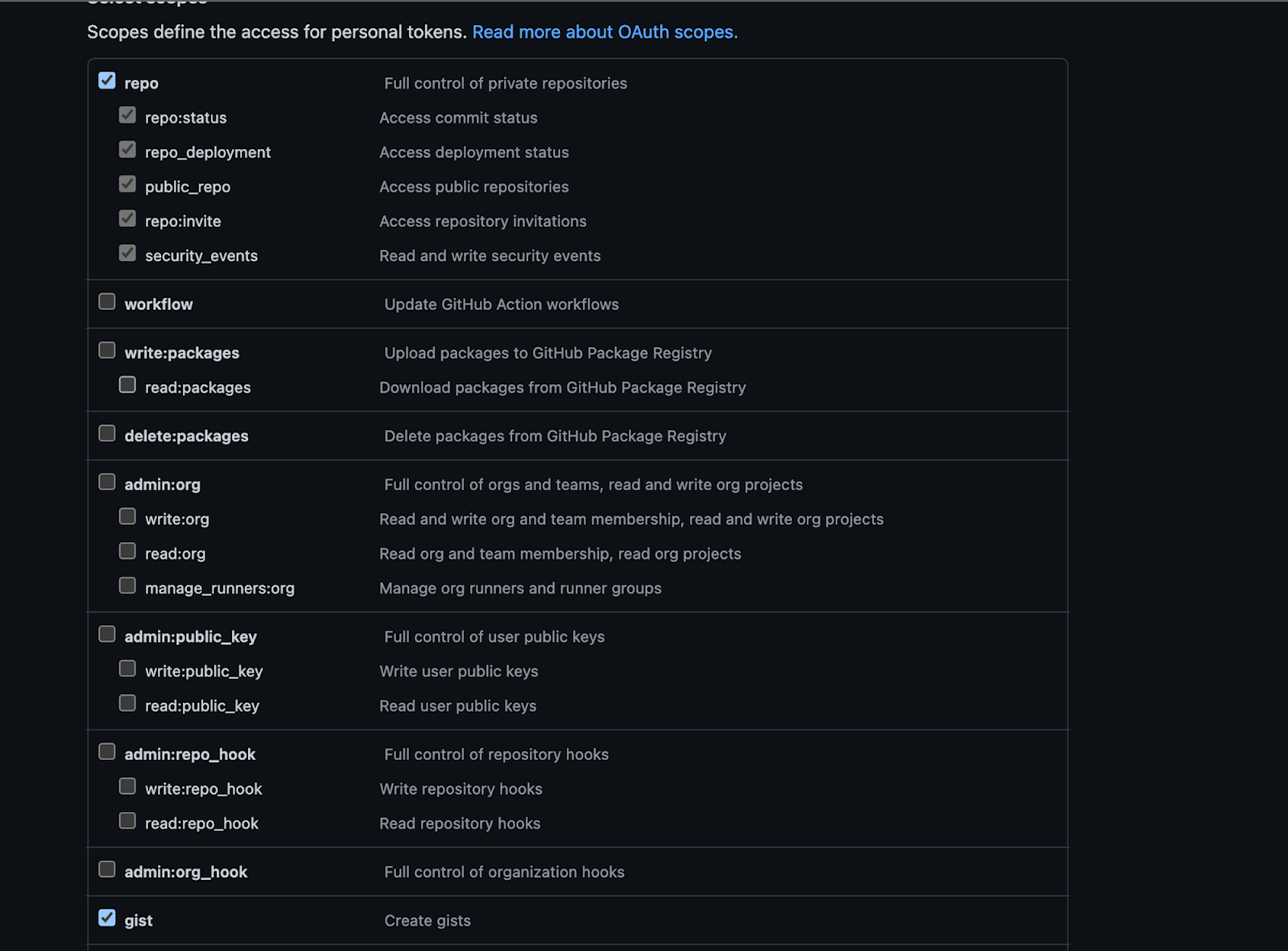
To create one, if you don’t have one, log in to your GitHub account. Then, click your profile icon, in the top right-hand corner, and in the popup that appears, click Settings. Next, click Developer settings at the bottom of the left-hand-side navigation menu. Then, click Personal access tokens > Tokens (classic). Finally, click Generate new token > Generate new token (classic)

In the "New personal access token (classic)" form, check repo and gist, as in the screenshot below.

Select criteria for GitHub private token

For this project, the React Context API will be used to store the token for an hour, after which the user will have to re-authenticate by providing the token again.

In the src folder, create a new folder called components to hold your React components. In it, create a new folder named context. In that folder, create a new file named AuthModal.tsx and add the following code to it.

import { Form, Input, Modal } from "antd";
import { EyeInvisibleOutlined, EyeTwoTone } from "@ant-design/icons";

interface Props {
  shouldShowModal: boolean;
  onSubmit: (token: string) => void;
  onCancel: () => void;
}

const AuthModal: React.FC<Props> = ({
  shouldShowModal,
  onSubmit,
  onCancel,
}) => {
  const [form] = Form.useForm();

  const onFormSubmit = () => {
    form.validateFields().then((values) => {
      onSubmit(values.token);
    });
  };

  return (
    <Modal
      title="Provide GitHub Authentication Token"
      centered
      okText="Save"
      cancelText="Cancel"
      open={shouldShowModal}
      onOk={onFormSubmit}
      onCancel={onCancel}
    >
      <Form
        form={form}
        name="auth_form"
        initialValues={{
          token: "",
        }}
      >
        <Form.Item
          name="token"
          label="Token"
          rules={[
            {
              required: true,
              message: "Please provide your GitHub Token!",
            },
          ]}
        >
          <Input.Password
            placeholder="GitHub Token"
            iconRender={(visible) =>
              visible ? <EyeTwoTone /> : <EyeInvisibleOutlined />
            }
          />
        </Form.Item>
      </Form>
    </Modal>
  );
};

export default AuthModal;

This component renders the authentication form. The form has a single field for the user to paste and save a token. The shouldShowModal prop is used to conditionally render the form, while the onSubmit and onCancel props are used to respond to the user’s action.

Next, in the context folder again, create a new file named AuthContext.tsx and add the following code to it.

import { Button, Result } from "antd";
import React, { createContext, useContext, useEffect, useState } from "react";
import AuthModal from "./AuthModal";
import { useNavigate } from "react-router-dom";
import { Nullable } from "../../types";

type AuthContextType = {
  token: Nullable<string>;
};
const AuthContext = createContext<AuthContextType>({ token: null });

interface Props {
  children: React.ReactNode;
}

const AuthContextProvider: React.FC<Props> = ({ children }) => {
  const [token, setToken] = useState<Nullable<string>>(null);
  const [shouldShowModal, setShouldShowModal] = useState(true);

  const navigate = useNavigate();

  useEffect(() => {
    const timer = setTimeout(() => {
      if (token !== null) {
        setToken(null);
        setShouldShowModal(true);
      }
    }, 3600000);
    return () => clearTimeout(timer);
  }, [token]);

  const onSubmit = (token: string) => {
    setToken(token);
    setShouldShowModal(false);
  };

  const onCancel = () => {
    setShouldShowModal(false);
  };

  if (!shouldShowModal && !token) {
    return (
      <Result
        status="error"
        title="Authentication Failed"
        subTitle="A GitHub token is required to view this page"
        extra={[
          <Button
            type="link"
            key="home"
            onClick={() => {
              navigate("/");
            }}
          >
            Public Section
          </Button>,
          <Button
            key="retry"
            type="primary"
            onClick={() => {
              setShouldShowModal(true);
            }}
          >
            Try Again
          </Button>,
        ]}
      />
    );
  }

  return (
    <>
      {shouldShowModal && (
        <AuthModal
          shouldShowModal={shouldShowModal}
          onSubmit={onSubmit}
          onCancel={onCancel}
        />
      )}
      <AuthContext.Provider value={{ token }}>{children}</AuthContext.Provider>
    </>
  );
};

export const useAuthContext = () => {
  const context = useContext(AuthContext);
  if (context === undefined) {
    throw new Error("useAuthContext must be used within a AuthContextProvider");
  }
  return context;
};

export default AuthContextProvider;

There are two exports in this file. The first is the useAuthContext hook. This hook will be used to retrieve the token saved in Context. The second is the AuthContextProvider component. This component is responsible for rendering the authentication form (either on page load or when the token has “expired” after 1 hour).

It also renders an error page if the user clicks “Cancel” on the authentication form. This component takes a JSX element (named children) as a prop and wraps it with a context provider — thus giving the child element access to the value of the token.

Add the Master-Detail layout

For displaying repositories and Gists, the master-detail layout will be used. A list of items will be rendered, and clicking on one item will display more information on the selected item beside the list. In the src/components folder, create a new file named ListItem.tsx and add the following code to it.

import { useEffect, useState } from "react";
import { GithubItem, Nullable } from "../types";
import { Avatar, Card, Skeleton } from "antd";

interface Props<T> {
  item: T;
  onSelect: (item: T) => void;
  selectedItem: Nullable<T>;
  title: string;
}

const ListItem = <T extends GithubItem>({
  item,
  onSelect,
  selectedItem,
  title,
}: Props<T>) => {
  const [loading, setLoading] = useState(true);
  const [gridStyle, setGridStyle] = useState({
    margin: "3%",
    width: "94%",
  });

  useEffect(() => {
    const isSelected = selectedItem?.id === item.id;
    setGridStyle({
      margin: "3%",
      width: "94%",
      ...(isSelected && { backgroundColor: "lightblue" }),
    });
  }, [selectedItem]);

  const onClickHandler = () => {
    onSelect(item);
  };

  useEffect(() => {
    setTimeout(() => {
      setLoading(false);
    }, 3000);
  }, []);

  return (
    <Card.Grid hoverable={true} style={gridStyle} onClick={onClickHandler}>
      <Skeleton loading={loading} avatar active>
        <Card.Meta
          avatar={<Avatar src={item.owner.avatar_url} />}
          title={title}
          description={`Authored by ${item.owner.login}`}
        />
      </Skeleton>
    </Card.Grid>
  );
};

export default ListItem;

This component renders a single GithubItem in the list using the AntD Card component. The title of the card is provided as a component prop. In addition to the title, this component receives three other props:

  • The onSelect prop is used to notify the parent item that the card has been clicked
  • item corresponds to the Gist or repository which will be rendered on the card
  • selectedItem is used by the component to determine if the rendered item was clicked by the user; in which case, a light blue background is added to the card styling.

Next, create a new file named MasterDetail.tsx in the components folder and add the following code to it.

import { GithubItem, Nullable } from "../types";
import { ReactNode, useState } from "react";
import { Affix, Card, Col, Row, Typography } from "antd";
import ListItem from "./ListItem";

interface Props<T> {
  title: string;
  items: T[];
  getItemDescription: (item: T) => string;
  detailLayout: (item: Nullable<T>) => Nullable<ReactNode>;
}

const MasterDetail = <T extends GithubItem>({
  title,
  items,
  getItemDescription,
  detailLayout,
}: Props<T>) => {
  const [selectedItem, setSelectedItem] = useState<Nullable<T>>(null);

  return (
    <>
      <Row justify="center">
        <Col>
          <Typography.Title level={3}>{title}</Typography.Title>
        </Col>
      </Row>
      <Row>
        <Col span={6}>
          <Affix offsetTop={20}>
            <div
              id="scrollableDiv"
              style={{
                height: "80vh",
                overflow: "auto",
                padding: "0 5px",
              }}
            >
              <Card bordered={false} style={{ boxShadow: "none" }}>
                {items.map((item, index) => (
                  <ListItem
                    key={index}
                    item={item}
                    onSelect={setSelectedItem}
                    selectedItem={selectedItem}
                    title={getItemDescription(item)}
                  />
                ))}
              </Card>
            </div>
          </Affix>
        </Col>
        {detailLayout(selectedItem)}
      </Row>
    </>
  );
};

export default MasterDetail;

This component is responsible for rendering the list of items in one column and the details of the selected item in another column. The items to be rendered are provided as a prop to the component.

In addition to that, the getItemDescription() prop is a function to get what will be displayed under the user avatar; this is the repository name or the Gist description.

The detailLayout() prop is a function provided by the parent component which returns the JSX content for the detail section based on the provided item. This allows Gists and repositories to have entirely different layouts while using the same child component for rendering.

Next, in the src/components folder, create a new folder named repository to hold components related to a repository.

Then, in the repository folder, create a new file named GithubUserGrid.tsx and add the following code to it.

import { GithubUser } from "../../types";
import { Avatar, Card, List } from "antd";

interface Props {
  users: GithubUser[];
}

const UserGrid: React.FC<Props> = ({ users }) => (
  <List
    grid={{ gutter: 16, column: 4 }}
    dataSource={users}
    renderItem={(user, index) => (
      <List.Item key={index} style={{ marginTop: "5px" }}>
        <Card.Meta
          avatar={<Avatar src={user.avatar_url} />}
          title={user.login}
        />
      </List.Item>
    )}
  />
);

export default UserGrid;

This component will be used to render the list of stargazers and contributors to a repository.

Then, create a new file named RepositoryDetails.tsx in the repository folder and add the following code to it.

import { useEffect, useState } from "react";
import { Commit, GithubUser, Nullable, Repository } from "../../types";
import { Card, Divider, Spin, Timeline, Typography } from "antd";
import GithubUserGrid from "./GithubUserGrid";
import { invoke } from "@tauri-apps/api/tauri";

interface Props {
  repository: Repository;
  token?: Nullable<string>;
}

const RepositoryDetails: React.FC<Props> = ({ repository, token = null }) => {
  const [commits, setCommits] = useState<Commit[]>([]);
  const [contributors, setContributors] = useState<GithubUser[]>([]);
  const [stargazers, setStargazers] = useState<GithubUser[]>([]);
  const [isLoading, setIsLoading] = useState(true);

  useEffect(() => {
    const getRepositoryDetails = async () => {
      setIsLoading(true);
      const stargazers: GithubUser[] = await invoke(
        "get_users_associated_with_repository",
        {
          url: repository.stargazers_url,
          token,
        }
      );
      const contributors: GithubUser[] = await invoke(
        "get_users_associated_with_repository",
        {
          url: repository.contributors_url,
          token,
        }
      );
      const commits: Commit[] = await invoke("get_commits_to_repository", {
        url: repository.commits_url.replace(/{\/[a-z]*}/, ""),
        token,
      });
      setCommits(commits);
      setContributors(contributors);
      setStargazers(stargazers);
      setIsLoading(false);
    };
    getRepositoryDetails();
  }, [repository]);
  return (
    <Card
      title={repository.name}
      bordered={false}
      style={{
        margin: "1%",
      }}
    >
      {repository.description}
      <Divider />
      <Spin tip="Loading" spinning={isLoading}>
        <Typography.Title level={5} style={{ margin: 10 }}>
          Contributors
        </Typography.Title>
        <GithubUserGrid users={contributors} />
        <Divider />
        <Typography.Title level={5} style={{ marginBottom: 15 }}>
          Stargazers
        </Typography.Title>
        <GithubUserGrid users={stargazers} />
        <Divider />
        <Typography.Title level={5} style={{ marginBottom: 15 }}>
          Commits
        </Typography.Title>
        <Timeline mode="alternate">
          {commits.map((commit, index) => {
            if (commit.commit) {
              return (
                <Timeline.Item key={index}>
                  {commit.commit?.message}
                </Timeline.Item>
              );
            }
            return null;
          })}
        </Timeline>
      </Spin>
    </Card>
  );
};

export default RepositoryDetails;

For the first time, you will use the invoke() function provided by Tauri. For a given Repository, three calls are made to the backend to get the contributors, stargazers, and commits for the repository.

The first parameter of the invoke() function is a string corresponding to the name of the backend function to be called. The second (optional) parameter is a JSON object which contains the arguments for the function. Idiomatically, Rust arguments are written in snake case, however, this function expects them to be provided in camel case hence a file_url argument on the backend should be provided as fileUrl to the function.

As mentioned earlier, the invoke() function is asynchronous and returns a Promise. This is why the async and await keywords are used.

Next, create the component for rendering public repositories. In the src/components/repository folder, create a new file named PublicRepositories.tsx and add the following code to it.

import { useEffect, useState } from "react";
import { Col, message } from "antd";
import { Nullable, Repository } from "../../types";
import RepositoryDetails from "./RepositoryDetails";
import MasterDetail from "../MasterDetail";
import { invoke } from "@tauri-apps/api/tauri";
import { getErrorMessage } from "../../helper";

const PublicRepositories: React.FC = () => {
  const [repositories, setRepositories] = useState<Repository[]>([]);
  const [messageApi, contextHolder] = message.useMessage();

  useEffect(() => {
    const getRepositories = async () => {
      try {
        const repositories: Repository[] = await invoke(
          "get_public_repositories"
        );
        console.log(repositories);
        setRepositories(repositories);
      } catch (error) {
        messageApi.open({
          type: "error",
          content: getErrorMessage(error),
        });
      }
    };
    getRepositories();
  }, []);

  const title = "Public Repositories";
  const getItemDescription = (repository: Repository) => repository.name;
  const detailLayout = (repository: Nullable<Repository>) => {
    if (!repository) return null;
    return (
      <Col span={18}>
        <RepositoryDetails repository={repository} />
      </Col>
    );
  };

  return (
    <>
      {contextHolder}
      <MasterDetail
        title={title}
        items={repositories}
        getItemDescription={getItemDescription}
        detailLayout={detailLayout}
      />
    </>
  );
};

export default PublicRepositories;

Next, create another file named PrivateRepositories.tsx in the src/components/repository folder and add the following code to it.

import {useEffect, useState} from "react";
import {useAuthContext} from "../context/AuthContext";
import RepositoryDetails from "./RepositoryDetails";
import MasterDetail from "../MasterDetail";
import {Col, message} from "antd";
import {Nullable, Repository} from "../../types";
import {invoke} from "@tauri-apps/api/tauri";
import {getErrorMessage} from "../../helper";

const PrivateRepositories = () => {
    const {token} = useAuthContext();
    const [repositories, setRepositories] = useState<Repository[]>([]);
    const [messageApi, contextHolder] = message.useMessage();

    useEffect(() => {
        const getRepositories = async () => {
            if (token) {
                try {
                    const repositories: Repository[] = await invoke(
                        "get_repositories_for_authenticated_user",
                        {token}
                    );
                    setRepositories(repositories);
                } catch (error) {
                    messageApi.open({
                        type: "error",
                        content: getErrorMessage(error),
                    });
                }
            }
        };
        getRepositories();
    }, [token]);

    const title = "Private Repositories";
    const getItemDescription = (repository: Repository) => repository.name;
    const detailLayout = (repository: Nullable<Repository>) => {
        if (!repository) return null;
        return (
            <Col span={18}>
                <RepositoryDetails repository={repository} token={token}/>
            </Col>
        );
    };

    return (
        <>
            {contextHolder}
            <MasterDetail
                title={title}
                items={repositories}
                getItemDescription={getItemDescription}
                detailLayout={detailLayout}
            />
        </>
    );
};

export default PrivateRepositories;

This component is very similar to the PublicRepositories component but for two key things. First, this component will be wrapped with an AuthContextProvider, which makes it possible to retrieve the saved token via the useAuthContext hook. Second, it invokes a different bound function (get_repositories_for_authenticated_user) to get the repositories for the user whose token was provided.

Next, in the src/components folder, create a new folder named gist to hold components related to a Gist. Then, in that new folder, create a new file named GistDetails.tsx and add the following code to it.

import { Carousel, Col, Row, Spin, Typography } from "antd";
import React, { useEffect, useState } from "react";
import "prismjs/themes/prism-okaidia.min.css";
import Prism from "prismjs";
import { CodeSnippet, Gist } from "../../types";
import { invoke } from "@tauri-apps/api/tauri";

interface Props {
  gist: Gist;
}

const GistDetails: React.FC<Props> = ({ gist }) => {
  const [snippets, setSnippets] = useState<CodeSnippet[]>([]);
  const [isLoading, setIsLoading] = useState(true);

  useEffect(() => {
    Prism.highlightAll();
  }, [snippets]);

  useEffect(() => {
    const getSnippets = async () => {
      setIsLoading(true);
      const snippets: CodeSnippet[] = await Promise.all(
        Object.values(gist.files).map(async (file) => ({
          language: file.language?.toLowerCase() || "text",
          content: await invoke("get_gist_content", { url: file.raw_url }),
        }))
      );
      setSnippets(snippets);
      setIsLoading(false);
    };
    getSnippets();
  }, [gist]);

  return (
    <Spin tip="Loading" spinning={isLoading}>
      <Row justify="center">
        <Col>
          {gist.description && (
            <Typography.Text strong>{gist.description}</Typography.Text>
          )}
        </Col>
      </Row>
      <div>
        <Carousel
          autoplay
          style={{ backgroundColor: "#272822", height: "100%" }}
        >
          {snippets.map((snippet, index) => (
            <pre key={index}>
              <code className={`language-${snippet.language}"`}>
                {snippet.content}
              </code>
            </pre>
          ))}
        </Carousel>
      </div>
    </Spin>
  );
};

export default GistDetails;

This component renders the code in the file(s) for a given Gist. Every Gist response comes with a files key. This is an object containing all the files for the Gist. Each file object contains the URL to the file’s raw content and the language associated with the file. This component retrieves all the files using the get_gist_content() function and renders them in a Carousel.

Prism is used to render the code as would be found in an IDE.

Next, in the gist folder, create a file named PublicGists.tsx and add the following code to it.

import { useEffect, useState } from "react";
import GistDetails from "./GistDetails";
import MasterDetail from "../MasterDetail";
import { Col, message } from "antd";
import { Gist, Nullable } from "../../types";
import { invoke } from "@tauri-apps/api/tauri";
import { getErrorMessage } from "../../helper";

const PublicGists = () => {
  const [gists, setGists] = useState<Gist[]>([]);
  const [messageApi, contextHolder] = message.useMessage();

  useEffect(() => {
    const getGists = async () => {
      try {
        const gists: Gist[] = await invoke("get_public_gists");
        setGists(gists);
      } catch (error) {
        messageApi.open({
          type: "error",
          content: getErrorMessage(error),
        });
      }
    };
    getGists();
  }, []);

  const title = "Public Gists";
  const getItemDescription = (gist: Gist) =>
    gist.description || "No description provided";
  const detailLayout = (gist: Nullable<Gist>) => {
    if (!gist) return null;
    return (
      <Col span={18}>
        <GistDetails gist={gist} />
      </Col>
    );
  };

  return (
    <>
      {contextHolder}
      <MasterDetail
        title={title}
        items={gists}
        getItemDescription={getItemDescription}
        detailLayout={detailLayout}
      />
    </>
  );
};

export default PublicGists;

Just as was done for the rendering of public repositories, the get_public_gists command is invoked to retrieve public Gists from the GitHub API and pass them to the MasterDetail component, along with the functions to get the Gist description and display more information on the Gist when selected.

Next, create a new file named PrivateGists.tsx in the gist folder and add the following code to it.

import {useEffect, useState} from "react";
import {useAuthContext} from "../context/AuthContext";
import MasterDetail from "../MasterDetail";
import GistDetails from "./GistDetails";
import {Col, message} from "antd";
import {Gist, Nullable} from "../../types";
import {invoke} from "@tauri-apps/api";
import {getErrorMessage} from "../../helper";

const PrivateGists = () => {
    const [gists, setGists] = useState<Gist[]>([]);
    const {token} = useAuthContext();
    const [messageApi, contextHolder] = message.useMessage();

    useEffect(() => {
        const getGists = async () => {
            if (token) {
                try {
                    const gists: Gist[] = await invoke(
                        "get_gists_for_authenticated_user",
                        {token}
                    );
                    setGists(gists);
                } catch (error) {
                    messageApi.open({
                        type: "error",
                        content: getErrorMessage(error),
                    });
                }
            }
        };
        getGists();
    }, [token]);

    const title = "Private Gists";
    const getItemDescription = (gist: Gist) =>
        gist.description || "No description provided";
    const detailLayout = (gist: Nullable<Gist>) => {
        if (!gist) return null;
        return (
            <Col span={18}>
                <GistDetails gist={gist}/>
            </Col>
        );
    };

    return (
        <>
            {contextHolder}
            <MasterDetail
                title={title}
                items={gists}
                getItemDescription={getItemDescription}
                detailLayout={detailLayout}
            />
        </>
    );
};

export default PrivateGists;

This component will be wrapped with an AuthContextProvider component, thus giving it access to the provided token. Using the token, an asynchronous call is made to the GitHub API via the get_gists_for_authenticated_user() command. The results are then passed to the MasterDetail component along with the other required props for appropriate rendering.

The last Gist-related component to be built is the form to create a new Gist. To do this, create a new file named CreateGist.tsx in the src/component/gist folder and add the following code to it.

import { useAuthContext } from "../context/AuthContext";
import { Button, Card, Divider, Form, Input, message, Switch } from "antd";
import { DeleteTwoTone, PlusOutlined } from "@ant-design/icons";
import { useNavigate } from "react-router-dom";
import { GistInput, NewGistResponse } from "../../types";
import { invoke } from "@tauri-apps/api/tauri";
import { getErrorMessage } from "../../helper";

const CreateGist = () => {
  const { token } = useAuthContext();
  const [messageApi, contextHolder] = message.useMessage();
  const navigate = useNavigate();

  const onFinish = async (values: GistInput) => {
    const { description, files, isPublic } = values;

    const gist = {
      description,
      public: !!isPublic,
      files: files.reduce(
        (accumulator, { filename, content }) =>
          Object.assign(accumulator, {
            [filename]: { content },
          }),
        {}
      ),
    };

    console.log(gist);
    try {
      const response: NewGistResponse = await invoke("create_new_gist", {
        gist,
        token,
      });
      messageApi.open({
        type: "success",
        content: `Gist ${response.id} created successfully`,
      });
      setTimeout(() => {
        navigate("/gists/private");
      }, 3000);
    } catch (error) {
      messageApi.open({
        type: "error",
        content: getErrorMessage(error),
      });
    }
  };

  return (
    <>
      {contextHolder}
      <Card title="Create a new Gist">
        <Form name="gist" onFinish={onFinish} autoComplete="off">
          <Form.Item name="description">
            <Input placeholder="Gist description..." />
          </Form.Item>
          <Form.Item
            label="Make gist public"
            valuePropName="checked"
            name="isPublic"
          >
            <Switch />
          </Form.Item>
          <Form.List
            name="files"
            rules={[
              {
                validator: async (_, files) => {
                  if (!files || files.length < 1) {
                    return Promise.reject(
                      new Error("At least 1 file is required to create a Gist")
                    );
                  }
                },
              },
            ]}
          >
            {(fields, { add, remove }, { errors }) => (
              <>
                {fields.map((field) => (
                  <div key={field.key}>
                    <Form.Item
                      shouldUpdate={(prevValues, curValues) =>
                        prevValues.area !== curValues.area ||
                        prevValues.sights !== curValues.sights
                      }
                    >
                      {() => (
                        <div>
                          <Divider />
                          <Form.Item
                            {...field}
                            name={[field.name, "filename"]}
                            rules={[
                              {
                                required: true,
                                message: "Missing filename",
                              },
                            ]}
                            noStyle
                          >
                            <Input
                              placeholder="Filename including extension..."
                              style={{ width: "90%", marginRight: "5px" }}
                            />
                          </Form.Item>

                          <DeleteTwoTone
                            style={{
                              fontSize: "30px",
                              verticalAlign: "middle",
                            }}
                            twoToneColor="#eb2f96"
                            onClick={() => remove(field.name)}
                          />
                        </div>
                      )}
                    </Form.Item>
                    <Form.Item
                      {...field}
                      name={[field.name, "content"]}
                      rules={[
                        {
                          required: true,
                          message: "Missing content",
                        },
                      ]}
                    >
                      <Input.TextArea rows={20} placeholder="Gist content" />
                    </Form.Item>
                  </div>
                ))}
                <Form.Item
                  wrapperCol={{
                    offset: 10,
                  }}
                >
                  <Button
                    type="dashed"
                    onClick={() => add()}
                    icon={<PlusOutlined />}
                  >
                    Add file
                  </Button>
                  <Form.ErrorList errors={errors} />
                </Form.Item>
              </>
            )}
          </Form.List>
          <Form.Item
            wrapperCol={{
              offset: 10,
            }}
          >
            <Button type="primary" htmlType="submit">
              Submit
            </Button>
          </Form.Item>
        </Form>
      </Card>
    </>
  );
};

export default CreateGist;

The request to create a new Gist has three fields:

  1. description: Where provided, this will describe what the code in the Gist aims to achieve. This field is optional and is represented in the form by an input field.
  2. public: This is a required field and determines whether or not the Gist has public access. In the form you created, this is represented by a switch which is set to off by default. This means that unless otherwise specified by the user, the created Gist will be secret and only available to users who have its link.
  3. files: This is another required field. It is an object and for each entry in the object, the key is the name of the file (with the extension included) and the value is the content of the file.
    This is represented in the form you created as a dynamic list with each list item consisting of a text field for the file name and a text area for the file content.
    By clicking the Add File button, you have the ability to add multiple files. You also have the ability to delete a file. Note that you will be required to have at least one file and if you do not, an error message will be displayed.

When the form is properly filled out and submitted, the onFinish() function is used to create an object conforming to the GistInput struct declared in src-tauri/src/models.rs and the create_new_gist command is invoked with the appropriate arguments.

Because this component is wrapped with the AuthContextProvider, the saved token can be retrieved and passed alongside the GistInput as required by the command. Once a successful response is received, the app displays a success message and redirects to the list of Gists for the authenticated user.

Put the pieces together

Add navigation

With all the individual components in place, the next thing to add is navigation, a means by which the user can move around the application. To add this, create a new file in the src/components folder named NavBar.tsx and add the following code to it.

import { LockOutlined, UnlockOutlined } from "@ant-design/icons";
import type { MenuProps } from "antd";
import { Layout, Menu } from "antd";
import { Link } from "react-router-dom";

type MenuItem = Required<MenuProps>["items"][number];

const getItem = (
  label: React.ReactNode,
  key: React.Key,
  icon?: React.ReactNode,
  children?: MenuItem[],
  type?: "group"
): MenuItem => {
  return {
    key,
    icon,
    children,
    label,
    type,
  } as MenuItem;
};

const items: MenuProps["items"] = [
  getItem("Public Actions", "sub1", <UnlockOutlined />, [
    getItem("Repositories", "g1", null, [
      getItem(
        <Link to={"repositories/public"}>View all repositories</Link>,
        "1"
      ),
    ]),
    getItem("Gists", "g2", null, [
      getItem(<Link to={"gists/public"}>View all gists</Link>, "3"),
    ]),
  ]),
  getItem("Private Actions", "sub2", <LockOutlined />, [
    getItem("Repositories", "g3", null, [
      getItem(
        <Link to={"repositories/private"}>View my repositories</Link>,
        "5"
      ),
    ]),
    getItem("Gists", "g4", null, [
      getItem(<Link to={"gists/private"}>View my gists</Link>, "6"),
      getItem(<Link to={"gist/new"}>Create new gist</Link>, "7"),
    ]),
  ]),
];

const NavBar: React.FC = () => {
  return (
    <Layout.Header style={{ background: "white" }}>
      <div
        className="logo"
        style={{
          float: "left",
          marginRight: "200px",
          padding: "1%",
        }}
      >
        <Link to="/">
          <img src="/tauri.svg" style={{ width: "40px" }} alt="Tauri logo" />
        </Link>
      </div>
      <Menu
        defaultSelectedKeys={["1"]}
        mode="horizontal"
        items={items}
        style={{
          position: "relative",
        }}
      />
    </Layout.Header>
  );
};

export default NavBar;

This component renders a navigation bar at the top of the window with two main items: Public Actions and Private Actions. Each item then has sub-items, which are links that will eventually render the component associated with the sub-item. With this in place, you can add routing to your application.

Add routing

In the src folder, create a new file named routes.tsx and add the following code to it.

import App from "./App";

import CreateGist from "./components/gist/CreateGist";
import PrivateGists from "./components/gist/PrivateGists";
import PublicGists from "./components/gist/PublicGists";

import PrivateRepositories from "./components/repository/PrivateRepositories";
import PublicRepositories from "./components/repository/PublicRepositories";
import AuthContextProvider from "./components/context/AuthContext";

const routes = [
  {
    path: "/",
    element: <App />,
    children: [
      { index: true, element: <PublicRepositories /> },
      {
        path: "repositories/public",
        element: <PublicRepositories />,
      },
      {
        path: "gists/public",
        element: <PublicGists />,
      },
      {
        path: "gist/new",
        element: (
          <AuthContextProvider>
            <CreateGist />
          </AuthContextProvider>
        ),
      },
      {
        path: "repositories/private",
        element: (
          <AuthContextProvider>
            <PrivateRepositories />
          </AuthContextProvider>
        ),
      },
      {
        path: "gists/private",
        element: (
         <AuthContextProvider>
            <PrivateGists />
          </AuthContextProvider>
        ),
      },
    ],
  },
];
export default routes;

Here, you specified the routes in the application as well as the component to be rendered for each path. In addition to that, you have wrapped the components which require the user to provide a token with the AuthContextProvider component.

Next, open src/App.tsx and update the file's code to match the following.

import NavBar from "./components/NavBar";
import { FloatButton, Layout } from "antd";
import { Outlet } from "react-router-dom";

const { Content } = Layout;

const App = () => {
  return (
    <Layout
      style={{
        minHeight: "100vh",
      }}
    >
      <NavBar />
      <Layout className="site-layout">
        <Content
          style={{
            background: "white",
          }}
        >
          <Outlet />
          <FloatButton.BackTop />
        </Content>
      </Layout>
    </Layout>
  );
};

export default App;

Here, you have included the NavBar component you declared earlier. You also declared an Outlet component which is provided by react-router-dom to render child route elements.

Finally update the code in main.tsx to match the following.

import React from "react";
import ReactDOM from "react-dom/client";
import { createHashRouter, RouterProvider } from "react-router-dom";
import routes from "./routes";

const router = createHashRouter(routes);

ReactDOM.createRoot(document.getElementById("root") as HTMLElement).render(
  <React.StrictMode>
    <RouterProvider router={router} />
  </React.StrictMode>
);

Test that the application works

You’ve successfully built your first app with Tauri. Run the application again and take it for a spin by running the following command from the project's top-level folder.


yarn tauri dev

By default, when the app loads, you will be greeted with a list of public repositories. Using the navigation menu, you can view public (and private) repositories and Gists by clicking the corresponding menu item.

When you select a menu item for a private repository or private Gist, a pop-up will be displayed asking for your GitHub token as shown below.

Prompt to provide a GitHub Authentication Token in the Tauri app

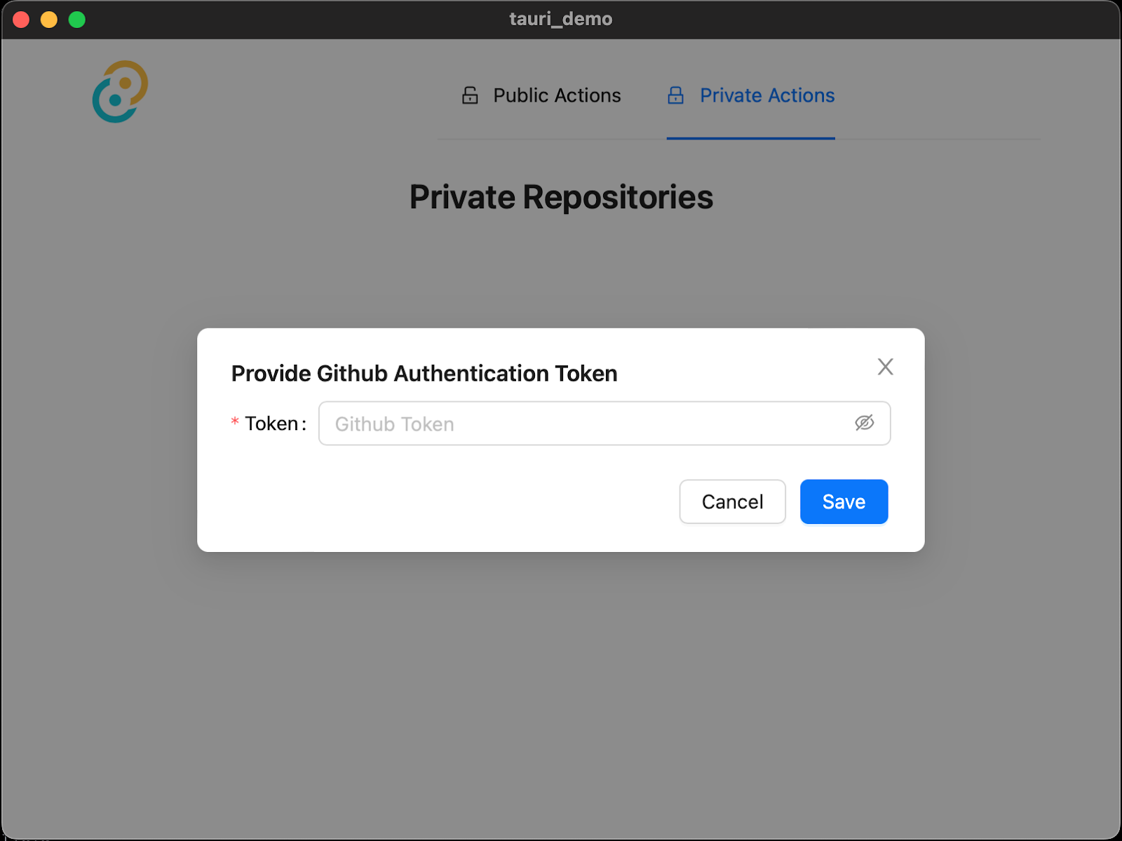
Paste your Personal Access Token (PAT) and click Save. Your repositories (or Gists as the case may be) will then be rendered. You will be able to navigate around the private section of the app without having to re-enter your token for a few minutes.

And that's how to build a cross-platform desktop application with Rust and Tauri

This is just the tip of the iceberg. Tauri helps you take advantage of Rust’s strengths - memory safety at compile-time, fearless concurrency, and improved performance due to the absence of a garbage collector; in the process of building next-generation desktop applications.

What other features do you think you can add to the application? Did you know that you could make further customizations to the app such as the width and height, or even start off in full-screen mode? Have a look at the Configuration documentation to see how you can further configure your app.

In case you get stuck at any point, feel free to access the codebase here.

I’m excited to see what more you come up with. Until next time, make peace, not war ✌🏾

Joseph Udonsak is a software engineer with a passion for solving challenges – be it building applications or conquering new frontiers on Candy Crush. When he’s not staring at his screens, he enjoys a cold beer and laughs with his family and friends.