Build an Interactive Bar Chart of Taylor Swift lyrics with D3.js and Observable
Time to read:
August 26, 2020
Written by
Reviewed by

Data visualizations are handy ways to examine and think about data. Observable is a Jupyter Notebook-like tool that makes it easy to quickly run JavaScript code in cells so you can see what you're doing in real-time.
This post will go over how to make an interactive bar chart showing Taylor Swift's most-used words from her lyrics with Observable using D3.js. In the meantime you can view the completed notebook and visualization here, and you can fork and edit it yourself.

Brief Intro to Observable
You can think of each different cell as a function. Cells come in two primary forms:
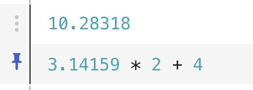
1. Expressions. Expression cells are the most concise and are meant for simple definitions and in Observable outside of a closure, you don’t need a var/const/let keyword.
2. Blocks. Block cells are encompassed by curly braces and include more complex code that might contain local variables and loops.
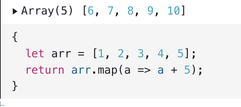
Because local variables like arr above can not be referenced by other cells, many Observable notebooks put different definitions and functions in their own cells. That is what this post will do as well--all the code snippets should be in their own cells, and after adding the code to a cell you should run it by typing shift-return.
For a more detailed introduction to Observable, check out this Notebook.
Setup
Download this dataset of Taylor Swift lyrics and then make an Observable account if you do not have one already. Once you have an account, make a new notebook by clicking the New button in the top-right corner.
To get started, hover your mouse near the left of a cell. You should see a plus sign like this:
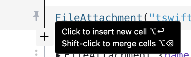
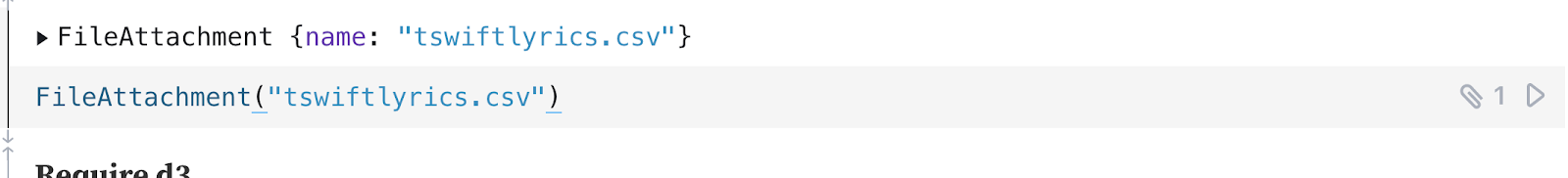
Import the dataset from your machine by clicking the plus sign beneath the existing stock markdown cell, clicking into an Observable cell, and then clicking shift-command-u on Mac. Then select the file you wish to import (don't forget to unzip it!) In the cell you selected, you should then see something like:
Your file name can be different. You can run the cell by clicking the right-facing triangle on the right-end of the Run cell button
or by typing shift-return, both of which would return the following:
To see the actual data from the CSV, append .text() to the code and run it to see the data above like so:
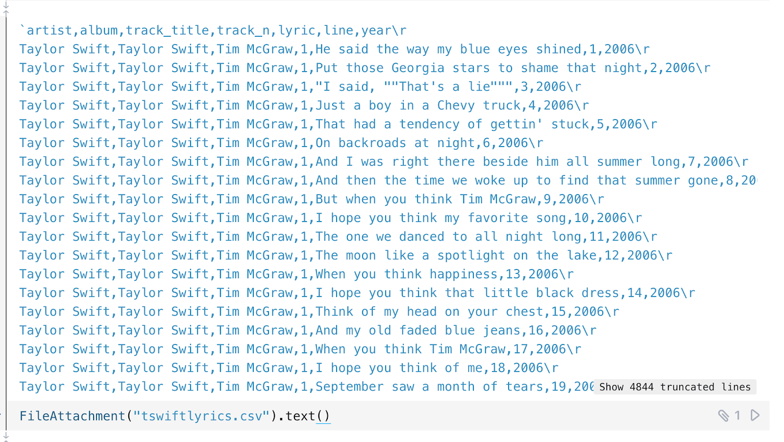
You can also see that a file was imported in that cell because there is that file symbol on the right. We see the data includes the artist for each song (Taylor Swift), the album name, the track title, track number on the album, the lyric, the line the lyric is on, and the year the song came out.
Now click the plus sign on the left of the cell to insert a new cell which will hold a comment. We can do that with markdown:
Insert a new cell and add the following to require D3.js.
In Observable notebooks you cannot require any npm package: you can only use tools that expose their modules via UMD or AMD. Usually if you can include the module from unpkg.com via CDN in a webpage, you can use it in Observable.
Now we loop through the CSV file, calling csvParse to parse the input string (the contents of our CSV file). This returns an array of objects according to the parsed rows.
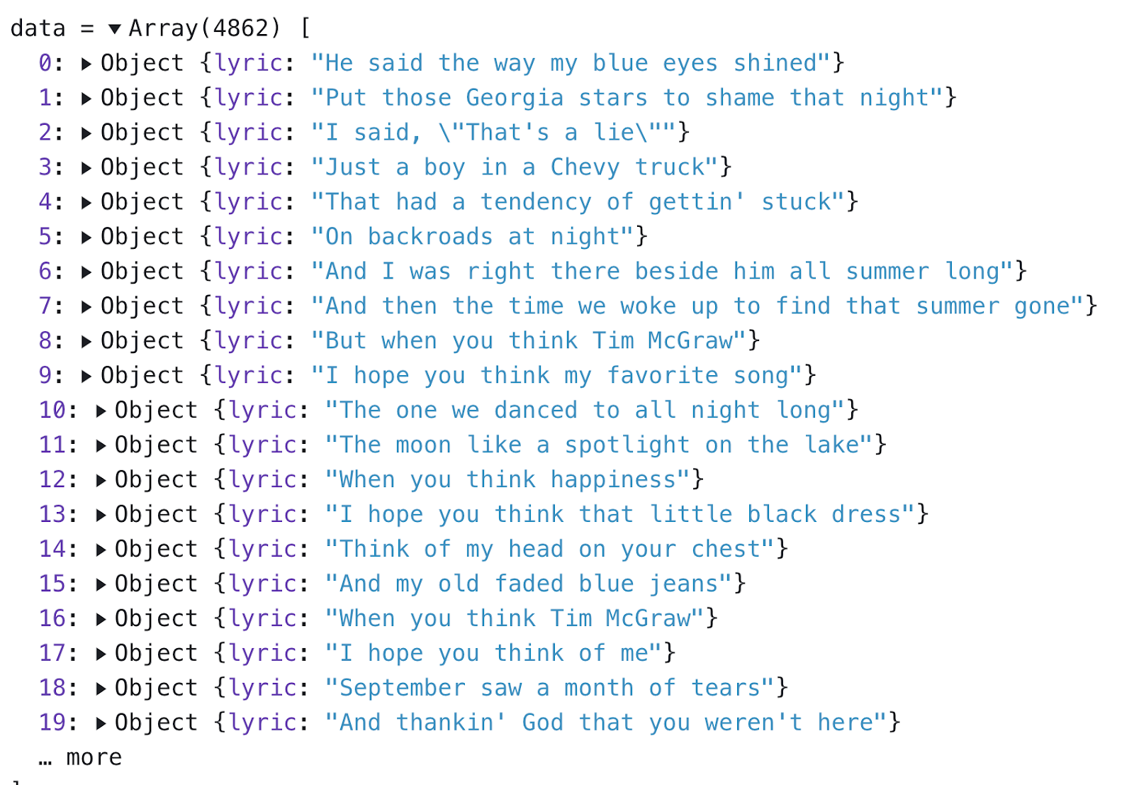
If you run and expand that cell you can see this input that just contains the lyrics from the CSV file:
In a new cell make an empty array to add the words from the lyrics to:
In a new cell add the following to loop through our data object to add each lyric to the lyrics array.
You can see the modified lyrics object in a new cell:

Clean up the Lyrics
Observable does not let us reassign variables because "Named cells are declarations, not assignments." If you were to try to reset or reassign the lyrics variable you would get this error because cell names must be unique:

To analyze the most-used words from Taylor's lyrics, in a new cell let's convert the array to a string and use regex to remove non-string characters.
After we clean the lyrics, let's remove the stopwords. Most of these words were taken from a list of NLTK stop words and do not really say much: they're sort-of "scaffolding-y." In a new cell add
To remove these stopwords from the lyrics add this function to a new cell.
Now we make a new variable in a new cell calling the remove_stopwords function.
Get String Frequency for each Lyric
To get the number of occurrences for each word in our lyrics array, add this code to a new cell using reduce.
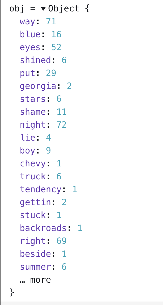
Then we call that strFrequency function and assign the output to a new variable obj.
If you run the cell you would see something like this:
Sort our Word Frequencies
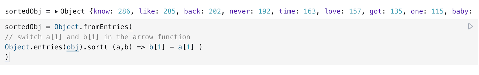
Because this is a JavaScript object we can't just call sort(). To sort our frequencies add this function to a new cell to sort our object from greatest to least.
Running the cell would show the following output:
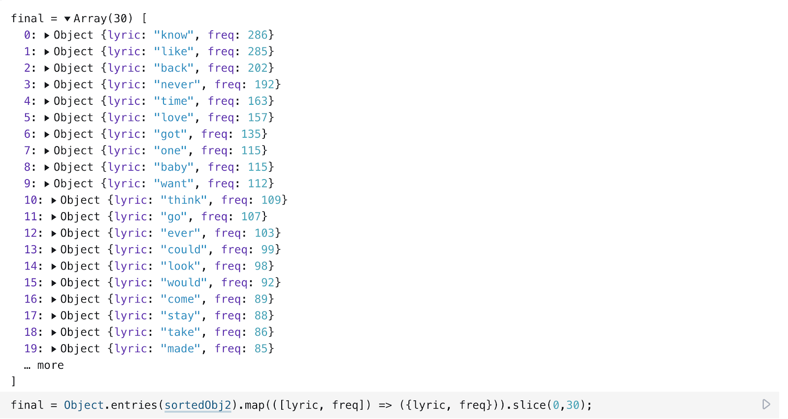
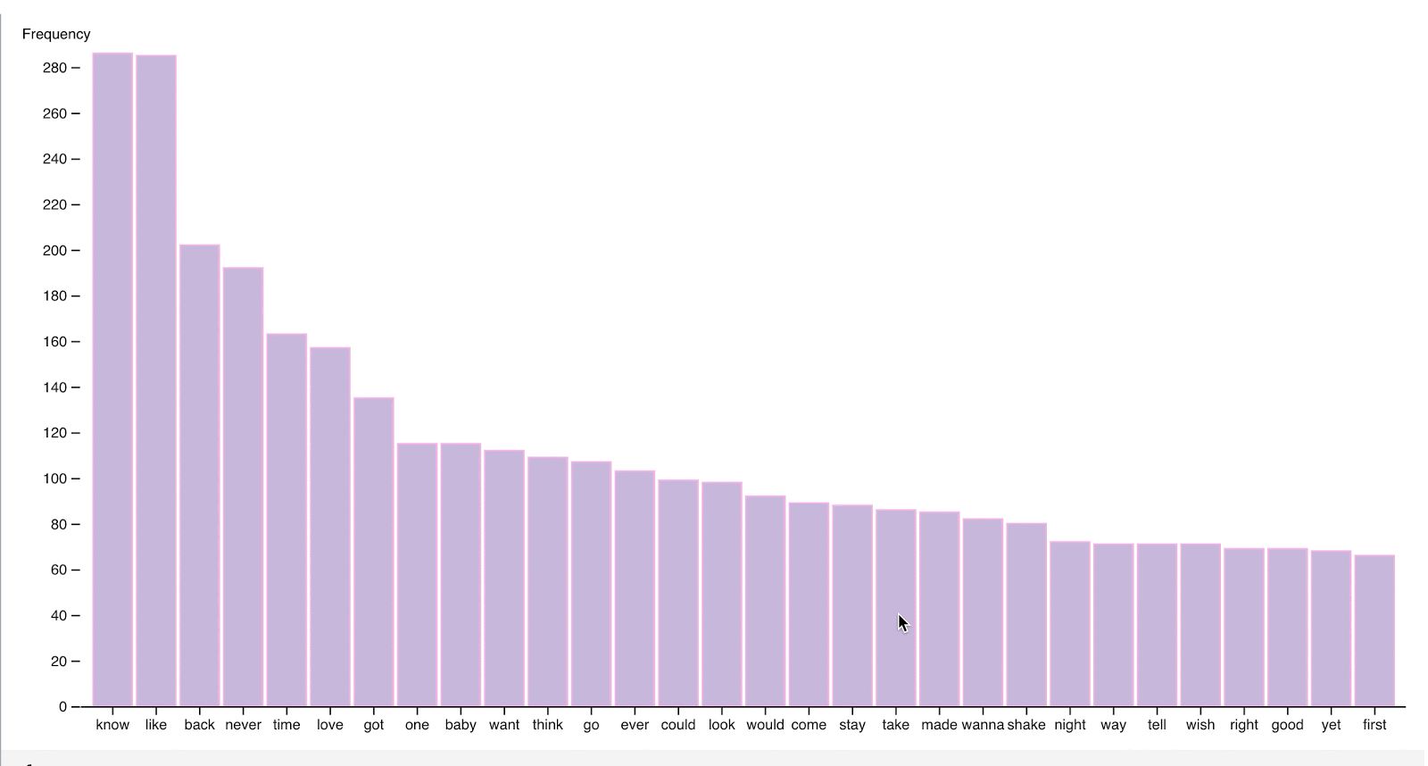
Make a new function in a new cell to only return the first x-number (in this case, 30) of items of the object, editing the object to also have lyric and freq in front of each value so the values are easy to access.
Running the cell you can see that final is an array, slightly different from sortedObj above.
Make our Chart
We need to set some attributes of our chart. In a new cell add
followed by another new cell with
Now we create our x-values in a new cell with d3.scaleBand() breaking up our domain of each Taylor Swift lyric from the final object into a range of values, which are the minimum and maximum extents of the band.
To style and display our axes, we must define them as functions translating them into the appropriate location according to the set orientation. In two separate cells include the following:
Now to add a title to the y-axis add the following code to a new cell.
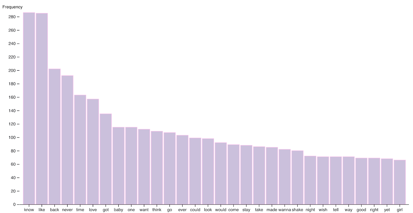
Now we call these by making our chart in a new cell. We create an SVG object, using the viewBox attribute to set the position and dimension. Then we append a g element (which is not unique to D3.js, as it is used to group SVG shapes together) creating rectangles from our lyric data and setting the lyric as the x-value for each rectangle and the frequency of the lyric as the y-value for each rectangle. We also set some style attributes and then call our xAxis, yAxis, and yTitle.
Running that cell should output this chart. Tada!
Add Interactivity to the Bar Chart
Beneath the yAxis cell, add a new cell to contain a tooltip, which is displayed when a user hovers their cursor over a rectangle. We set different style elements to be hex colors related to Taylor Swift albums and other CSS-like properties.
Now edit the chart cell before by adding the following tooltip code. On a mouseover event the tooltip is displayed and shows the word with how frequently the word appears in Taylor Swift songs. When the mouse moves while hovering over a rectangle in the bar chart, so does the tooltip and its text.
You should see:
Tada! Now if you hover over a bar, you can see the exact value. If you want to see the complete code you can play around with the published Observable notebook here.
What's next for data visualizations?
You don't need to use Observable notebooks to make data visualizations in JavaScript-- you can use D3.js and other data visualization libraries in your preferred text editor too, and then display them in a webpage. However, Observable is a handy tool that lets you view code output quickly and can help make building and sharing demos easier. You can use other datasets as well such as different datasets here on Kaggle and be sure to ask yourself these 5 questions before working with a dataset! Let me know online what you're building.
- GitHub: elizabethsiegle
- Twitter: @lizziepika
- email: lsiegle@twilio.com


Related Resources
Twilio Docs
From APIs to SDKs to sample apps
API reference documentation, SDKs, helper libraries, quickstarts, and tutorials for your language and platform.
Resource Center
The latest ebooks, industry reports, and webinars
Learn from customer engagement experts to improve your own communication.
Ahoy
Twilio's developer community hub
Best practices, code samples, and inspiration to build communications and digital engagement experiences.